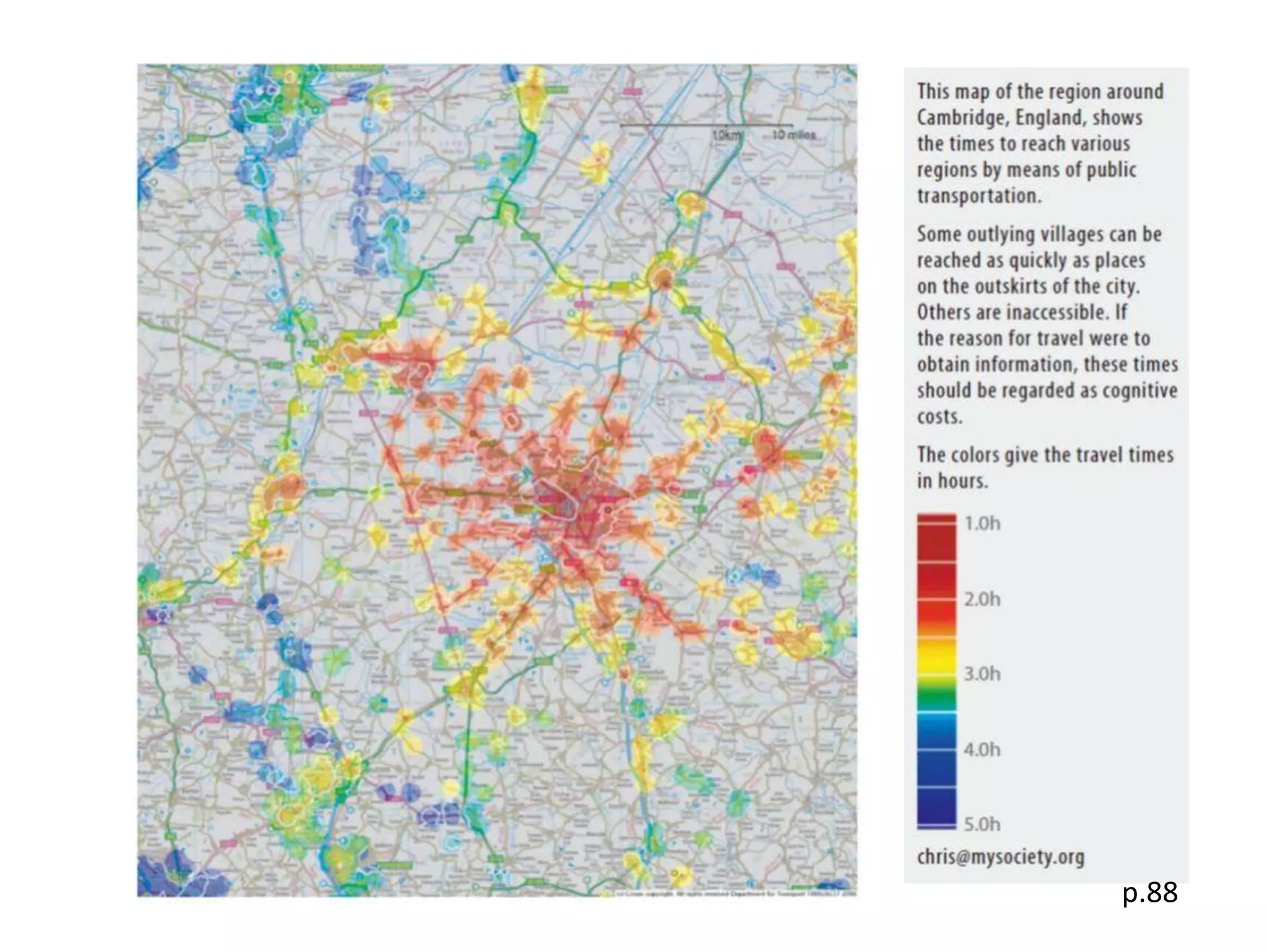
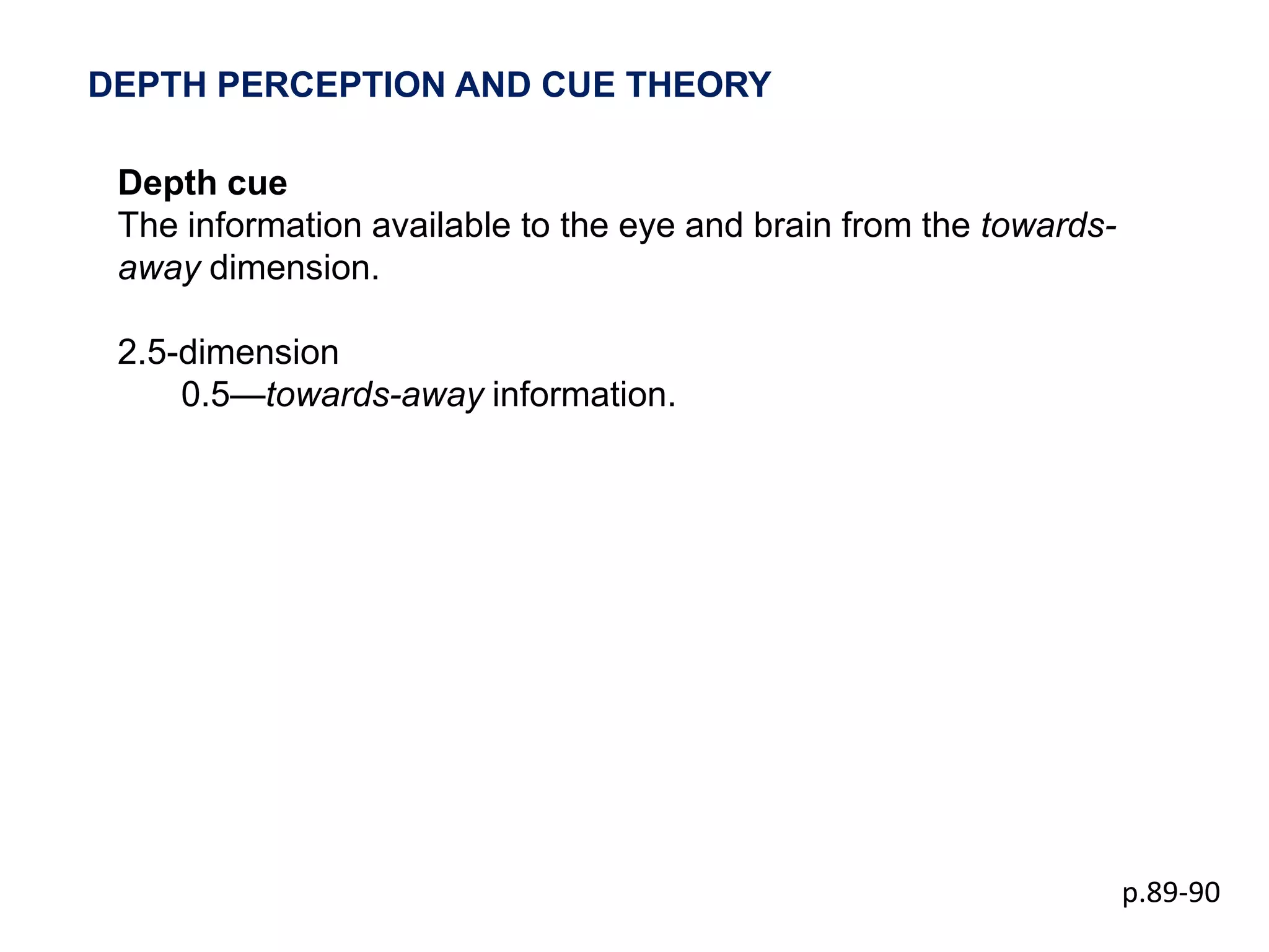
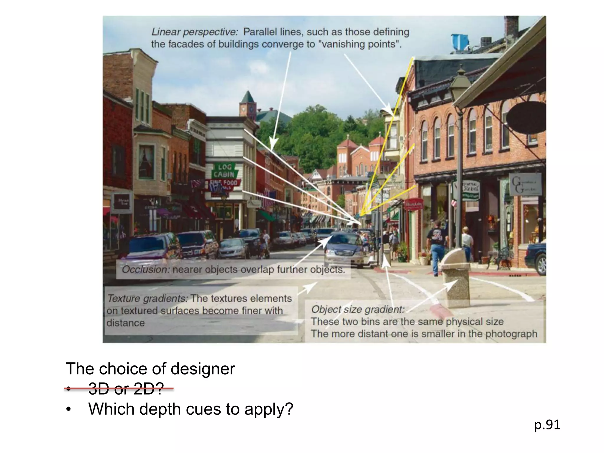
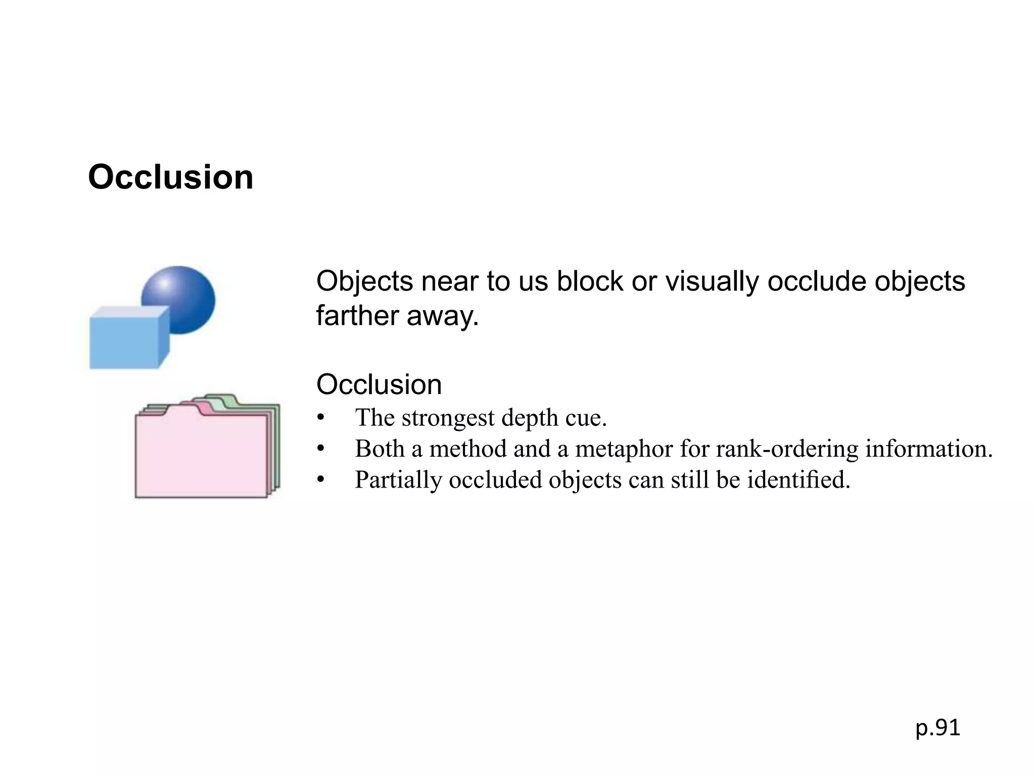
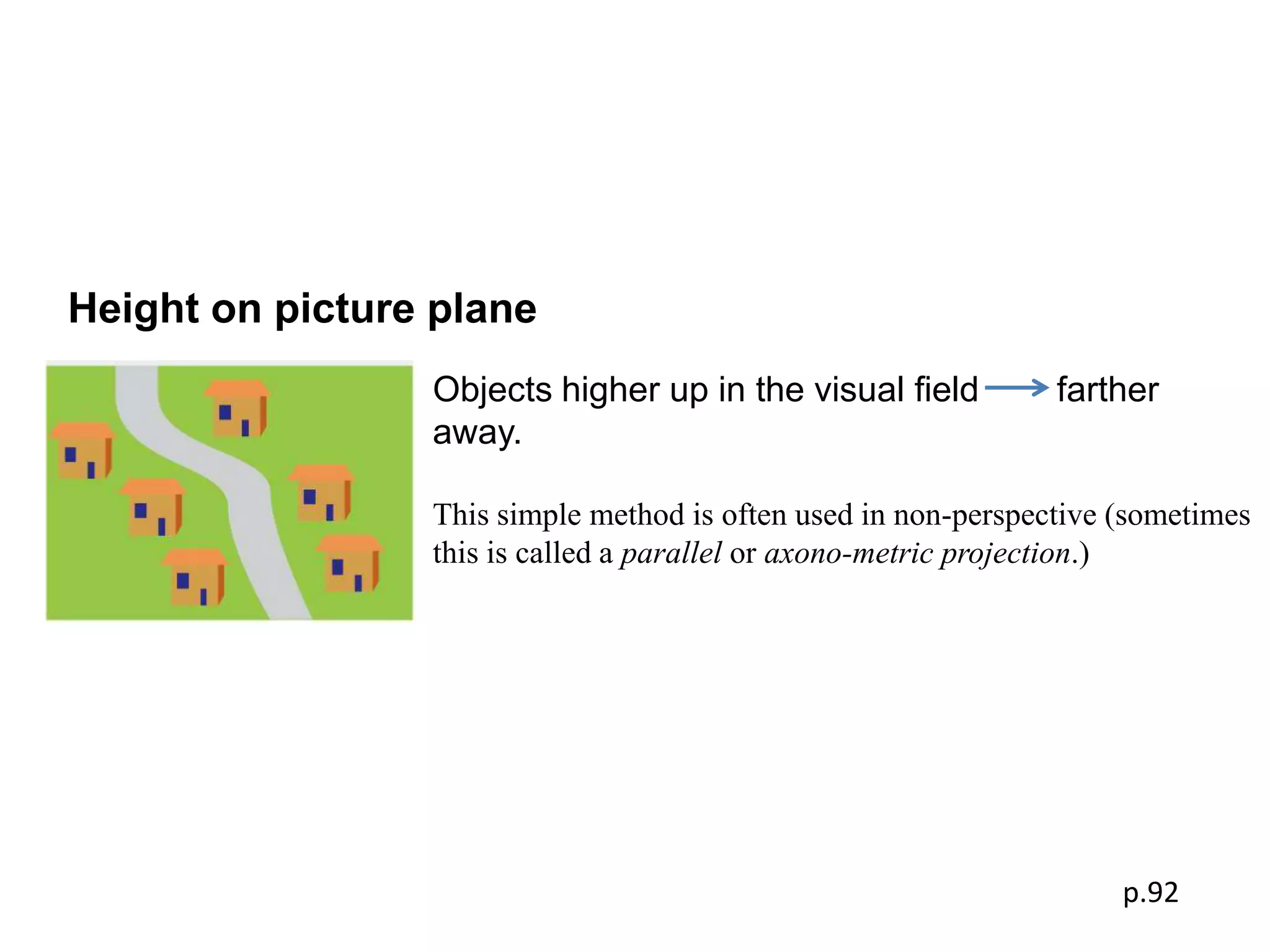
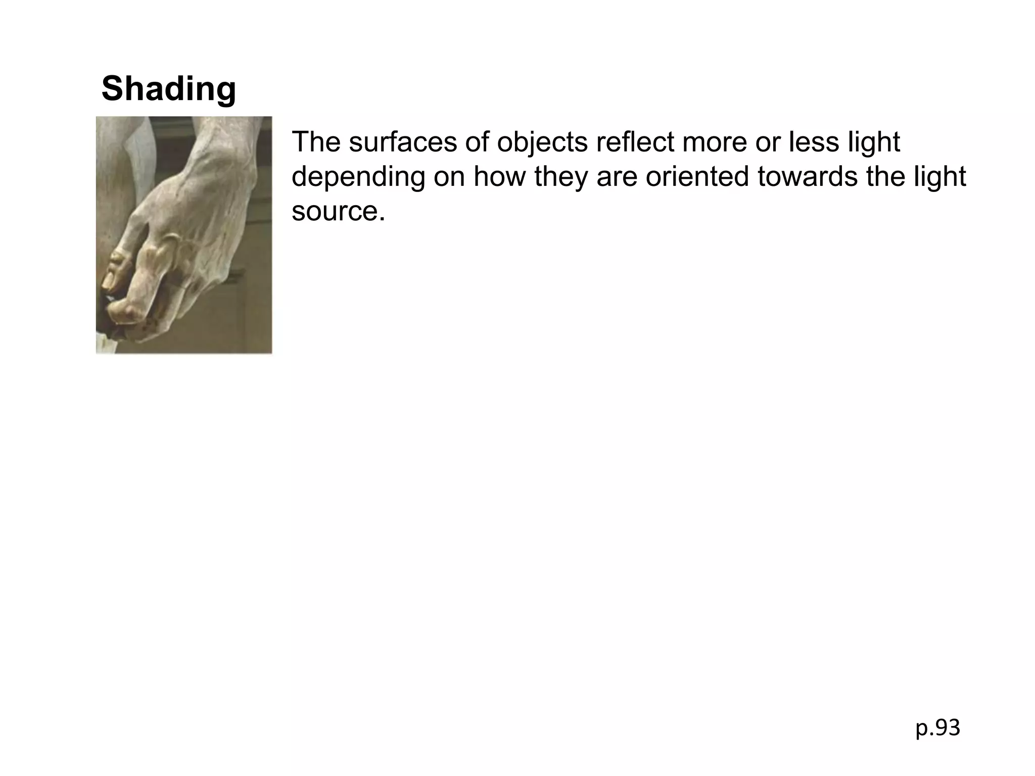
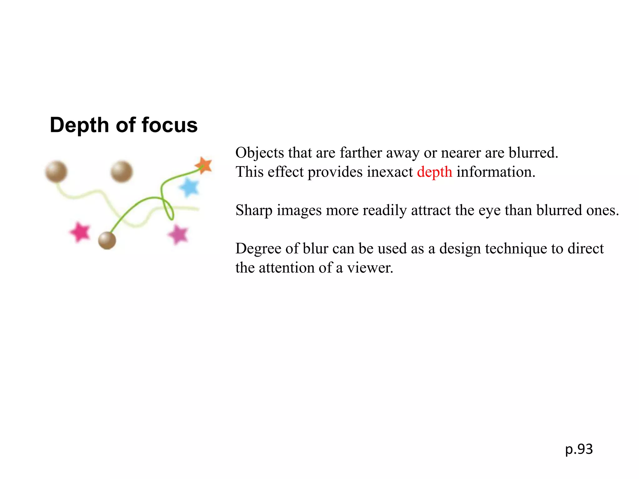
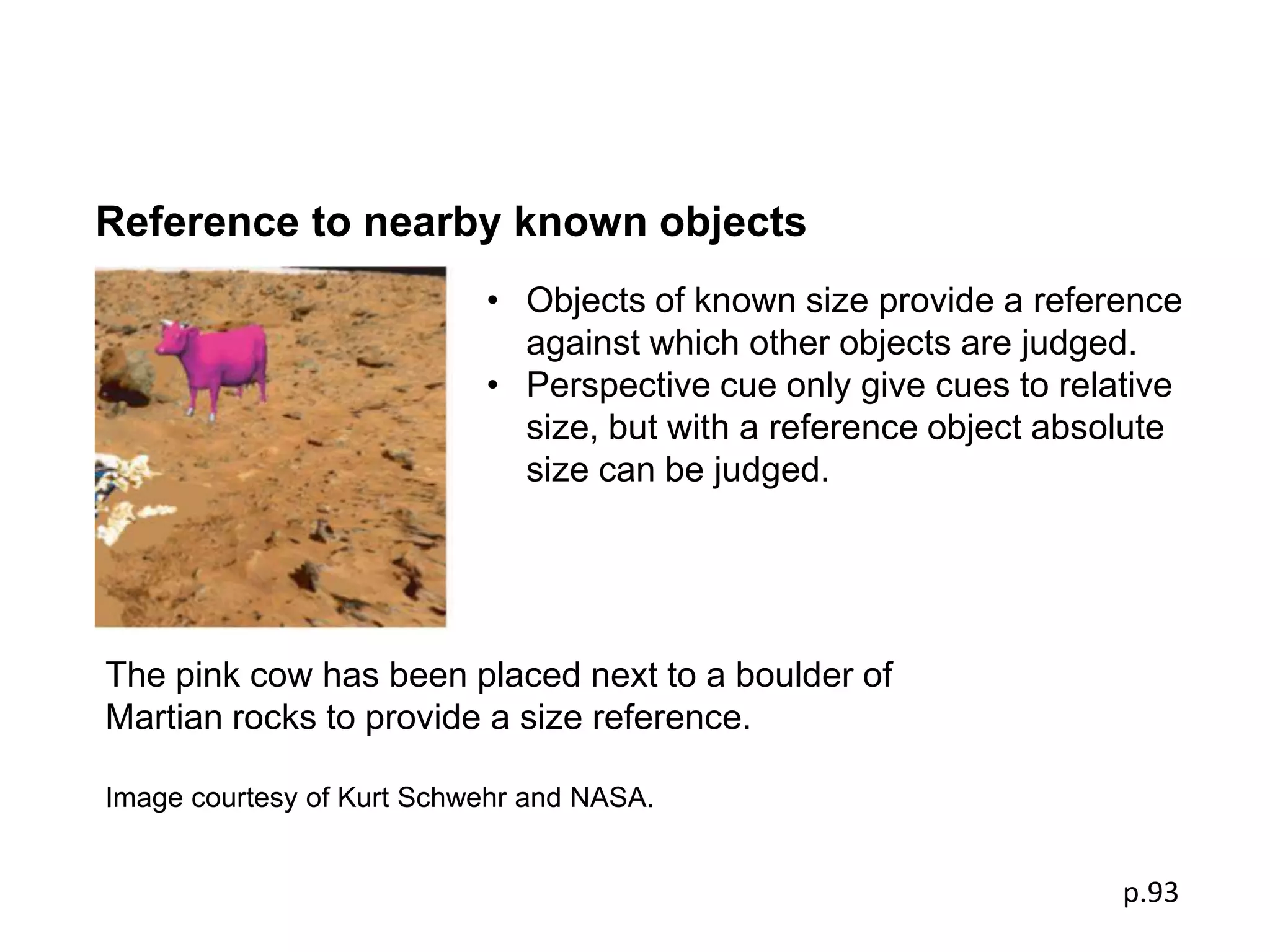
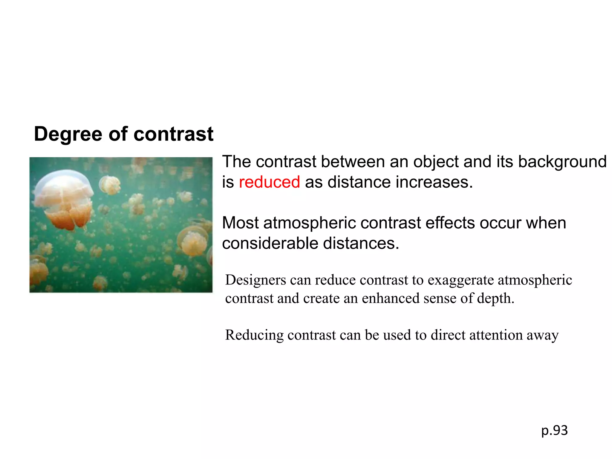
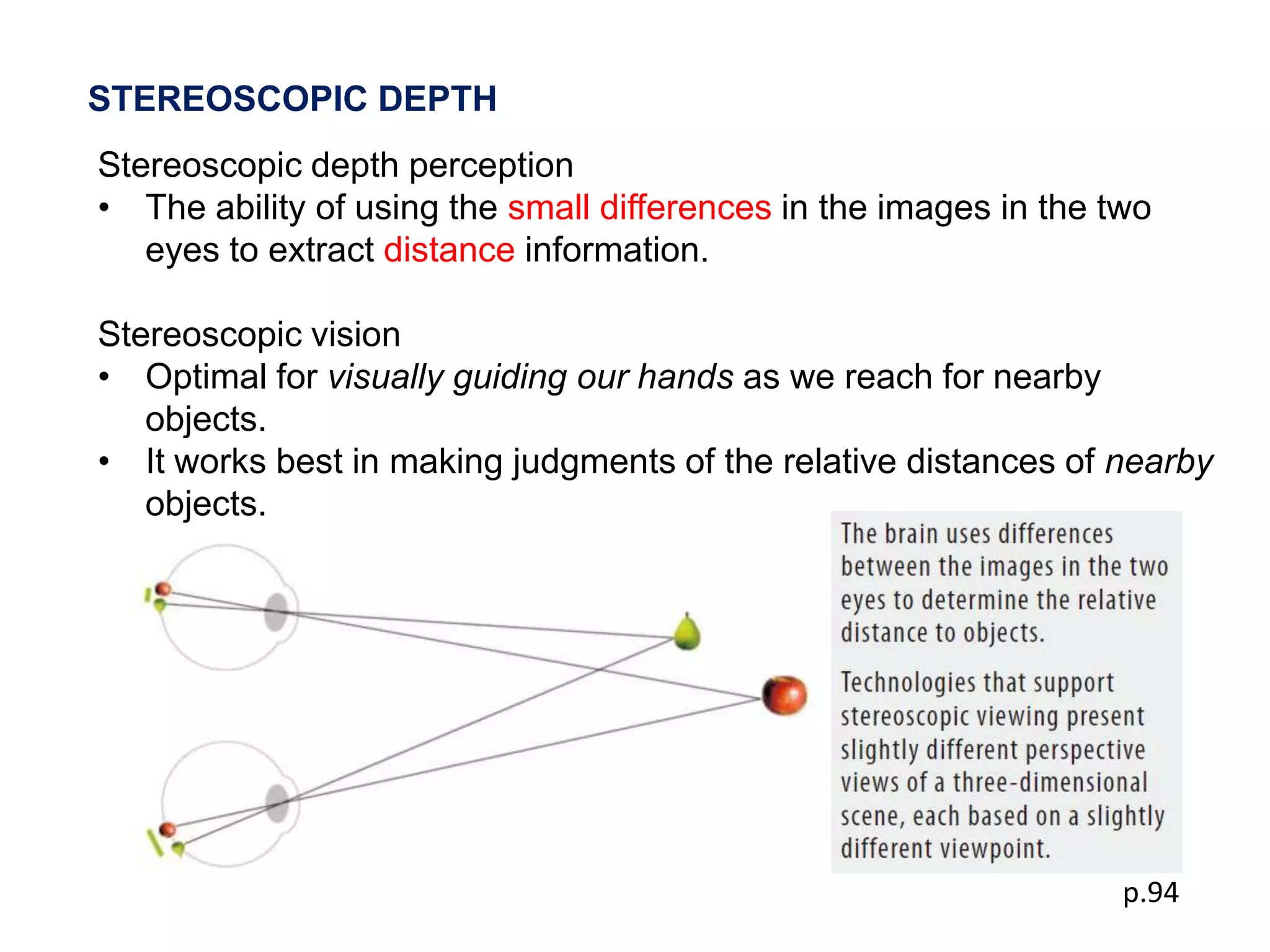
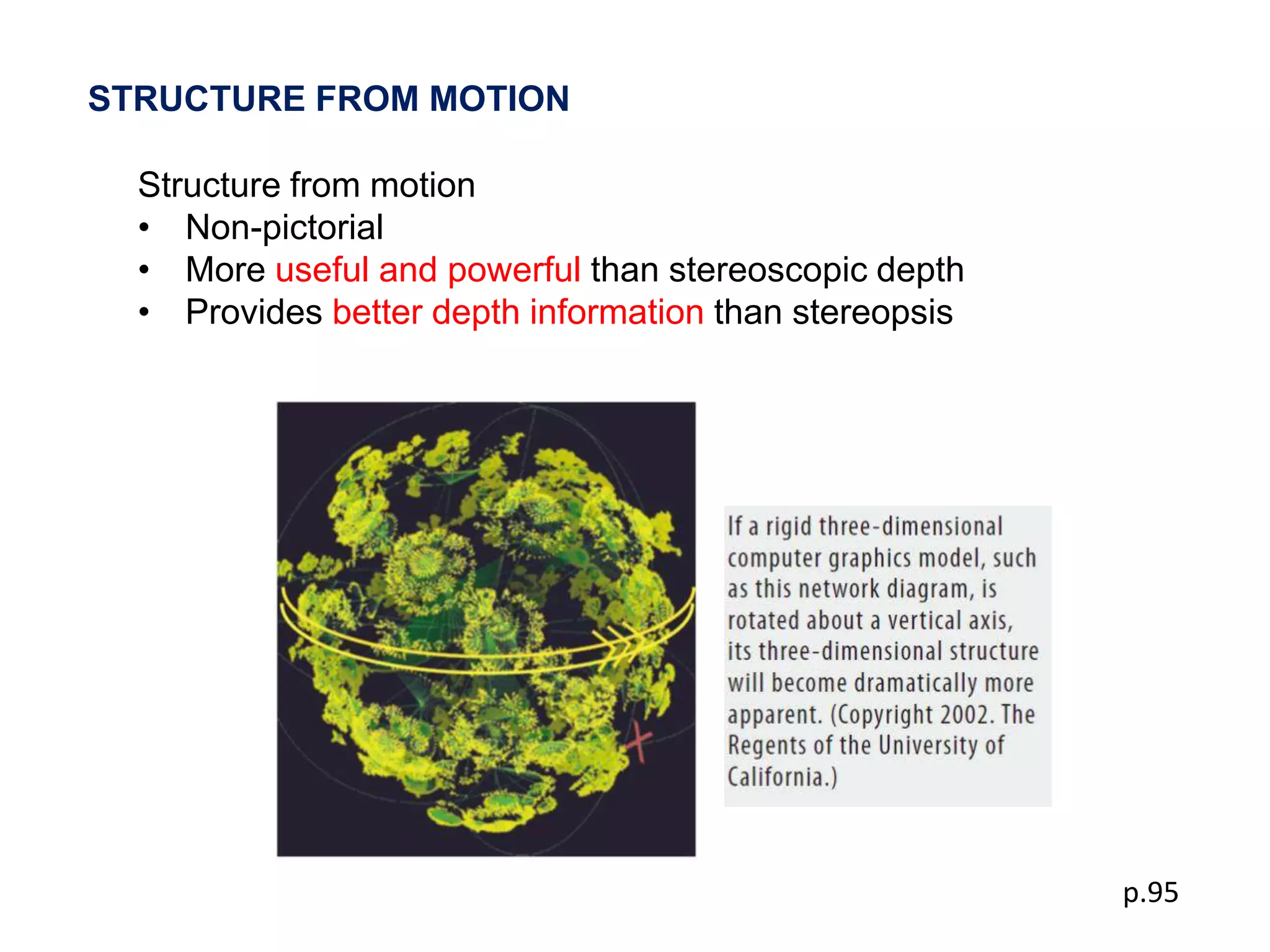
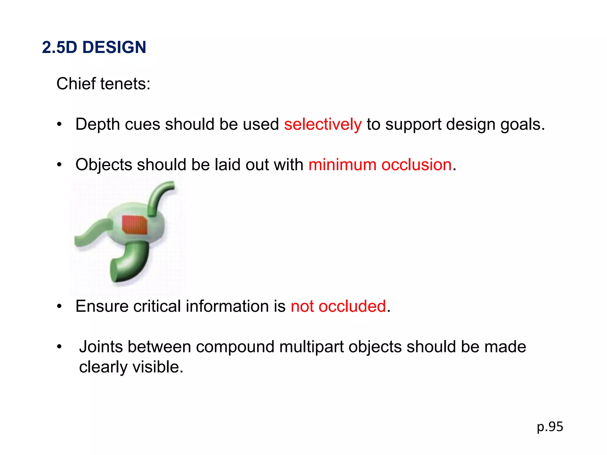
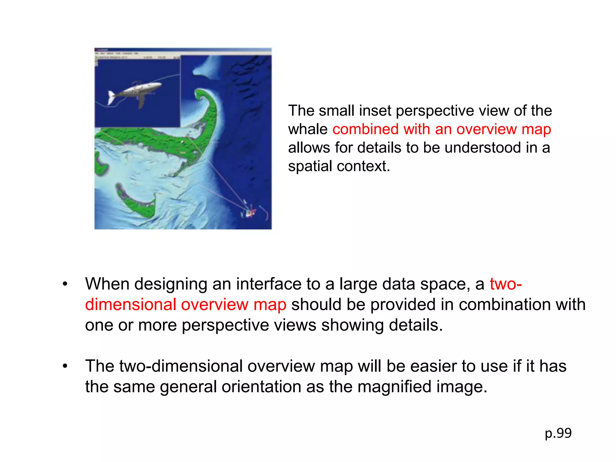
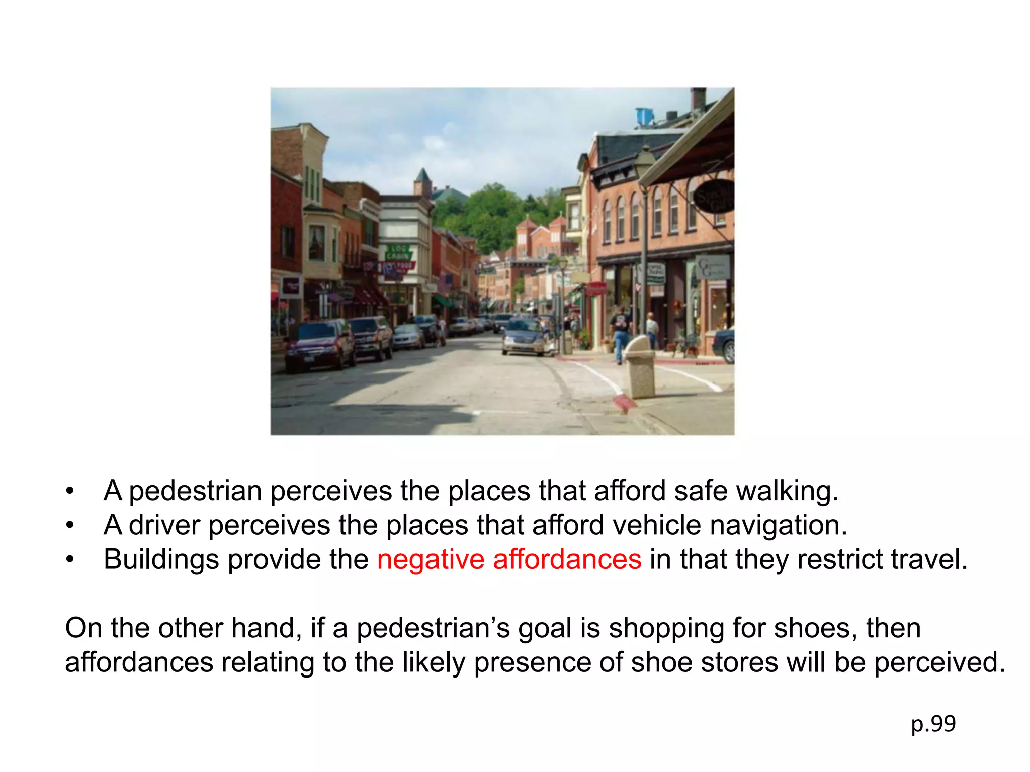
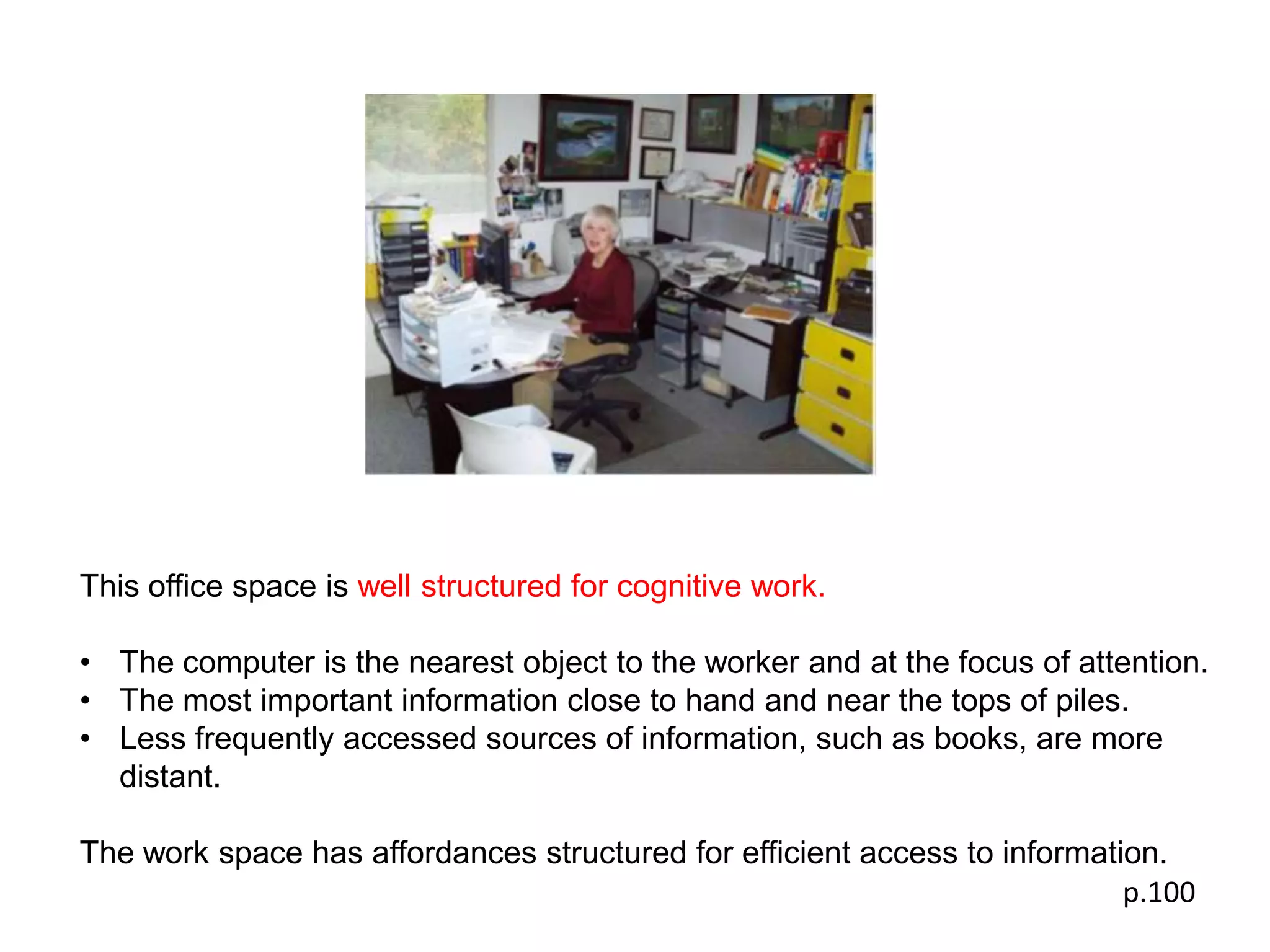
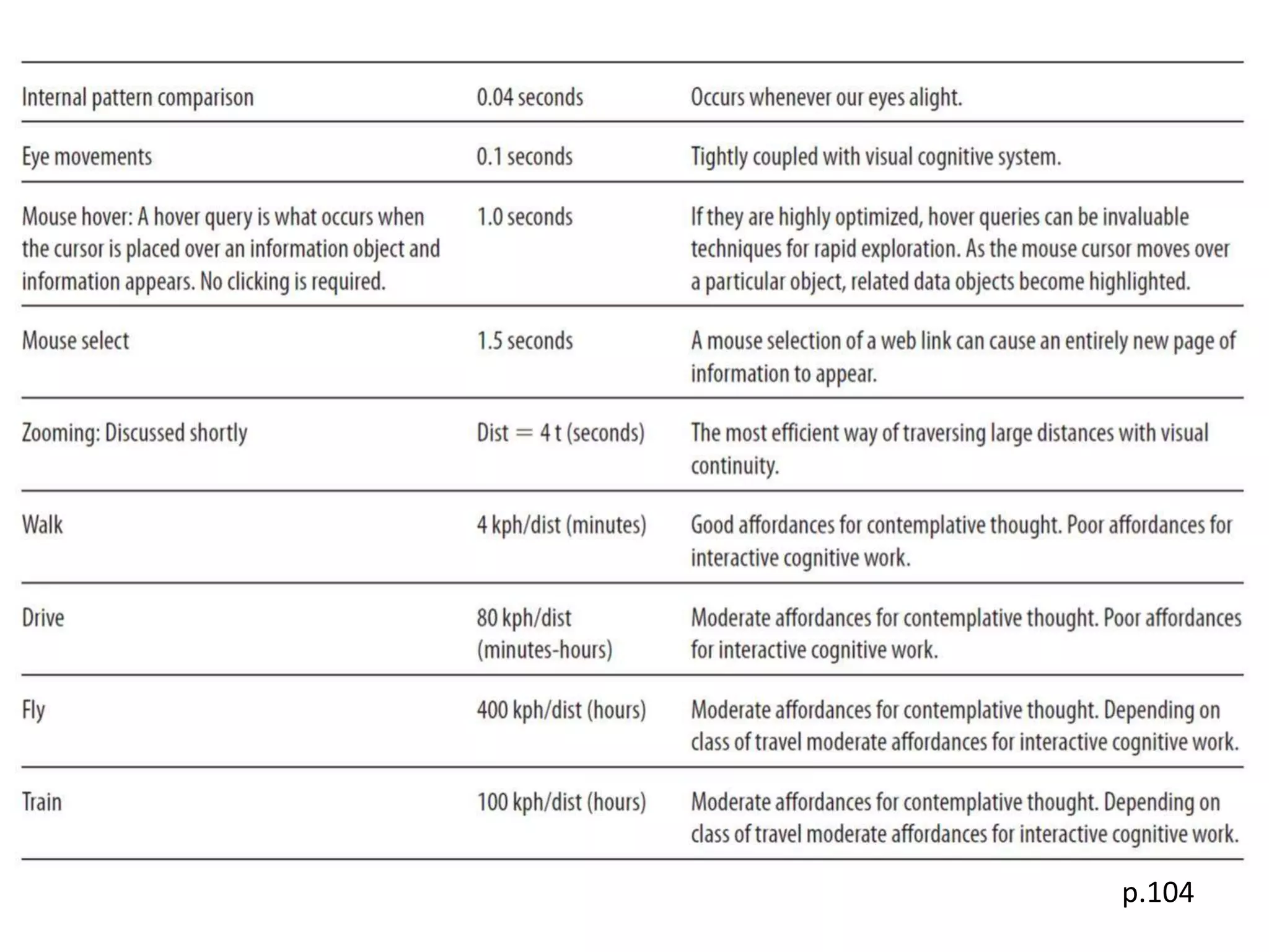
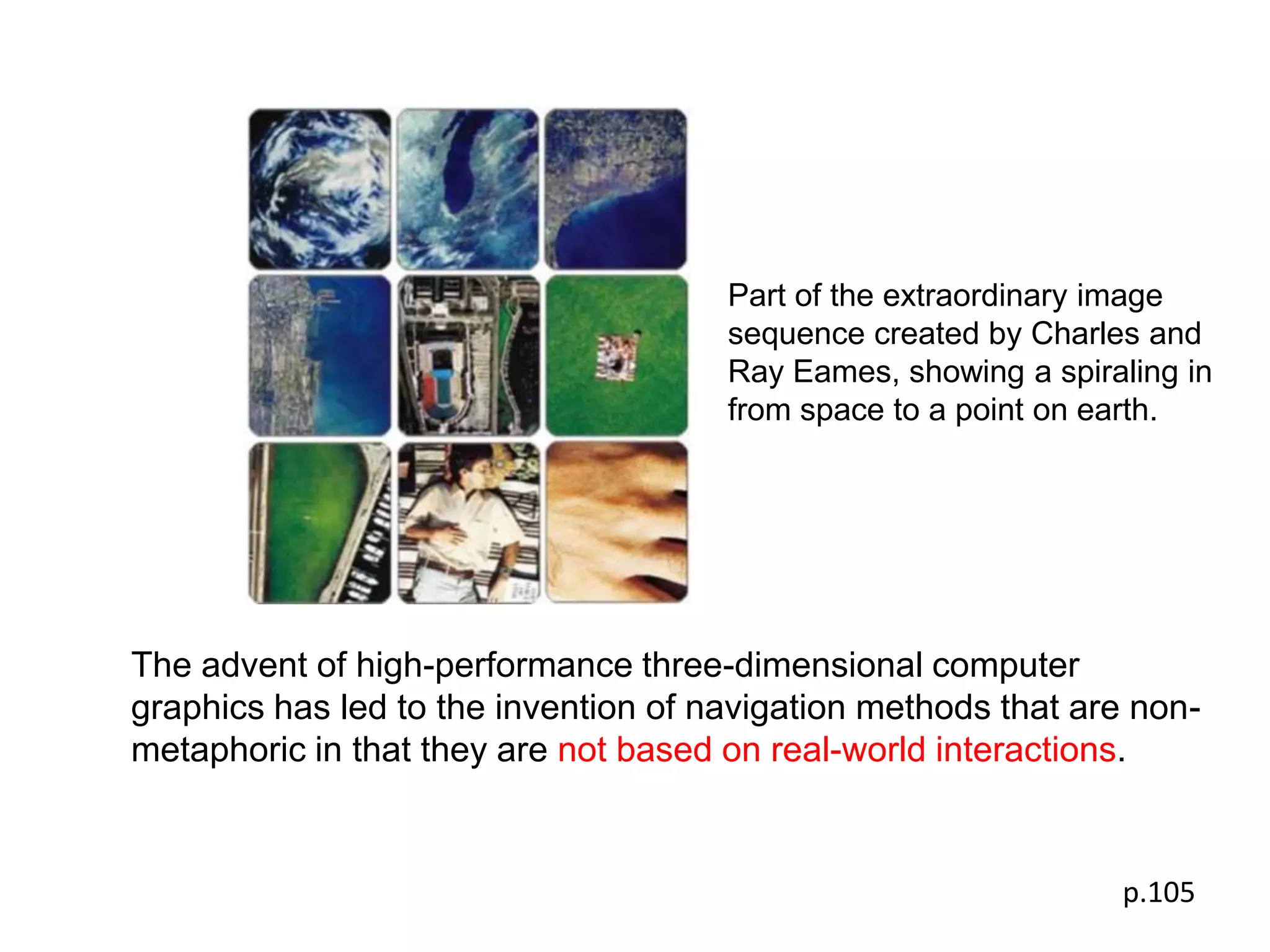
This chapter is about the perceptual and cognitive structure of
space taking into account both how depth is perceived and
the costs of navigation to access information.
                                                                  p.87
p.88
DEPTH PERCEPTION AND CUE THEORY

 Depth cue
 The information available to the eye and brain from the towards-
 away dimension.

 2.5-dimension
     0.5—towards-away information.


                                                                    p.89-90
The choice of designer
• 3D or 2D?
• Which depth cues to apply?
                               p.91
Occlusion

            Objects near to us block or visually occlude objects
            farther away.

            Occlusion
            •   The strongest depth cue.
            •   Both a method and a metaphor for rank-ordering information.
            •   Partially occluded objects can still be identified.


                                                                   p.91
Perspective
              Size gradients: More distant objects         smaller

              • A visual metaphor for the relative importance of
                different information objects.

              • Advantage: Less important information takes
                less space


                                                            p.92
Perspective
              Texture gradients: There is a reduction in size
              and increase in density of texture elements with
              distance.

              • The texture elements on a ground plane provide a size
                reference for objects
              • Unfortunately, fine textures are usually not reproduced on
                computer displays


                                                               p.92
Linear Perspective
                     Projections of parallel lines converge on
                     the picture plane.

                     A grid of lines
                     •   provide a reference plane for judging the three-
                         dimensional layout of objects.
                     •   Provide a ruler for visual queries aimed at
                         judging the sizes of objects.


                                                                p.92
Cast shadows
               The shadow cast            information about distance.

               The height of the two cyan balls above the checkerboard can be
               seen from the shadows.

               The magenta balls, having no shadows, have nothing to tie them
               to the ground plane.


                                                                   p.92
Height on picture plane
                 Objects higher up in the visual field           farther
                 away.

                 This simple method is often used in non-perspective (sometimes
                 this is called a parallel or axono-metric projection.)


                                                                     p.92
Shading
          The surfaces of objects reflect more or less light
          depending on how they are oriented towards the light
          source.


                                                          p.93
Depth of focus
                 Objects that are farther away or nearer are blurred.
                 This effect provides inexact depth information.

                 Sharp images more readily attract the eye than blurred ones.

                 Degree of blur can be used as a design technique to direct
                 the attention of a viewer.


                                                                        p.93
Reference to nearby known objects
                           • Objects of known size provide a reference
                             against which other objects are judged.
                           • Perspective cue only give cues to relative
                             size, but with a reference object absolute
                             size can be judged.


The pink cow has been placed next to a boulder of
Martian rocks to provide a size reference.

Image courtesy of Kurt Schwehr and NASA.


                                                                   p.93
Degree of contrast
                     The contrast between an object and its background
                     is reduced as distance increases.

                     Most atmospheric contrast effects occur when
                     considerable distances.

                     Designers can reduce contrast to exaggerate atmospheric
                     contrast and create an enhanced sense of depth.

                     Reducing contrast can be used to direct attention away


                                                                        p.93
STEREOSCOPIC DEPTH
Stereoscopic depth perception
• The ability of using the small differences in the images in the two
   eyes to extract distance information.

Stereoscopic vision
• Optimal for visually guiding our hands as we reach for nearby
   objects.
• It works best in making judgments of the relative distances of nearby
   objects.


                                                                   p.94
STRUCTURE FROM MOTION

  Structure from motion
  • Non-pictorial
  • More useful and powerful than stereoscopic depth
  • Provides better depth information than stereopsis


                                                        p.95
2.5D DESIGN

 Chief tenets:

 • Depth cues should be used selectively to support design goals.

 • Objects should be laid out with minimum occlusion.


 • Ensure critical information is not occluded.

 • Joints between compound multipart objects should be made
   clearly visible.


                                                               p.95
• Make clear spatial relationships, such as on top
  of, attached to, and inside of.

• Depth should be minimized, but when there are
  different depths the layout should be carefully
  designed to make relative distances clear.

• Display text in the image plane. Text that is
  slanted in perspective views is harder to read.

• Give common views of objects for rapid
  identification.


                                                     p.96
An example—
human digestive system.


     • The layout is almost entirely in the picture plane.
     • The connections between components are made very clear.
     • There is occasional occlusion but it never destroys object identity.

     (Image from David Dickson, illustrator.www. daviddicksonillustration.com.)
                                                                                  p.96
HOW MUCH OF THE THIRD DIMENSION?
In determining whether a three-dimensional or two-dimensional
design, appropriate is the nature of what is to be displayed.
  • The fact that we do not perceive three dimensions.

  • Getting around in three dimensions is much harder than
    navigation in two dimensions.

  • It is useful to mix two-dimensional design elements with three-
    dimensional design elements.

  • A primarily two-dimensional design with a judicious use of depth
    can be useful.

  • Many three-dimensional interfaces actually have two-dimensional
    controls placed in the margin.


                                                                 p.97
It is a good example of the application of 2.5-dimensional design principles
to the visualization of a complex business system.

• Careful use of occlusion, height on the picture plane, and layering.
• No important objects are obscured through occlusion.
• All the important junctions in the information network are clearly visible.

                                                                      p.98
The small inset perspective view of the
                             whale combined with an overview map
                             allows for details to be understood in a
                             spatial context.


• When designing an interface to a large data space, a two-
  dimensional overview map should be provided in combination with
  one or more perspective views showing details.

• The two-dimensional overview map will be easier to use if it has
  the same general orientation as the magnified image.

                                                                   p.99
AFFORDANCE

 The main thread of this chapter—the connections between
 perception and action.

 • Developed by the psychologist James Gibson in the 1960s
 • Gibson started a revolution in the study of perception by claiming that
   we perceive physical affordances for actions, and not images on the
   retina


 Cognitive affordances are readily perceived possibilities for action.


                                                                       p.99
AFFORDANCE

 • Developed by the psychologist James Gibson in the 1960s
 • Gibson started a revolution in the study of perception by claiming that we
   perceive physical affordances for actions, and not images on the retina


                                                                                p.99
• A pedestrian perceives the places that afford safe walking.
• A driver perceives the places that afford vehicle navigation.
• Buildings provide the negative affordances in that they restrict travel.

On the other hand, if a pedestrian’s goal is shopping for shoes, then
affordances relating to the likely presence of shoe stores will be perceived.

                                                                     p.99
Workbenches and kitchens are structured to
afford good support for manual construction tasks.

(Image courtesy of Joshua Eckels. josh@jeckels.com.)


                                                       p.100
This office space is well structured for cognitive work.

• The computer is the nearest object to the worker and at the focus of attention.
• The most important information close to hand and near the tops of piles.
• Less frequently accessed sources of information, such as books, are more
  distant.

The work space has affordances structured for efficient access to information.
                                                                           p.100
SPACE TRAVERSAL AND COGNITIVE COSTS


 Moving through space can be regarded as a cognitive cost.
 •   We weigh the time to go to the library against the time to access
     information online, taking into account the relative quality of information
     we are likely to get

 There are cognitive tradeoffs other than time to consider.
 •   We choose to travel by train, as opposed to driving a car, because we
     can read and write while on the train but not in the car.

 In this light, it is useful to review the basic costs of some common
 modes of information access.

 A list of rough values for various costs is set out in the following table.


                                                                            p.103
p.104
SPACE TRAVERSAL AND COGNITIVE COSTS


In this way, the efficiency of one design can be compared against another.

The table is far too rough an approximation.
It is intended as food for thought.

Pure cognitive efficiency is always something that should be taken into
account.


                                                                    p.104
Part of the extraordinary image
                                      sequence created by Charles and
                                      Ray Eames, showing a spiraling in
                                      from space to a point on earth.


The advent of high-performance three-dimensional computer
graphics has led to the invention of navigation methods that are non-
metaphoric in that they are not based on real-world interactions.


                                                                p.105
CONCLUSION

   The main point of this chapter
   • The functional aesthetics of space are related to the cost
     of accessing information.

   Less information being rapidly available in the towards-away
   (depth) direction than the sideways and up-down directions.

   Depth is perceived in ways that are radically different from
   the way patterns in the image plane are perceived.

   The set of design principles that takes the space-time structure
   of perception into account is called 2.5-dimension design.


                                                                  p.105
CONCLUSION


 There is no need to use depth cues all together in a consistent
 way unless visual realism is, in and of itself, a design goal.


 The piecemeal use of depth cues is part of 2.5-dimension design

 The primary design consideration
 • The layout of objects
 • Patterns as they appear in the image plane


                                                                   p.106

W10 visual space and time

  • 1.
    This chapter isabout the perceptual and cognitive structure of space taking into account both how depth is perceived and the costs of navigation to access information. p.87
  • 2.
  • 3.
    DEPTH PERCEPTION ANDCUE THEORY Depth cue The information available to the eye and brain from the towards- away dimension. 2.5-dimension 0.5—towards-away information. p.89-90
  • 4.
    The choice ofdesigner • 3D or 2D? • Which depth cues to apply? p.91
  • 5.
    Occlusion Objects near to us block or visually occlude objects farther away. Occlusion • The strongest depth cue. • Both a method and a metaphor for rank-ordering information. • Partially occluded objects can still be identified. p.91
  • 6.
    Perspective Size gradients: More distant objects smaller • A visual metaphor for the relative importance of different information objects. • Advantage: Less important information takes less space p.92
  • 7.
    Perspective Texture gradients: There is a reduction in size and increase in density of texture elements with distance. • The texture elements on a ground plane provide a size reference for objects • Unfortunately, fine textures are usually not reproduced on computer displays p.92
  • 8.
    Linear Perspective Projections of parallel lines converge on the picture plane. A grid of lines • provide a reference plane for judging the three- dimensional layout of objects. • Provide a ruler for visual queries aimed at judging the sizes of objects. p.92
  • 9.
    Cast shadows The shadow cast information about distance. The height of the two cyan balls above the checkerboard can be seen from the shadows. The magenta balls, having no shadows, have nothing to tie them to the ground plane. p.92
  • 10.
    Height on pictureplane Objects higher up in the visual field farther away. This simple method is often used in non-perspective (sometimes this is called a parallel or axono-metric projection.) p.92
  • 11.
    Shading The surfaces of objects reflect more or less light depending on how they are oriented towards the light source. p.93
  • 12.
    Depth of focus Objects that are farther away or nearer are blurred. This effect provides inexact depth information. Sharp images more readily attract the eye than blurred ones. Degree of blur can be used as a design technique to direct the attention of a viewer. p.93
  • 13.
    Reference to nearbyknown objects • Objects of known size provide a reference against which other objects are judged. • Perspective cue only give cues to relative size, but with a reference object absolute size can be judged. The pink cow has been placed next to a boulder of Martian rocks to provide a size reference. Image courtesy of Kurt Schwehr and NASA. p.93
  • 14.
    Degree of contrast The contrast between an object and its background is reduced as distance increases. Most atmospheric contrast effects occur when considerable distances. Designers can reduce contrast to exaggerate atmospheric contrast and create an enhanced sense of depth. Reducing contrast can be used to direct attention away p.93
  • 15.
    STEREOSCOPIC DEPTH Stereoscopic depthperception • The ability of using the small differences in the images in the two eyes to extract distance information. Stereoscopic vision • Optimal for visually guiding our hands as we reach for nearby objects. • It works best in making judgments of the relative distances of nearby objects. p.94
  • 16.
    STRUCTURE FROM MOTION Structure from motion • Non-pictorial • More useful and powerful than stereoscopic depth • Provides better depth information than stereopsis p.95
  • 17.
    2.5D DESIGN Chieftenets: • Depth cues should be used selectively to support design goals. • Objects should be laid out with minimum occlusion. • Ensure critical information is not occluded. • Joints between compound multipart objects should be made clearly visible. p.95
  • 18.
    • Make clearspatial relationships, such as on top of, attached to, and inside of. • Depth should be minimized, but when there are different depths the layout should be carefully designed to make relative distances clear. • Display text in the image plane. Text that is slanted in perspective views is harder to read. • Give common views of objects for rapid identification. p.96
  • 19.
    An example— human digestivesystem. • The layout is almost entirely in the picture plane. • The connections between components are made very clear. • There is occasional occlusion but it never destroys object identity. (Image from David Dickson, illustrator.www. daviddicksonillustration.com.) p.96
  • 20.
    HOW MUCH OFTHE THIRD DIMENSION? In determining whether a three-dimensional or two-dimensional design, appropriate is the nature of what is to be displayed. • The fact that we do not perceive three dimensions. • Getting around in three dimensions is much harder than navigation in two dimensions. • It is useful to mix two-dimensional design elements with three- dimensional design elements. • A primarily two-dimensional design with a judicious use of depth can be useful. • Many three-dimensional interfaces actually have two-dimensional controls placed in the margin. p.97
  • 21.
    It is agood example of the application of 2.5-dimensional design principles to the visualization of a complex business system. • Careful use of occlusion, height on the picture plane, and layering. • No important objects are obscured through occlusion. • All the important junctions in the information network are clearly visible. p.98
  • 22.
    The small insetperspective view of the whale combined with an overview map allows for details to be understood in a spatial context. • When designing an interface to a large data space, a two- dimensional overview map should be provided in combination with one or more perspective views showing details. • The two-dimensional overview map will be easier to use if it has the same general orientation as the magnified image. p.99
  • 23.
    AFFORDANCE The mainthread of this chapter—the connections between perception and action. • Developed by the psychologist James Gibson in the 1960s • Gibson started a revolution in the study of perception by claiming that we perceive physical affordances for actions, and not images on the retina Cognitive affordances are readily perceived possibilities for action. p.99
  • 24.
    AFFORDANCE • Developedby the psychologist James Gibson in the 1960s • Gibson started a revolution in the study of perception by claiming that we perceive physical affordances for actions, and not images on the retina p.99
  • 25.
    • A pedestrianperceives the places that afford safe walking. • A driver perceives the places that afford vehicle navigation. • Buildings provide the negative affordances in that they restrict travel. On the other hand, if a pedestrian’s goal is shopping for shoes, then affordances relating to the likely presence of shoe stores will be perceived. p.99
  • 26.
    Workbenches and kitchensare structured to afford good support for manual construction tasks. (Image courtesy of Joshua Eckels. josh@jeckels.com.) p.100
  • 27.
    This office spaceis well structured for cognitive work. • The computer is the nearest object to the worker and at the focus of attention. • The most important information close to hand and near the tops of piles. • Less frequently accessed sources of information, such as books, are more distant. The work space has affordances structured for efficient access to information. p.100
  • 28.
    SPACE TRAVERSAL ANDCOGNITIVE COSTS Moving through space can be regarded as a cognitive cost. • We weigh the time to go to the library against the time to access information online, taking into account the relative quality of information we are likely to get There are cognitive tradeoffs other than time to consider. • We choose to travel by train, as opposed to driving a car, because we can read and write while on the train but not in the car. In this light, it is useful to review the basic costs of some common modes of information access. A list of rough values for various costs is set out in the following table. p.103
  • 29.
  • 30.
    SPACE TRAVERSAL ANDCOGNITIVE COSTS In this way, the efficiency of one design can be compared against another. The table is far too rough an approximation. It is intended as food for thought. Pure cognitive efficiency is always something that should be taken into account. p.104
  • 31.
    Part of theextraordinary image sequence created by Charles and Ray Eames, showing a spiraling in from space to a point on earth. The advent of high-performance three-dimensional computer graphics has led to the invention of navigation methods that are non- metaphoric in that they are not based on real-world interactions. p.105
  • 32.
    CONCLUSION The main point of this chapter • The functional aesthetics of space are related to the cost of accessing information. Less information being rapidly available in the towards-away (depth) direction than the sideways and up-down directions. Depth is perceived in ways that are radically different from the way patterns in the image plane are perceived. The set of design principles that takes the space-time structure of perception into account is called 2.5-dimension design. p.105
  • 33.
    CONCLUSION There isno need to use depth cues all together in a consistent way unless visual realism is, in and of itself, a design goal. The piecemeal use of depth cues is part of 2.5-dimension design The primary design consideration • The layout of objects • Patterns as they appear in the image plane p.106