Download as PDF, PPTX
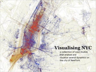

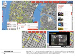


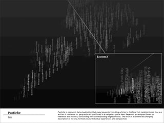


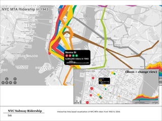


The document presents a collection of case studies analyzing and visualizing the dynamics of New York City through various data sources, including social media check-ins, geotags, and interactive maps. It explores themes such as community interactions (livehoods), urban cultural events, police activity, and transportation patterns, revealing insights into the city's complex social fabric. Projects like MyBlockNYC and Invisible Cities illustrate how personal experiences and real-time data can shape a deeper understanding of urban life.


