Downloaded 304 times


![© 2020 Minitab, LLC.
Continue learning with our free webinar series
INCLUDING:
• November 18
Streaming Analytics: Introducing the Next Generation of Statistical
Process Control
• December 2
Tips & Tricks for CART in Minitab Statistical Software
• December 9
Time-to-Market and Design for Reliability at the Speed of Light in
Signify [Case Study]
info.minitab.com/resources/webinars/webinar-Wednesdays >>
Minitab Training is available
worldwide! Learn more at
minitab.com/training >>
25](https://image.slidesharecdn.com/visualizationsthatmakeanimpact-seewhatsnewinminitabstatisticalsoftware-201109222402/75/Visualizations-that-make-an-impact-see-what-s-new-in-minitab-statistical-software-25-2048.jpg)

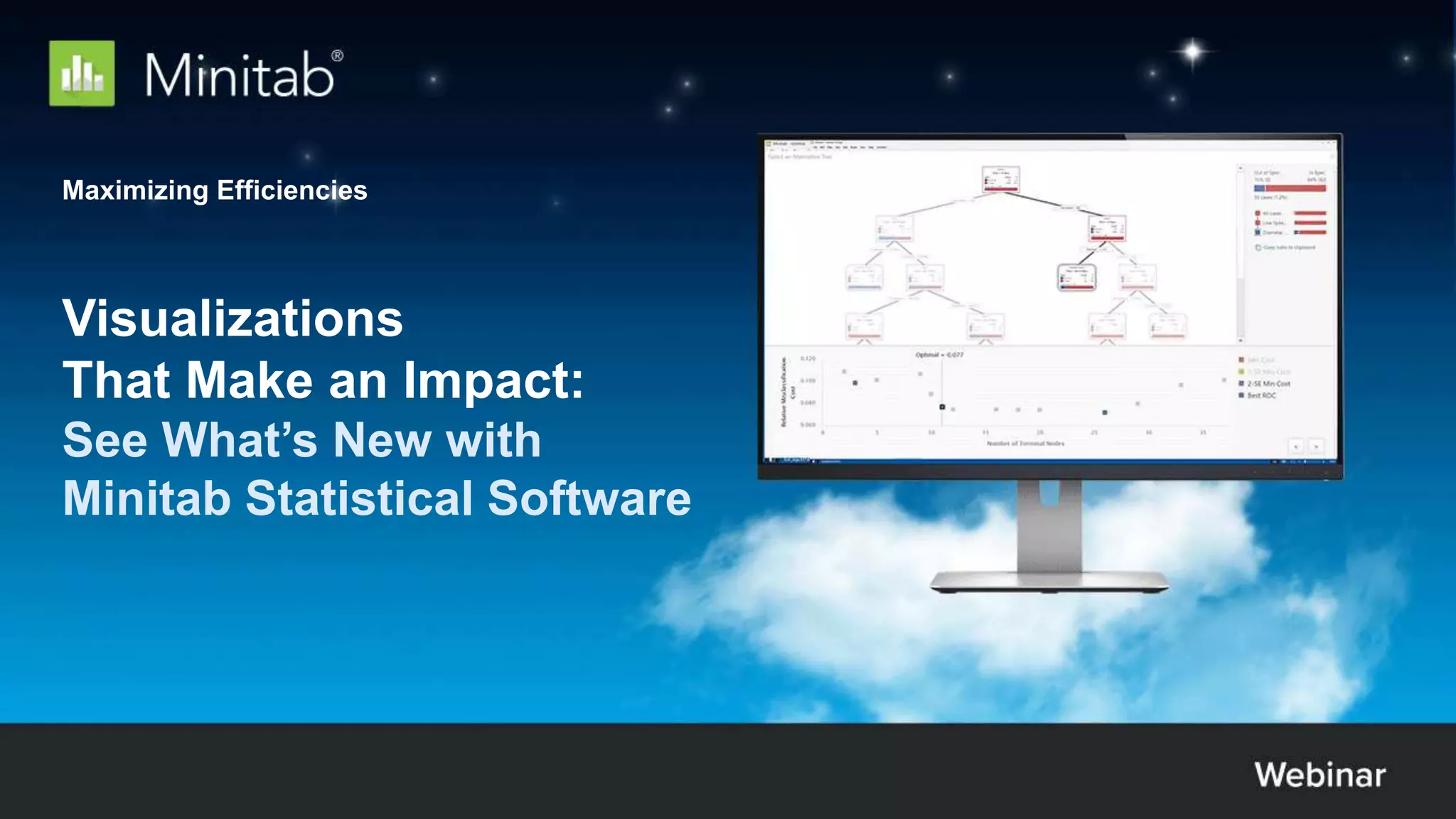
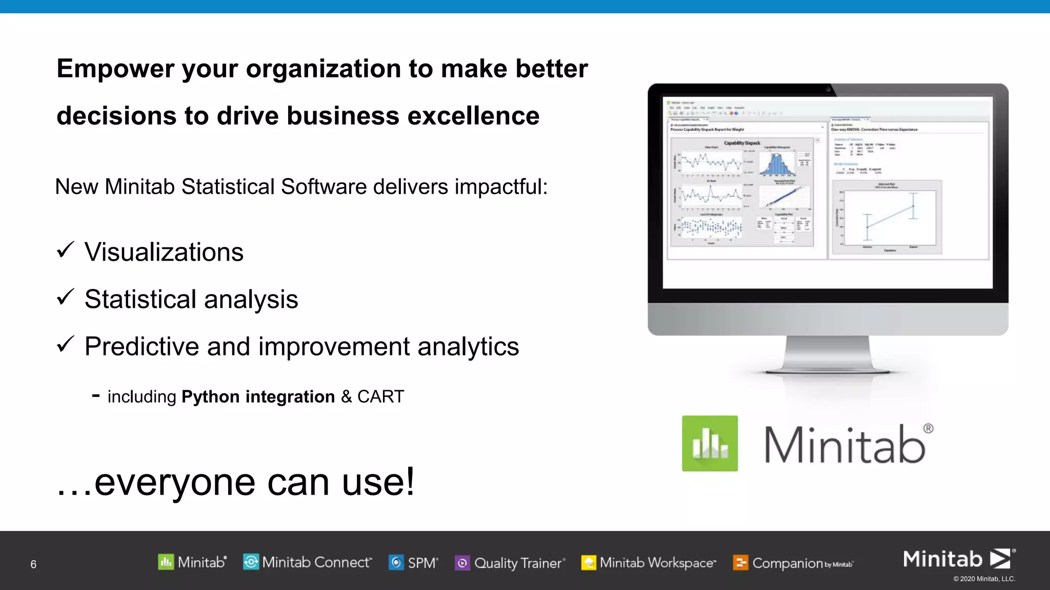
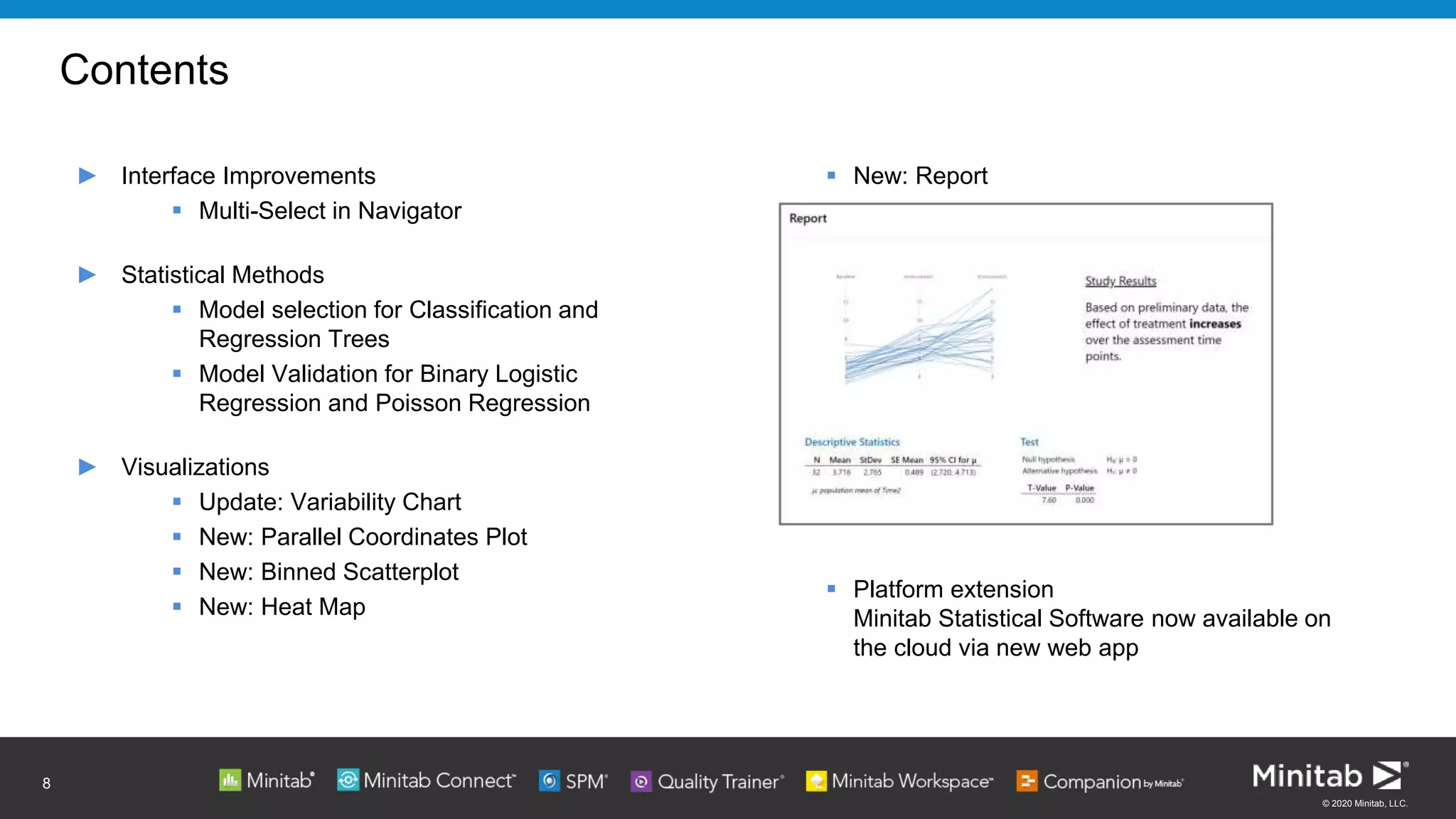
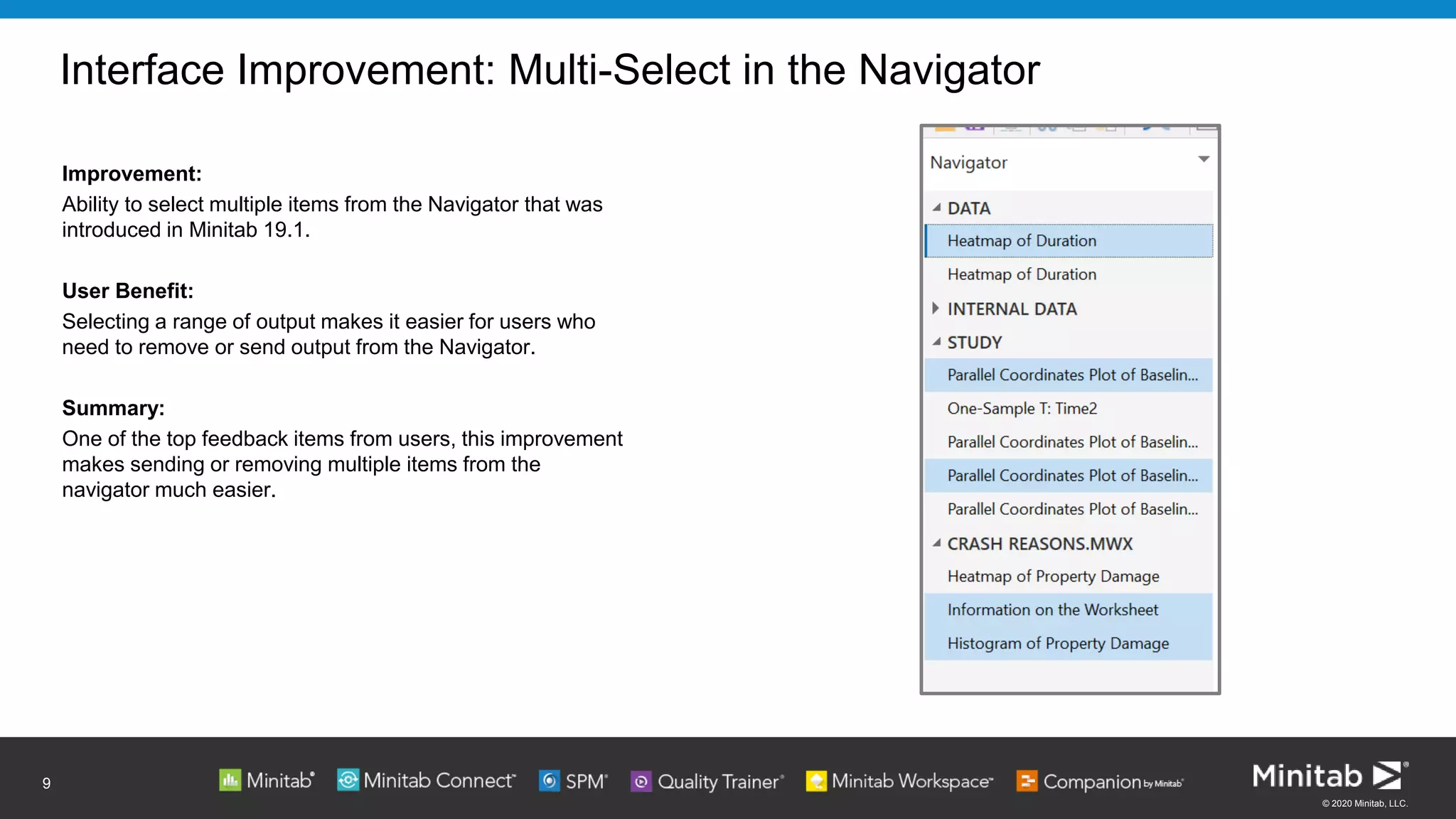
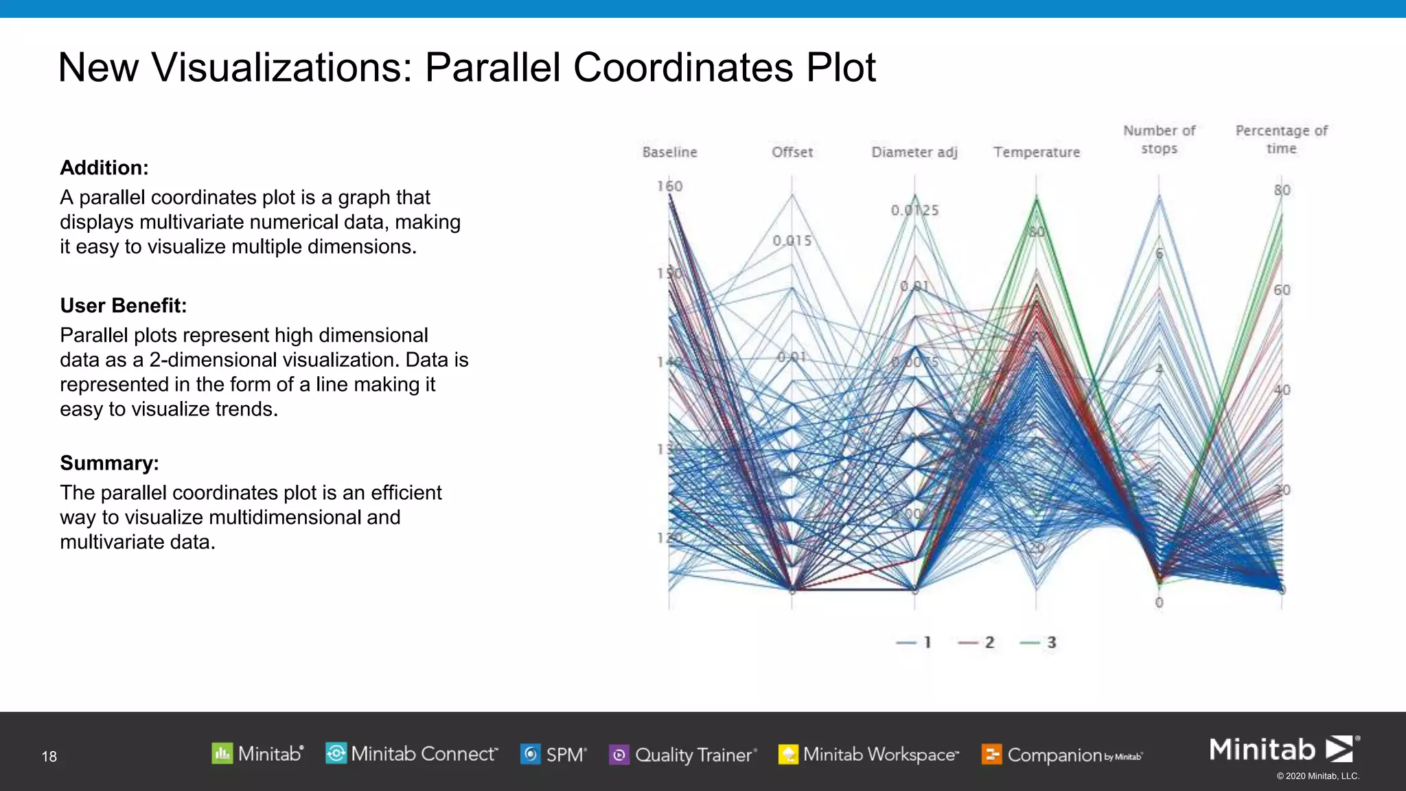
The document outlines new features and improvements in Minitab's statistical software, emphasizing enhanced data visualization tools like parallel coordinates plots, binned scatterplots, and heatmaps. It highlights updates in predictive analytics, including model validation for logistic and Poisson regression, along with an accessible cloud platform for broader usability. Minitab aims to empower organizations to make better data-driven decisions and streamline their analytical processes.