Report
Share
Download to read offline
Recommended
7th pre alg -oct24
This document contains a to-do list for a school assignment. It notes that a comic strip scale drawing project is due on Tuesday, October 30th. It also asks if there will be any timed tests and reminds the reader to work on their comic strip project.
#truHongKong
The document announces an unconventional recruiting conference called truHongKong to be held on November 30th, 2012 in Hong Kong. truHongKong will follow the format of previous unconferences held in various cities around the world since 2009. The unconferences have no formal presentations, powerpoint, name tags, or dress code - instead emphasizing open conversation and idea sharing. Attendees will include recruiters, HR professionals, talent acquisition specialists, social media and tech professionals from around the globe. Tracks at the event will be led by thought leaders in the industry to start discussions on various topics.
Prysmian CW75K Brass Cable Gland Kit 62.5-78.0mm
The document describes a brass gland kit for securing cables. The kit includes a brass gland, brass earth tag, brass locknut, and PVC shroud. It is intended for use with circular steel-armored plastic or rubber cables outdoors or indoors. The kit is rated for IP66 protection and has a service temperature range of -20°C to +90°C.
fabia 2015
Fabia Jambrina has over 10 years of experience in customer service and administrative roles. She has strong communication, organizational, and problem-solving skills developed through roles as an administrative assistant, transportation coordinator, travel coordinator, and various hospitality roles. She is bilingual in Spanish and English, skilled in Microsoft Office, and is always looking to improve her skills professionally.
Alt reader board
The document describes a rebellious girl who parties often and enjoys life to the fullest. She likely has piercings, smokes or takes drugs, and listens to rock bands like Lost Prophets, Muse, and You Me at Six. She dresses casually in jeans, hoodies, and customized clothing from brands like Vans, Dr. Martens, and shops at places like Topshop and vintage stores.
Alt reader board
The document describes a type of girl who is rebellious and enjoys living life to the fullest through partying, music, and unconventional fashion choices. She likely has piercings, smokes or takes drugs, and wears customized jeans and hoodies with spikes along with brands like Vans and Doc Martens. Her music tastes include Arctic Monkeys, Muse and You Me at Six.
Media image analysis 2
This document discusses image choices for different sections of a music magazine. For the front cover, the author chose an image of an artist performing that related to one of the cover stories and depicted typical music magazine concepts. For interior pages, images were chosen of the featured artists Lawson that portrayed them as humble, innocent, and vulnerable to appeal to the target audience. Images for opening spreads were also selected to represent the artists as dreamers and passionate about music in order to inspire readers. Throughout, the author aimed to use images that balanced genres and gender representation to be relatable.
Media evaluation
The document discusses the ways in which the media product conforms to and challenges conventions of music magazines. It conforms by using taglines, announcing tours and albums, and including a barcode. However, it challenges conventions by adding a gold color and Polaroid photos. Additional challenges include a non-traditional masthead color and size, and including a competition. The product develops conventions by using a high-angle shot on the cover page, atypical for music magazines. Overall, the document examines how the product both adheres to common magazine structures while also innovating in its design and content choices.
Magazine planning
The document summarizes the key design elements of a magazine front cover, contents page, and double page spread for an indie/rock music magazine. For the front cover, conventions like the masthead, date, issue number, and main cover image were used along with a red, black, white, and gold color scheme associated with indie/rock magazines. The contents page drew inspiration from NME magazine and used pictures and numbers creatively across the page to display content listings. For the double page spread, conventional elements like images, pull quotes, column writing, and bold text were implemented, and creative backgrounds like Polaroid and puzzle piece templates were incorporated.
Media preliminary task flat plans
The document describes the design and layout of a school newsletter created to follow conventions of the genre while appealing to a target audience of sixth form students. Key elements included a title, date, issue number, school logo and motto on the front cover. The contents page listed topics in a quirky, fun font with smiley faces and bubble numbers. A double page spread included related articles and images to engage the target audience. The creator aimed to balance conventions with unconventional, creative elements to appeal to sixth form readers.
Media evaluation
My media product challenges some conventions of music magazines while conforming to others. It challenges conventions through using a different colored and sized masthead on the contents page and boxing information about artists at the bottom left of pages. However, it conforms to conventions by including features like a band index, photos relating to cover stories, and issues of address and formality in artist profiles. The product aims to be creative while still relating to audiences through both conforming and challenging typical magazine conventions.
First draft front cover analysis
The document provides an analysis of the front cover design for a magazine media product. It summarizes how the cover design both conforms to and challenges conventions of real music magazines. It conforms by using colors and layout elements typical of indie/rock magazines like NME. However, it also challenges conventions by using a less crowded layout between the styles of two example NME covers. The cover is meant to represent and attract teenage audiences interested in music and culture through the image of a teenage girl and use of music-related language.
Magazine reader profile
A genuine reader of unzipped is described as someone who likely has tattoos and piercings, smokes or takes drugs, and parties often. They are rebellious and creative, either writing music or playing in a band. They believe in pursuing success and dreams through living life to the fullest and having fun. Their style includes jeans, hoodies, and customized clothing with spikes and studs. Favorite brands are Vans, Dr. Martens, creepers, Topshop, and vintage shops. Their music tastes include bands like Lost Prophets, Arctic Monkeys, Muse, and You Me at Six.
Magazine reader profile
The document describes a genuine reader of unzipped as someone who has tattoos and piercings, likely smokes and parties a lot, and either writes or plays music. They are described as rebellious and believing in living life to the fullest. It notes their clothing includes jeans, hoodies customized with spikes, and brands like Vans, Dr. Martens, creepers, Topshop, and vintage shops. Their music tastes include bands like Lostprophets, Muse, and You Me at Six.
Magazine reader profile
A genuine reader of unzipped is described as a rebellious girl who has piercings, parties often, plays music, and believes in living life to the fullest. She likely smokes and takes drugs. Her style includes jeans, hoodies, and clothing customized with spikes. She shops at brands like Vans, Dr. Martens, Topshop, and vintage shops. Her music tastes include Arctic Monkeys, Muse, and You Me at Six.
Preliminary task evaluation
This document contains the responses to pre-production questions about a media product. [1] The responses indicate that the media product uses conventions of real magazines like a masthead and cover lines, but challenges conventions with its color scheme and layout. [2] The product represents indie social groups through its cover image and masthead. [3] The target audience is identified as people interested in music, indie lifestyle, and freedom of expression. [4] The document reflects on how the product aims to attract this audience through its cover image, unconventional design, and focus on music tours.
Lilly allen double page spread analysis copy
The document summarizes a magazine double page spread about artist Lilly Allen. The large pull quote grabs readers' attention with its newspaper-like style in the magazine's typical colors of red, black, and white. The main image of Allen conveys her rebellious attitude through her pose and tattoos. The language used in the article is casual to relate to the young readership and capture Allen's personality. Color and fonts are consistently used to match the artist's style and maintain magazine conventions.
Nme double page spread florence and the machine analysis
This article is about Florence + the Machine and appeals primarily to American readers. The main image dominates the page and sexually objectifies Florence by showing her dressed in black and high heels. The composition is intelligently laid out to force readers to look at the article. A basic color palette of red and black is used to make Florence stand out from other artists and relate to the target NME audience. The language directly addresses Florence's single to establish a personal connection with readers. The font captures readers' eyes in a way conventional for music magazines.
Nme content page analysis
The document provides a general overview of an NME magazine contents page layout. It notes that the header conveys the magazine's logo to identify the publisher. The layout is conventional and sectioned to clearly separate different stories and images. The color palette of red, black, white, and yellow follows NME's house colors for consistency. The main feature uses bold colors and text to draw the reader's eye to the headline story.
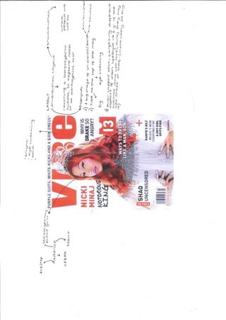
Nme the wombts front cover analysis
The document summarizes the layout and design elements of a music magazine cover featuring the band The Wombats. It analyzes the use of a bright yellow tag line to attract attention, a close-up image of the band members staring directly at the viewer to create a personal feel. It also notes the use of bold primary colors that make the text pop off the page and draw the eye, with the main cover line in a contrasting yellow color to stand out from the blue cover lines. The overall layout follows a conventional masthead, image, tagline and lines format expected of magazine covers.
Media analysis of prliminary task
The document analyzes and evaluates a student magazine titled "PMS Gossip Sheet". It discusses the title choice and use of the school's colors in the design. The main image on the cover is analyzed for how it represents key themes. Further evaluation comments that adding the school logo would help identify the magazine. An overview concludes that the magazine has a clear consistent layout but lacks creativity and individuality.
More Related Content
More from ChelseaHowsin1994
Alt reader board
The document describes a rebellious girl who parties often and enjoys life to the fullest. She likely has piercings, smokes or takes drugs, and listens to rock bands like Lost Prophets, Muse, and You Me at Six. She dresses casually in jeans, hoodies, and customized clothing from brands like Vans, Dr. Martens, and shops at places like Topshop and vintage stores.
Alt reader board
The document describes a type of girl who is rebellious and enjoys living life to the fullest through partying, music, and unconventional fashion choices. She likely has piercings, smokes or takes drugs, and wears customized jeans and hoodies with spikes along with brands like Vans and Doc Martens. Her music tastes include Arctic Monkeys, Muse and You Me at Six.
Media image analysis 2
This document discusses image choices for different sections of a music magazine. For the front cover, the author chose an image of an artist performing that related to one of the cover stories and depicted typical music magazine concepts. For interior pages, images were chosen of the featured artists Lawson that portrayed them as humble, innocent, and vulnerable to appeal to the target audience. Images for opening spreads were also selected to represent the artists as dreamers and passionate about music in order to inspire readers. Throughout, the author aimed to use images that balanced genres and gender representation to be relatable.
Media evaluation
The document discusses the ways in which the media product conforms to and challenges conventions of music magazines. It conforms by using taglines, announcing tours and albums, and including a barcode. However, it challenges conventions by adding a gold color and Polaroid photos. Additional challenges include a non-traditional masthead color and size, and including a competition. The product develops conventions by using a high-angle shot on the cover page, atypical for music magazines. Overall, the document examines how the product both adheres to common magazine structures while also innovating in its design and content choices.
Magazine planning
The document summarizes the key design elements of a magazine front cover, contents page, and double page spread for an indie/rock music magazine. For the front cover, conventions like the masthead, date, issue number, and main cover image were used along with a red, black, white, and gold color scheme associated with indie/rock magazines. The contents page drew inspiration from NME magazine and used pictures and numbers creatively across the page to display content listings. For the double page spread, conventional elements like images, pull quotes, column writing, and bold text were implemented, and creative backgrounds like Polaroid and puzzle piece templates were incorporated.
Media preliminary task flat plans
The document describes the design and layout of a school newsletter created to follow conventions of the genre while appealing to a target audience of sixth form students. Key elements included a title, date, issue number, school logo and motto on the front cover. The contents page listed topics in a quirky, fun font with smiley faces and bubble numbers. A double page spread included related articles and images to engage the target audience. The creator aimed to balance conventions with unconventional, creative elements to appeal to sixth form readers.
Media evaluation
My media product challenges some conventions of music magazines while conforming to others. It challenges conventions through using a different colored and sized masthead on the contents page and boxing information about artists at the bottom left of pages. However, it conforms to conventions by including features like a band index, photos relating to cover stories, and issues of address and formality in artist profiles. The product aims to be creative while still relating to audiences through both conforming and challenging typical magazine conventions.
First draft front cover analysis
The document provides an analysis of the front cover design for a magazine media product. It summarizes how the cover design both conforms to and challenges conventions of real music magazines. It conforms by using colors and layout elements typical of indie/rock magazines like NME. However, it also challenges conventions by using a less crowded layout between the styles of two example NME covers. The cover is meant to represent and attract teenage audiences interested in music and culture through the image of a teenage girl and use of music-related language.
Magazine reader profile
A genuine reader of unzipped is described as someone who likely has tattoos and piercings, smokes or takes drugs, and parties often. They are rebellious and creative, either writing music or playing in a band. They believe in pursuing success and dreams through living life to the fullest and having fun. Their style includes jeans, hoodies, and customized clothing with spikes and studs. Favorite brands are Vans, Dr. Martens, creepers, Topshop, and vintage shops. Their music tastes include bands like Lost Prophets, Arctic Monkeys, Muse, and You Me at Six.
Magazine reader profile
The document describes a genuine reader of unzipped as someone who has tattoos and piercings, likely smokes and parties a lot, and either writes or plays music. They are described as rebellious and believing in living life to the fullest. It notes their clothing includes jeans, hoodies customized with spikes, and brands like Vans, Dr. Martens, creepers, Topshop, and vintage shops. Their music tastes include bands like Lostprophets, Muse, and You Me at Six.
Magazine reader profile
A genuine reader of unzipped is described as a rebellious girl who has piercings, parties often, plays music, and believes in living life to the fullest. She likely smokes and takes drugs. Her style includes jeans, hoodies, and clothing customized with spikes. She shops at brands like Vans, Dr. Martens, Topshop, and vintage shops. Her music tastes include Arctic Monkeys, Muse, and You Me at Six.
Preliminary task evaluation
This document contains the responses to pre-production questions about a media product. [1] The responses indicate that the media product uses conventions of real magazines like a masthead and cover lines, but challenges conventions with its color scheme and layout. [2] The product represents indie social groups through its cover image and masthead. [3] The target audience is identified as people interested in music, indie lifestyle, and freedom of expression. [4] The document reflects on how the product aims to attract this audience through its cover image, unconventional design, and focus on music tours.
Lilly allen double page spread analysis copy
The document summarizes a magazine double page spread about artist Lilly Allen. The large pull quote grabs readers' attention with its newspaper-like style in the magazine's typical colors of red, black, and white. The main image of Allen conveys her rebellious attitude through her pose and tattoos. The language used in the article is casual to relate to the young readership and capture Allen's personality. Color and fonts are consistently used to match the artist's style and maintain magazine conventions.
Nme double page spread florence and the machine analysis
This article is about Florence + the Machine and appeals primarily to American readers. The main image dominates the page and sexually objectifies Florence by showing her dressed in black and high heels. The composition is intelligently laid out to force readers to look at the article. A basic color palette of red and black is used to make Florence stand out from other artists and relate to the target NME audience. The language directly addresses Florence's single to establish a personal connection with readers. The font captures readers' eyes in a way conventional for music magazines.
Nme content page analysis
The document provides a general overview of an NME magazine contents page layout. It notes that the header conveys the magazine's logo to identify the publisher. The layout is conventional and sectioned to clearly separate different stories and images. The color palette of red, black, white, and yellow follows NME's house colors for consistency. The main feature uses bold colors and text to draw the reader's eye to the headline story.
Nme the wombts front cover analysis
The document summarizes the layout and design elements of a music magazine cover featuring the band The Wombats. It analyzes the use of a bright yellow tag line to attract attention, a close-up image of the band members staring directly at the viewer to create a personal feel. It also notes the use of bold primary colors that make the text pop off the page and draw the eye, with the main cover line in a contrasting yellow color to stand out from the blue cover lines. The overall layout follows a conventional masthead, image, tagline and lines format expected of magazine covers.
Media analysis of prliminary task
The document analyzes and evaluates a student magazine titled "PMS Gossip Sheet". It discusses the title choice and use of the school's colors in the design. The main image on the cover is analyzed for how it represents key themes. Further evaluation comments that adding the school logo would help identify the magazine. An overview concludes that the magazine has a clear consistent layout but lacks creativity and individuality.
More from ChelseaHowsin1994 (20)
Nme double page spread florence and the machine analysis
Nme double page spread florence and the machine analysis