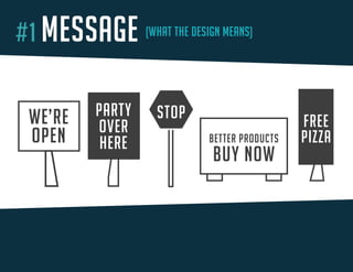
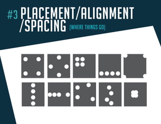
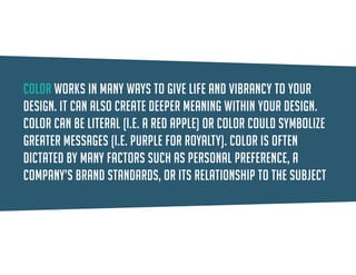
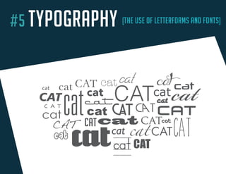
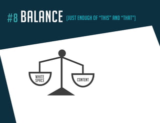
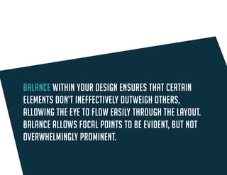
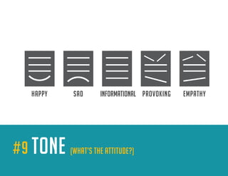
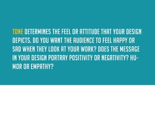
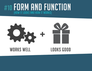
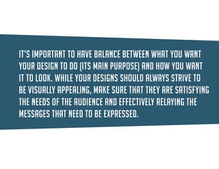
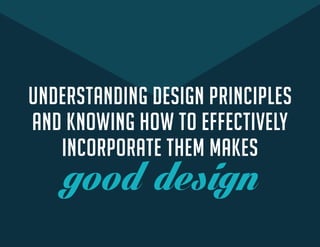
THINGS 
THAT MAKE 
YOUR DESIGN Good
WHAT MAKES DESIGN GOOD?
WHAT MAKES DESIGN GOOD? 
flashy images?
WHAT MAKES DESIGN GOOD? 
flashy images? 
(possibly)
WHAT MAKES DESIGN GOOD? 
cool fonts?
WHAT MAKES DESIGN GOOD? 
cool fonts? 
(well, sometimes)
WHAT MAKES DESIGN GOOD? 
drop shadows and bevels?
WHAT MAKES DESIGN GOOD? 
drop shadows and bevels? 
(ummm...)
BUT REALLY, WHAT MAKES DESIGN GOOD?
principles
principles 
(wait, what?)
design principles 
yes 
THERE’S A METHOD TO THE MADNESS, A RECIPE FOR SUCCESS…
ready?
YOU 
ready?
YOU DESIGN PRINCIPLES 
( meat & potatoes ) 
ready?
YOU DESIGN PRINCIPLES 
( meat & potatoes ) GOOD DESIGN 
ready?
THAT’S THE RECIPE 
YOU DESIGN PRINCIPLES 
( meat & potatoes ) GOOD DESIGN 
ready?
DOES THIS RECIPE APPLY TO BOTH 
PRINT AND WEB DESIGN?
yes 
DOES THIS RECIPE APPLY TO BOTH 
PRINT AND WEB DESIGN?
principles 
ARE THE KEY INGREDIENTS 
HERE ARE
#1 MESSAGE (WHAT THE DESIGN MEANS) 
M 
ESSAGESTOPFREEPIZZAPARTYOVERHEREBETTER PRODUCTSBUY NOWWE’REOPEN
The message is what drives the direction of the design and dictates what the design is communicating and to whom. In essence, the message tells a story that can be communicated with words, images or both.
#2 HIERARCHY (DETERMINING WHAT’S MOST IMPORTANT) 
HIERAR 
CHYGRAND OPENING1234 NEW AVE. DEC 1, 2014 | NOON-4PMMEET OUR FRIENDLY STAFF! MOST IMPORTANTIMPORTANTIMPORTANTLESS IMPORTANT
Hierarchy places priority on the elements of your layout, whether they are text, images or graphics. what’s the most important part of that message? second, third, and so on? You can show hierarchy in various ways, such as placement, size and color.
#3 PLACEMENT/ALIGNMENT 
/SPACING (WHERE THINGS GO) 
PLACEMENT / SP 
ACING / ALIGNMENT
Placement focuses on the positioning of elements and making best use of the space available. 
Spacing deals with the proximity — how close or far away — the design elements are from each other. 
Alignment describes how elements line up with each other and how they line up with the overall space.
#4 COLOR (YOU KNOW WHAT THIS IS) 
CO 
LOR
Color can be literal (i.e. a red apple) or color could symbolize greater messages (i.e. purple for royalty). Color is often dictated by many factors such as personal preference, a company’s brand standards, or its relationship to the subject matter.
#5 TYPOGRAPHY (THE USE OF LETTERFORMS AND FONTS) 
TY 
POGRAPHYcatcatcatcatcatcatcatcatcatcatcatcatcatcatcatcatcatcatcatcatcatatcatcatcatcatcatCATCATCATCATCATCATCAT
Typography describes the use of typefaces/fonts and letterforms to display content or to be used as artistic elements. The way that you organize 
words/text onto the page can influence how well your audience will understand your message. 
Consider font type, as well as the size, weight (thickness), color, and placement of the type.
#6 IMAGERY (YOU KNOW WHAT THIS IS TOO) 
PHOTOGRAPH 
GRAPHICICONIMAGERY
IMAGERY comes in various forms, including photographs, graphics, icons, illustrations and charts/graphs. Use imagery in a way that connects to the overall message that you must communicate.
#7 CONTRAST (OPPOSITES ATTRACT) 
SIZE 
COLORSHAPECONTRAST
Contrast is the existence of opposing elements. This can include contrast of color, size, shape, space and more. Contrast allows for emphasis in your design.
#8 BALANCE (JUST ENOUGH OF “THIS” AND “THAT”) 
WHITE 
SPACECONTENTBALANCE
Balance within your design ensures that certain elements don’t ineffectively outweigh others, allowing the eye to flow easily through the layout. Balance allows focal points to be evident, but not overwhelmingly prominent.
#9 TONE (WHAT’S THE ATTITUDE?) 
HAPP 
YSADINFORMATIONALPROVOKINGEMPATHYTONE
TONE determines the feel or attitude that your design depicts. How do you want the audience to feel when they look at your work? What emotion does the message portray and how does the design relfect that emotion?
#10 FORM AND FUNCTION 
(HOW IT LOOKS AND HOW IT WORKS) 
W 
ORKS WELLLOOKS GOODFORM AND FUNCTION
It’s important to have balance between what you want your design to do (function) and how you want it to look (form). While your designs should always strive to be visually appealing, make sure that they are satisfying the needs of the audience and effectively relaying the messages that need to be expressed.
UNDERSTANDING DESIGN PRINCIPLES 
AND KNOWING HOW TO EFFECTIVELY 
INCORPORATE THEM MAKES 
good design
LEARN THEM
PRACTICE THEM
ALWAYS KEEP THEM IN MIND
AND YOUR DESIGNS WILL GO far!
NOW GO CREATE 
Awesome Design!
Visit: 
MAKEAWESOMEDESIGN.COM 
and don’t forget to share this! 
- to learn more 
- to get the book 
@cre8tiveventing /MakeAwesomeDesign

10 Things That Make Your Design Good

  • 1.
    THINGS THAT MAKE YOUR DESIGN Good
  • 2.
  • 3.
    WHAT MAKES DESIGNGOOD? flashy images?
  • 4.
    WHAT MAKES DESIGNGOOD? flashy images? (possibly)
  • 5.
    WHAT MAKES DESIGNGOOD? cool fonts?
  • 6.
    WHAT MAKES DESIGNGOOD? cool fonts? (well, sometimes)
  • 7.
    WHAT MAKES DESIGNGOOD? drop shadows and bevels?
  • 8.
    WHAT MAKES DESIGNGOOD? drop shadows and bevels? (ummm...)
  • 9.
    BUT REALLY, WHATMAKES DESIGN GOOD?
  • 10.
  • 11.
  • 12.
    design principles yes THERE’S A METHOD TO THE MADNESS, A RECIPE FOR SUCCESS…
  • 13.
  • 14.
  • 15.
    YOU DESIGN PRINCIPLES ( meat & potatoes ) ready?
  • 16.
    YOU DESIGN PRINCIPLES ( meat & potatoes ) GOOD DESIGN ready?
  • 17.
    THAT’S THE RECIPE YOU DESIGN PRINCIPLES ( meat & potatoes ) GOOD DESIGN ready?
  • 18.
    DOES THIS RECIPEAPPLY TO BOTH PRINT AND WEB DESIGN?
  • 19.
    yes DOES THISRECIPE APPLY TO BOTH PRINT AND WEB DESIGN?
  • 20.
    principles ARE THEKEY INGREDIENTS HERE ARE
  • 21.
    #1 MESSAGE (WHATTHE DESIGN MEANS) M ESSAGESTOPFREEPIZZAPARTYOVERHEREBETTER PRODUCTSBUY NOWWE’REOPEN
  • 22.
    The message iswhat drives the direction of the design and dictates what the design is communicating and to whom. In essence, the message tells a story that can be communicated with words, images or both.
  • 23.
    #2 HIERARCHY (DETERMININGWHAT’S MOST IMPORTANT) HIERAR CHYGRAND OPENING1234 NEW AVE. DEC 1, 2014 | NOON-4PMMEET OUR FRIENDLY STAFF! MOST IMPORTANTIMPORTANTIMPORTANTLESS IMPORTANT
  • 24.
    Hierarchy places priorityon the elements of your layout, whether they are text, images or graphics. what’s the most important part of that message? second, third, and so on? You can show hierarchy in various ways, such as placement, size and color.
  • 25.
    #3 PLACEMENT/ALIGNMENT /SPACING(WHERE THINGS GO) PLACEMENT / SP ACING / ALIGNMENT
  • 26.
    Placement focuses onthe positioning of elements and making best use of the space available. Spacing deals with the proximity — how close or far away — the design elements are from each other. Alignment describes how elements line up with each other and how they line up with the overall space.
  • 27.
    #4 COLOR (YOUKNOW WHAT THIS IS) CO LOR
  • 28.
    Color can beliteral (i.e. a red apple) or color could symbolize greater messages (i.e. purple for royalty). Color is often dictated by many factors such as personal preference, a company’s brand standards, or its relationship to the subject matter.
  • 29.
    #5 TYPOGRAPHY (THEUSE OF LETTERFORMS AND FONTS) TY POGRAPHYcatcatcatcatcatcatcatcatcatcatcatcatcatcatcatcatcatcatcatcatcatatcatcatcatcatcatCATCATCATCATCATCATCAT
  • 30.
    Typography describes theuse of typefaces/fonts and letterforms to display content or to be used as artistic elements. The way that you organize words/text onto the page can influence how well your audience will understand your message. Consider font type, as well as the size, weight (thickness), color, and placement of the type.
  • 31.
    #6 IMAGERY (YOUKNOW WHAT THIS IS TOO) PHOTOGRAPH GRAPHICICONIMAGERY
  • 32.
    IMAGERY comes invarious forms, including photographs, graphics, icons, illustrations and charts/graphs. Use imagery in a way that connects to the overall message that you must communicate.
  • 33.
    #7 CONTRAST (OPPOSITESATTRACT) SIZE COLORSHAPECONTRAST
  • 34.
    Contrast is theexistence of opposing elements. This can include contrast of color, size, shape, space and more. Contrast allows for emphasis in your design.
  • 35.
    #8 BALANCE (JUSTENOUGH OF “THIS” AND “THAT”) WHITE SPACECONTENTBALANCE
  • 36.
    Balance within yourdesign ensures that certain elements don’t ineffectively outweigh others, allowing the eye to flow easily through the layout. Balance allows focal points to be evident, but not overwhelmingly prominent.
  • 37.
    #9 TONE (WHAT’STHE ATTITUDE?) HAPP YSADINFORMATIONALPROVOKINGEMPATHYTONE
  • 38.
    TONE determines thefeel or attitude that your design depicts. How do you want the audience to feel when they look at your work? What emotion does the message portray and how does the design relfect that emotion?
  • 39.
    #10 FORM ANDFUNCTION (HOW IT LOOKS AND HOW IT WORKS) W ORKS WELLLOOKS GOODFORM AND FUNCTION
  • 40.
    It’s important tohave balance between what you want your design to do (function) and how you want it to look (form). While your designs should always strive to be visually appealing, make sure that they are satisfying the needs of the audience and effectively relaying the messages that need to be expressed.
  • 41.
    UNDERSTANDING DESIGN PRINCIPLES AND KNOWING HOW TO EFFECTIVELY INCORPORATE THEM MAKES good design
  • 42.
  • 43.
  • 44.
  • 45.
    AND YOUR DESIGNSWILL GO far!
  • 46.
    NOW GO CREATE Awesome Design!
  • 47.
    Visit: MAKEAWESOMEDESIGN.COM anddon’t forget to share this! - to learn more - to get the book @cre8tiveventing /MakeAwesomeDesign