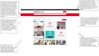
The ‘UCAS’ logo is centred at top
right hand corner, it is in red and
black which are dominant colours,
this shows that it is a informative
and important website. Next to the
logo gives a brief description of
what the website is giving the
audience more information about
what they are going to find out.
Short sentences to keep it neat and
precise
The website is in black, red and
white which shows it has a theme.
Having simple colours shows it gets
to the point and is serious. Using
these colours also makes the message
the audience are trying to portray
clearer.
There is a black menu bar at the
top of the page which gives you
hyperlinks to relevant links. A
red search bar is bright and
attracts the audience. The menu
bar is situated at the top where it
is on most websites so navigation
is easy for the audience.
The website I chose is an
informative website similar to what
I want to create. This website is
informing the audience about
higher education opportunities.
When it comes to typography the text
is the same size when you first click
on the website. Having a different
font would make the website look
messy as it is made to inform the
audience
On the home page there is two
adverts which are advertising about
university which is what the website
is mainly about. The advert is
advertising an open day
recommending students to attend
All images are centred in the
middle of the page this makes
the website clearer to see. The
website is laid out like a grid
making navigation easy for the
audience to press on the part they
would like to see.
Colourful images with a caption
making the informative website
more attractive for the audience.
Having a caption under each
image makes the audience know
what to press on depending on
the information they need to find
out.
Neat structure to show how
professional the organization.
Website is in the style of a blog,
having boxes to divide each
topic. The use of this conveys to
the target audience which are
young people aged 16-19.
This website is mainly aimed at
people who are leaving college or
sixth form looking to go into a
higher education. The primary
audience is people aged 17-19
students. The secondary audience is
parents and tutors. This website is
aimed at a mass audience. The
UCAS website is for UK students
looking for higher education within
the country and the secondary
audience is international students
looking to study in the UK.
I think this is the audience as it has
information about writing a personal
statement and replying to offers which is
for university.
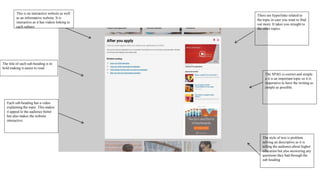
This is an interactive website as well
as an informative website. It is
interactive as it has videos linking to
each subject
The title of each sub-heading is in
bold making it easier to read.
Each sub-heading has a video
explaining the topic. This makes
it appeal to the audience better
but also makes the website
interactive.
There are hyperlinks related to
the topic in case you want to find
out more. It takes you straight to
the other topics.
The style of text is problem
solving an descriptive as it is
telling the audience about higher
education but also answering any
questions they had through the
sub heading
The SPAG is correct and simple
a it is an important topic so it is
imperative to have the writing as
simple as possible.
The website is owned by UCAS. It is a
large company as it helps students who
finish post 18 education find higher
education or an apprenticeship
They have a global reach as
students across the world are able
to use it. The website is funded by
the Government
At the bottom of the website
there is articles the audience are
able to look at which link to the
topic of further education.
Social media links in the footer
making it clear the audience are
16-19 year olds as they are the
age group that mainly use social
media. This is also showing they
are using social media to market
the product.
There are also hyperlinks which
take you to different parts of the
page such as events and the
website terms explained.
You are also able to give feedback
on how you found the website. This
is useful as feedback is always
needed to improve a webpage

UCAS case study

  • 1.
    The ‘UCAS’ logois centred at top right hand corner, it is in red and black which are dominant colours, this shows that it is a informative and important website. Next to the logo gives a brief description of what the website is giving the audience more information about what they are going to find out. Short sentences to keep it neat and precise The website is in black, red and white which shows it has a theme. Having simple colours shows it gets to the point and is serious. Using these colours also makes the message the audience are trying to portray clearer. There is a black menu bar at the top of the page which gives you hyperlinks to relevant links. A red search bar is bright and attracts the audience. The menu bar is situated at the top where it is on most websites so navigation is easy for the audience. The website I chose is an informative website similar to what I want to create. This website is informing the audience about higher education opportunities. When it comes to typography the text is the same size when you first click on the website. Having a different font would make the website look messy as it is made to inform the audience On the home page there is two adverts which are advertising about university which is what the website is mainly about. The advert is advertising an open day recommending students to attend
  • 2.
    All images arecentred in the middle of the page this makes the website clearer to see. The website is laid out like a grid making navigation easy for the audience to press on the part they would like to see. Colourful images with a caption making the informative website more attractive for the audience. Having a caption under each image makes the audience know what to press on depending on the information they need to find out. Neat structure to show how professional the organization. Website is in the style of a blog, having boxes to divide each topic. The use of this conveys to the target audience which are young people aged 16-19. This website is mainly aimed at people who are leaving college or sixth form looking to go into a higher education. The primary audience is people aged 17-19 students. The secondary audience is parents and tutors. This website is aimed at a mass audience. The UCAS website is for UK students looking for higher education within the country and the secondary audience is international students looking to study in the UK. I think this is the audience as it has information about writing a personal statement and replying to offers which is for university.
  • 3.
    This is aninteractive website as well as an informative website. It is interactive as it has videos linking to each subject The title of each sub-heading is in bold making it easier to read. Each sub-heading has a video explaining the topic. This makes it appeal to the audience better but also makes the website interactive. There are hyperlinks related to the topic in case you want to find out more. It takes you straight to the other topics. The style of text is problem solving an descriptive as it is telling the audience about higher education but also answering any questions they had through the sub heading The SPAG is correct and simple a it is an important topic so it is imperative to have the writing as simple as possible.
  • 4.
    The website isowned by UCAS. It is a large company as it helps students who finish post 18 education find higher education or an apprenticeship They have a global reach as students across the world are able to use it. The website is funded by the Government At the bottom of the website there is articles the audience are able to look at which link to the topic of further education. Social media links in the footer making it clear the audience are 16-19 year olds as they are the age group that mainly use social media. This is also showing they are using social media to market the product. There are also hyperlinks which take you to different parts of the page such as events and the website terms explained. You are also able to give feedback on how you found the website. This is useful as feedback is always needed to improve a webpage