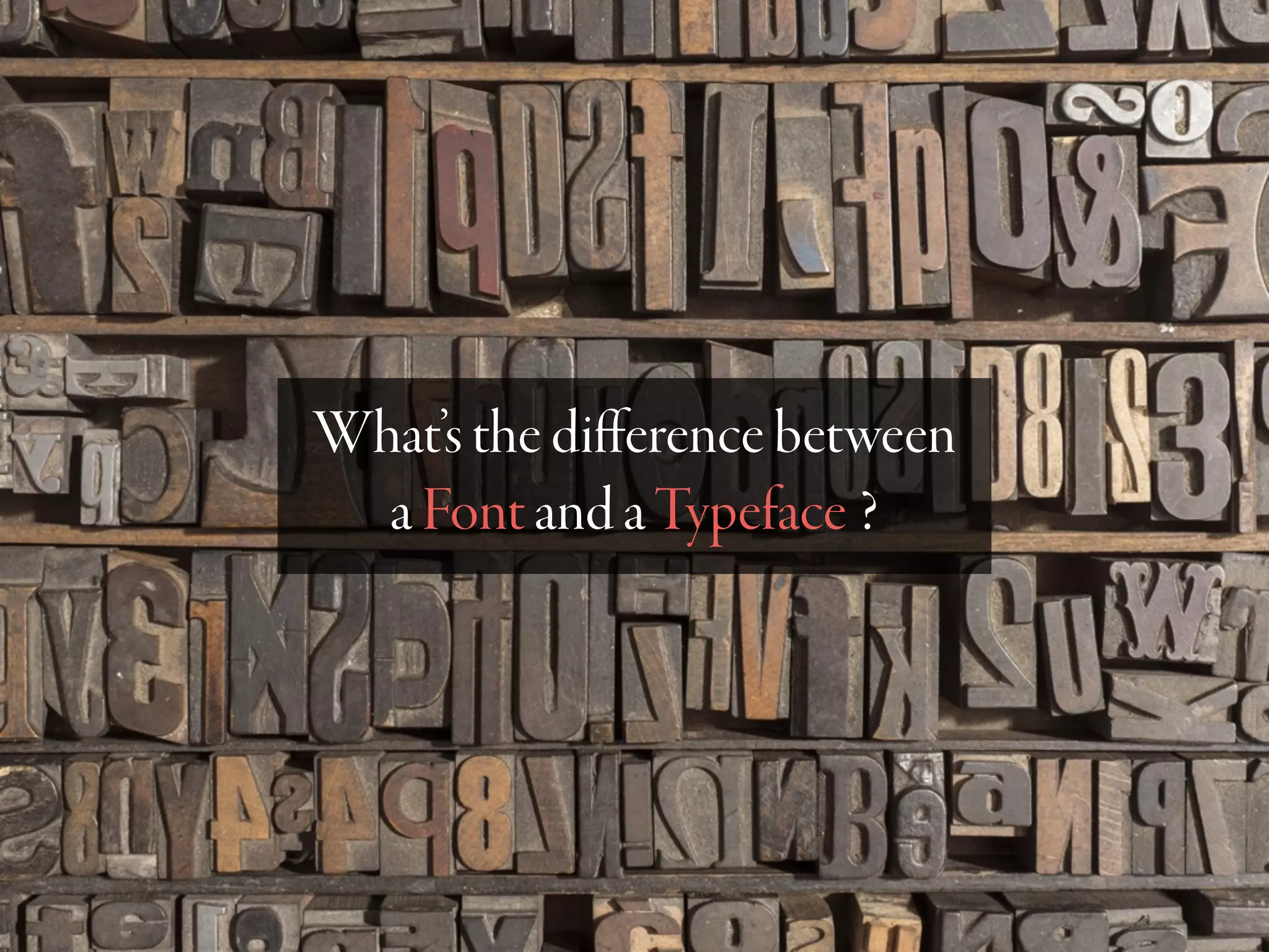
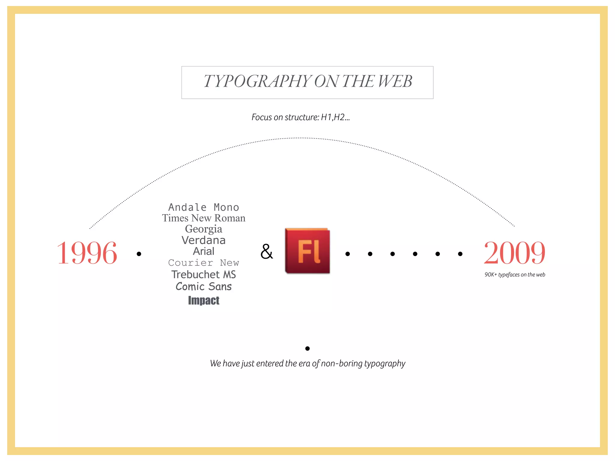
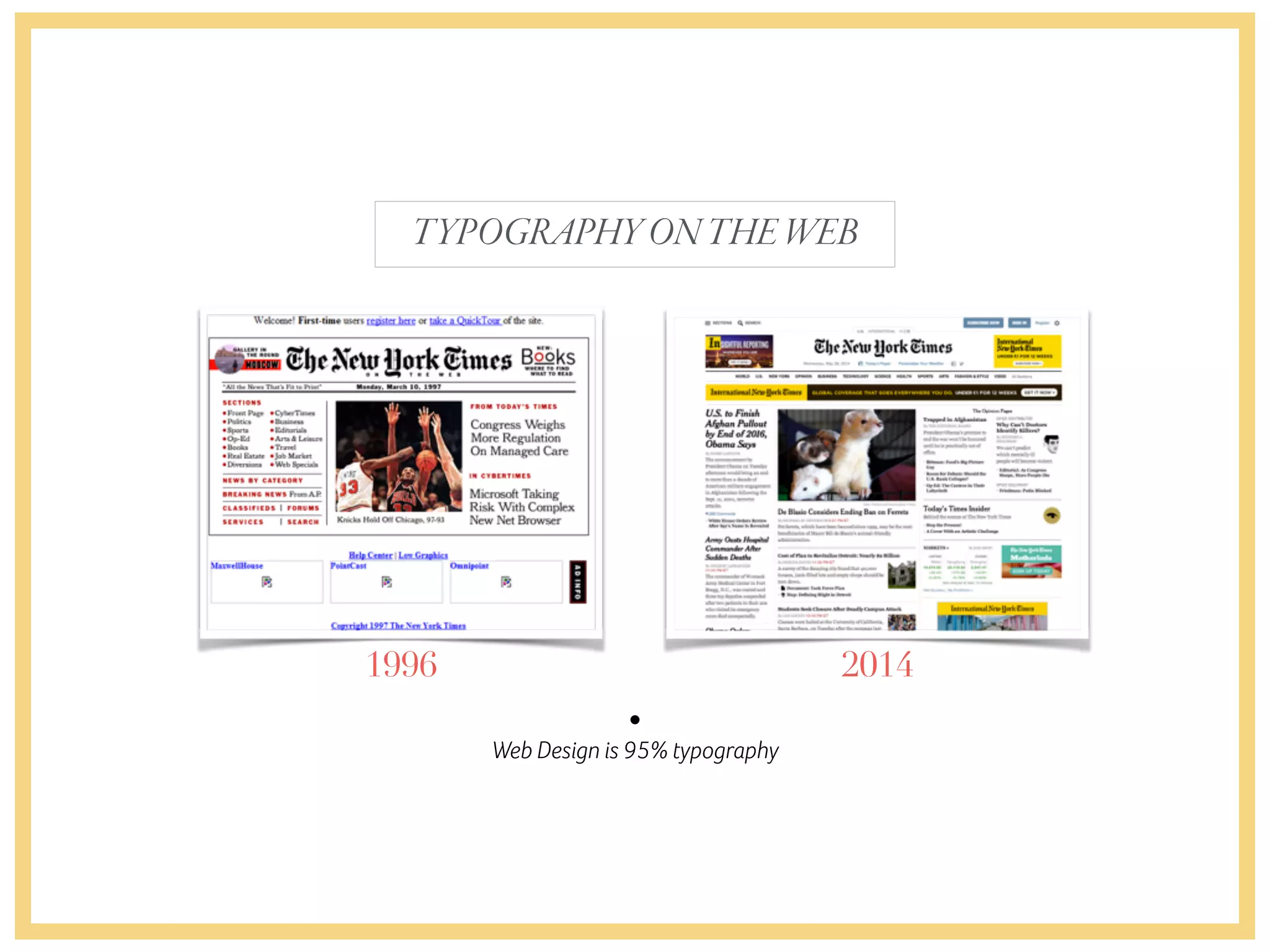
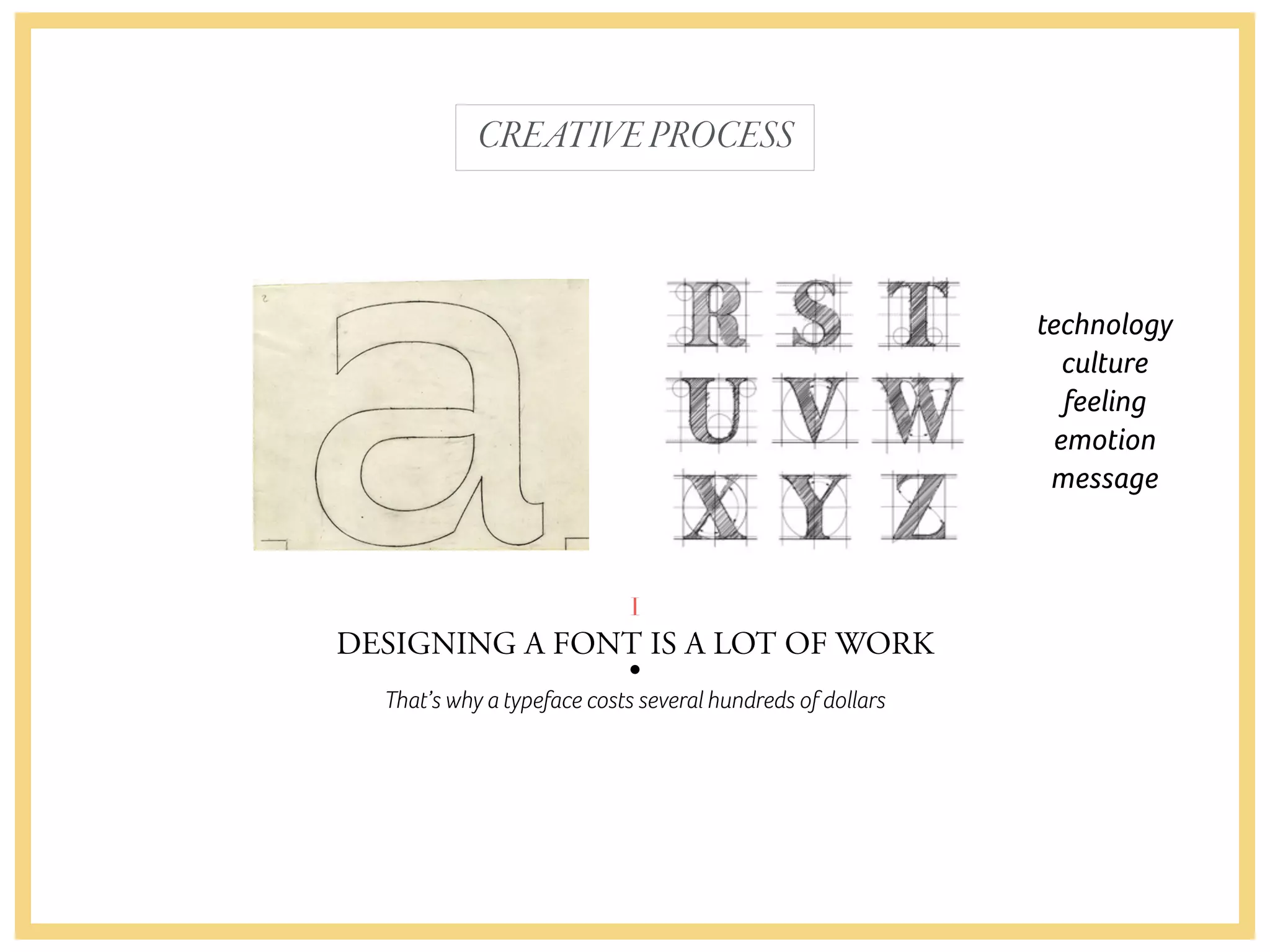
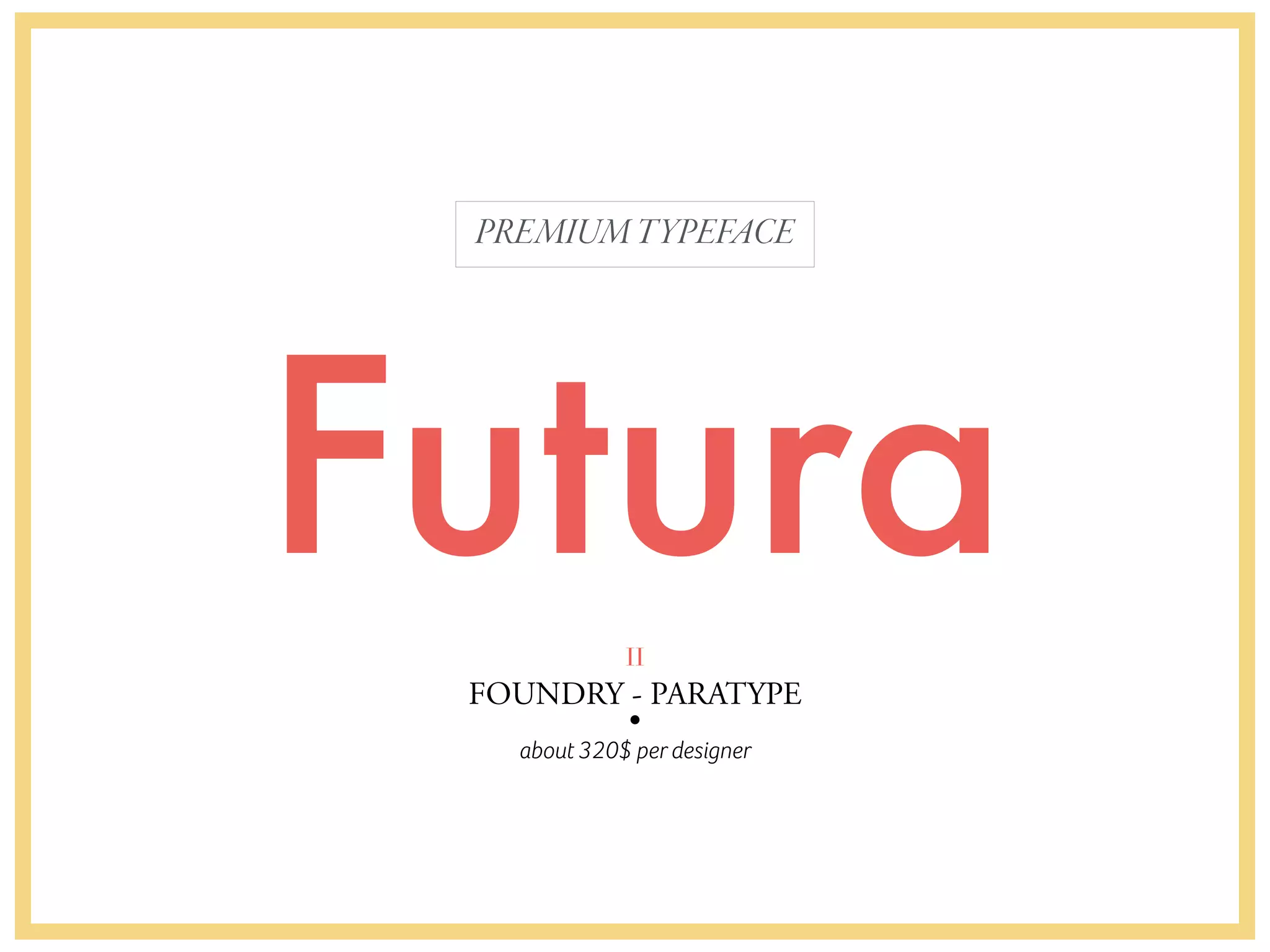
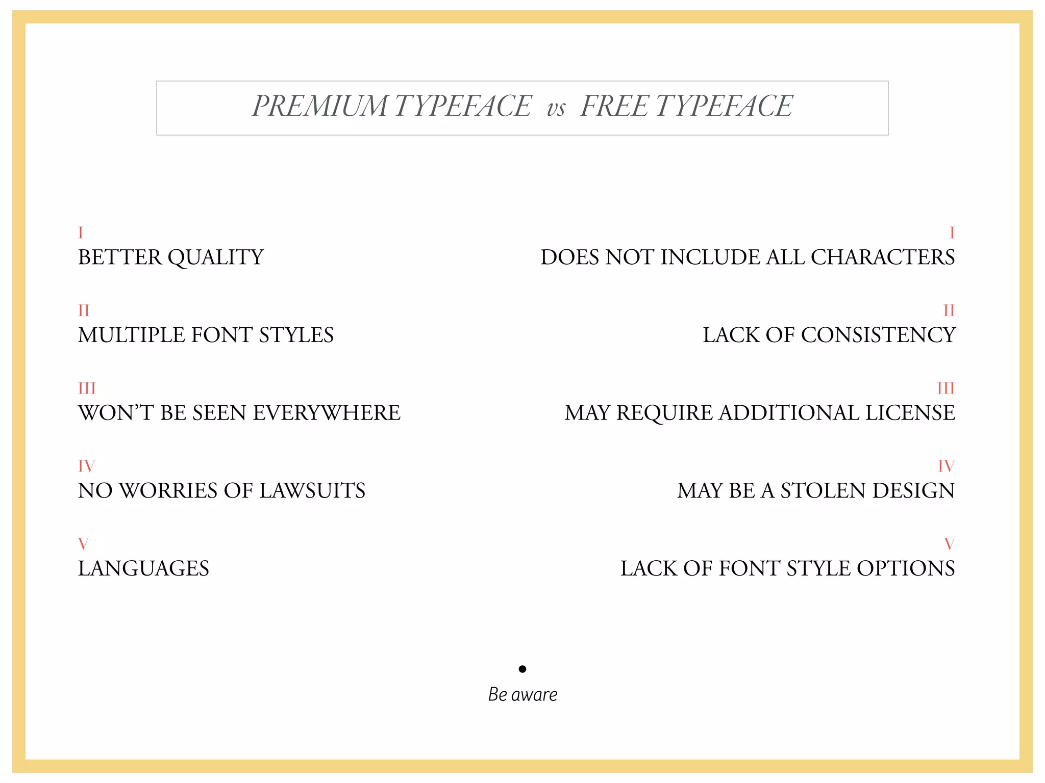
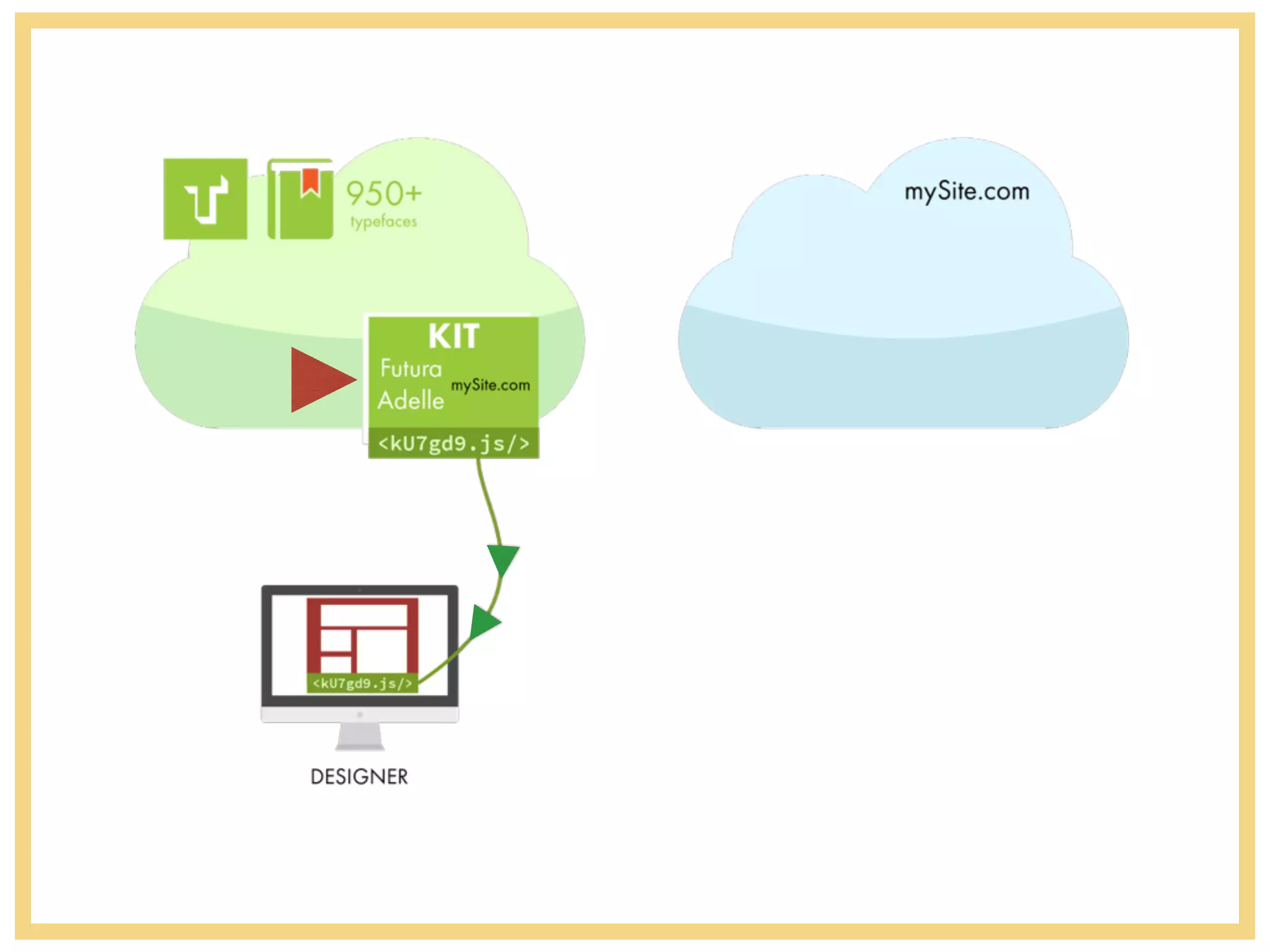
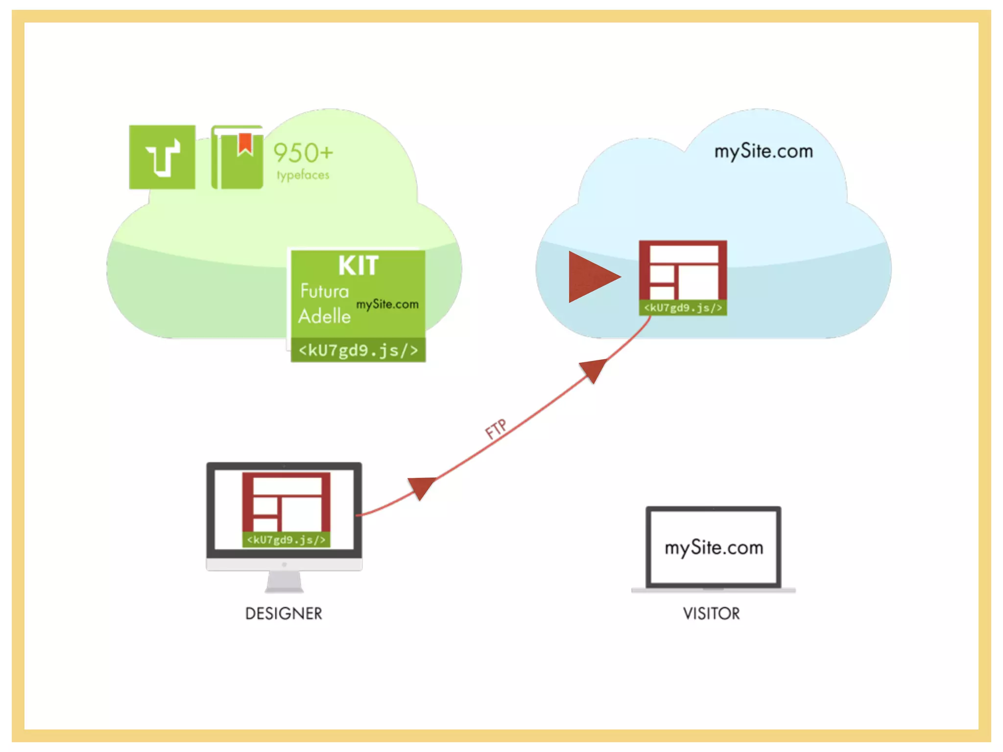
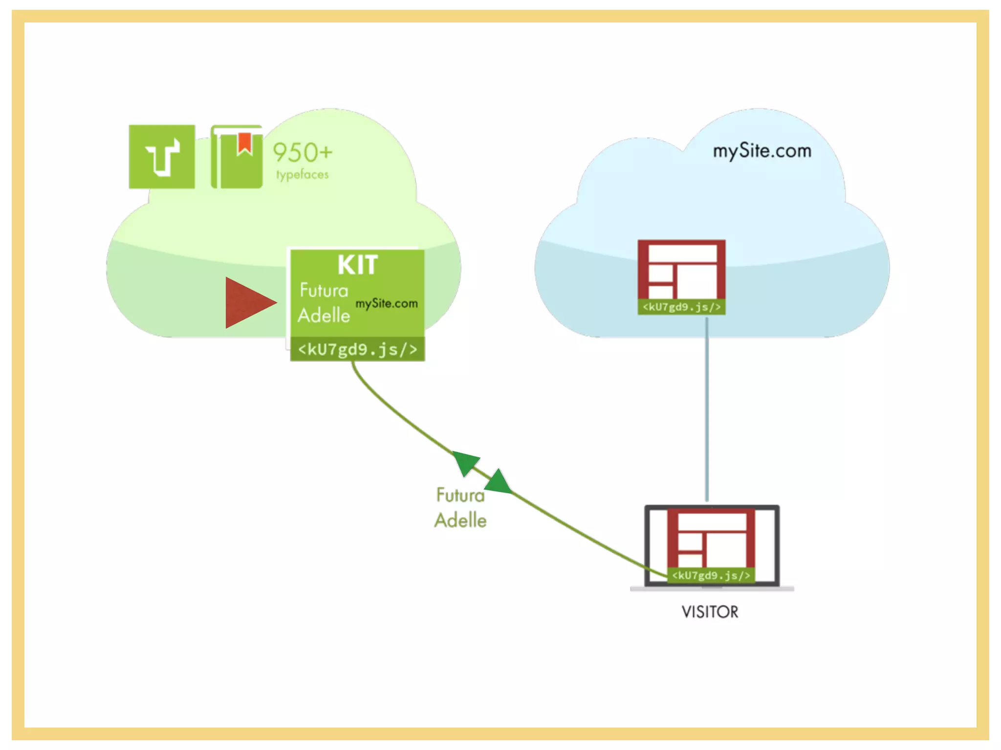
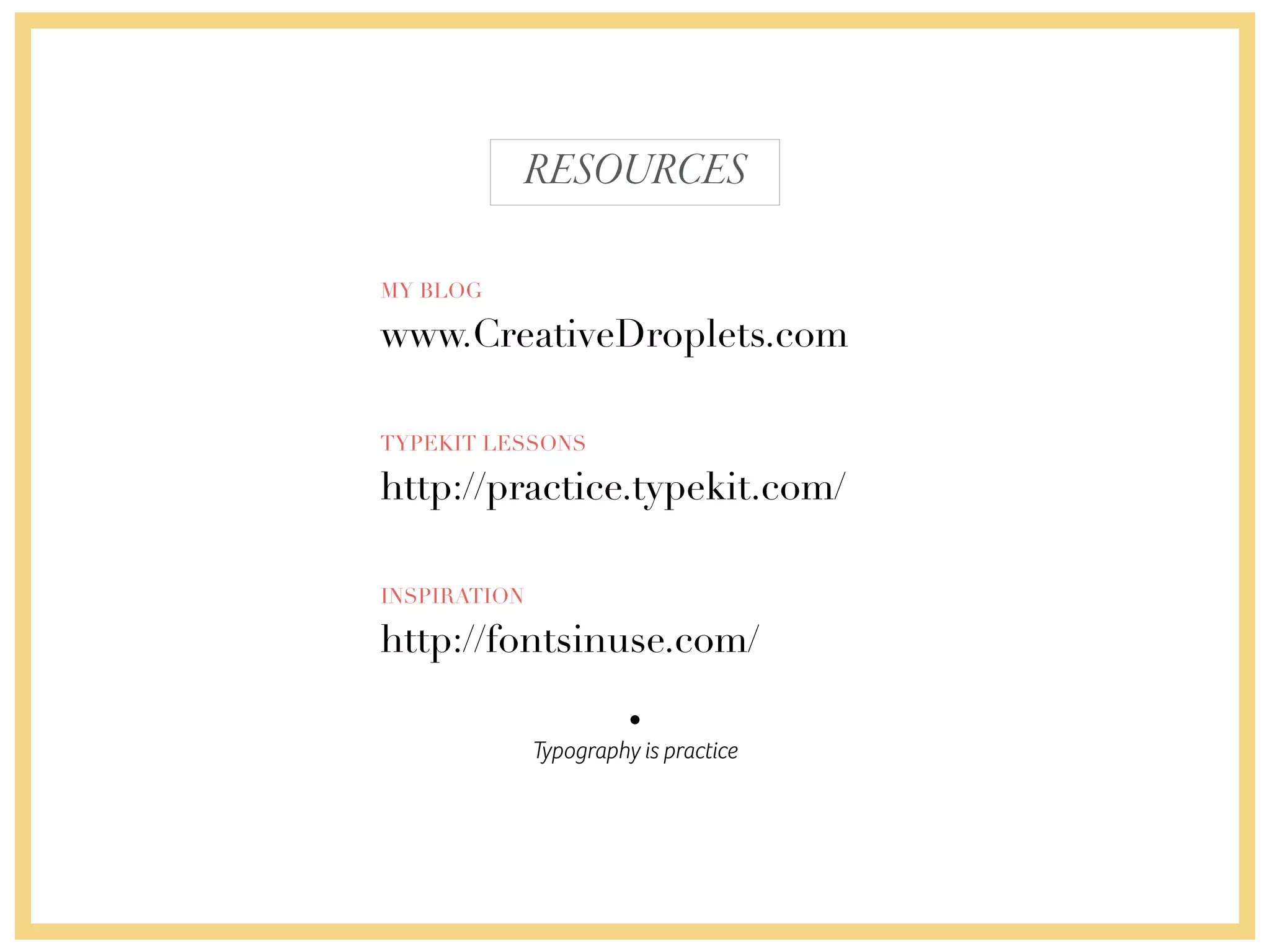
This document discusses typography on the web. It provides an overview of the evolution of typography and web fonts from 1996 to the present. Key topics covered include the transition from basic web-safe fonts to services like Typekit that allow designers to use premium fonts on websites. The document also discusses considerations for choosing typefaces, the process of designing fonts, and resources for learning about typography.
We heart it! Evoking emotion through typographyChiara Aliotta
Starting from the point of view of Donald Norman, author of the book Emotional Design, and from the most recent book of Aaron Walter, Designing for Emotion, this presentation will explain how to use typography to trigger emotion and engage your website visitors.
Typography is an essential element in graphic design and communication. Usually it is used to “carry” information so it must have some common-sense characteristics such as high legibility and readability, scalability and appropriateness.
But there is yet another level to explore, where typography can play a big role: evoking and triggering emotions.
We all know about emotions because we experience them every day. Emotions influence the way we make decisions, evaluate risks, solve problems and categorize information.
In advertising and product design, emotions are a really well-known subject. In web design, emotional design has just recently made its way to usability.
After giving you 3 reasons to embrace emotional design, you will learn how to use typography to:
1. Avoid negative experiences with typography that require more attention and effort from users, which leads to unnecessary frustration and dangerous aversion of your site.
2. Create a positive experience and enhance user performance with your website, so that times flies faster!
3. Add personality and character to your website using typography for a more creative and unique experience.
4. Draw attention to specific areas of your site by creating visually appealing layouts and harmony.
5. Be clear and consistent for a more effective message.
6. And finally, encourage people to share their experiences and create long-lasting relationships with users.
All of these subjects will be presented in a very easy and engaging way, with practical examples and tools to solidify the concepts. It is not necessary to have any specific knowledge about design and typography (some basic terms will be introduced during the presentation).
Recommended for web designers, graphic designers and UX designers.
Web designers are having a great time. Over the last year, a lot of web design patterns took off: more simplicity, more cleanliness and more focus. This energy can translate into Flat Design, RWD, web fonts, parallax… Michaël has worked in the Web Design industry since the 90’s. In this session, he will list the current web design trends. Then he will explain WHY they took off, and HOW to achieve them. Get inspired and join the conversation about our Web Design industry.
Michael Chaize, Creative Cloud Evangelist chez Adobe, viendra tout spécialement de Paris et vous fera un tour d’horizon de sa nouvelle suite de logiciels. Via des exemples concrets, il vous démontrera les avantages d’une utilisation combinée de Photoshop, Illustrator et Edge Reflow pour le web design.
FITC 2014 Amsterdam - Adobe Apps for Web Designers in 2014Michael Chaize
We all have our habits, our routines and our rituals to create. Web designers need to constantly adapt their creative process to embrace new web trends, such as Responsive Web Design, High-Density Screens or Flat Design. Adobe is also transforming applications to answer these needs.
In this session, Michaël will showcase how web designers can optimize their workflows with Photoshop CC, Illustrator CC and new applications such as Reflow CC, RWD, SVG, symbol fonts, web fonts, asset generation and scripting. Join Michaël to discover how to improve your web design process in order to focus even more on your creativity.
White wonder, Work developed by Eva TschoppMansi Shah
White Wonder by Eva Tschopp
A tale about our culture around the use of fertilizers and pesticides visiting small farms around Ahmedabad in Matar and Shilaj.
Decormart Studio is widely recognized as one of the best interior designers in Bangalore, known for their exceptional design expertise and ability to create stunning, functional spaces. With a strong focus on client preferences and timely project delivery, Decormart Studio has built a solid reputation for their innovative and personalized approach to interior design.
Explore the essential graphic design tools and software that can elevate your creative projects. Discover industry favorites and innovative solutions for stunning design results.
Can AI do good? at 'offtheCanvas' India HCI preludeAlan Dix
Invited talk at 'offtheCanvas' IndiaHCI prelude, 29th June 2024.
https://www.alandix.com/academic/talks/offtheCanvas-IndiaHCI2024/
The world is being changed fundamentally by AI and we are constantly faced with newspaper headlines about its harmful effects. However, there is also the potential to both ameliorate theses harms and use the new abilities of AI to transform society for the good. Can you make the difference?
11. We have just entered the era of non-boring typography
TYPOGRAPHYONTHEWEB
1996
Andale Mono
Times New Roman
Georgia
Verdana
Arial
Courier New
Trebuchet MS
Comic Sans
Impact
200990K+ typefaces on the web
Focus on structure: H1,H2…
&
12. Web Design is 95% typography
TYPOGRAPHYONTHEWEB
1996 2014
15. kerning, leading, uppercase…
DESIGNCHOICES
“Choosing typefaces relies on weighing the context of what you’re designing against your technical
requirements, typographic knowledge, and gut instinct. Just as the best coffee machine won’t necessarily make
you the best cup of coffee, good typography depends on the ingredients you choose, the particular
combination of those ingredients, and the ways you combine them. Your typeface choices must fit the
circumstances you need them for and so must your design.”
Excerpt From: Jason Santa Maria. “On Web Typography.”
“Choosing typefaces relies on weighing the
context of what you’re designing against your
technical requirements, typographic knowledge,
and gut instinct. Just as the best coffee machine
won’t necessarily make you the best cup of
coffee, good typography depends on the
ingredients you choose, the particular
combination of those ingredients, and the ways
you combine them.”
“ C h o o s i n g
typefaces relies on
w e i g h i n g t h e
context of what
you’re designing
a g a i n s t y o u r
t e c h n i c a l
r e q u i r e m e n t s ,
t y p o g r a p h i c
knowledge, and gut
instinct. Just as the
b e s t c o f f e e
machine won’t
necessarily make
you the best cup
of coffee, good
t y p o g r a p h y
depends on the
ingredients you
c h o o s e , t h e
p a r t i c u l a r
combination of
those ingredients,
and the ways you
combine them.
Yo u r t y p e f a c e
choices must fit
the circumstances
you need them for
and so must your
design.”
16. “Choosing typefaces relies on weighing the
context of what you’re designing against your
technical requirements, typographic
knowledge, and gut instinct. Just as the best
coffee machine won’t necessarily make you the
best cup of coffee, good typography depends
on the ingredients you choose, the particular
combination of those ingredients, and the ways
you combine them.Your typeface choices must
fit the circumstances you need them for and
so must your design.”
FONT SIZE x 30
34px * 30 = 1020 pixels
TRICK
DESIGNCHOICES
READ IT LOUD
TRICK
17. picking the right typeface
“Choosing typefaces relies on weighing the
context of what you’re designing against your
technical requirements, typographic knowledge,
and gut instinct. Just as the best coffee machine
won’t necessarily make you the best cup of coffee,
good typography depends on the ingredients you
choose, the particular combination of those
ingredients, and the ways you combine them.Your
typeface choices must fit the circumstances you
need them for and so must your design.”
“Choosing typefaces relies on weighing the
context of what you’re designing against your
technical requirements, typographic knowledge,
and gut instinct. Just as the best coffee machine
won’t necessarily make you the best cup of coffee,
good typography depends on the ingredients you
choose, the particular combination of those
ingredients, and the ways you combine them.
Your typeface choices must fit the circumstances
you need them for and so must your design.”
DESIGNCHOICES
32. That’s why a typeface costs several hundreds of dollars
CREATIVEPROCESS
I
DESIGNING A FONT IS A LOT OF WORK
technology
culture
feeling
emotion
message
33. about 320$ per designer
PREMIUMTYPEFACE
II
FOUNDRY - PARATYPE
Futura
34.
35. about 320$ per designer
PREMIUMTYPEFACE
II
FOUNDRY - PARATYPE
Futura
36. Be aware
PREMIUMTYPEFACE vs FREETYPEFACE
I
BETTER QUALITY
II
MULTIPLE FONT STYLES
III
WON’T BE SEEN EVERYWHERE
IV
NO WORRIES OF LAWSUITS
V
LANGUAGES
I
DOES NOT INCLUDE ALL CHARACTERS
II
LACK OF CONSISTENCY
III
MAY REQUIRE ADDITIONAL LICENSE
IV
MAY BE A STOLEN DESIGN
V
LACK OF FONT STYLE OPTIONS
38. Best friend of typographers and designers in general.
TYPEKIT
I
1000+ TYPEFACES
II
SUBSCRIPTION MODEL SINCE 2009
III
CREATIVE CLOUD MEMBERSHIP INCLUDES A
TYPEKIT PORTFOLIO PLAN
IV
FULL CATALOG FOR YOUR WEBSITES
V
15 BILLION PAGE VIEWS/MONTH
45. You can create a 100% web safe visual workflow
The classic customer quote:
“The page of my website
looked better in Photoshop”
99% of the time, this is because
fonts look better in Photoshop.
Design with the browser in mind.
PHOTOSHOP&WEBFONTS