
More Related Content
Similar to Typography for Our Film
Similar to Typography for Our Film (20)
Recently uploaded
Recently uploaded (19)
Typography for Our Film
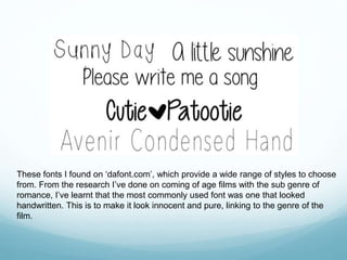
- 1. These fonts I found on ‘dafont.com’, which provide a wide range of styles to choose from. From the research I’ve done on coming of age films with the sub genre of romance, I’ve learnt that the most commonly used font was one that looked handwritten. This is to make it look innocent and pure, linking to the genre of the film.
- 2. I chose three of my most preferred fonts from the ones on the previous slide and put them to use: The reason why I chose these three was because they’re all different in several ways. For example, some are bolder than others and some look more handwritten than the rest.
- 3. I used the three I liked and asked 20 people I know to see which one they liked best and which one they believed suited the romance genre well. The second one was the most popular as people thought it’s not too formal, unlike the bottom one as it comes across more childish due to the lettering. Also, the thickness of the text attracted them which is where the first one lacked its engagement due to how thin it was. Even though it’s possible to make it bolder and I told those who mentioned that it was too thin that it could be adjusted, they still chose the middle one.
- 4. Along with the font for our title, we still had to decide on what font to use for our credits. Therefore, I searched for some on dafont.com with a similar style to the title style and used the word ‘Director’ as a tester: This font is extremely similar to the main title font which what attracted me to it.
- 5. I then did the same survey as I did with the main title font and asked 20 people for their opinion on which font they liked best: The top font was the most popular as the people I asked said it best suited the romance genre out of the three and was similar to the title font so there wont be any major changes within the opening sequence – everything will run smoothly.