While most of us were not formally trained as graphic designers, we are increasingly asked to design professional proposals, ads, flyers, and presentations. This Society for Marketing Professional Services, Pacific Regional Conference session is for those who want to raise the heat on their graphic design skills. The molten core of great graphic design is typography. Type must look great in print and on screens. David Lecours is a professional graphic designer who taught Typography at UCLA. He share how to choose the right fonts, setting type to better create persuasive proposals, and slide design for sizzling presentation interviews.
4G technology in wireless communications and it's standards.
Prepared by : Ola Mashaqi ,, Suhad Malayshe
(A telecomm. Engineering Students)
Annajah National University
http://www.gloucestercounty-va.com What education used to look like. This was a very popular and common way for teaching children about the alphabet. Some old fashioned and fun history. Enjoy.
Eva Anderson - Graphic Design for ReadabilityPlain Talk 2015
"Graphic Design for Readability" was presented at the Center for Health Literacy Conference 2011: Plain Talk in Complex Times by Eva Anderson.
Description: Learn design strategies that improve the readability and usability of print and Web materials. This workshop is for people who aren't designers but have to do their own graphic design at work and for people who hire graphic designers.
The following 37 slides present guidelines and suggestions f.docxoreo10
The following 37 slides present guidelines and suggestions for the use of fonts, colors, and graphics when preparing PowerPoint presentations for
Sessions and Seminars.
This media (PPT) is designed to ENHANCE your presentation, not BE the presentation.
Remember, only you can prevent
“Death by PowerPoint”
PowerPoint Presentation Guidelines
Highlight key points or reinforce what the facilitator is saying
Should be short and to the point, include only key words and phases for visual, reinforcement
In order for your presentation to fit on most screens, text and images should be placed within 95% of the PowerPoint slide. This “action safe” area is seen in the next slide.
PowerPoint Slide
*
Layout continuity from frame to frame conveys a sense of completenessHeadings, subheadings, and logos should show up in the same spot on each frameMargins, fonts, font size, and colors should be consistent with graphics located in the same general position on each frameLines, boxes, borders, and open space also should be consistent throughout
PowerPoint Layout
Fonts Font Style Should be ReadableRecommended fonts: Arial, Tahoma, VerandaStandardize the Font ThroughoutThis presentation is in Tahoma
Do !
This is a good title size Verdana 40 point
A good subtitle or bullet point size Verdana 32 point
Content text should be no smaller than
Verdana 24 point
This font size is not recommended for content. Verdana 12 point.
Font SizeThe larger, the better. Remember, your slides must be readable, even at the back of the room.
TIPS Presentation: 3/8/2004
Dawn Thomas, CRM
Font Size
What does this say? Garamond Font, Italic, Bold 12pt.
This is very difficult to read. Times Font, Bold, 12pt.
This point could be lost. Century Gothic Font, Bold, Italic, 14pt.
No one will be able to read this. Gill Sans Font, Condensed Bold, 12pt Combining small font sizes with bold or italics is not recommended:Small fonts are okay for a footer, such as:
Don’t !
FontsDon’t Sacrifice Readability for StyleDon’t Sacrifice Readability for StyleDon’t Sacrifice Readability for StyleDon’t Sacrifice Readability for Style
Don’t !
Caps and ItalicsDO NOT USE ALL CAPITAL LETTERSMakes text hard to readConceals acronymsDenies their use for EMPHASISItalicsUsed for “quotes”Used to highlight thoughts or ideasUsed for book, journal, or magazine titles
Use a TemplateUse a set font and color scheme.Different styles are disconcerting to the audience.You want the audience to focus on what you present, not the way you present.
Use the Same Background
on Each Slide
Do !!
Don’t use multiple backgrounds in your presentation
Changing the style is distracting
Don’t!
ColorsReds and oranges are high-energy but can be difficult to stay focused on.
Greens, blues, and browns are mellower, but not as attention grabbing.
Reds and Greens can be difficult to see for those who are color blind.
Avoid These Combinations
Examples:Green on BlueDark Yellow on GreenPurple on ...
Concept
After reading the questionnaire and browsing the competitor’s website, it is understood that we are not talking about ordinary computers. These are custom-made powerful machines built depending on the client’s specific needs. The esthetic aspect is important but what makes these computers unique are the internal components, processor, memory, motherboard, etc. in other words, “THE FIRE IS INSIDE”
Shape
An illustration of a flame of fire could result in an overused idea with a cheap appearance. We found the right solution to communicate this idea by using the initials of the brand’s name. We placed the letter C under de letter W turned 90 grades. The final result is a simple shape where the negative space represents a flame. This concept supports the tagline “THE FIRE IS INSIDE”
Typography
We are using a sans serif font on the name and the icon. This is the perfect style to communicate the client’s values: Bold, exciting modern pure energy, and fun
Color
The colors selected were orange and black. Orange to represent the fire and the black to achieve a better definition of the shape
Want to level up your typography game?
Here's what not to do: steer clear of excessive font variety, illegible or ornate fonts, sloppy kerning and spacing, stretched proportions, and generic font settings.
Elevate your design with these Typography Tips! 🎨✨
[DevDay2019] Spacing and Typography, keys to a professional UI design - By Ng...DevDay.org
In this talk, you will learn UI Design Theory and the Basic Principles of Typography and Spacing, create elegant Web & Mobile app design by selecting and pairing meaningful Typography and know how to use spacing effectively and balance your design. You will achieve the experience and knowledge to take UI design fundamentals and apply them in your everyday life.
Handout 2 for POW! Your Point: Better Presentations for a Happier Audience given at the Arizona Library Association Annual Conference November 19, 2015.
Similar to Hot Typography SMPS Pacific Regional Conference (20)
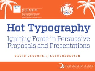
Talk delivered at SMPS Southern Regional Conference
Culture isn't something you have, it's something you do. Join David Lecours, brand and culture expert, to learn why Marketing needs to design your firm's culture. Hint: attracting great clients and talent is just the beginning. Then, David will share how to proactively design a flourishing culture. This will include best practices of A/E/C firms using culture as a compelling differentiator. As Peter Drucker said, “culture eats strategy for breakfast.” YUM!
Learning Outcomes:
- You will learn how to design a magnetic culture to attract clients and talent
- Expect to connect the infinite loop of brand and culture
- You will become empowered to take the lead role in your firm's culture
Delivered first at SMPS Pacific Regional Conference
Culture isn't something you have, it's something you do. Join David Lecours, brand and culture expert, to learn why Marketing needs to design your firm's culture. Hint: attracting great clients and talent is just the beginning. Then, David will share how to proactively design a flourishing culture. This will include best practices of A/E/C firms using culture as a compelling differentiator. As Peter Drucker said, “culture eats strategy for breakfast.” YUM!
Learning Outcomes:
- You will learn how to design a magnetic culture to attract clients and talent
- Expect to connect the infinite loop of brand and culture
- You will become empowered to take the lead role in your firm's culture
Stealing from Surf Brands for A/E/C Firm DifferentiationDavid Lecours
Closing keynote by David Lecours at the SMPS Pacific Regional Conference in Honolulu, HI. Surf brands and Architecture, Engineering, Construction (A/E/C) firms must fight commmoditization with these recommended tools.
A/E/C Websites: Innovating from Good to GrapeDavid Lecours
Presentation by David Lecours at SMPS Pacific Regional Conference in Napa, CA on A/E/C Firm Website Best Practices.
In 2017 the SMPS Foundation published this study: How A/E/C Clients Use Websites to Find and Vet Services Providers. In 2018, David Lecours published research on best practices of ENR 20 and 20 progressive firm websites. Merging these two studies, David shares data, and what we can learn about the effectiveness of top A/E/C websites. You’ll learn the latest tactics that firms are using to attract and convert great clients and talent.
The Power of Infographics for AEC MarketersDavid Lecours
A/E/C firms are marketing in the era of big data, but small attention spans. It’s challenging to differentiate your firm from the competition when your prospective client doesn’t have time to listen.
This presentation delivered at the SMPS Build Business National Conference will unleash the untapped power of infographics to help your firm stand out. Sure, writing and speaking are the typical ways to demonstrate thought leadership via content marketing. But who wants to be typical? With data visualization in the form of infographics, you can effectively demonstrate your expertise to win new business.
You’ll learn:
• How infographics are persuasive in differentiating your firm
• Why infographics distill the complexity of your firm into simple, compelling visual story
• Where infographics can be used in proposals
• Inspiring best practices from leading A/E/C firms using data visualization
• How to create infographics
• Where to distribute your infographics
The Untapped Marketing Power of InfographicsDavid Lecours
A/E/C firms are marketing in the era of big data, but small attention spans. It’s challenging to differentiate your firm from the competition when your prospective client doesn’t have time to listen.
This presentation will unleash the untapped power of infographics to help your firm stand out. Sure, writing and speaking are the typical ways to demonstrate thought leadership via content marketing. But who wants to be typical? With data visualization in the form of infographics, you can effectively demonstrate your expertise to win new business.
You’ll learn:
• How infographics are persuasive in differentiating your firm
• Why infographics distill the complexity of your firm into simple, compelling visual story
• Where infographics can be used in proposals
• Inspiring best practices from leading A/E/C firms using data visualization
• How to create infographics
• Where to distribute your infographics
A/E/C Marketers must continually deepen their expertise and share it generously via the power of story. Learn the About Me, About My Firm, and Whom We've Helped Stories. Learn why story persuades, how to write your stories, and how to tell your stories.
Deck from David Lecours and Josh Miles' session at SMPS Build Business 2015.
Since Los Angeles is the epicenter of Game Shows, your polyester-clad hosts David Lecours and Josh Miles will quiz and answer the latest trends in A/E/C firm websites, and what they mean for digital marketing for professional services firms. A few years ago, firms could get by with brochure-style websites. Today the prizes are bigger, and the competition is tougher. The modern website should be a business development tool that helps your firm generate leads while standing out from your competition.
Presentation made to Architects and Interior Designers at the Leaders of Design Council in Athens, Greece.
Designers that lead embrace the power of narrative. In a noisy world, you must clearly and succinctly tell your personal and studio’s story to clients, vendors, and staff. Story creates an emotional connection with potential clients that will make you memorable and influence the buying decision. When you harness the power of story in your personal interviews, web site, and case studies, you win better clients, and increase your ability to lead those clients towards success.
Expect to Learn:
Aristotle: The Architect of Persuasion on Why Story Works
Which Stories To Tell
Where To Find Your Stories
How To Structure a Compelling Story - Writing
How To Tell Better Stories - Delivery
Teaching Others to Tell Your Story
The New Wave of A/E/C Firm Websites and Digital MarketingDavid Lecours
Real-life surfer David Lecours joins Midwesterner and surf-poseur Josh Miles for a surf session about the latest in websites, and what they mean for A/E/C firm digital marketing. A few years ago, firms could get by with brochure-style websites. Today the waves are bigger, and the competition is tougher. The modern website is a business development tool that also helps you stand out from your competition.
Surf instructors David Lecours and Josh Miles will share their experiences guiding A/E/C firms to create award-winning websites. Not just pretty websites, but powerful business development tools, capable of generating leads and nurturing prospects throughout the sales tube. Learn the latest trends in digital marketing, social media, responsive design, mobile-ready websites, SEO,and more. Go back to your firm with clarity on how a modern website is the hub of a digital marketing ecosystem.
What The New Wave of Websites Means for AEC MarketersDavid Lecours
Real-life surfer David Lecours joins Midwesterner and surf-poseur Josh Miles for a highly interactive surf session about the latest in websites, and what they mean for AEC marketers. A few years ago, firms could get by with brochure-style websites. Today the waves are bigger, and the competition is tougher. How do you make the most of your ride, and stand out from the competition?
Surf instructors David and Josh will share their experiences working with dozens of AEC firms to create award-winning websites. Not just pretty websites—but powerful business development tools, capable of generating leads and nurturing prospects throughout the sales tube. Hear the latest trends in digital marketing, responsive, mobile-ready websites, SEO, and more. Leave this session ready to assemble the right internal and external teams to build a website that shreds.
Links to Sites Mentioned and More Resources:
http://www.lecoursdesign.com/wave2014/
http://design-firm.milesdesign.com/surf
Rebranding Your A/E/C Firm: What, When, HowDavid Lecours
Your firm should be continually growing its expertise and capabilities. In the last 5-10 years, you probably added new markets and new services. You may have an entirely new strategic direction. Is the public perception of your firm keeping up, or is it stuck in the past? It could be time for a rebrand.
Rebranding is not a panacea. But done well, it can energize a tired brand. All A/E/C firm brands go through a life cycle. So it's nearly guaranteed that, at some point in your career as a firm owner or marketer, your firm will go through a rebrand. From gaining Board of Directors' approval, to budgeting, managing the process, managing expectations, and rolling it out, this can be a delicate process. Just ask Yahoo, The Gap, and UPS.
This slide deck is from a webinar designed to help you navigate the process of what, when, and how to complete a successful A/E/C firm rebranding.
Expert Accessory Dwelling Unit (ADU) Drafting ServicesResDraft
Whether you’re looking to create a guest house, a rental unit, or a private retreat, our experienced team will design a space that complements your existing home and maximizes your investment. We provide personalized, comprehensive expert accessory dwelling unit (ADU)drafting solutions tailored to your needs, ensuring a seamless process from concept to completion.
Dive into the innovative world of smart garages with our insightful presentation, "Exploring the Future of Smart Garages." This comprehensive guide covers the latest advancements in garage technology, including automated systems, smart security features, energy efficiency solutions, and seamless integration with smart home ecosystems. Learn how these technologies are transforming traditional garages into high-tech, efficient spaces that enhance convenience, safety, and sustainability.
Ideal for homeowners, tech enthusiasts, and industry professionals, this presentation provides valuable insights into the trends, benefits, and future developments in smart garage technology. Stay ahead of the curve with our expert analysis and practical tips on implementing smart garage solutions.
Top 5 Indian Style Modular Kitchen DesignsFinzo Kitchens
Get the perfect modular kitchen in Gurgaon at Finzo! We offer high-quality, custom-designed kitchens at the best prices. Wardrobes and home & office furniture are also available. Free consultation! Best Quality Luxury Modular kitchen in Gurgaon available at best price. All types of Modular Kitchens are available U Shaped Modular kitchens, L Shaped Modular Kitchen, G Shaped Modular Kitchens, Inline Modular Kitchens and Italian Modular Kitchen.
You could be a professional graphic designer and still make mistakes. There is always the possibility of human error. On the other hand if you’re not a designer, the chances of making some common graphic design mistakes are even higher. Because you don’t know what you don’t know. That’s where this blog comes in. To make your job easier and help you create better designs, we have put together a list of common graphic design mistakes that you need to avoid.
45. HEADLINE
This is body copy that is meant to
be readable. This is body copy that is
meant to be readable. This is body
copy that is meant to be readable.
74. If body copy, then this reversed out text is causes
eye fatigue. If body copy, then this reversed out
text is causes eye fatigue. If body copy, then this
reversed out text is causes eye fatigue. If body
copy, then this reversed out text is causes eye
fatigue.
If body copy, then this dark text on a light
background is easiest on the eyes. If body copy,
then this dark text on a light background is
easiest on the eyes. If body copy, then this dark
text on a light background is easiest on the eyes.
94. pms
spot
476
wg1
wg4
382
hex
#f0ecde
#83bb41
#4e3f3a
#bbbaaf
#d8d6c8
c m y k r g b
5 4 12 0 240 236 222
54 4 100 0 131 187 65
57 63 65 48 78 63 58
27 21 29 0
15 11 20 0
187 186 175
216 214 200
Obey the Logo Laws
Never stretch the logo. Never change the colors or font. Avoid shrinking the logo smaller than 1" wide.
the logo if using an .ai or .pdf file (for print). Use .jpg, .png for web or devices, .png has transparent background.
cmyk = cyan, magenta,
Used for print, also calle
rgb = red, green, blue u
hex = hexadecimal col
used to specify website
pms = pantone match
commercial printing w
wg = warm gray
COLORCOLOR
TYPOGRAPHY
TYPOGRAPHY
If words are the content, then typography is the voice used when communicating visually. The logotype is custom, ba
on Trade Gothic Bold, set in ALL CAPS. Fonts are available for purchase at adobe.com/type
STATIONERY
STATIONERY
Paper
Recommended
Neenah Classic Crest Smooth Avon Brilliant White
110# Cover for business cards
riting or 70# Text for letterhead, 2nd sheets, envel
Printer
Sir Speedy Printing rep: Alan
3517 Main Street, suite 303
Avenir 45 Book, Oblique
Trade Gothic Bold, Oblique
Museo Slab 900, Italic
10 pt. Book for body text, w/ 13 pt. leading
18 pt. or larger for Headlines
95. pms
2935*
115
296
LOGOLOGO
hex
#0055b8
#293145
#54b7bf
c m y k
r g b
100 46 0 0
0 85 184
85 75 48 47
41 49 69
84 183 191
Obey the Logo Laws
Never stretch the logo horizontally or vertically. Never change the colors or font. Avoid shrinking the logo smaller than .75" wide.
Only enlarge the logo if using an .ai or .pdf file. If a larger .png or .jpg file is needed, create it in Photoshop from the .ai file.
cmyk = cyan, magenta, yellow, bla
also called 4-color process, used fo
pms = pantone matching system f
commercial printing with pantone
for exact color matching. PMS 293
LSA blue, used in logo. cg3 = coo
rgb = red, green, blue used for o
lsa_logo_blue_rectangle.ai
lsa_logo_blue_rectangle.pdf
lsa_logo_blue_rectangle.png
lsa_logo_wht.ai
lsa_logo_wht.pdf
lsa_logo_wht.png
(background pattern does not print)
lsa_logo.ai
lsa_logo.pdf
lsa_logo.png
COLORCOLOR
TYPOGRAPHY
TYPOGRAPHY
If words are the content, then typography is the voice used when communicating in print or on screen. Proxima Nova is
used by the Marketing department for print materials and the website. Trebuchet MS is used for everyday communication
like email, .doc and .ppt. Trebuchet MS comes pre-loaded on most PCs.
Note: .ai files are set up for PMS printing, .pdf files are set up for CMYK printing, .png files are for web or devices.
Proxima Nova Regular, Proxima Nova Regular Italic
Proxima Nova Semi-Bold, Proxima Nova Semi-Bold Italic
Proxima Nova Black, Proxima Nova Black Italic
Trebuchet MS Regular, Trebuchet MS Italic
Trebuchet MS Bold, Trebuchet MS Bold Italic
P R I N T
S C R E E N