Download to read offline
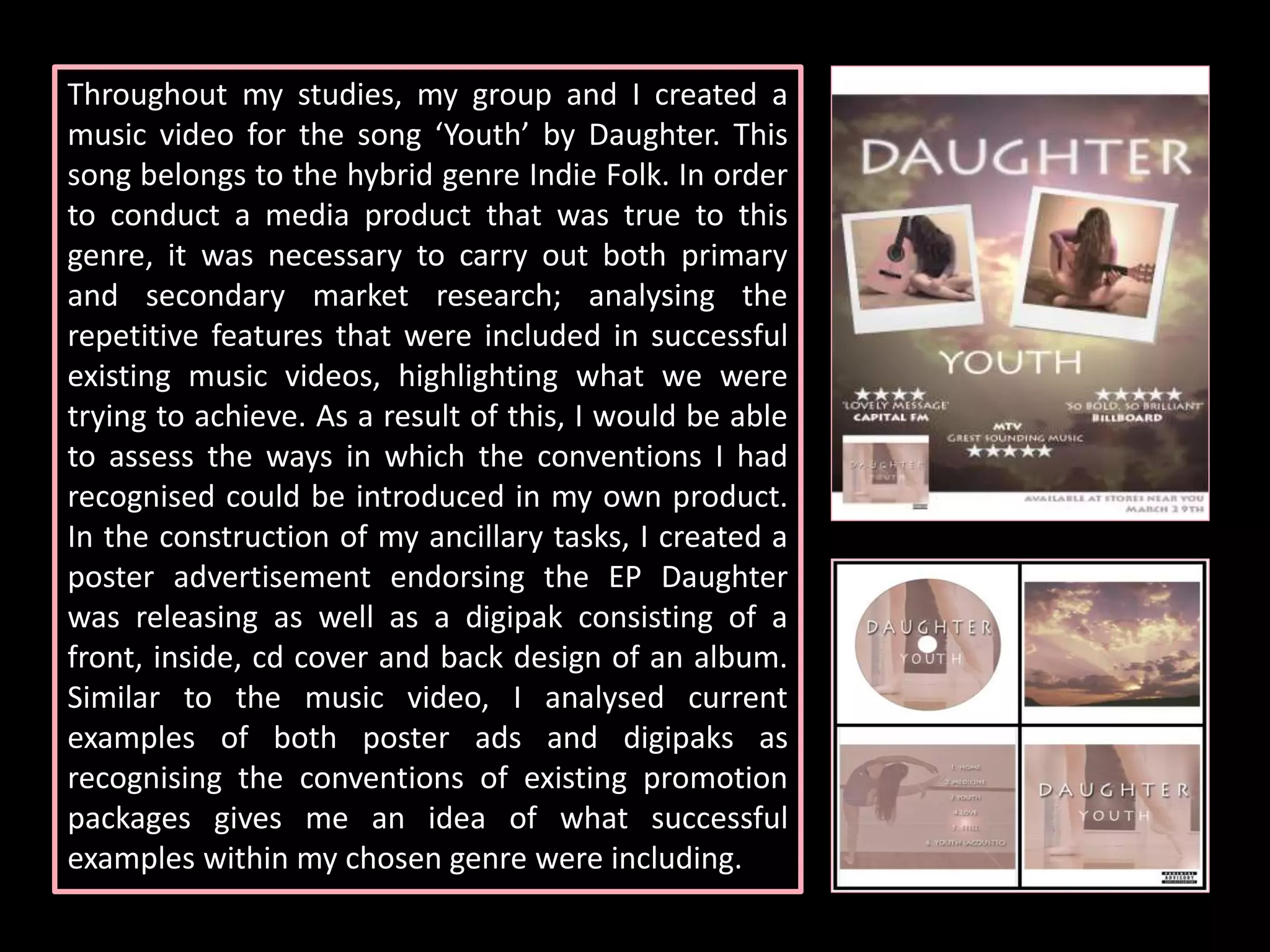
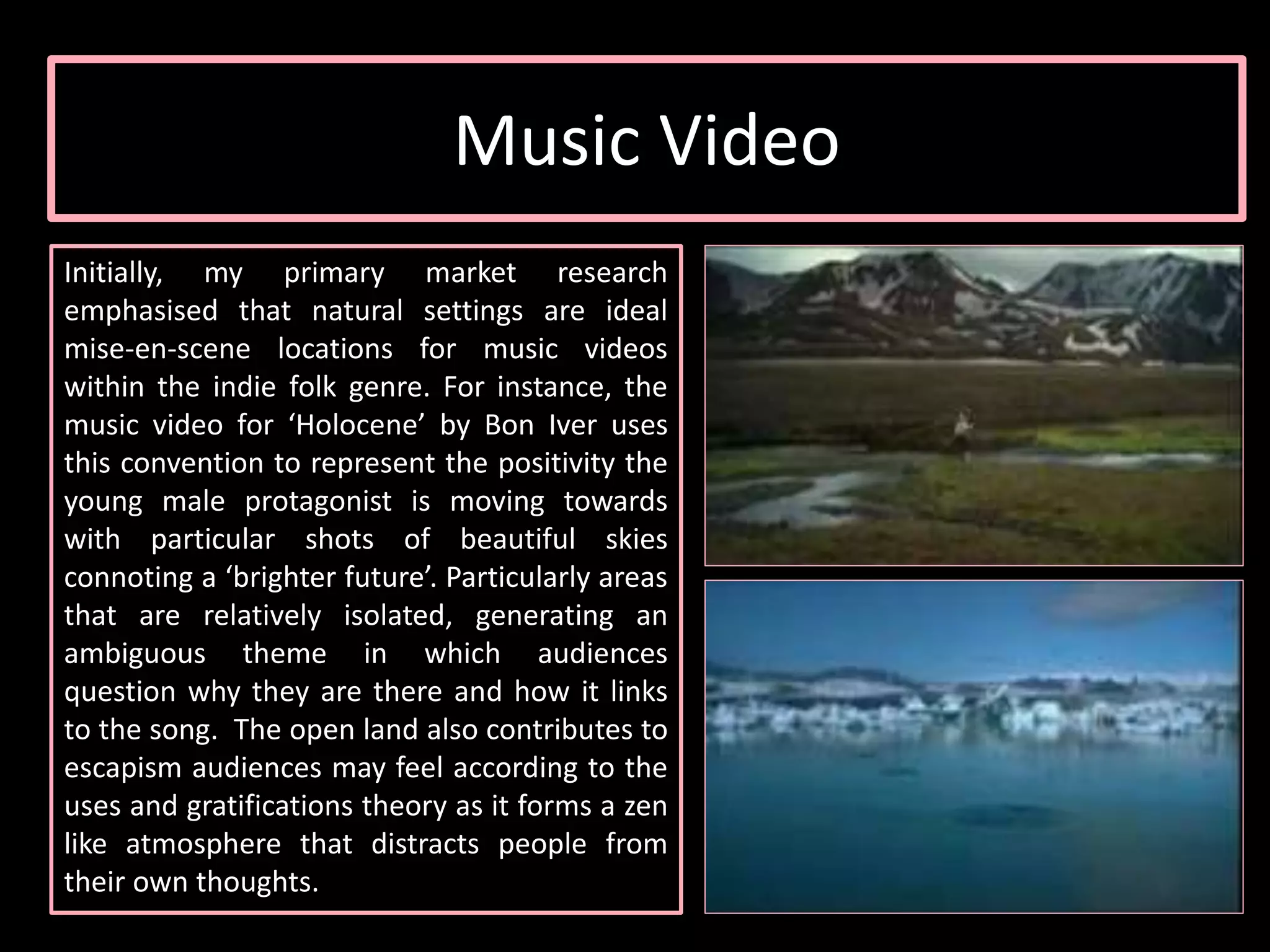
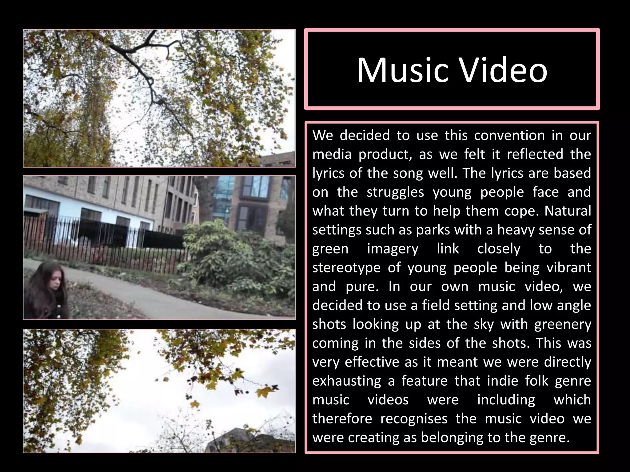
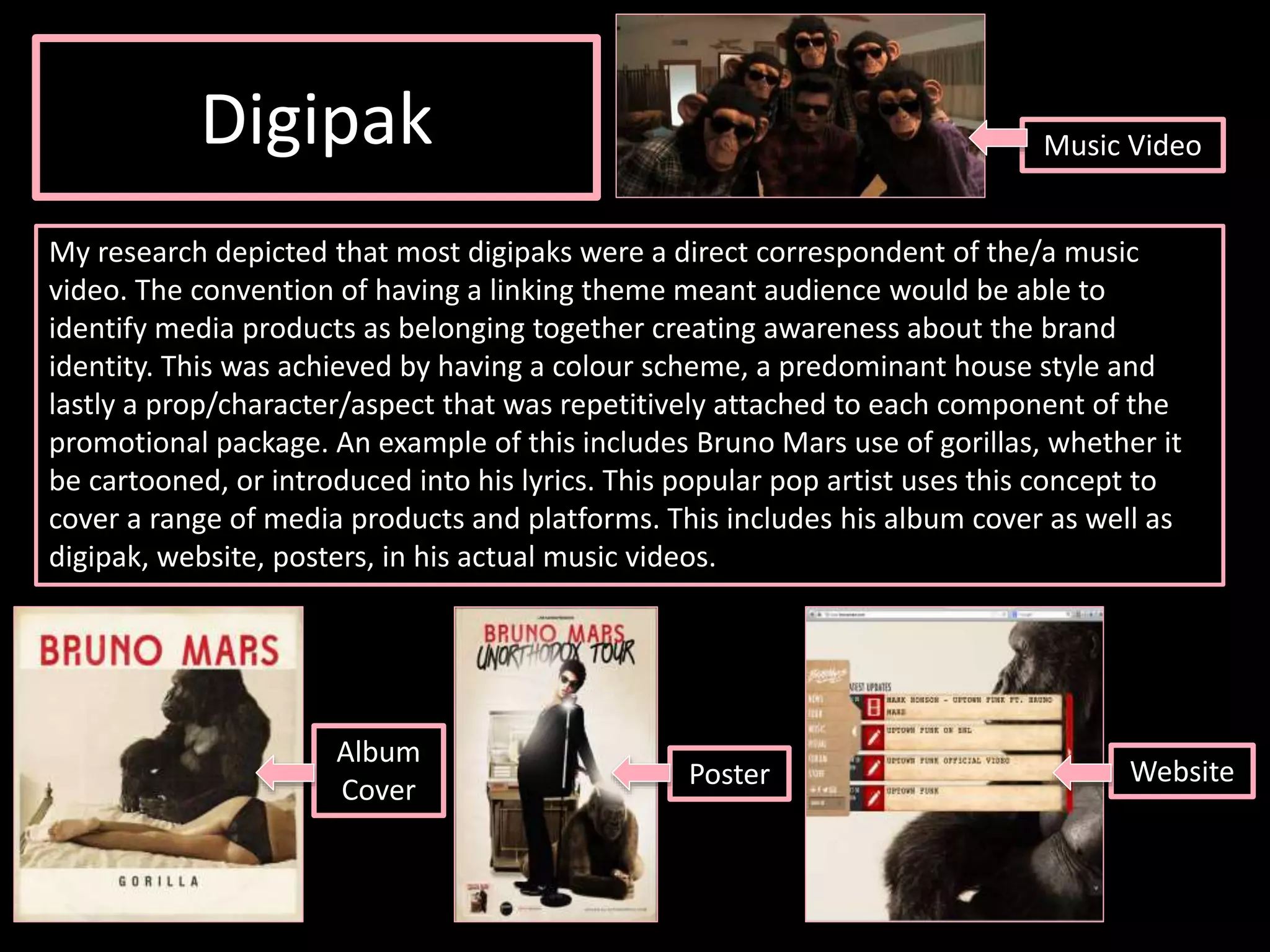
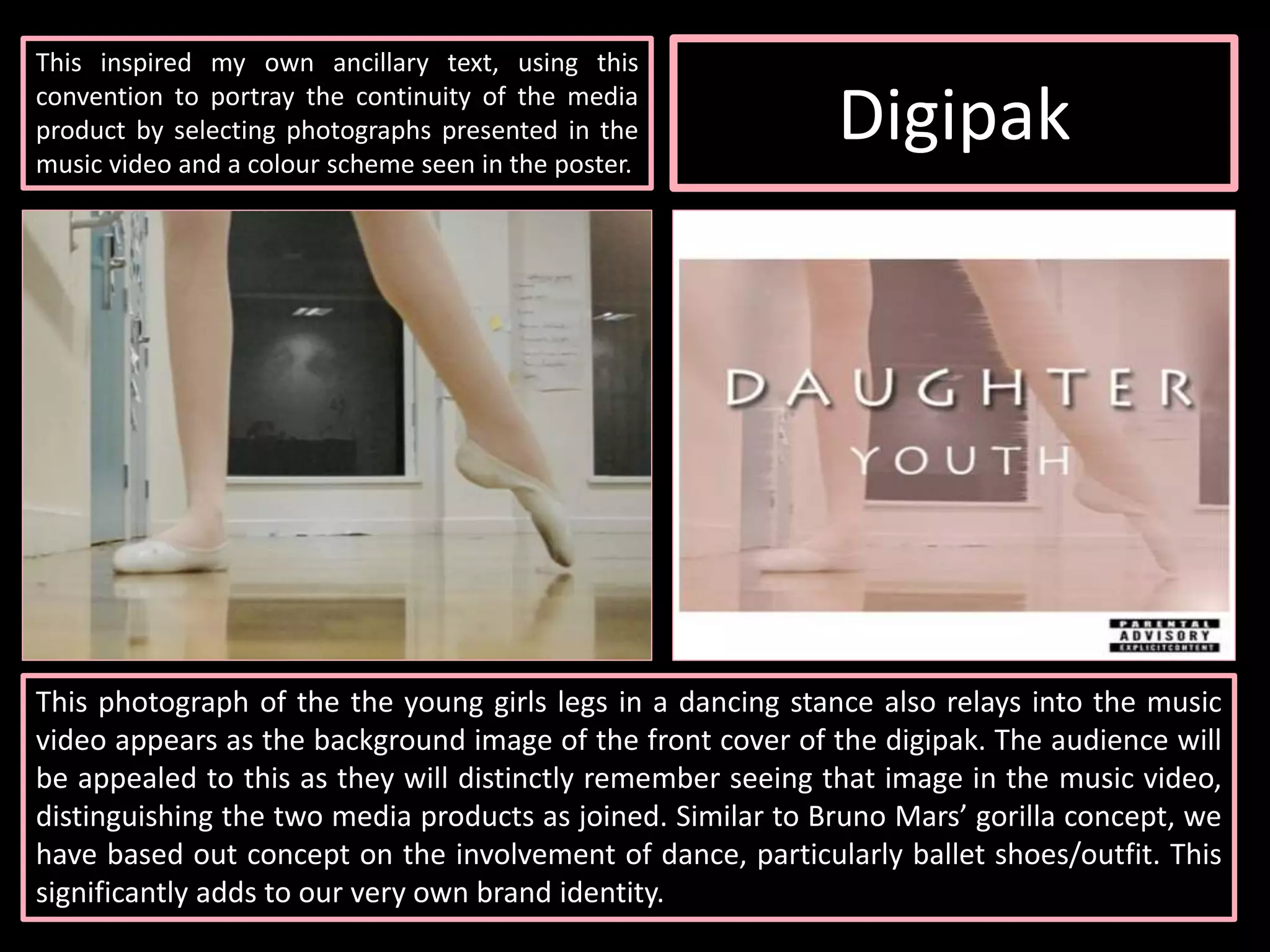
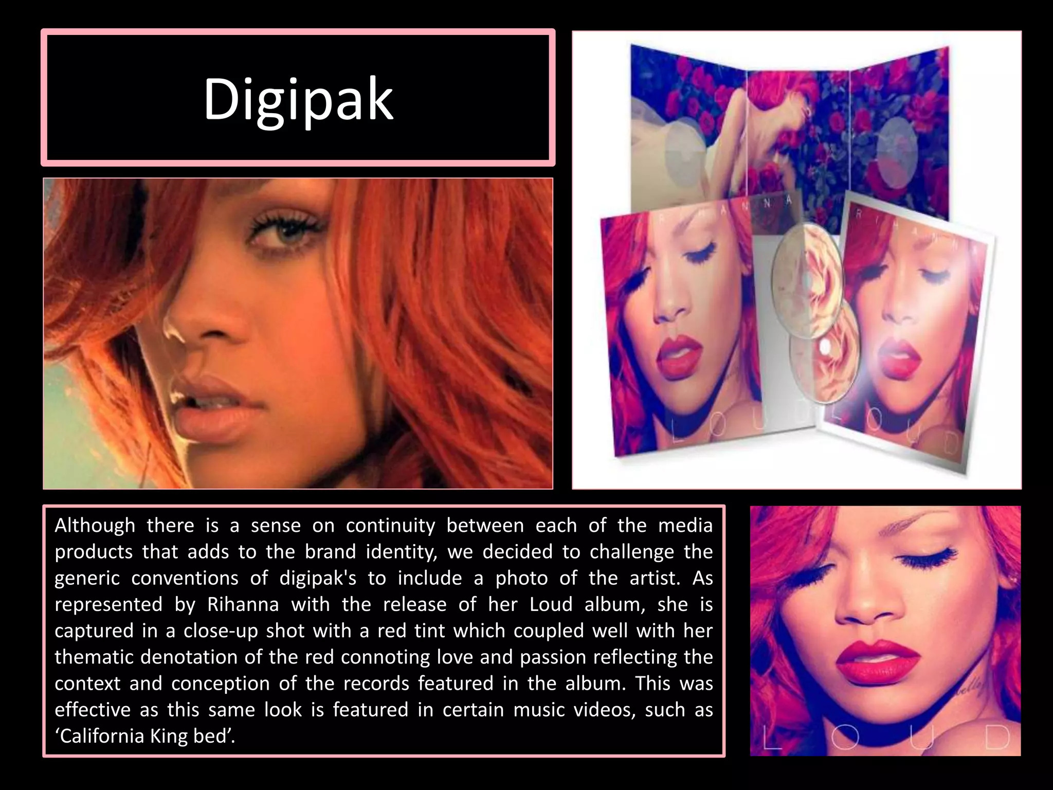
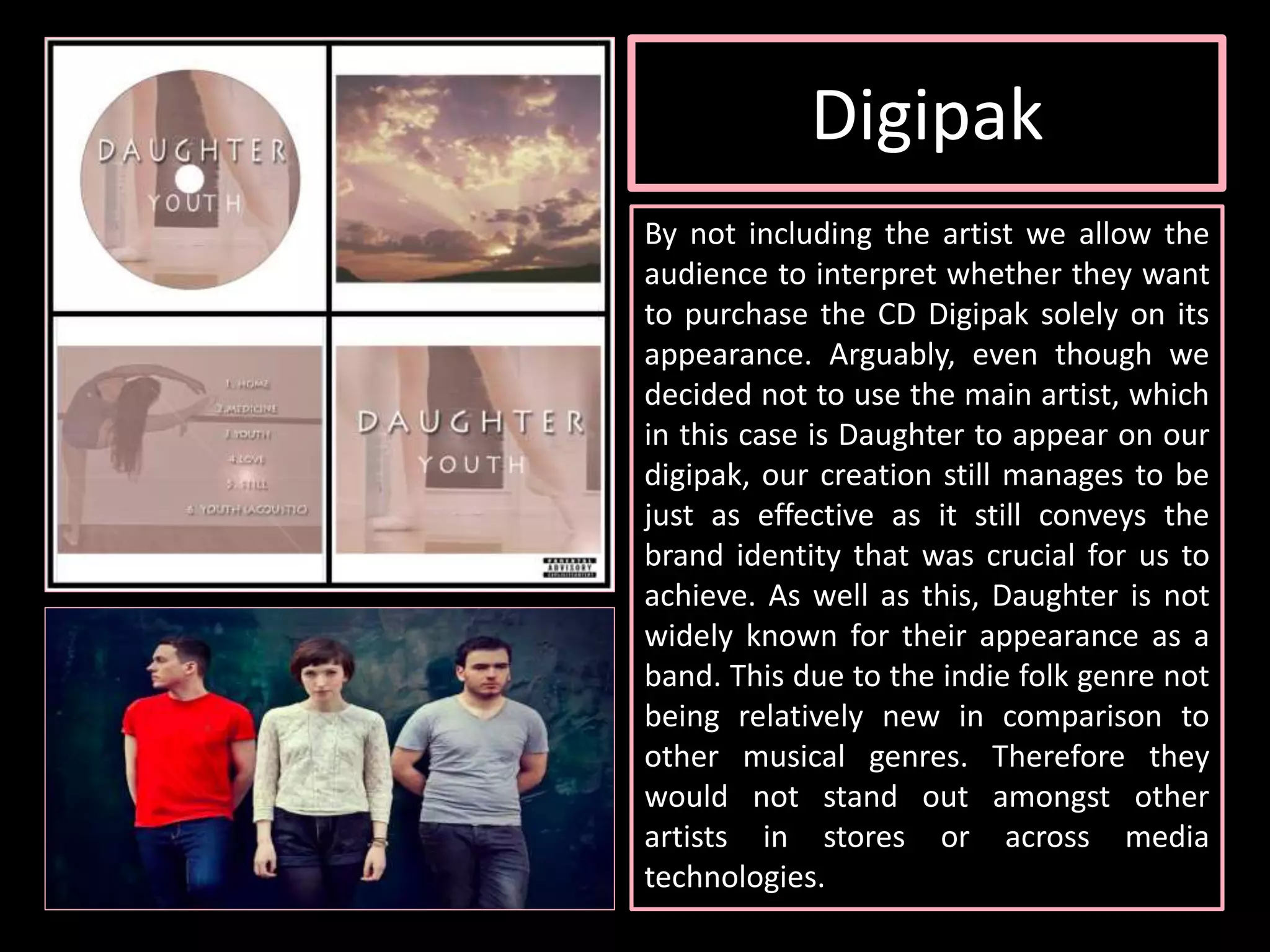
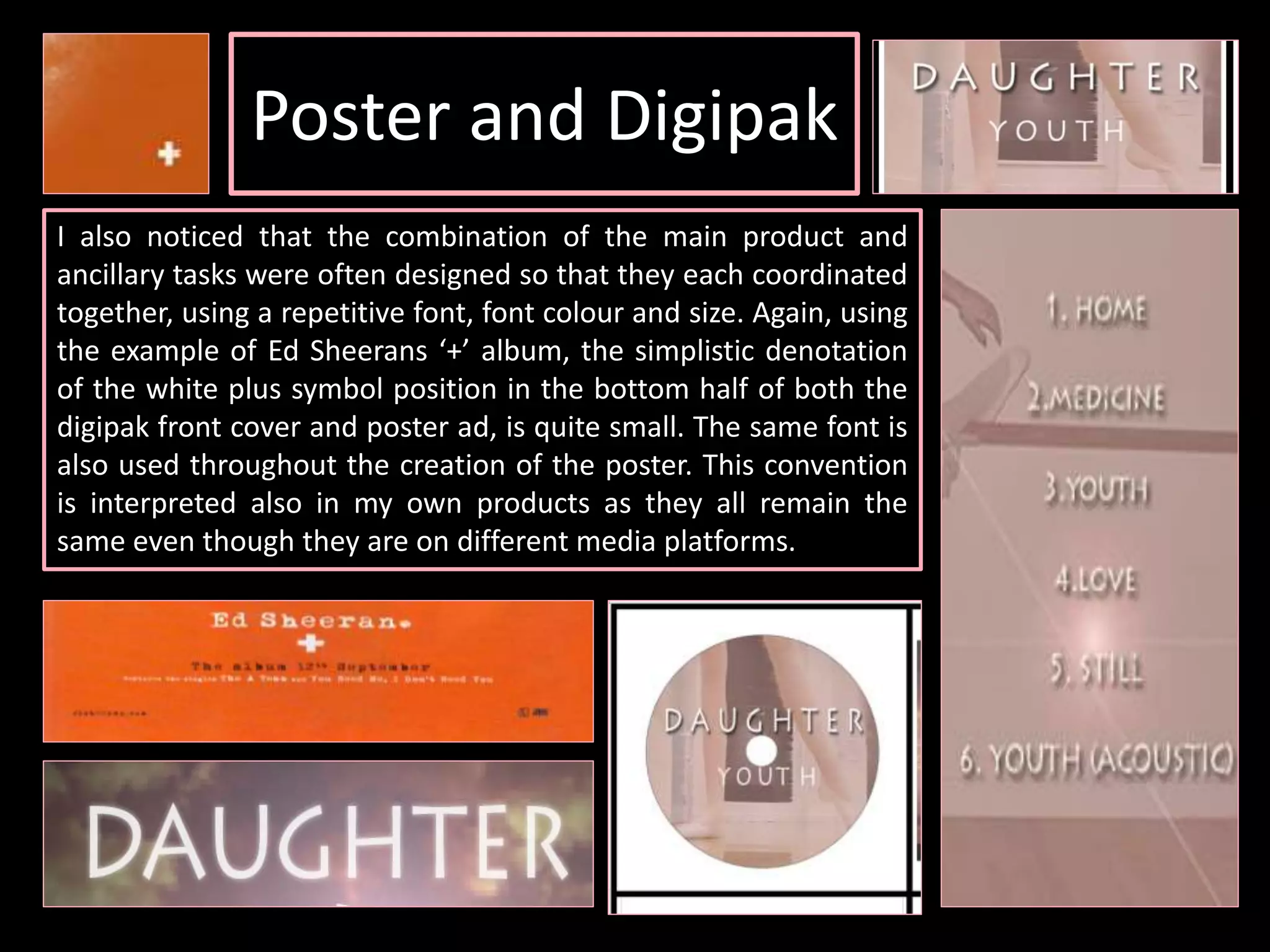

The document discusses conventions used in music videos, digipaks, and posters for the indie folk genre. The creator analyzed existing examples to identify conventions such as natural settings in music videos. Their own media products used conventions like this but also challenged some, like including urban settings in the music video. Continuity between products was important, so the music video, digipak, and poster featured shared themes, colors, and characters to represent the brand identity. While conventions were generally followed, some were developed, like including more narrative in the music video.


