Tile And Typography
  Analyzing three posters typography and title. And
 identify the themes they I trying to convey through
this. Also I will be talking about our own title and how
we came to deciding the title. And looking at different
                    typographies to us.
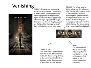
Vanishing   THEMES: The title and typography
                                                        COLOUR: The colour used is
                                                        Bright yellow and this relates to
            conveys to its audience .That location      light. For example is is very simile
            is based in high street from the style      to the colour of a light bulb.
            of the typography relating to shop          Indicating that light sources are
            lights display. And the disappearance       an important aspect in the film.
            of something is highlighted through         And the darker and lighter
            the name and the edit they have used        shades could represent how the
            on the font. Also the importance of         light is fighting the darkness and
            light is highlighted by the color used.     binary opposites of good VS evil .


                                                                  FONT:
                                                                  The font resembles
                   LAYOUT STYLE:                                  that of a shop sign
                   They have used a gradient effect               indicating where it
                   on it that makes it transparent                may be set in a shop
                   and that it disappearing . Linking             or high street. And
                   to the narrative of the film that              linking to the
                   its based on the disappearance                 importance of light
                   of something being a feature.                  in the film
Playback
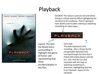
                COLOUR: The colours used are red and white.
                Giving it a blood stained effect highlighting the
                narrative to the audience. That it’s going to
                have deaths and murders relating to watching
                something or video tapes.


Layout: The font          Font style
has blood stains          The style represents VHS
surrounding it.           recording , this is shown by the
                          recognizable distorted lines
Highlight the genre
                          running through the font that is
of horror and             linked with video players and old
representing that         tv’s. But that we can also
there                     associate with vhs tape or
murders/deaths in         watching something on
this film.                television. Highlighting that this
                          is an impotent aspect of the
                          narrative.
Jennifer’s Body
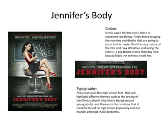
                            Colour:
                            In this case I feel the red is there to
                            represent two things. Firstly blood relaying
                            the murders and deaths that are going to
                            occur in this movie. Also the sexy nature of
                            the film and how attractive and luring the
                            killer is a key theme in this film how here
                            beauty hides the evilness inside her.


      Typography:
      They have used this high school font. That will
      highlight different themes such as the setting of
      the film (a school). Also that is based around
      young adults and themes in the narrative that it
      could be based on high school popularity and evil
      murder amongst these problems.
Evaluation of the purpose of typography.

All these films have conveyed themes and aspects of
there narrative really well through a range of different
ways. They have thought of a range of ways to convey
different aspects. Such as the colour using the colour
red in the title symbolizes blood and links strongly with
the genre of horror . Also the actual font they use such
as jock typography in ‘Jennifer's Body’ highlights the
high school theme in this movie. And different effects
such as in the vanishing can really make your titles
come to life and convey another theme in the
narrative.
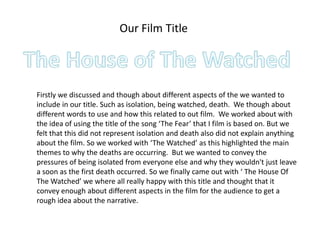
Our Film Title


Firstly we discussed and though about different aspects of the we wanted to
include in our title. Such as isolation, being watched, death. We though about
different words to use and how this related to out film. We worked about with
the idea of using the title of the song ‘The Fear’ that I film is based on. But we
felt that this did not represent isolation and death also did not explain anything
about the film. So we worked with ‘The Watched’ as this highlighted the main
themes to why the deaths are occurring. But we wanted to convey the
pressures of being isolated from everyone else and why they wouldn't just leave
a soon as the first death occurred. So we finally came out with ‘ The House Of
The Watched’ we where all really happy with this title and thought that it
convey enough about different aspects in the film for the audience to get a
rough idea about the narrative.
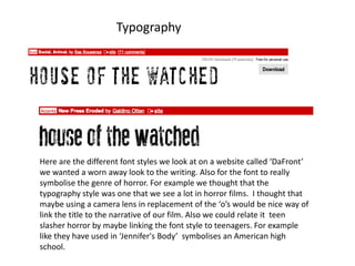
Typography


Here are the different font styles we look at on a website called ‘DaFront’
we wanted a worn away look to the writing. Also for the font to really
symbolise the genre of horror. For example we thought that the
typography style was one that we see a lot in horror films. I thought that
maybe using a camera lens in replacement of the ‘o’s would be nice way of
link the title to the narrative of our film. Also we could relate it teen
slasher horror by maybe linking the font style to teenagers. For example
like they have used in ‘Jennifer's Body’ symbolises an American high
school.

Title and typography

  • 1.
    Tile And Typography Analyzing three posters typography and title. And identify the themes they I trying to convey through this. Also I will be talking about our own title and how we came to deciding the title. And looking at different typographies to us.
  • 2.
    Vanishing THEMES: The title and typography COLOUR: The colour used is Bright yellow and this relates to conveys to its audience .That location light. For example is is very simile is based in high street from the style to the colour of a light bulb. of the typography relating to shop Indicating that light sources are lights display. And the disappearance an important aspect in the film. of something is highlighted through And the darker and lighter the name and the edit they have used shades could represent how the on the font. Also the importance of light is fighting the darkness and light is highlighted by the color used. binary opposites of good VS evil . FONT: The font resembles LAYOUT STYLE: that of a shop sign They have used a gradient effect indicating where it on it that makes it transparent may be set in a shop and that it disappearing . Linking or high street. And to the narrative of the film that linking to the its based on the disappearance importance of light of something being a feature. in the film
  • 3.
    Playback COLOUR: The colours used are red and white. Giving it a blood stained effect highlighting the narrative to the audience. That it’s going to have deaths and murders relating to watching something or video tapes. Layout: The font Font style has blood stains The style represents VHS surrounding it. recording , this is shown by the recognizable distorted lines Highlight the genre running through the font that is of horror and linked with video players and old representing that tv’s. But that we can also there associate with vhs tape or murders/deaths in watching something on this film. television. Highlighting that this is an impotent aspect of the narrative.
  • 4.
    Jennifer’s Body Colour: In this case I feel the red is there to represent two things. Firstly blood relaying the murders and deaths that are going to occur in this movie. Also the sexy nature of the film and how attractive and luring the killer is a key theme in this film how here beauty hides the evilness inside her. Typography: They have used this high school font. That will highlight different themes such as the setting of the film (a school). Also that is based around young adults and themes in the narrative that it could be based on high school popularity and evil murder amongst these problems.
  • 5.
    Evaluation of thepurpose of typography. All these films have conveyed themes and aspects of there narrative really well through a range of different ways. They have thought of a range of ways to convey different aspects. Such as the colour using the colour red in the title symbolizes blood and links strongly with the genre of horror . Also the actual font they use such as jock typography in ‘Jennifer's Body’ highlights the high school theme in this movie. And different effects such as in the vanishing can really make your titles come to life and convey another theme in the narrative.
  • 6.
    Our Film Title Firstlywe discussed and though about different aspects of the we wanted to include in our title. Such as isolation, being watched, death. We though about different words to use and how this related to out film. We worked about with the idea of using the title of the song ‘The Fear’ that I film is based on. But we felt that this did not represent isolation and death also did not explain anything about the film. So we worked with ‘The Watched’ as this highlighted the main themes to why the deaths are occurring. But we wanted to convey the pressures of being isolated from everyone else and why they wouldn't just leave a soon as the first death occurred. So we finally came out with ‘ The House Of The Watched’ we where all really happy with this title and thought that it convey enough about different aspects in the film for the audience to get a rough idea about the narrative.
  • 7.
    Typography Here are thedifferent font styles we look at on a website called ‘DaFront’ we wanted a worn away look to the writing. Also for the font to really symbolise the genre of horror. For example we thought that the typography style was one that we see a lot in horror films. I thought that maybe using a camera lens in replacement of the ‘o’s would be nice way of link the title to the narrative of our film. Also we could relate it teen slasher horror by maybe linking the font style to teenagers. For example like they have used in ‘Jennifer's Body’ symbolises an American high school.