
Recommended
More Related Content
Recently uploaded
Recently uploaded (20)
Featured
Featured (20)
Thornton grammar school magazine analysis
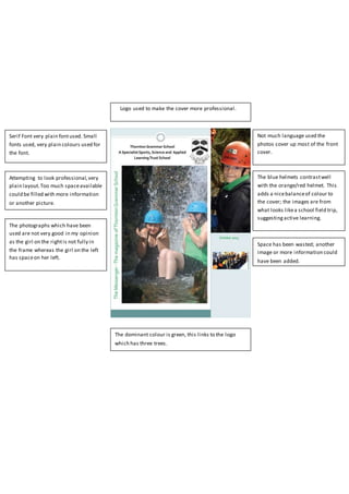
- 1. Serif Font very plain fontused. Small fonts used, very plain colours used for the font. . Attempting to look professional,very plain layout.Too much spaceavailable could be filled with more information or another picture. Not much language used the photos cover up most of the front cover. The dominant colour is green, this links to the logo which has three trees. The photographs which have been used are not very good in my opinion as the girl on the rightis not fully in the frame whereas the girl on the left has spaceon her left. The blue helmets contrastwell with the orange/red helmet. This adds a nicebalanceof colour to the cover; the images are from what looks likea school field trip, suggestingactive learning. Space has been wasted; another image or more information could have been added. Logo used to make the cover more professional.