Download to read offline

![Method
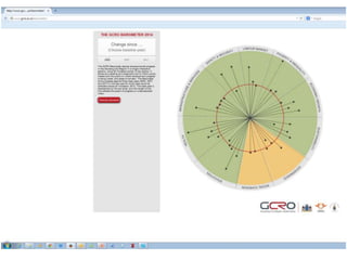
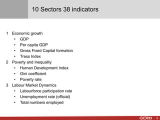
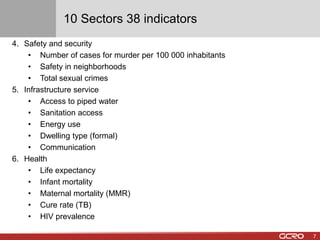
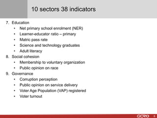
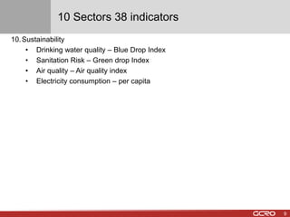
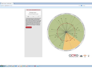
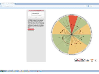
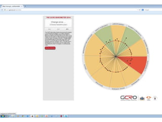
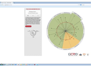
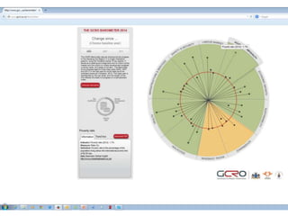
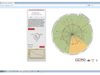
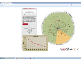
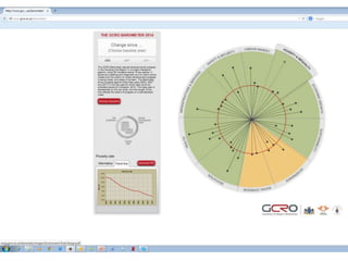
• 38 key indicators were selected and categorized into 10 broad sectors
• The period covered in the analysis is 2002 to 2012.
• Ideally, the intention was to cover the period from 1995 to 2013 but there were
no datasets that consistently covered this period for all 38 indicators.
• Various data sources were used such as StatsSA3, Quantec, Global Insight,
SAAQIS, SAPS and GCRO’s Quality of Life (QoL) surveys.
• A simple index was used to benchmark progress in 2012 against 3 base years
i.e. 2002, 2007 and 2011.
• The average sector indices were used to determine progress relative to the
base years using a colour scale,
• Red=significant negative change [<100];
• Amber=only minor positive change [=>100 but <105];
• Green=significant positive change =>105).
10](https://image.slidesharecdn.com/ygdqdhgdt2cgdz8rf4im-signature-20fdb5cedc1d3f4985dd340af4396430f7ffaea0cbd91d47a966620f3b962f88-poli-141121021820-conversion-gate02/85/The-GCRO-BAROMETER-2014-10-320.jpg)

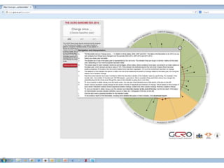

The GCRO Barometer 2014 presents a comprehensive tool for tracking developmental progress in the Gauteng City Region across 38 indicators in 10 sectors, from economic growth to sustainability. It highlights significant advancements since 2002, although public perceptions about government and citizen engagement show concerning declines. Additionally, data scarcity poses challenges for in-depth analysis, while the interactive platform allows users to access and interpret the data across various devices.


