OVERVIEW THE WHOLEPOINT BRAND GUIDELINES
ANOTHER MANIFESTO
Oh,heythere.Webelieveinadventure.Webelieveinasserting
ourselves.Webelieveinnolimits.Webelieveindoingitfirst—and
(maybe)askingforpermissionlater.Webelieveinnotbeinganother
sheepinthecrowd.Webelieveincreatingandrelishinginyourown
personalbrand.Webelieveinlivingbyyourownmanifesto.We
believeinnotbeingscaredtosay,“Oh,fuck.”Webelieveinallthat
andmore.Webelieveinmakingasmuchnoiseaspossible.We
believeinthefactthatthere’ssomuchmoretolifethanyour9-to-5,
allyourdailytoil,your401k,andyour40-yearmortgage.Webelieve
inputtingawaythethree-piecesuitforaneveningofreally,really
bad/awesomerealitytelevision.Inshort—webelieveinbeliefs.
Needwesaymore?Toknowyourself,toknowthemission,toknow
what’sbehind,toknowwhat’sahead:Staytogether,movetogether.
Be…together.Butthisisn’taboutus,ortheapp,orsplashes(okay,
lotsofsplashes)offluorescentpink.It’saboutyou.
It’s the millions of people connecting
in rides across North America every
single day. It’s the countless, unique
connections between people of all
walks of life. It’s the endless proof that
different people can get along — even
if it’s just for a 5-minute ride.
Be clear.
Be concise.
Bedirect.
Simplify
Be bold.
Be thoughtful.
Be tenacious.
Giveit
contrast
Design
principles
01
Be expressive.
Be unapologetic.
And, uh, do have
a sense of humor.
Staya
rebel
02
03
Simplicity is the whole reason Lyft exists in the first place.
If our experience is more difficult than taking a bus, then
there’s no point in doing it. Designs should be easy to
understand and free of unnecessary clutter. Busy is bad.
Lyft sits at the cross-section of technology and humanity.
Contrast is woven into the DNA of our origin story and
throughout our most successful and enduring ideas. This
clash of opposing forces will be a gauge for anything from
materials and finishes to physical experiences and beyond.
This company was formed through rebellion, and we
continue to move in our own direction. We should always
strive to maintain that unique Lyft spirit, and never be
stodgy, arrogant, or mean.
7.
TheLyft
voice
The voice ofLyft is casual and
conversational, and we speak
with everyone as equals. We
always remember people first.
These principles lay at the heart of everything we share with riders
and drivers. Whether it’s a promoted post on Facebook or a shiny, new
landing page, we should always:
In order to achieve these goals, we make sure our content is:
Informative but not pedantic
Elevate: Prioritize people first by using clear, unhindered language that’s both
informative and actionable. Content should be structured to help drivers
and passengers perform whatever action is necessary at the time.
Respect:
Understand that Lyft can play both small and large roles in the lives of our
drivers and passengers. Avoid dramatic claims and never assume.
Be considerate when writing for drivers and passengers. People have
places to go and things to do, and they use Lyft to get there. Tell drivers and
passengers what they need to know — and not just what we’d like to say.
(But also avoid pandering.)
Be humble:
Write and speak like you would with a friend. Proper grammar is (really)
wonderful, but we always prioritize sounding like real humans first.
Clear: Use simple — but not patronizing — sentences and words. Understand
the topic you’re writing about. Use findings and metrics whenever possible.
Useful: What’s our main goal with this piece of content? Who’s our audience?
What do they need to know right now?
Appropriate: You wouldn’t write to your grandmother the same way you’d write to a
friend. In the same way, you should flex your tone depending on audience,
how your audience feels, and subject matter.
Friendly:
the Lyft voice is:
Convincing but not corny
Authentic but not sloppy
Smart but not stuffy
For more specifics around voice,
tone, grammar, and Lyft-specific
language, visit the official Lyft
Editorial Style Guide.
9.
The Lyft markis Lyft’s official logo and
is used in above-the-line marketing
materials and on our products. The Lyft
mark — which is now, by the way, pixel
perfect — is the most recognizable
asset of the Lyft brand and works at
both large and small scales.
Logo Master logo Partnership lockup
Print / 0.3”
Digital / 16px
Minimum height
xheight clearspace
xheight
xheight
2xheight
business
xheight
xheight
Standard lockup
A note from our legal team:
We have to authorize any and every use of our logo or
name. The Lyft logo cannot be used on merchandise,
apparel, promotional, sales or marketing materials,
on your social media account, in a film, video, radio,
or anything really without our express authorization.
We typically will not authorize the use of our logo unless
you are an official partner of Lyft through a partnership
or enterprise contract.
Guidelines on how to request permission
• All requests must be in English
• The name and contact information for the
individual and company making the request
• A detailed summary of the request, placement,
and the proposed use
• Requested use dates
• Intended distribution channels
• The final version of the proposed use
(including script pages and treatment if use
involves TV/film/podcast/radio)
Email brandpermissions@lyft.com to request permission.
11.
Primary
palette
Proportion & ratio
Ourprimary palette is at the core of
our brand identity and should be used
for any static or one-off, brand-focused
executions (such as business system,
app icons, press materials).
• Our primary palette consists
of pink, white, and black.
• We use white and black more
often, and use pink more sparingly.
• This proportion lets us be more
precise with how and when we
use pink.
• It makes the use of pink more
meaningful and important.
• Simply put: We’ll no longer
default to all-pink-everything.
White
RGB: 255, 255, 255
HEX: ffffff
PMS: N/A
CMYK: 0/0/0/0
LyftPink
RGB: 255, 0, 191
HEX: ff00bf
PMS: 813 Neon U/C
CMYK: 0/100/0/0
Black
RGB: 17, 17, 31
HEX: 11111f
PMS:Black C
CMYK: 0/0/0/100
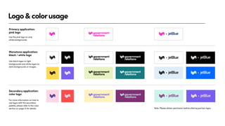
Logo&colorusage
Primary application:
pink logo
Note:Please obtain permission before altering partner logos.
Monotone application:
black / white logo
Secondary application:
color logo
Use black logos on light
backgrounds and white logos on
dark backgrounds or images.
Use the pink logo on only
white backgrounds.
For more information on how to
use logos with the secondary
palette, please refer to the color
section on page 13 for details.
16.
Brand
Typeface:
LyftPro bold
semibold
Lyft Prois confident and playful,
while retaining readability and its
own unique personality.
We have customized a handful of
characters to ensure legibility at all
sizes and in all weights.
medium
regular
Font weights Hierarchy and weights
Font-weight: Regular
Letter spacing: -20pt
Case: Sentence case
Bodycopy
Font-weight: Bold
Letter spacing: -40pt
Case: Sentence case
Subheadline
Font-weight: Bold
Letter spacing: -40pt
Case: Sentence case
Headline
Font-weight: Bold
Letter spacing: -20pt
Case: All caps
Eyebrow HEY FUTURE DRIVER OF SAN FRANCISCO
Make$35an
hourcruising
theMission.
Start being your own boss
and sign up to drive today.
Lorem ipsum dolor sit amet, consectetur
adipiscing elit, sed diam nonummy nibh euismod
tincididunt ut laoreet dolore magna aliquam erat
volutpat. Ut wisi enim ad minim veniam, quis
nostrud exerci tation ullam suscipit lobortis nisl.