The document discusses various design elements for a website, including:
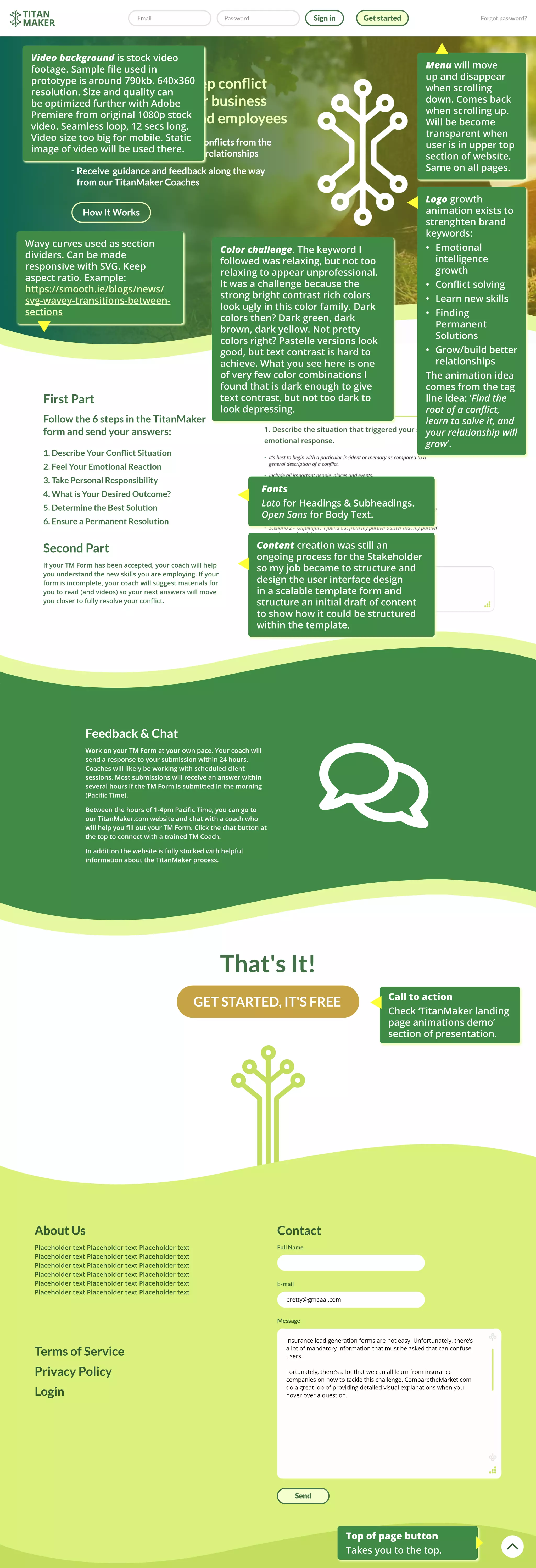
1. The menu bar will disappear and reappear when scrolling up and down pages, and become transparent at the top of pages.
2. Wavy curves can be used as section dividers and made responsive with SVG. Choosing colors was challenging to be relaxing but not too relaxing or dark.
3. A stock video background file is used but needs optimization for size and resolution, with a static image used for mobile.
4. An animation grows the logo to strengthen brand keywords about emotional intelligence and relationship skills.
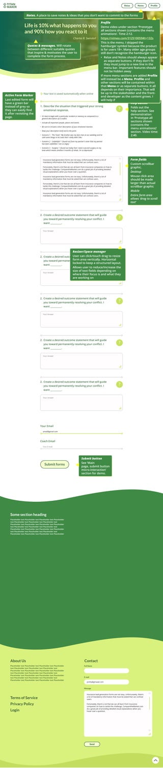
5. Buttons and interactions are described for top of page, help, active forms, and submitting. User res