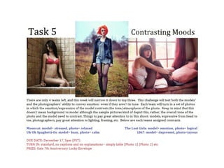
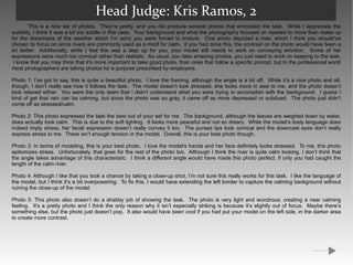
The document contains feedback from judges on photos submitted by two teams for a modeling competition task of depicting "stressed/calm". For Team 1, the judges praise Photo 1 for perfectly embodying the task through contrasting bright colors in the background and the model's depressed expression and body language. They note minor issues could be improved but overall it is nearly perfect. They provide additional feedback on technical and execution issues for each of the other photos. For Team 2, the judges note the photos were nice but did not fully accomplish depicting the task through contrast as the backgrounds did not clearly convey relaxation. They felt the model's expressions were too comical rather than realistic portrayals of stress. They provide feedback on each photo and how
This team submitted photos telling the story of a blind date. The head judge praised the clear progression of the timeline but felt the creativity and acting could have been stronger. The first photo showing a phone call was plain with poor lighting and a red tint on the model's face. Overall the quality was lower than usual, perhaps due to indoor lighting. The judge encouraged bringing more unique creativity combined with compositional skills.
The judge provides a lengthy critique of the model and photographer's preliminary photos submitted for a photography competition. Overall, the judge found the photos to be disappointing and not representative of the skills shown in the application. Specifically, the photos lacked context, had poorly chosen backgrounds, and failed to clearly convey the theme of controlling freedom. The model's strength is her expressive face, but it was not used effectively in the photos. Improvements are needed in composition, lighting, emotion, and portraying the assigned concepts.
Excellent: Lighting, Composition, and Thematic Expression
Needs Minor Work: Some Photos Overexposed
Overall: Photos Display Professional Quality and Storytelling Ability
This team portrayed the Spanish Flag Vine in their photos. Their photos showed the vibrant colors of the plant through creative poses and locations. The judge praised their improvement, variety of shots, and incorporation of the plant's traits. Some photos could be improved by better lighting or clearer connection to the plant. Overall, the judge was impressed by their risk-taking and consideration of the plant's description.
This document provides details on 10 photographs selected for a photography project. It describes the subject, theme, and reasoning for selecting each image. Various techniques used to capture the images are also discussed, including positioning subjects, manual focusing, shutter speed, ISO settings, and use of lighting. The selected images feature the photographer's friend Jacques Laycock, sometimes along with another subject, in a variety of outdoor locations and scenes relating to music style. Reasons for selecting the images emphasized capturing moments, incorporating relevant elements like season and graffiti, and showing variation across the final selection.
Task 4 Final Images Portrait Review Work Sheetryansharman
The document summarizes a photography student's selection of 10 images from a photo shoot. For each image, the student describes the theme, focus, and reasons for choosing it. They also discuss the techniques used to capture each photo and note strengths and areas for improvement. The editing process is then summarized, involving spot healing, applying black and white filters, and using burn and dodge tools to adjust tones. Capture logs list the consistent shutter speed, ISO and aperture settings used.
The document is a reflection by a student on their experimental photography project aimed at depicting human emotions. They intended to photograph six basic emotions but found it difficult to capture genuine expressions of emotions other than happiness. Their original photographs did not turn out as planned so they edited the images in Photoshop instead. They used layer effects like multiply and subtract to combine two photos, and changed one image to black and white with a hue blend to depict different emotions. While they were pleased with the effects, they acknowledge the photos of emotions looked fake and could have been improved with better lighting, makeup, and a more cooperative model.
The document summarizes several photography experiments conducted by Hayley Roberts exploring different techniques:
1. Out of focus photography using different aperture settings to intentionally blur subjects. The middle image used f/4.5 and avoided camera shake better than the top blurred image.
2. Capturing movement over longer exposures, including panning cars and zooming the lens. The bottom image effectively showed moving cars while keeping landscape in focus.
3. Reflections, with the bottom blue-tinted image most effectively showing a reflection without revealing what it depicted.
4. A Hockney photomontage experiment where individual photos were merged without blending to create a collage-like effect, though only two images
1) The document summarizes a fashion photoshoot contact sheet analysis where the photographer selected their best photos.
2) A variety of poses were captured including portraits, landscapes, and photos of models together. Lighting was adjusted throughout.
3) The photographer indicated successful and unsuccessful photos by using crosses and ticks. Photos were assessed based on lighting, posing, facial expressions, and outfit visibility.
4) The best photos were chosen to focus the magazine article and showcase outfits effectively. These photos will be enlarged and edited to be suitable for publication.
This document discusses and analyzes several photographs taken by renowned photographers such as Sarolta Ban, Steve McCurry, and Robert Capa. It examines each photo in terms of composition using the rule of thirds, lighting and use of shadows, focus and depth of field, cropping, narrative, and mise-en-scene. For each photo, it provides a technical breakdown and interpretation of the visual elements and intended narrative or message conveyed by the photographer.
The document discusses a photographer testing out different photography techniques using their sister as a model. They took sample photos against a cream wall with flash to better light the subject. The photographer found the bottom left photo looked better due to the lighting and angle. They also tried different editing techniques like 3D effects, overlapping photos with different blend modes, and positioning layers to better show emotions. However, the last set of photos were of poorer quality since the model was tired and distracted, so better conditions are needed for more successful photos.
The document summarizes four photo shoots taken by the author for their magazine. For each shoot, they chose young models around the same age as their target audience. They describe improvising shots without needed props. For editing, they used Photoshop to increase saturation and brightness, blur backgrounds, change colors, and remove backgrounds. Their goal was to prepare photos that fit their magazine's Christmas theme and genre of music charts.
The document discusses the student's photography project exploring different styles like street photography, architecture, and landscape photography. It includes contact sheets from two photo shoots, 8 final edited images with descriptions of the edits made, and an evaluation of the project covering composition, audience, technical qualities, influences, and skills learned. The student received mostly positive feedback and aims to focus more specifically on street photography for future work.
Hannah Mizen experimented with out-of-focus photography by taking photos of everyday items around her college with an out-of-focus effect. She found that some subjects like lights looked effective blurred while others did not, and that colors blending together worked well. Messing with aperture and shutter speed changed the sharpness of focus. She also experimented with movement photography using the zoom technique and capturing movement with a stationary camera, finding zoom worked better but was limited, while movement photos had more potential. In reflections photography, she found subtle reflections and experimented with lighting and depth of field but felt the subject matter of reflections was not very interesting.
The document discusses the selection and editing of photos for a fashion spread with the theme of "teens in childish situations." It describes five photos chosen for the spread, explaining why each photo fits the theme. It also summarizes the edits made to each photo, such as adjusting lighting, saturation, and applying selective sepia toning, to create visual cohesion across the images while maintaining the contrast between "cool" styling and childish settings.
Fashion contemporary photographers | Artist research & analysisHannahTapscott
The document summarizes the artist's analysis of several photographers' works that inspire the document author's own photography project. It examines key elements of compositions like use of light, rule of thirds, negative space. It also considers the initial ideas, thoughts processes behind the photos, how focus and perspective are used. The analyses provide guidance and ideas for the document author's simple self-portrait style and use of patterns/textures.
This document analyzes and summarizes a fashion photography shoot. It notes that the dark lighting in an old manor house gives a ghostly, historic feel while still showing modern fashion. It highlights how the lighting from a large off-camera window focuses on the model and fashion against the historic backdrop. The document expresses a desire to replicate this dramatic lighting effect and take inspiration from the elegant, secretive style.
Task 1 work sheet 2 dimitris theocharis (done)shaunaeleacy
The document analyzes six photographs taken by photographer Dimitris Theocharis for various advertising and magazine campaigns. For each photo, it describes the theme, composition, techniques used, and strengths and weaknesses. The photos were taken in a studio setting and feature models promoting products or styled for fashion magazines. They utilize black and white editing and lighting to draw attention to the subjects and fit the mood of the campaigns.
The document summarizes photography experiments the author conducted using different techniques: out of focus, movement, photomontage, and reflections. For the out of focus technique, the author found blurrier images looked better in brighter areas. They produced abstract images blending colors. For movement, they captured legs in motion using long exposures and camera movement. Their reflection images featured multiple mirrored views and colorful reflections that transformed ordinary subjects.
The document discusses test photographs taken of the author's sister to practice photography techniques. It analyzes several photographs with different lighting, angles, and facial expressions. The author experiments with editing the photographs using layer blending, 3D effects, and overlapping multiple photos to depict different emotions. The goal is to learn techniques that can make emotions appear more natural and faces stand out against backgrounds for the author's real photography project.
This document discusses various types of photography and their applications. Advertising and promotional photography aim to sell products by portraying them in a controlled, appealing light. Fashion photography uses models and lighting to make clothes look desirable. Medical photography accurately documents diseases and procedures. Fine art photography expresses the artist's vision and emotions through various subjects like landscapes and portraits. Illustrative photography provides clear visuals to accompany informational texts. Overall, the different applications of photography require tailored techniques for lighting, composition and post-production to suit each purpose.
This document contains summaries of edits made to photographs from Paige Ward's Alice in Wonderland horror-themed photoshoot. In 3 sentences:
The document outlines various edits made to the photos, including changing them to black and white, adding filters, and adjusting brightness and contrast. Specific edits are described like adding a blue or purple tint, blurring backgrounds, and using selection tools to isolate parts of photos. The goal of the edits was to give the photos a horror or fantasy look to match the theme of the photoshoot.
This document discusses various types of photography and their applications. Advertising and promotional photography aim to sell products by portraying them in a controlled, appealing light. Fashion photography uses slim models photographed with artificial lighting and post-production editing to make clothing look desirable. Documentary photography captures real situations without control, like images from war zones. Medical photography accurately records diseases and operations without editing. Fine art photography freely expresses the artist's vision through various subjects and editing styles.
This document contains 6 analyses of photographs taken by the author. Each analysis discusses elements of the photo such as lines, shapes, color, lighting, balance of light and dark, and what meaning or story the photo could represent. Suggestions are made for how to improve certain photos such as changing the lighting, angle, or focus to make different elements like the background or subject stand out more clearly.
The document discusses four fashion photography pictures taken by the author. For each picture, they describe the outfit, pose, and editing choices made to portray different themes - a spring look with an umbrella, a summer evening dress, a black evening dress focused on the outfit details, and a winter look with coat, hat and scarf. The author aims to showcase different seasons and times of day through styling while also experimenting with lighting, backgrounds, and post-processing techniques like adjusting brightness, contrast and colors.
Photography is used for various applications including advertising, promotion, fashion, portraiture, journalism, fine art, and medical documentation. Different types of photography have distinct purposes, techniques, and post-production processes. The document provides examples of different photographic applications and discusses the objectives, methods, equipment, lighting, and editing involved in each type of photography.
This document discusses different types of photography and their applications. Advertising and promotional photography aim to sell products by portraying them in a controlled, appealing light. Fashion photography uses slim models and lighting/editing to make clothing look desirable. Documentary photography captures real situations without control, like war photos. Portraiture involves posing subjects and lighting faces. High street studios take posed family photos in studios. Architecture photography varies in style from artistic to real estate. Illustrative photos accompany information. Medical photography accurately records diseases. Fine art explores various subjects through the artist's vision.
This team submitted photos for the task of portraying Proposition 8 in California, which defined marriage as only between a man and a woman. The judges praised the team for having a personal connection to the topic and for progressing with their skills. While the photos were not the most provocative, they did a good job of expressing their message. The first photo subtly portrayed feelings of being ostracized through text and bonds, but could have shown more emotion from the model. The second photo effectively used blurred focus on the model's face and hands to draw attention, though the model's slight smile was inappropriate for the theme. Overall the judges felt the photos clearly portrayed the topic without major technical flaws.
This team captured the energy of a hurricane well through the model's body language, but photo quality decreased from blurriness. The first photo was praised for crispness and the model's fierce expression. Later photos had issues like blurred backgrounds, awkward poses cutting off limbs, and deformed appearances. Overall, the team embodied a hurricane through movement but needs to improve technical aspects like contrast and sharpness to match the portrayed ferocity. Location choice did not fully represent a hurricane either.
The document analyzes 11 pictures taken for the front cover of a project on hip hop artists. None were deemed suitable for the main cover image due to issues like blurriness, lighting, poses, or props not being clear enough. Though some captured the intended mood using a male model with stereotypical hip hop props like chains and hats, the desired close-up shot could not be achieved at a high enough quality. In conclusion, while the model and props were appropriate, the photographer was unable to capture a clear main image meeting their vision for the cover.
The document analyzes 11 pictures taken for the front cover of a project on hip hop artists. None were deemed suitable for the main cover image due to issues like blurriness, lighting, poses, or props not being clear enough. Though some captured the intended mood using a male model with stereotypical hip hop props like chains and hats, the best photo was still not close enough or clear enough to stand out as the main focal point. Going forward, the photographer aims to get a better close-up shot where props are more distinctly visible.
The document discusses a photographer testing out different photography techniques using their sister as a model. They took sample photos against a cream wall with flash to better light the subject. The photographer experimented with different lighting, angles, and facial expressions to improve the shots. Various editing techniques were then tested on the photos, including layer blending for 3D effects, overlapping images to show different emotions, and adjusting colors and opacity. While the sample photos helped test techniques, the photographer realized the shots did not capture genuine emotions and were of poorer quality than other photos due to distractions during the shoot.
The student conducted an experimental photography project aimed at capturing human emotions. They took photos of a model attempting to display emotions like happiness, sadness, fear and anger, but found the expressions looked fake. They then experimented with editing the photos in Photoshop, applying effects like changing layers to multiply or subtract and adjusting opacity. This allowed them to highlight certain features or add color. The final images combined two or four photos with 3D blending effects to show differences in emotion. While the photos did not turn out as hoped due to the model's limited emotional range, the editing effects produced interesting results.
The document discusses four documentary photographs taken by different photographers and analyzed by the author. For a photography assignment, the author conducted two photo shoots in Cheltenham capturing people unaware. Several photos from each shoot were selected, cropped, desaturated and adjusted for lighting and contrast. Three photos from each shoot were chosen as finals based on compositions and expressions captured. The author's style is compared to photographer Dominic Bracco II.
This document discusses several photographs by different artists. It analyzes Juan Felipe Rubio's photos of couples showing love and intimacy through bright colors. It also examines David Hilliard's gloomy photo "In Pursuit of Other Things" with dark tones. Additionally, it looks at David Hilliard's mysterious photo "Ponchos" of hooded figures in a forest, and David Hockney's abstract portrait of Henry Moore made of multiple angled shots.
This document discusses and analyzes several photographs by different artists. It examines Juan Felipe Rubio's photos depicting couples and their use of bright colors to convey positivity. It also analyzes David Hilliard's photo "In Pursuit of Other Things" and its dark, gloomy tones. Lee Summers' "Portrait Triptych Series" is discussed for its mysterious atmosphere created through repetitive poses.
This document discusses several photographs by different artists. It analyzes Juan Felipe Rubio's photos of couples showing love and intimacy through bright colors. It also examines David Hilliard's gloomy photo "In Pursuit of Other Things" with dark tones. Additionally, it looks at David Hilliard's mysterious photo "Ponchos" of hooded figures in a forest, and David Hockney's abstract portrait of Henry Moore made up of 24 sections.
Teddy Smith conducted a photo shoot for a Kpop magazine. The equipment used included a green screen, photography camera, studio lights and umbrellas, and a chair. Risks of the shoot included tripping over wires and getting burned by the hot lamps. Several test photos were taken of the model in different poses and lighting. Some photos were blurry or didn't fit the desired mysterious aesthetic. However, others showed the model's eye or with her hand covering her mouth, portraying her as shy but confident. These photos were edited and incorporated into the magazine design. Through this project, Teddy Smith learned photography skills and how to select the best images to represent their magazine concept.
Portrait task 4 final images review work sheet (1)HaiiEmmaa
This document contains Emma Upton's selection of final images and review for a photography assignment. It includes 10 images of a rock band with descriptions of each image focusing on the subjects and composition. It also discusses the techniques used - such as manual mode, ISO, shutter speed and aperture. Strengths and areas for improvement are provided for each image. Minimal editing was done and capture logs are included. The goal was to produce images representative of a rock band that could appear in a music magazine.
- The document describes the process of editing photos for a fashion magazine portrait shoot. It discusses selecting 4 photos, editing them on Photoshop, and preparing them for use on the magazine cover and interior pages.
- Edits included adjusting brightness, tones, colors, cropping photos and cloning out reflections. The goal was to prepare high quality, cohesive images that told the story of the fashion magazine.
The document discusses an experimental photography project exploring multiple exposure techniques. The photographer created two images by overlaying a photo of trees onto portraits of a model. They preferred the first image in color over monochrome as the varied patterns and colors were more vibrant. They felt the second image with a pure white background was more successful than the first with patches of the overlay in assessing the qualities and evaluating opportunities for developing the techniques further.
Photography is a passion of mine and I would like to pursue it further. I have two years experience in photography college where I learned various techniques like street, architecture, and portraiture photography. I enjoyed working in the darkroom developing photos. I am skilled with camera settings, studio lighting, and Photoshop. This course would help expand my skills and understanding of photography and editing. In the future, I am interested in event, portraiture, commercial, or medical photography or pursuing university/apprenticeships.
This document provides information about various photography specialisms and the key characteristics and skills required for each. It discusses specialisms such as architecture, sport, social photography, travel, advertising, fashion, commercial, industrial, documentary, contemporary practice, reportage, portraiture, fine art, and historical photography. For each specialism, examples of prominent photographers in that field are given along with the traits that have made them successful. The document also provides guidance on lighting, equipment, locations, communication skills, creativity, and other factors that photographers need depending on their specialism.
The document discusses the selection and annotation of photos taken for a music magazine project. The photographer provides reasoning for including and excluding various photos of bands and musicians. Photos were chosen or rejected based on lighting, composition, posing of subjects, background settings, and how well they represented the music genres. The ideal photos captured the essence of the musicians, had striking lighting and angles, and would catch readers' attention on the magazine pages.
The document provides details on a photography student's selection of final images and review for an assignment on photography and photographic practice. It includes 10 images taken of band members in various poses and locations. For each image, the student explains their theme, goals, and strengths and improvements. The student aimed to capture poses and styles typical of indie rock band magazine covers. They worked to direct the viewer's gaze and used lighting, angles, and post-processing techniques like adding selective color. Overall, the student demonstrated an understanding of compositional techniques and sought to convey different emotions and perspectives through their shots.
The document discusses photographs the author took to use for the front cover of their music magazine. Photograph 6 was ultimately selected as it fits the folk/acoustic genre of the magazine, features a subject with a powerful yet relaxed pose, and has a natural background that conveys the magazine's theme while avoiding distracting elements seen in other photos.
The document summarizes the process of creating a magazine front cover for a band photoshoot. It describes taking initial test shots to capture the band's fun personality, then refining the layout and backgrounds to make the images more professional. The final cover features the band on a yellow background with a skyline, using a decaying font style and bold text to match the rock music genre.
3. Head Judge: Kris Ramos, 1 The judges unanimously voted your team first this week, and I’ve got to say, you really deserved it. You were the only team that I felt actually managed to embody the task. Granted, it was a really difficult task and I need to find a way to modify it in the future, but your team actually represented your assignment pretty well. A couple of your photos actually hit the task on the head. In general, I found that your photography was what made your photos great this week, although your model did a decent job as well. As a whole, your photos are great, you just need to pay attention to the details and fix up all the small things that need improving. Your biggest asset is that you keep listening and you keep improving, just keep it up. Photo 1: When it comes to following the task, this photo is the best of all we received this task. The model is obviously depressed, while the entire photo, not just the background, is joyous. This is due to the numerous bright and happy colors. I love the setting you chose; it’s incredibly beautiful. The framing of the model against the landscape is just right, so major props to the photographer here. The model embodied her emotion perfectly through both body language and facial expression. Honestly, this is a pretty damn near perfect photo. My only suggestions, and this is really nitpicking here, are that the saturation is just a bit too high and the cropping on the left side should be a bit more in so that the disconnected leaves are cut off and the framing is a bit more crisp. Otherwise, great job with this photo. Photo 2: Although a bit confusing, this photo is quite cool. The setting is wonderful although I wish that the large rock hadn’t been cut. The framing is also nice on this photo, although I wish it had been zoomed out a bit to really get the framing of the rocks. The model looks a bit more confused rather than depressed and I’ve got to wonder why she’s upset about the orange juice. She definitely looks more angry and frustrated than depressed, although her body language is still good for depressed. Not to mention, why is she wearing fairy wings? The photo is quirky, but a bit too much so. The lighting is phenomenal, however. It’s a great photo, it just doesn’t follow the task as well as some of your other photos. Photo 3: At first, I really didn’t get this photo whatsoever. I was like, “this is joyous at all.” However, I eventually began to see what you were going for. The reflection off the glass is really quite beautiful, colorful, and joyous. Even serene in a way. I definitely like the change in lighting from where the building is and the model. The happy light is on the colorful building while the model is in darkness. Well done, and great attention to detail. I just wish the building area had been more lit up, because unfortunately it’s a bit too dull for viewers to see joyous right off the bat. The model does look quite distraught. However, this is one of the mistakes in this photograph. There is a very big difference between depressed and distraught. One of the keys to this task was to realize the subtlety of emotion, or in other words, what makes a certain emotion different or unique compared to others. I think you understood this in most of your photos, but not all of them. Photo 4: As far as photos go, this is by far my favorite. I love the reflection of the tree and I must say, your photographer is definitely growing in skill throughout this competition. I do have a couple suggestions to further your improvement though. While use of the 2/3rds rule does create nice framing, it’s still good to deviate and find other ways to create a clean photo. Try switching it up a bit. Also, I haven’t really looked in your other photos so I don’t know if this is a trend, but the horizon line isn’t straight in this photo evident by the top of the curtain. It may seem picky, but all this stuff, when perfected, really does add up to a better photograph. I like the subtlety of the model’s expression and body language, although again, I’m not sure if it really says depressed. The photo is also a bit dark and that takes away from it looking as joyous as it should. This is a really beautiful photo though, great job.
4. Photo 5: I really love the idea behind this photo. Although I do find the whole consumeristic angle of this photo depressing, the holidays is more often associated with joy and everyone feeling happy. The lighting of this photo in general definitely makes it seem more joyous. I love the tunnel effect of this photo, especially with the three wreathes going all the way down the hall. The cropping is off however, as the side area on either side of the wreaths is different. I also wish that the model looked more depressed. She looks lost here, but not necessarily sad. I think this is one of those tasks and emotion where the model should be more animated. Great idea, okay execution. Photography Judge: Nick Sullivan, 1 Your photos really stood out in this task as the only ones really exhibiting your theme. The model is very obviously depressed, and the large contrast with her surroundings only helps to accentuate this. The third photo kind of seemed like it was just stuck in there, but the other four, especially number 4, definitely more than made up for it. Wonderful job! Photography Judge: Kaitlyn, 1 Photography Judge: Sandy, 1 Your first two photos are gorgeous and I loved that none of your photos are even closely like the others. However, I would reconsider the last photo because it's a bit out of focus and your model is not the first thing you look at. Modeling Judge: Cassandra, 1 I was extremely impressed with how this team executed the task; there was such obvious clashing in all the images and the model's poses and expressions were spot-on. I am highly pleased with how much the team stepped it up once again and am looking forward to what they can put out in the later rounds. I think the main thing that they just need to keep working on is making sure that all their poses are perfect and making sure that every image has just as much emotion as the next. These photos capture the task the best for me. That model is clearly depressed. The surroundings are clearly not. Very stark contrast, VERY well done. I love that this team also incorporated the holidays. Each photo is unique, yet all contribute to the theme. My only negative comment would have been to see the model standing at least once, if only to have the variation, but it really didn’t matter. She looked isolated and depressed. Exactly how she was supposed to. Not only were the back drops of the photos more cheerful, but the lighting was immaculate! Excellent work this week.
5. Modeling Judge: Shawn Keeney, 1 I was very impressed with this group for this task. The model is the only one I felt fully committed to the task this time. Her face read as depressed; her body read as depressed. She pulled off her feeling completely for me. As for technical modeling, very good as well; the only thing I noticed was in the final photo the knees are pointed directly at the camera and it makes her look a bit amputee-y, but other than that good job. For the overall photos, I feel like the first photo had the best contrasting location with the bue skies and green grass and such. At first I wasn't sure about the second picture because it seemed a little to dark to be joyous, but then I saw the Minute Maid and I thought it was genius. Top marks for me this week. Modeling Judge: Momo, 1 You guys have really clawed your way up to the top! Congrats on doing so well the past few rounds. You've really stepped up! For the first picture, I love the coloring in the photo. The background is all bright and happy-- joyous for sure! A mix of cool and warm colors along with a nice saturation really brings your eye to it. It looks like a lovely day. Then, your eye wanders to the model... grey, dark, crouched with a cig and looking depressed. The blanket really helped sell it-- when you're not feeling well it can be a comfort item for some. Her neck is there, her facial expression is miserable, and she's sitting on the corner alone, really looking depressed. The fact that she's curled up also helps show her discomfort. Second picture:The first thing that struck me was how beautiful the colors and scene was here. Stunning. The second thing I noticed was the red picnic blanket and the really sad looking girl on top of it. When I saw this, I honestly went, "Oh...." because she looks so terribly sad! I felt bad for her! She looks like she had a teaparty set up and no one came. This is my favorite picture out of the set, tied with the last one. I don't understand the wings, but I think I do, all at the same time-- it leaves me to believe she's trying to escape reality by going back to her childhood. I really just love this picture. It feels like someone could write a story to it. Her neck is missing, but in this position there's not much you can do about it-- and her whole jawline is visible which is WONDERFUL and hard to do in shadowed areas like this. The way she's sort of picking at the orange juice even adds a bit-- something someone does when they're not trying to focus (on the fact that no one's there). I really want to give her a hug in this picture and tell her to enjoy the scenery! While the background may not shout joyous, it's certainly beautiful and to me, beauty can equal joy or at least tranquility. The third picture was OK for me. I wasn't sure if she was at school or a church, or a library-- for me, I pretended it was a church, because for some church can be a very joyous place. Once again, the model looks terribly sad and distraught, even as far as a bit of color to her cheeks and nose as if she's been crying. The hunched back helps bring the 'uncomfortable' factor into play. The last picture was tied for my favorites out of this set because of the overwhelming contrast. You really hit the theme here. A pretty Christmas tree with presents-- what's a more joyful holiday than Christmas? Yet here's your model, alone, on the floor, clutching the present like it's the only thing she has left in this world. The face is more of a melancholy than outright depression, but still. All in all, you caught the theme pretty well in my opinion with different, interesting locations and photos.
7. Head Judge: Kris Ramos, 2 This is a nice set of photos. They’re pretty, and you did produce several photos that embodied the task. While I appreciate the subtlety, I think it was a bit too subtle in this case. Your background and what the photography focused on needed to more than make up for the dreariness of the weather which I’m sorry you were forced to endure. One photo depicted a river, which I think you should’ve chosen to focus on since rivers are commonly used as a motif for calm. If you had done this, the contrast on the photo would have been a lot better. Additionally, while I feel this was a step up for you, your model still needs to work on conveying emotion. Some of her expressions were much too comical rather than realistic. As usual, you take amazing photos, you just need to work on keeping to the task. I know that you may think that it’s more important to take good photo, than ones that follow a specific prompt, but in the professional world most photographers are taking photos for a purpose prescribed by employers. Photo 1: I’ve got to say, this is quite a beautiful photo. I love the framing, although the angle is a bit off. While it’s a nice photo and all, though, I don’t really see how it follows the task. The model doesn’t look stressed, she looks more in awe to me, and the photo doesn’t look relaxed either. You were the only team that I didn’t understand what you were trying to accomplish with the background. I guess I kind of get that rain can be calming, but since the photo was so gray, it came off as more depressed or subdued. The photo just didn’t come off as stressed/calm. Photo 2: This photo expressed the task the best out of your set for me. The background, although the leaves are weighed down by water, does actually look calm. This is due to the soft lighting. It looks more peaceful and not so dreary. While the model’s body language does indeed imply stress, her facial expression doesn’t really convey it too. The pursed lips look comical and the downcast eyes don’t really express stress to me. There isn’t enough tension in the model. Overall, this is your best photo though. Photo 3: In terms of modeling, this is your best photo. I love the model’s hands and her face definitely looks stressed. To me, this photo epitomizes stress. Unfortunately, that goes for the rest of the photo too. Although I think the river is quite calm looking, I don’t think that the angle takes advantage of this characteristic. I think a different angle would have made this photo perfect, if only you had caught the length of the calm river. Photo 4: Although I like that you took a chance by taking a close-up shot, I’m not sure this really works for this task. I like the language of the model, but I think it’s a bit overpowering. To fix this, I would have extending the left border to capture the calming background without ruining the close-up of the model. Photo 5: This photo also doesn’t do a shabby job of showing the task. The photo is very light and wondrous; creating a near calming feeling. It’s a pretty photo and I think the only reason why it isn’t especially striking is because it’s slightly out of focus. Maybe there’s something else, but the photo just doesn’t pop. It also would have been cool if you had put your model on the left side, in the darker area to create more contrast.
8. Photography Judge: Nick Sullivan, 2 While your model seemed very stressed, so did the photos as a whole. Your photos were nice, but the style seemed to make the photos more stressed and less relaxed. Other than that, your photos were rather good, as we've come to expect. Well done. Photography Judge: Kaitlyn, 3 Photography Judge: Sandy, 3 Your photos are beautifully lit however I would omit the 4th photo as it does not fit with the others. I would also use a tighter frame on the first third and last photo. Modeling Judge: Cassandra, 2 This team did a great job and I was pleased with the photos. The poses were nicely executed and the way they went about capturing the theme was clever I did feel however that there really wasn't too much of a clash but it was still there, I just would've liked a bit more. Another thing that I found to be an issue is that the model seemed to be leaning towards the same pose for most of the pictures making it seem more like just one image taken at different angles. I can definitely tell the model in these photos is stressed. I would be too if I was caught in the rain in that pretty dress! However…I can’t say I approve of the choice of location. I think it takes away from, rather than adding to it. I don’t think “relaxed” or “relaxing” when I see that rain-drenched wood. I think depressed or haggard. Those emotions go with being stressed as opposed to aiding it. That was the only thing separating you from the other teams, and the only reason I ranked you last. These photos are, as usual, flawless. The other two teams just did the task a little better. Modeling Judge: Shawn Keeney, 2 For the first time, I honestly don't care for the set they turned in. It is only in the final photo that I get a feeling of stress from the model. The others just look frightened. The photos are not really bad (except for photo three where the face goes from ugly-pretty to ugly-ugly) but they just haven't fulfilled the task given to them. You can write the best paper in the world, but if you don't address the prompt, you're still going to fail. However, I feel that the work they've done in the past is more than enough to put them into the final two; I'm not about condemning someone for one off task.
9. Modeling Judge: Momo, 2 I loved the softness to some of the photos. It was a nice, relaxing touch. On the first picture, I didn't get too much of a "stress" feeling from the model. The wardrobe was well done-- a dark, sort of 'gothic lolita' feel doesn't make one appear calm or relaxed. The model has sort of a wondrous look on her face rather than a stressed one. The body language would have fit a bit better if she had her head curved down, or perhaps a disappointed look on her face. The scene does look nice and calm, though, I would simply love to walk down there when it's raining lightly like that. In the second picture, the stress is very apparent while the 'calm' isn't quite as prevalent.. though it IS there. The clenched hands through the hair is a very, very obvious sign of stress, and the model's eyes are casted down (a sign of not being comfortable, which is linked to stress). The background is soft, and the light is heavenly. The third picture is a better mix of the two. The model is clearly showing stress-- the clawed hands, angry face, and tilted up head as if asking, "why me?". The calm is there as well, though it is rather cloudy and dreary looking-- I'm aware there's not much you can do in this weather, but perhaps you should have attempted an indoor shoot. I like the fourth picture the best, but I feel it doesn't quite follow the theme exactly. The closeup is wonderful to show the stress of the picture-- the tendons sticking out, the look on her face, her messy hair-- however, you lose a lot of the 'calm' here. It's barely peeking through in the background, shown only by a few bare branches and a leaf. It's there but hiding. I feel a closeup wasn't the best idea for the contrasting theme, though it is a nice picture. The fifth picture, once again, the location just doesn't quite chalk up to me. The model has stress down fine, but the location just looks dreary to me, not calm. I feel an indoor location could have gotten you better results. Rain can be calming but often it makes things look dreary. The first picture would have been wonderful if the model had a better expression-- that was the way to show the rain. The bare trees and cloudy sky just made the pictures look a little too.. scrubby for my tastes, but overall, good photos!
11. Head Judge: Kris Ramos, 3 I’m happy to see that you guys are still improving, however, I’d like to see you guys push even harder. I very much liked the subdued but still interesting photoshopping this week. You found a way to make it add rather than detract from the photos. I also enjoyed the brightness and location of your shoot. Both created a very calming effect on your photos. Since your background and lighting was so effective in making the photo represent the calm emotion though, your model really needed to go all out to convey her “business.” Unfortunately, your model didn’t do that. Neither her body language or facial expression conveyed “busy” very well. Additionally, what turned me off to your photos the most, was that your photos (aside from the last one) were a bit too similar, especially two of them (1, 4) in which the model is in the exact same position and the photo is taken from the exact same angle. You need to vary up your photos more. As is though, just keep on improving. Photo 1: When it comes exclusively to task interpretation, this is probably your best photo. I like how she’s not just on her laptop, but her hand is moving and her mouth is moving as she talks to someone on the phone. Multitasking generally implies being quite busy, so props there. The greenery is calming, however, I don’t know how calming the concrete lot behind the model is. While I actually really like the photoshopping in this photograph, I don’t think this photo is that interesting. It represents the task alright but simply doesn’t stand alone as a photograph. Photo 2: As far as a stand alone photograph goes, this one is my favorite. The model’s stare is compelling and the stark contrast between the model’s neutral colored clothing and the bright green background is nice. However, the model doesn’t actually look that busy, rather she looks kinda confused or lost. It’s a pretty photo though. Photo 3: This is probably my least favorite photo of the set. The location is pretty and does have a somewhat calming effect, however, your model simply doesn’t look busy at all. Props do not make a photo or create the emotion in a photo and I think this is something you need to work on. Nothing from the model’s expression to her body language looks busy. She actually looks quite laidback and relaxed. The background really overpowers the model in this photo. Photo 4: Again, I really love the background here. It’s both beautiful and calming as is the entire photo in general. While I suppose this is a good thing, the model just doesn’t seem busy to me. Just being on a laptop doesn’t make someone busy. There are a ton of things that you can do on a laptop that are quite...calm. This photo is pretty, but I don’t think the model is embodying the emotion she is supposed to. Photo 5: I’ve got to admit, this is a cool looking photo. I love the screened effect and the light and dark contrast looks especially cool. It makes me consider a new part of next season in which I may ask for an additional sixth photo for each task that is simply, an example of a really great photo that doesn’t necessarily follow the task. Anyway, while this is a very cool photo, it doesn’t really follow the task at all. Make sure you don’t jeopardize the task just to turn in a cool looking photo. Both panels judge strongly on whether or not you follow the task, so make sure to adhere to it.
12. Photography Judge: Nick Sullivan, 3 Your model doesn't really expressed 'busy'. Just because she's on her phone doesn't mean she's really busy. The scenery seemed slightly calm, but not enough to offset the lack of busy in the model. I liked the composition and style of the photos, but I think they could have followed the task a bit more. Photography Judge: Kaitlyn, 2 Photography Judge: Sandy, 2 I am so proud of you guys these photos are your best work yet. However, I don't think that your 2nd and 3rd photo was good enough to be submitted. All of the photos were beautifully lit but some needed a tighter frame. The first photo also looks a bit out of focus. Congrats on this weeks improvement! Modeling Judge: Cassandra, 3 Overall this team did a fairly nice job with both modeling and capturing the essence of the task. It was very clear in most of the images that the model was distracted by a lot going on with her job while the calmness of her surroundings contradicted the photo nicely. I did feel though that the model didn't do as great a job expressing emotions as she is capable of and some images didn't quite capture the "busy" aspect. This is your best work yet! You keep improving and keep improving and I’m so blown away. Beautiful use of lighting, color, and wardrobe. Soft lighting always relaxes a photo, and you chose stark colors to put on your model, which definitely makes her look more rigid. The locations are all a little similar, but otherwise fantastic work! Modeling Judge: Shawn Keeney, 3 I think this is it for me, for this team. Again, I didn't see busy in any of these pictures...I actually didn't really see much of any emotion from the model in these pictures. Her face is practically the same in every picture. I don't see how using a laptop implies being busy. Also, the third picture actually fits with the calm theme more than anything because the face looks very somber, more relaxed. In a task that requires such facial animation, they fell significantly short of the mark for me.
13. Modeling Judge: Momo, 3 The only real reason you guys ranked third for me is because the other two were amazing; this was actually, in my opinion, your best work so far! Great job on portrayal of the theme. My main critique on the modeling of these photos would be; that turtleneck. I realize it looks business-y, but I really wish you would have chosen one with a bit more slouch to it, to show her neck more, or have pulled her hair back like you had it in the first photo the whole time. Her neck is gone in all of the pictures, leaving not too pretty of a result. Also, I would have recommended to have the model sharper than the rest of the picture; the picture is very calm with the nice blur, but she seems to be blending in a bit too much with it. A soft eraser, slightly transparent would have sharpened her up a bit and brought her into focus while leaving the rest of the photo smooth. In the first picture, the turtleneck comes into play-- if she had something else on, this would have been fine. However, you get a bit of a head-on-shoulders syndrome here, where she seems to have absolutely no neck. It's simply not flattering. I do like how her mouth is mid-speech, and her hand on the laptop is kind of... I don't know how to describe it, but when I'm feeling busy/overworked, I tend to flail when I'm talking to people, and she looks like she's about to give up with whomever's on the line. The second picture, her hair is covering her shoulders, leaving them to look awfully broad, and her head is floating! I feel the cellphone is hiding a bit; it almost looks as if she's just pondering the weather. The third picture; once again-- no neck!! This time her hair's covering it. The fourth and fifth pictures are my favorites. Fourth: Biting her lip-- that's one thing I always do when I concentrate, it makes her look like she's working hard! I can almost forgive the no-neck here because the hair reveals all of her jawline and almost...traces it. This is a really calm looking picture, and she's just sitting there, busy as a bee. Fifth: I almost, almost don't like how she has no shape due to the coat, but at the same time.. It makes it look realistic. She's defined the one part of her waist with her hand, which helps out the silhouette nicely. I think what's making it work for me is the loose on top-- the coat, and the tight, well-defined legs on the bottom. It's a nice contrast and you can see she definitely has a figure. She almost looks thrown into the picture-- the colors (in the other pictures, as well) are warm and calming, and she's there, all blue-ish grey and shadowed. Job well done! The theme was definitely captured here.