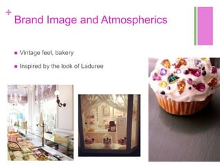
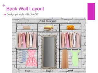
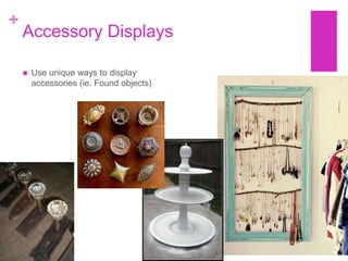
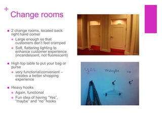
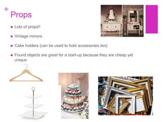
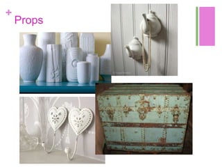
+


    Sweet Nothing‟s

    Sarah Fedy, Julie Forbes, Natalie Jamieson,
    Amy McIntosh, Charlotte Snow
+
    Store Name and Reason
     Sweet     Nothings:
        The name is fun, flirty and
         goes with our store brand
         image
        The name can be used to
         incorporate in-store
         promotions and marketing
         because it lends well to a
         girly, Pinterest-baker inspired
         environment
        Our name will resonate with
         our target customer because
         it fits with their fun lifestyle
+
    Logo
+


    Target Customer
    Meet   Claire
+
    Who is Claire?

       Claire is 25                                 Claire stays active by going to the
                                                      gym with her roommate where
       She lives with a roommate on King             she takes part in various exercise
        West and works full time at an ad
        agency                                        classes like step and Zumba

       She is very creative and loves to visit      Claire has three other siblings
        the St. Lawrence market on the                and loves to visit her family at
        weekend                                       home in Stratford
       Staying healthy is very important to
        Claire- she enjoys to cook balanced          Claire is a savvy shopper and
        meals using fresh food she has                loves to stay on trend- her extra
        purchased at the market                       disposable income is spent on
                                                      updating her wardrobe with
       However- Claire loves to splurge on           stylish, cute pieces that
        delicious lattes and freshly baked
        goods from local coffee shops in the          compliment her style
        area
+
    Ideal Outfit

       Ideal Outfit
           Cute dress
           Ballet flats
           Blazer
           Brightly coloured nails
           Stacked bangles
           Oversize sunglasses
+
    Merchandise Strategy

       Sweet Nothing‟s carries                  The quality is high depending on
        merchandise that gets updated             the item- the store does not carry
        according to regular fashion              luxury items however it does
        seasons                                   carry unique pieces
         Spring/Summer
         Fall/Winter
                                                 Sweet Nothing‟s has a mid to
                                                  high price point because they
         Seasonal                                support lesser known designers
                                                  that create unique pieces
       It carries various fashion brands
        and different designers                  Sweet Nothing‟s carries tops,
                                                  bottoms (small selection of
       The depth and breadth of the              denim) dresses, skirts, light outer
        collections are not wide or deep          ware, accessories, and some foot
        as the store is unique and there          ware
        are only a couple pieces from
        various collections in the store at      It would be classified as ladies
        once                                      casual wear
+
    Fashion Merchandising Strategy
+
+
+
    Brand Image and Atmospherics

       Vintage feel, bakery

       Inspired by the look of Laduree
+
    Inspiration: Laduree!
+
    Atmospherics

       The atmospherics elements are:
         Cupcake trays

         Glass display cases

         Hanging accessories on vintage knobs

         Exposed brick walls

         Designer books on shelves for inspiration

         Indie/pop music playing in the background

         Bright pastel coloured clothing and décor
+
+
    Exterior
       Vintage Bakery Feel

       Large exterior sign showing
        name of store “Sweet Nothings”

       Store sign incorporates
        cupcake theme with hanger to
        suggest that it is in fact a
        clothing store
+
    Exterior - Layout
+ Floor Plan


    For our store layout, we decided to place the cash register on the left side in the centre
     so individuals will walk throughout the whole store before coming around to the left side
     of the store.

    The fitting rooms were placed in the back right hand corner of the store as to keep the
     left back wall free for merchandise that will be able to be seen as soon as each
     individual enters the store and in their clear line of vision.

     This planogram features a free-flow layout as well as some aspects of open concept so
     that customers may move around the store freely and there is a good amount of space
     between adjacent fixtures and wall displays.
+
    Interior

       Square footage: 720 square         Small restrooms located at back of store -
        feet                                for employees only (upon customer
                                            request, exceptions might be made)
       Focal areas: Right wall, Back
        wall, Mannequins                   Small office/storage space at back of
                                            boutique.
       Atmospherics / ambience: soft          Features a desk, moveable wardrobe
        indie love songs, hint of               racks for extra clothing, room for boxes
        fragrance to simulate bakery            of new inventory when it comes in.
        feel                                   Features task lighting (overhead light
                                                and lamp on desk)

                                           Universal access – no stairs, change
                                            rooms large enough for wheelchairs

                                           Lots of props throughout store
+
    Point of Sale
        Point of sale: cash desk to be located
         on left hand side.

        Cash desk to look like a bakery display
         case, showcasing accessories and
         add-on sales.
            People are shopping less frequently,
             so it is more important than ever to
             have „add-on sales‟, which is why
             we want these items displayed in a
             fun way!

        Vintage Cash Register
+
    Wall Layouts
       The most prominent wall displays will be the front right interior wall as well as the
        back left wall

       For these walls, we decided to employ a formal balance with symmetrical
        layouts.

       The right wall is twelve feet in length in order to facilitate all the newest
        merchandise for our location.

       The back wall is nine feet in length to appeal to the customer‟s eye and create a
        dynamic display.

       Each wall focuses on tops over bottoms and keeps a 5-inch space between
        each line of merchandise. Also, the skirts and pants on the bottom will be hung
        three inches from the floor as to not ruin the bottoms of the merchandise.

       We have created these displays to be dynamic to the eye as well as paint our
        walls as a destination rather than something to pass-by.
+
    Right Wall Layout
   Design principle
    – BALANCE

   Recall Paco
    Underhill “why
    we buy” – found
    that customers
    always veer to
    the right side of
    the store upon
    entry, which is
    why the right
    wall will be a
    focal point
+
    Back Wall Layout
   Design principle - BALANCE
+
    Accessory Displays

       Use unique ways to display
        accessories (ie. Found objects)
+
    Change rooms
   2 change rooms, located back
    right hand corner
     Large enough so that
       customers don‟t feel cramped
     Soft, flattering lighting to
       enhance customer experience
       (incandescent, not fluorescent)

   High top table to put your bag or
    purse
     very functional/convenient –
      creates a better shopping
      experience

   Heavy hooks
     Again, functional
     Fun idea of having “Yes”,
      “maybe” and “no” hooks
Large vintage
    mirrors outside of
    change rooms


+
+
    Colours and Materials
       Main Colours : Pink, Off-White, Gold/Copper
           Pink is the most calming colours – represents romance,
            love, and gentle feelings
           Pink is also very fun and girly, which ties into the type of
            merchandise being sold

       Additional accent colours from a pastel palette
           Lavender Purples, Mint green, Soft yellow

       Luxurious materials - Chiffon, silk, lace, crochet, cashmere
           Textured materials can absorb and reflect light
           Also help tie-in store‟s brand image that likely resonates
            with the customer‟s style aesthetic
+
    Fixtures

    FLOOR FIXTURES

       2-way and 4-way racks

       Select furniture fixtures, such
        as café tables, to help tie in
        vintage bakery feel
+
    Fixtures
    WALL FIXTURES

       Recall, the Wall is the most important “fixture” in the store

       Can be used to highlight coordinated fashions and colour stories

       Will use wall standard system
           Is the most versatile and adaptable
           Also looks better/ties in better to store aesthetics than slatwall
            system or gridwall system

       Lighting – track lighting to be set up 6 to 8 ft from wall, running
        parallel to it
+
    Walls
+
    Merchandise Presentation

       In the presentation of our merchandise, we will use the design principles
        of balance (formal symmetry)

       Remember Judith Bell‟s 7 colour groups when creating colour stories in
        merchandise displays

       Fixtures of various heights (tables, hanging floor fixtures) ; these help
        guide the customer through the store

       Can use repetition to create sequential rhythm – eg. In store windows, on
        walls

       For walls, we will use the following guidelines:
           Coordinated tops with bottoms (will put tops over bottoms), pants to hang 3” from
            floor
           For waterfalls, straight face-outs, and hangrails with 5” of space between tops and
            bottoms
+
    Walls
+
    Lighting
       Recall, lighting of windows and store plays an important role
        in helping drive sales

       Lighting also contributes to overall atmosphere and feel of
        the store environment

       We want to have a light source with full colour spectrum
        wavelengths (no fluorescent lighting except within
        office/storage rooms)

       Primarily use incandescent lighting because it is good
        accent lighting for selling areas of stores and also good for
        fitting rooms

       Track Lighting LED or Halogen to highlight walls (placed 7ft
        away from wall)
         Yes, LED/Halogen are initially more expensive, but are
          more energy efficient, have longer lamp life, and produce
          a more precise light beam. They also emphasize texture
          and form better

       No coloured gels
+
    Lighting
       Additional decorative lighting:
           Unique vintage chandeliers for additional accent lighting and to tie in
            theme of store
           Drop down light bulbs
+
    Signs


   Consistent font for all signage:
    Snell Roundhand (identical to logo
    font)

   Only use signs that are
    NECESSARY (don‟t want to over-
    sign the store since this can be
    distracting and take away focus
    from the merchandise)
+
    Signs

   All signs in holders (otherwise looks
    unprofessional) – can use vintage gold
    frames to tie in with rest of store design

   Use creative and imaginative copy and
    always keep message on brand
       Ie. “Check out these sweet spring styles!”

   Can use literary techniques such as
    puns, alliteration, and rhyming words
    when writing copy for signs
+
    Signs
    Operational Signs

       Hanging “Open / Closed” sign

       Store hours – listed on front door in vinyl

       Return policies listed on standing sign at
        cash (in vintage frame)

       Location sign not required since there is
        only one location

       All signs to include store logo

       Cards at cash for customers to be able to
        take with them
+
    Signs
    Lifestyle graphics (photos/illustrations)

       Can be put into vintage frames and placed on
        shelves around the store

       Use a variety of real photos of outfits as well as
        more artistic fashion illustrations that fit with the
        theme of the store
+
    Signs
    Merchandise Signs

       Again, use same font for consistency

       Can be used around store to highlight
        certain collections and to promote new
        merchandise and new trends that are
        featured in-store
           Remember to use fun and creative
            copy!

       Can also highlight small sale section in
        the back right corner
+
    Windows
       Open back windows, because they allow customers to see
        additional merchandise within the store from outside

       Windows will typically be fashion oriented, containing the latest
        items that the store carries

       When possible, incorporates seasonal themes (eg. Winter
        holidays, Spring)

       Incorporate props that are aligned with the bakery theme when
        possible, BUT amek sure that the props don‟t overshadow the
        clothing on display

       Use cross lighting in windows (because it reduces harsh shadows)
+
    Windows
+
    Editorial Displays

       Main editorial display is within windows

       2 additional mannequins can be used to create small fully
        accessorized outfits

       This is a great place to be creative in our displays!!
           Always remain on brand
+
    Mannequins
       4 mannequins – 2 in window, 2
        within store with styled looks

       Supporting rob support because
        more stable and does not require
        the same level of skill as striking
        or wire rigging (also, striking and
        wire rigging should be used only
        for enclosed windows, and we
        have an open back window
        display)

       Patina V – “Downtown” collection
         Less costly than some other
          manufacturers
         Semi-realistic – requires less
          maintenance and don‟t need to
          change as often as realistic
          mannequins
+
    Mannequins


       4 mannequins – 2 in window, 2 within
        store with styled looks

       Supporting rob support because more
        stable and does not require the same
        level of skill as striking or wire rigging
        (also, striking and wire rigging should
        be used only for enclosed windows,
        and we have an open back window
        display)
+
    Mannequins
       Patina V – “Downtown” collection
           Less costly than some other manufacturers
           Semi-realistic – requires less maintenance and don‟t
            need to change as often as realistic mannequins
+
    Props
       Lots of props!!

       Vintage mirrors

       Cake holders (can be used to hold accessories too)

       Found objects are great for a start-up because they are cheap yet
        unique
+
    Props
+
    Props
+
    Employee Dress Code

       Fashionable, trendy

       Employees get 40% discount so
        can wear the clothing
+
    Social Media

            Twitter and Facebook                          Pinterest
       Our customer is always                 With photos, interesting ideas,
        involved with social media, so          and a chance to engage the
        interacting with these women in         customer, Sweet Nothing‟s can
        this particular way will ensure a       show it‟s personality through
        stronger relationship.                  Pinterest.
+
    Pinterest
+
    Thank You!

Sweet Nothing's Presentation

  • 1.
    + Sweet Nothing‟s Sarah Fedy, Julie Forbes, Natalie Jamieson, Amy McIntosh, Charlotte Snow
  • 2.
    + Store Name and Reason  Sweet Nothings:  The name is fun, flirty and goes with our store brand image  The name can be used to incorporate in-store promotions and marketing because it lends well to a girly, Pinterest-baker inspired environment  Our name will resonate with our target customer because it fits with their fun lifestyle
  • 3.
    + Logo
  • 4.
    + Target Customer Meet Claire
  • 5.
    + Who is Claire?  Claire is 25  Claire stays active by going to the gym with her roommate where  She lives with a roommate on King she takes part in various exercise West and works full time at an ad agency classes like step and Zumba  She is very creative and loves to visit  Claire has three other siblings the St. Lawrence market on the and loves to visit her family at weekend home in Stratford  Staying healthy is very important to Claire- she enjoys to cook balanced  Claire is a savvy shopper and meals using fresh food she has loves to stay on trend- her extra purchased at the market disposable income is spent on updating her wardrobe with  However- Claire loves to splurge on stylish, cute pieces that delicious lattes and freshly baked goods from local coffee shops in the compliment her style area
  • 6.
    + Ideal Outfit  Ideal Outfit  Cute dress  Ballet flats  Blazer  Brightly coloured nails  Stacked bangles  Oversize sunglasses
  • 7.
    + Merchandise Strategy  Sweet Nothing‟s carries  The quality is high depending on merchandise that gets updated the item- the store does not carry according to regular fashion luxury items however it does seasons carry unique pieces  Spring/Summer  Fall/Winter  Sweet Nothing‟s has a mid to high price point because they  Seasonal support lesser known designers that create unique pieces  It carries various fashion brands and different designers  Sweet Nothing‟s carries tops, bottoms (small selection of  The depth and breadth of the denim) dresses, skirts, light outer collections are not wide or deep ware, accessories, and some foot as the store is unique and there ware are only a couple pieces from various collections in the store at  It would be classified as ladies once casual wear
  • 8.
    + Fashion Merchandising Strategy
  • 9.
  • 10.
  • 11.
    + Brand Image and Atmospherics  Vintage feel, bakery  Inspired by the look of Laduree
  • 12.
    + Inspiration: Laduree!
  • 13.
    + Atmospherics  The atmospherics elements are:  Cupcake trays  Glass display cases  Hanging accessories on vintage knobs  Exposed brick walls  Designer books on shelves for inspiration  Indie/pop music playing in the background  Bright pastel coloured clothing and décor
  • 14.
  • 15.
    + Exterior  Vintage Bakery Feel  Large exterior sign showing name of store “Sweet Nothings”  Store sign incorporates cupcake theme with hanger to suggest that it is in fact a clothing store
  • 16.
    + Exterior - Layout
  • 17.
    + Floor Plan  For our store layout, we decided to place the cash register on the left side in the centre so individuals will walk throughout the whole store before coming around to the left side of the store.  The fitting rooms were placed in the back right hand corner of the store as to keep the left back wall free for merchandise that will be able to be seen as soon as each individual enters the store and in their clear line of vision.  This planogram features a free-flow layout as well as some aspects of open concept so that customers may move around the store freely and there is a good amount of space between adjacent fixtures and wall displays.
  • 18.
    + Interior  Square footage: 720 square  Small restrooms located at back of store - feet for employees only (upon customer request, exceptions might be made)  Focal areas: Right wall, Back wall, Mannequins  Small office/storage space at back of boutique.  Atmospherics / ambience: soft  Features a desk, moveable wardrobe indie love songs, hint of racks for extra clothing, room for boxes fragrance to simulate bakery of new inventory when it comes in. feel  Features task lighting (overhead light and lamp on desk)  Universal access – no stairs, change rooms large enough for wheelchairs  Lots of props throughout store
  • 19.
    + Point of Sale  Point of sale: cash desk to be located on left hand side.  Cash desk to look like a bakery display case, showcasing accessories and add-on sales.  People are shopping less frequently, so it is more important than ever to have „add-on sales‟, which is why we want these items displayed in a fun way!  Vintage Cash Register
  • 20.
    + Wall Layouts  The most prominent wall displays will be the front right interior wall as well as the back left wall  For these walls, we decided to employ a formal balance with symmetrical layouts.  The right wall is twelve feet in length in order to facilitate all the newest merchandise for our location.  The back wall is nine feet in length to appeal to the customer‟s eye and create a dynamic display.  Each wall focuses on tops over bottoms and keeps a 5-inch space between each line of merchandise. Also, the skirts and pants on the bottom will be hung three inches from the floor as to not ruin the bottoms of the merchandise.  We have created these displays to be dynamic to the eye as well as paint our walls as a destination rather than something to pass-by.
  • 21.
    + Right Wall Layout  Design principle – BALANCE  Recall Paco Underhill “why we buy” – found that customers always veer to the right side of the store upon entry, which is why the right wall will be a focal point
  • 22.
    + Back Wall Layout  Design principle - BALANCE
  • 23.
    + Accessory Displays  Use unique ways to display accessories (ie. Found objects)
  • 24.
    + Change rooms  2 change rooms, located back right hand corner  Large enough so that customers don‟t feel cramped  Soft, flattering lighting to enhance customer experience (incandescent, not fluorescent)  High top table to put your bag or purse  very functional/convenient – creates a better shopping experience  Heavy hooks  Again, functional  Fun idea of having “Yes”, “maybe” and “no” hooks
  • 25.
    Large vintage mirrors outside of change rooms +
  • 26.
    + Colours and Materials  Main Colours : Pink, Off-White, Gold/Copper  Pink is the most calming colours – represents romance, love, and gentle feelings  Pink is also very fun and girly, which ties into the type of merchandise being sold  Additional accent colours from a pastel palette  Lavender Purples, Mint green, Soft yellow  Luxurious materials - Chiffon, silk, lace, crochet, cashmere  Textured materials can absorb and reflect light  Also help tie-in store‟s brand image that likely resonates with the customer‟s style aesthetic
  • 27.
    + Fixtures FLOOR FIXTURES  2-way and 4-way racks  Select furniture fixtures, such as café tables, to help tie in vintage bakery feel
  • 28.
    + Fixtures WALL FIXTURES  Recall, the Wall is the most important “fixture” in the store  Can be used to highlight coordinated fashions and colour stories  Will use wall standard system  Is the most versatile and adaptable  Also looks better/ties in better to store aesthetics than slatwall system or gridwall system  Lighting – track lighting to be set up 6 to 8 ft from wall, running parallel to it
  • 29.
    + Walls
  • 30.
    + Merchandise Presentation  In the presentation of our merchandise, we will use the design principles of balance (formal symmetry)  Remember Judith Bell‟s 7 colour groups when creating colour stories in merchandise displays  Fixtures of various heights (tables, hanging floor fixtures) ; these help guide the customer through the store  Can use repetition to create sequential rhythm – eg. In store windows, on walls  For walls, we will use the following guidelines:  Coordinated tops with bottoms (will put tops over bottoms), pants to hang 3” from floor  For waterfalls, straight face-outs, and hangrails with 5” of space between tops and bottoms
  • 31.
    + Walls
  • 32.
    + Lighting  Recall, lighting of windows and store plays an important role in helping drive sales  Lighting also contributes to overall atmosphere and feel of the store environment  We want to have a light source with full colour spectrum wavelengths (no fluorescent lighting except within office/storage rooms)  Primarily use incandescent lighting because it is good accent lighting for selling areas of stores and also good for fitting rooms  Track Lighting LED or Halogen to highlight walls (placed 7ft away from wall)  Yes, LED/Halogen are initially more expensive, but are more energy efficient, have longer lamp life, and produce a more precise light beam. They also emphasize texture and form better  No coloured gels
  • 33.
    + Lighting  Additional decorative lighting:  Unique vintage chandeliers for additional accent lighting and to tie in theme of store  Drop down light bulbs
  • 34.
    + Signs  Consistent font for all signage: Snell Roundhand (identical to logo font)  Only use signs that are NECESSARY (don‟t want to over- sign the store since this can be distracting and take away focus from the merchandise)
  • 35.
    + Signs  All signs in holders (otherwise looks unprofessional) – can use vintage gold frames to tie in with rest of store design  Use creative and imaginative copy and always keep message on brand  Ie. “Check out these sweet spring styles!”  Can use literary techniques such as puns, alliteration, and rhyming words when writing copy for signs
  • 36.
    + Signs Operational Signs  Hanging “Open / Closed” sign  Store hours – listed on front door in vinyl  Return policies listed on standing sign at cash (in vintage frame)  Location sign not required since there is only one location  All signs to include store logo  Cards at cash for customers to be able to take with them
  • 37.
    + Signs Lifestyle graphics (photos/illustrations)  Can be put into vintage frames and placed on shelves around the store  Use a variety of real photos of outfits as well as more artistic fashion illustrations that fit with the theme of the store
  • 38.
    + Signs Merchandise Signs  Again, use same font for consistency  Can be used around store to highlight certain collections and to promote new merchandise and new trends that are featured in-store  Remember to use fun and creative copy!  Can also highlight small sale section in the back right corner
  • 39.
    + Windows  Open back windows, because they allow customers to see additional merchandise within the store from outside  Windows will typically be fashion oriented, containing the latest items that the store carries  When possible, incorporates seasonal themes (eg. Winter holidays, Spring)  Incorporate props that are aligned with the bakery theme when possible, BUT amek sure that the props don‟t overshadow the clothing on display  Use cross lighting in windows (because it reduces harsh shadows)
  • 40.
    + Windows
  • 41.
    + Editorial Displays  Main editorial display is within windows  2 additional mannequins can be used to create small fully accessorized outfits  This is a great place to be creative in our displays!!  Always remain on brand
  • 42.
    + Mannequins  4 mannequins – 2 in window, 2 within store with styled looks  Supporting rob support because more stable and does not require the same level of skill as striking or wire rigging (also, striking and wire rigging should be used only for enclosed windows, and we have an open back window display)  Patina V – “Downtown” collection  Less costly than some other manufacturers  Semi-realistic – requires less maintenance and don‟t need to change as often as realistic mannequins
  • 43.
    + Mannequins  4 mannequins – 2 in window, 2 within store with styled looks  Supporting rob support because more stable and does not require the same level of skill as striking or wire rigging (also, striking and wire rigging should be used only for enclosed windows, and we have an open back window display)
  • 44.
    + Mannequins  Patina V – “Downtown” collection  Less costly than some other manufacturers  Semi-realistic – requires less maintenance and don‟t need to change as often as realistic mannequins
  • 45.
    + Props  Lots of props!!  Vintage mirrors  Cake holders (can be used to hold accessories too)  Found objects are great for a start-up because they are cheap yet unique
  • 46.
    + Props
  • 47.
    + Props
  • 48.
    + Employee Dress Code  Fashionable, trendy  Employees get 40% discount so can wear the clothing
  • 49.
    + Social Media Twitter and Facebook Pinterest  Our customer is always  With photos, interesting ideas, involved with social media, so and a chance to engage the interacting with these women in customer, Sweet Nothing‟s can this particular way will ensure a show it‟s personality through stronger relationship. Pinterest.
  • 50.
    + Pinterest
  • 51.
    + Thank You!