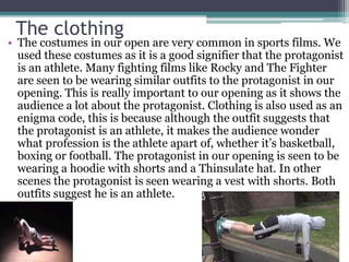
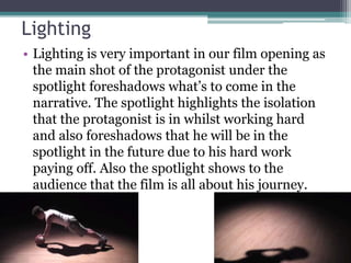
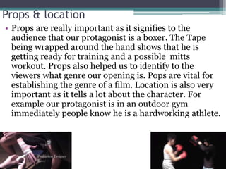
Q1- In what ways does your media
product use, develop or challenge
forms and conventions of real
media products?
My media product challenges and
develops the forms and conventions of
real media productions through the
institutional logos, titles, costumes,
lighting, props and locations.
Institutional Logos
• I researched in to the institutional logos of the
films which are pretty similar to mine. Firstly I
researched the logos used in Rocky Balboa and
In Cinderella Man. I realised that both films had
2 institutional logos at the start. One of Rocky’s
institutional logo being ‘Colombia’. Cinderella
man had the logo of ‘Miramax films’. ‘Colombia’
is very bright and stands out a lot as their are
many different colours visible in the logo.
Whereas ‘Miramax Films’ is a lot darker with
very little variety of colours visible.
Institutional Logos
• My media product uses 2 institutional logos at the start
which is like both rocky and Cinderella man. The titles we
decided to go for were more similar to the Cinderella man
logos as we felt that the simple looking would fit in best
with the opening. The animation used on our logos differs
from both rocky and Cinderella man as we felt that for
example the ‘Colombia’ logo was too extravagant, so we
decided to keep ours simple but yet effective. These are
the screenshots of our logo ‘Infinite Studios’. The
Animation used shows the letter appearing as if they’re
being typed up.
Titles
• The titles we went for in our film opening was similar
to those in Rocky Balboa. Both our titles and Rocky
titles were in white and in bold, we decided to keep
our titles very simple in order to make it easy for the
viewers to read. Our titles were roughly 2 seconds long
followed by a fade. This is very similar to the titles
shown in Rocky Balboa. Our titles would fade away
giving an opportunity for another title to be seen, this
is very effective as it captures the audiences attentions.
Rocky BalboaThe Weigh in
The clothing
• The costumes in our open are very common in sports films. We
used these costumes as it is a good signifier that the protagonist
is an athlete. Many fighting films like Rocky and The Fighter
are seen to be wearing similar outfits to the protagonist in our
opening. This is really important to our opening as it shows the
audience a lot about the protagonist. Clothing is also used as an
enigma code, this is because although the outfit suggests that
the protagonist is an athlete, it makes the audience wonder
what profession is the athlete apart of, whether it’s basketball,
boxing or football. The protagonist in our opening is seen to be
wearing a hoodie with shorts and a Thinsulate hat. In other
scenes the protagonist is seen wearing a vest with shorts. Both
outfits suggest he is an athlete.
Lighting
• Lighting is very important in our film opening as
the main shot of the protagonist under the
spotlight foreshadows what’s to come in the
narrative. The spotlight highlights the isolation
that the protagonist is in whilst working hard
and also foreshadows that he will be in the
spotlight in the future due to his hard work
paying off. Also the spotlight shows to the
audience that the film is all about his journey.
Props & location
• Props are really important as it signifies to the
audience that our protagonist is a boxer. The Tape
being wrapped around the hand shows that he is
getting ready for training and a possible mitts
workout. Props also helped us to identify to the
viewers what genre our opening is. Pops are vital for
establishing the genre of a film. Location is also very
important as it tells a lot about the character. For
example our protagonist is in an outdoor gym
immediately people know he is a hardworking athlete.

Q1- Amad evaluation

  • 1.
    Q1- In whatways does your media product use, develop or challenge forms and conventions of real media products?
  • 2.
    My media productchallenges and develops the forms and conventions of real media productions through the institutional logos, titles, costumes, lighting, props and locations.
  • 3.
    Institutional Logos • Iresearched in to the institutional logos of the films which are pretty similar to mine. Firstly I researched the logos used in Rocky Balboa and In Cinderella Man. I realised that both films had 2 institutional logos at the start. One of Rocky’s institutional logo being ‘Colombia’. Cinderella man had the logo of ‘Miramax films’. ‘Colombia’ is very bright and stands out a lot as their are many different colours visible in the logo. Whereas ‘Miramax Films’ is a lot darker with very little variety of colours visible.
  • 4.
    Institutional Logos • Mymedia product uses 2 institutional logos at the start which is like both rocky and Cinderella man. The titles we decided to go for were more similar to the Cinderella man logos as we felt that the simple looking would fit in best with the opening. The animation used on our logos differs from both rocky and Cinderella man as we felt that for example the ‘Colombia’ logo was too extravagant, so we decided to keep ours simple but yet effective. These are the screenshots of our logo ‘Infinite Studios’. The Animation used shows the letter appearing as if they’re being typed up.
  • 5.
    Titles • The titleswe went for in our film opening was similar to those in Rocky Balboa. Both our titles and Rocky titles were in white and in bold, we decided to keep our titles very simple in order to make it easy for the viewers to read. Our titles were roughly 2 seconds long followed by a fade. This is very similar to the titles shown in Rocky Balboa. Our titles would fade away giving an opportunity for another title to be seen, this is very effective as it captures the audiences attentions. Rocky BalboaThe Weigh in
  • 6.
    The clothing • Thecostumes in our open are very common in sports films. We used these costumes as it is a good signifier that the protagonist is an athlete. Many fighting films like Rocky and The Fighter are seen to be wearing similar outfits to the protagonist in our opening. This is really important to our opening as it shows the audience a lot about the protagonist. Clothing is also used as an enigma code, this is because although the outfit suggests that the protagonist is an athlete, it makes the audience wonder what profession is the athlete apart of, whether it’s basketball, boxing or football. The protagonist in our opening is seen to be wearing a hoodie with shorts and a Thinsulate hat. In other scenes the protagonist is seen wearing a vest with shorts. Both outfits suggest he is an athlete.
  • 7.
    Lighting • Lighting isvery important in our film opening as the main shot of the protagonist under the spotlight foreshadows what’s to come in the narrative. The spotlight highlights the isolation that the protagonist is in whilst working hard and also foreshadows that he will be in the spotlight in the future due to his hard work paying off. Also the spotlight shows to the audience that the film is all about his journey.
  • 8.
    Props & location •Props are really important as it signifies to the audience that our protagonist is a boxer. The Tape being wrapped around the hand shows that he is getting ready for training and a possible mitts workout. Props also helped us to identify to the viewers what genre our opening is. Pops are vital for establishing the genre of a film. Location is also very important as it tells a lot about the character. For example our protagonist is in an outdoor gym immediately people know he is a hardworking athlete.