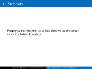
Chapter 3
Frequency Distributions
STAT 214 Statistics
Southern Philippines Agri-business and Marine and Aquatic School of Technology
September 5, 2023
Bachelor of Science in Environmental Science Stat 214 Inferential Statistics and Biometry
Outline of Presentation
3.1 Stemplots
3.2 Frequency Tables
3.3 Additional Frequency Charts
Bachelor of Science in Environmental Science Stat 214 Inferential Statistics and Biometry
3.1 Stemplots
Frequency distributions tell us how often we see the various
values in a batch of numbers.
Bachelor of Science in Environmental Science Stat 214 Inferential Statistics and Biometry
3.1 Stemplots
Stem-and-leaf Plot
The stem-and-leaf plot (stemplot) is a graphical technique that
organizes data into a histogram-like display. It is an excellent way
to begin an analysis and is a good way to learn several important
statistical principles.
To construct a stemplot, begin by dividing each data point into a
stem component and a leaf component. Considering this small
sample of n = 10:
21 42 05 11 30 50 28 27 24 52
For these data points, the “tens place” will become stem values
and the “ones place” will become leaf values. For example, the
data point 21 has a stem value of 2 and leaf value of 1.
Bachelor of Science in Environmental Science Stat 214 Inferential Statistics and Biometry
3.1 Stemplots
A stem-like axis is drawn. Because data range from 5 to 52, stem
values will range from 0 to 5. Stem values are listed in ascending
(or descending) order at regularly spaced intervals to form a
number line. A vertical line may be drawn next to the stem to
separate it from where the leaves will be placed.
Bachelor of Science in Environmental Science Stat 214 Inferential Statistics and Biometry
3.1 Stemplots
An axis multiplier (×10) is included below the stem to show that
a stem value of 5 represents 50 (and not say 5 or 500). Leaf values
are placed adjacent to their associated stem values. For example,
“21” is:
Bachelor of Science in Environmental Science Stat 214 Inferential Statistics and Biometry
3.1 Stemplots
The remaining leaves are plotted:
Bachelor of Science in Environmental Science Stat 214 Inferential Statistics and Biometry
3.1 Stemplots
Leaves are then rearranged to appear in rank order:
Bachelor of Science in Environmental Science Stat 214 Inferential Statistics and Biometry
3.1 Stemplots
The stemplot now resembles a histogram on its side. Rotate the
plot 90 degrees to display the distribution in the more familiar
horizontal orientation.
Bachelor of Science in Environmental Science Stat 214 Inferential Statistics and Biometry
3.1 Stemplots
Shape is the aspect of the distribution that we are interested in.
Shape
Shape refers to the configuration of data points as they appear on
the graph.
Bachelor of Science in Environmental Science Stat 214 Inferential Statistics and Biometry
3.1 Stemplots
It is difficult to make statements about shape when the data set is
this small, so let us look at a larger data set.
Figure 3.1 is a histogram of about a thousand intelligence quotient
scores. Overlaying the histogram is a fitted curve. Although the fit
of the curve is imperfect, the curve still provides a convenient way
to discuss the shape of the distribution.
Bachelor of Science in Environmental Science Stat 214 Inferential Statistics and Biometry
3.1 Stemplots
Bachelor of Science in Environmental Science Stat 214 Inferential Statistics and Biometry
3.1 Stemplots
A distribution’s shape can be discussed in terms of its symmetry,
modality, and kurtosis.
Symmetry refers to the degree to which the shape reflects a
mirror image of itself around its center.
Modality refers to the number of peaks on the distribution.
Kurtosis refers to the steepness of the mound.
Bachelor of Science in Environmental Science Stat 214 Inferential Statistics and Biometry
3.1 Stemplots
Figure 3.2 illustrates these characteristics.
Distributions (a)–(c) are symmetrical.
Distributions (d)–(f) are asymmetrical.
Distribution (d) is bimodal; the rest of the distributions are
unimodal.
Distribution (b) is flat with broad tails. This is a platykurtic
distribution (like a platypus). A tall curve with long skinny
tails (not shown) is said to be leptokurtic. A curve with
medium kurtosis is mesokurtic.
Distributions (e) and (f) are skewed. Figure (e) has a
positive skew (tail toward larger numbers on a number line).
Figure (f) has a negative skew (tail toward smaller numbers).
Bachelor of Science in Environmental Science Stat 214 Inferential Statistics and Biometry
3.1 Stemplots
Bachelor of Science in Environmental Science Stat 214 Inferential Statistics and Biometry
3.1 Stemplots
An outlier is a striking deviation from the overall pattern or shape
of the distribution. As an example, the value of 50 on this
stemplot is an outlier:
Bachelor of Science in Environmental Science Stat 214 Inferential Statistics and Biometry
3.2 Frequency Tables
Frequency Tables
Frequency tables are a traditional way to describe the distribution
of counts in a data set. Table 3.8 shows a typical frequency table.
Three types of frequencies are listed.
The frequency column contains counts.
The relative frequency (%) column contains frequency counts
divided by the total with values expressed as a percentage.
For example:
2 ÷ 654 = 0.003 or 0.03% are 3 years of age
9 ÷ 654 = 0.014 or 1.4% are 4 years of age
28 ÷ 654 = 0.043 or 4.3% are 5 years of age
Bachelor of Science in Environmental Science Stat 214 Inferential Statistics and Biometry
3.2 Frequency Tables
Bachelor of Science in Environmental Science Stat 214 Inferential Statistics and Biometry
3.2 Frequency Tables
The cumulative frequency (%) column contains percents that
fall within or below a given level. To determine cumulative
percents, add the current relative frequency to the prior
cumulative relative frequency. Start with the fact that 0.3%
of individuals are 3 years old. Then determine
0.3% + 0.14% = 1.7% are 4 years of age or younger.
Bachelor of Science in Environmental Science Stat 214 Inferential Statistics and Biometry
3.2 Frequency Tables
Frequency ≡ count
Relative frequency ≡ proportion
Cumulative relative frequency ≡ proportion that falls in or below a
certain level
Bachelor of Science in Environmental Science Stat 214 Inferential Statistics and Biometry
3.2 Frequency Tables
Class-Interval Frequency Tables (Grouped
Data)
It is often necessary to group data into class intervals before
tallying frequencies. Class intervals can be set up with equal
spacing or unequal spacing. Endpoint conventions are needed to
ensure that each observation falls into only one interval. Class
intervals may either: (a) include the left boundary and exclude the
right boundary or (b) include the right boundary and exclude the
left boundary.
Bachelor of Science in Environmental Science Stat 214 Inferential Statistics and Biometry
3.2 Frequency Tables
Here are 10-year age intervals that include the left boundary and
exclude the right boundary:
0.0 ≤ years < 10
10.0 ≤ years < 20
.
.
.
50.0 ≤ years < 60
Bachelor of Science in Environmental Science Stat 214 Inferential Statistics and Biometry
3.2 Frequency Tables
To construct a frequency table with class intervals:
1. List class intervals in ascending or descending order.
2. Tally frequencies that fall within each interval.
3. Sum frequencies to determine the total sample size: n =
P
fi ,
where fi represents the frequency in class i.
4. Determine relative frequencies (proportions) that fall within
each interval: pi = fi ÷ n, where pi represents the proportion
in class interval i. (It is often useful to report proportions as
percents by moving the decimal point over two places to the
right and adding a “%” sign.)
5. Determine the cumulative proportions by summing proportions
from prior levels to the current level: ci = pi + ci−1, where ci
represents the cumulative relative frequency in class i.
Bachelor of Science in Environmental Science Stat 214 Inferential Statistics and Biometry
3.2 Frequency Tables
Here is a listing of the 10 data points that began the chapter:
5 11 21 24 27 28 30 42 50 52
Here are the data as a frequency table with uniform 15-year class
intervals:
Bachelor of Science in Environmental Science Stat 214 Inferential Statistics and Biometry
3.2 Frequency Tables
Some situations call for nonuniform class intervals. Here are the
data from Figure 3.6 with data grouped in classes corresponding to
school-age populations.
Bachelor of Science in Environmental Science Stat 214 Inferential Statistics and Biometry
3.3 Additional Frequency Charts
Bar charts display frequencies with bars that correspond in height
to frequencies or relative frequencies. Histograms are bar charts
with contiguous bars and are therefore reserved for displaying
frequencies associated with quantitative variables. Figure 3.7 is a
histogram of the data from Table 3.8.
Bachelor of Science in Environmental Science Stat 214 Inferential Statistics and Biometry
3.3 Additional Frequency Charts
Bachelor of Science in Environmental Science Stat 214 Inferential Statistics and Biometry
3.3 Additional Frequency Charts
Frequency polygons replace histogram bars with a line
connecting frequency levels. Figure 3.8 is a frequency polygon of
the same data plotted in Figure 3.7.
Bachelor of Science in Environmental Science Stat 214 Inferential Statistics and Biometry
3.3 Additional Frequency Charts
Histograms and frequency polygons are reserved for use with
quantitative variables. Frequencies for categorical variables should
be displayed via bar charts with noncontiguous bars (e.g., Figure
3.9) or pie charts (e.g., Figure 3.10).
Bachelor of Science in Environmental Science Stat 214 Inferential Statistics and Biometry
3.3 Additional Frequency Charts
Bachelor of Science in Environmental Science Stat 214 Inferential Statistics and Biometry
Summary Points (Frequency Distributions)
1. Frequency distributions tell us how often various values occur
in a batch of numbers. We explore a distribution’s shape,
location, and spread to begin each data analysis.
2. Distributional shape is described in terms of symmetry,
direction of skew if asymmetric, modality (number of peaks),
and kurtosis (steepness of peaks). Note: Descriptors of shape
are unreliable when data sets are small and moderate in size.
Bachelor of Science in Environmental Science Stat 214 Inferential Statistics and Biometry
Summary Points (Frequency Distributions)
3. The stem-and-leaf plot (“stemplot”) is an excellent way to
explore the shape of a distribution. Briefly, the stem on a
stemplot represents a number line with “bins.” Leaves
represent the following significant digit value.
4. Additional graphical techniques for exploring the shape
includes histograms and frequency polygons.
Bachelor of Science in Environmental Science Stat 214 Inferential Statistics and Biometry
Summary Points (Frequency Distributions)
5. The distribution of categorical variables may be displayed in
the form of a bar chart or pie chart.
6. Frequency tables list frequencies (counts), relative frequencies
(proportions), and cumulative frequencies (proportion of
values up to and including the current value). Quantitative
data may first need to be grouped into class intervals before
tallying frequencies.
Bachelor of Science in Environmental Science Stat 214 Inferential Statistics and Biometry
Reference
Burt Gertsman. (2015). Basic Biostatistics Statistics for
Public Health Practice. Jones and Bartlett Learning.
Bachelor of Science in Environmental Science Stat 214 Inferential Statistics and Biometry

Stat214_Chapter 3.pdf

  • 1.
    Chapter 3 Frequency Distributions STAT214 Statistics Southern Philippines Agri-business and Marine and Aquatic School of Technology September 5, 2023 Bachelor of Science in Environmental Science Stat 214 Inferential Statistics and Biometry
  • 2.
    Outline of Presentation 3.1Stemplots 3.2 Frequency Tables 3.3 Additional Frequency Charts Bachelor of Science in Environmental Science Stat 214 Inferential Statistics and Biometry
  • 3.
    3.1 Stemplots Frequency distributionstell us how often we see the various values in a batch of numbers. Bachelor of Science in Environmental Science Stat 214 Inferential Statistics and Biometry
  • 4.
    3.1 Stemplots Stem-and-leaf Plot Thestem-and-leaf plot (stemplot) is a graphical technique that organizes data into a histogram-like display. It is an excellent way to begin an analysis and is a good way to learn several important statistical principles. To construct a stemplot, begin by dividing each data point into a stem component and a leaf component. Considering this small sample of n = 10: 21 42 05 11 30 50 28 27 24 52 For these data points, the “tens place” will become stem values and the “ones place” will become leaf values. For example, the data point 21 has a stem value of 2 and leaf value of 1. Bachelor of Science in Environmental Science Stat 214 Inferential Statistics and Biometry
  • 5.
    3.1 Stemplots A stem-likeaxis is drawn. Because data range from 5 to 52, stem values will range from 0 to 5. Stem values are listed in ascending (or descending) order at regularly spaced intervals to form a number line. A vertical line may be drawn next to the stem to separate it from where the leaves will be placed. Bachelor of Science in Environmental Science Stat 214 Inferential Statistics and Biometry
  • 6.
    3.1 Stemplots An axismultiplier (×10) is included below the stem to show that a stem value of 5 represents 50 (and not say 5 or 500). Leaf values are placed adjacent to their associated stem values. For example, “21” is: Bachelor of Science in Environmental Science Stat 214 Inferential Statistics and Biometry
  • 7.
    3.1 Stemplots The remainingleaves are plotted: Bachelor of Science in Environmental Science Stat 214 Inferential Statistics and Biometry
  • 8.
    3.1 Stemplots Leaves arethen rearranged to appear in rank order: Bachelor of Science in Environmental Science Stat 214 Inferential Statistics and Biometry
  • 9.
    3.1 Stemplots The stemplotnow resembles a histogram on its side. Rotate the plot 90 degrees to display the distribution in the more familiar horizontal orientation. Bachelor of Science in Environmental Science Stat 214 Inferential Statistics and Biometry
  • 10.
    3.1 Stemplots Shape isthe aspect of the distribution that we are interested in. Shape Shape refers to the configuration of data points as they appear on the graph. Bachelor of Science in Environmental Science Stat 214 Inferential Statistics and Biometry
  • 11.
    3.1 Stemplots It isdifficult to make statements about shape when the data set is this small, so let us look at a larger data set. Figure 3.1 is a histogram of about a thousand intelligence quotient scores. Overlaying the histogram is a fitted curve. Although the fit of the curve is imperfect, the curve still provides a convenient way to discuss the shape of the distribution. Bachelor of Science in Environmental Science Stat 214 Inferential Statistics and Biometry
  • 12.
    3.1 Stemplots Bachelor ofScience in Environmental Science Stat 214 Inferential Statistics and Biometry
  • 13.
    3.1 Stemplots A distribution’sshape can be discussed in terms of its symmetry, modality, and kurtosis. Symmetry refers to the degree to which the shape reflects a mirror image of itself around its center. Modality refers to the number of peaks on the distribution. Kurtosis refers to the steepness of the mound. Bachelor of Science in Environmental Science Stat 214 Inferential Statistics and Biometry
  • 14.
    3.1 Stemplots Figure 3.2illustrates these characteristics. Distributions (a)–(c) are symmetrical. Distributions (d)–(f) are asymmetrical. Distribution (d) is bimodal; the rest of the distributions are unimodal. Distribution (b) is flat with broad tails. This is a platykurtic distribution (like a platypus). A tall curve with long skinny tails (not shown) is said to be leptokurtic. A curve with medium kurtosis is mesokurtic. Distributions (e) and (f) are skewed. Figure (e) has a positive skew (tail toward larger numbers on a number line). Figure (f) has a negative skew (tail toward smaller numbers). Bachelor of Science in Environmental Science Stat 214 Inferential Statistics and Biometry
  • 15.
    3.1 Stemplots Bachelor ofScience in Environmental Science Stat 214 Inferential Statistics and Biometry
  • 16.
    3.1 Stemplots An outlieris a striking deviation from the overall pattern or shape of the distribution. As an example, the value of 50 on this stemplot is an outlier: Bachelor of Science in Environmental Science Stat 214 Inferential Statistics and Biometry
  • 17.
    3.2 Frequency Tables FrequencyTables Frequency tables are a traditional way to describe the distribution of counts in a data set. Table 3.8 shows a typical frequency table. Three types of frequencies are listed. The frequency column contains counts. The relative frequency (%) column contains frequency counts divided by the total with values expressed as a percentage. For example: 2 ÷ 654 = 0.003 or 0.03% are 3 years of age 9 ÷ 654 = 0.014 or 1.4% are 4 years of age 28 ÷ 654 = 0.043 or 4.3% are 5 years of age Bachelor of Science in Environmental Science Stat 214 Inferential Statistics and Biometry
  • 18.
    3.2 Frequency Tables Bachelorof Science in Environmental Science Stat 214 Inferential Statistics and Biometry
  • 19.
    3.2 Frequency Tables Thecumulative frequency (%) column contains percents that fall within or below a given level. To determine cumulative percents, add the current relative frequency to the prior cumulative relative frequency. Start with the fact that 0.3% of individuals are 3 years old. Then determine 0.3% + 0.14% = 1.7% are 4 years of age or younger. Bachelor of Science in Environmental Science Stat 214 Inferential Statistics and Biometry
  • 20.
    3.2 Frequency Tables Frequency≡ count Relative frequency ≡ proportion Cumulative relative frequency ≡ proportion that falls in or below a certain level Bachelor of Science in Environmental Science Stat 214 Inferential Statistics and Biometry
  • 21.
    3.2 Frequency Tables Class-IntervalFrequency Tables (Grouped Data) It is often necessary to group data into class intervals before tallying frequencies. Class intervals can be set up with equal spacing or unequal spacing. Endpoint conventions are needed to ensure that each observation falls into only one interval. Class intervals may either: (a) include the left boundary and exclude the right boundary or (b) include the right boundary and exclude the left boundary. Bachelor of Science in Environmental Science Stat 214 Inferential Statistics and Biometry
  • 22.
    3.2 Frequency Tables Hereare 10-year age intervals that include the left boundary and exclude the right boundary: 0.0 ≤ years < 10 10.0 ≤ years < 20 . . . 50.0 ≤ years < 60 Bachelor of Science in Environmental Science Stat 214 Inferential Statistics and Biometry
  • 23.
    3.2 Frequency Tables Toconstruct a frequency table with class intervals: 1. List class intervals in ascending or descending order. 2. Tally frequencies that fall within each interval. 3. Sum frequencies to determine the total sample size: n = P fi , where fi represents the frequency in class i. 4. Determine relative frequencies (proportions) that fall within each interval: pi = fi ÷ n, where pi represents the proportion in class interval i. (It is often useful to report proportions as percents by moving the decimal point over two places to the right and adding a “%” sign.) 5. Determine the cumulative proportions by summing proportions from prior levels to the current level: ci = pi + ci−1, where ci represents the cumulative relative frequency in class i. Bachelor of Science in Environmental Science Stat 214 Inferential Statistics and Biometry
  • 24.
    3.2 Frequency Tables Hereis a listing of the 10 data points that began the chapter: 5 11 21 24 27 28 30 42 50 52 Here are the data as a frequency table with uniform 15-year class intervals: Bachelor of Science in Environmental Science Stat 214 Inferential Statistics and Biometry
  • 25.
    3.2 Frequency Tables Somesituations call for nonuniform class intervals. Here are the data from Figure 3.6 with data grouped in classes corresponding to school-age populations. Bachelor of Science in Environmental Science Stat 214 Inferential Statistics and Biometry
  • 26.
    3.3 Additional FrequencyCharts Bar charts display frequencies with bars that correspond in height to frequencies or relative frequencies. Histograms are bar charts with contiguous bars and are therefore reserved for displaying frequencies associated with quantitative variables. Figure 3.7 is a histogram of the data from Table 3.8. Bachelor of Science in Environmental Science Stat 214 Inferential Statistics and Biometry
  • 27.
    3.3 Additional FrequencyCharts Bachelor of Science in Environmental Science Stat 214 Inferential Statistics and Biometry
  • 28.
    3.3 Additional FrequencyCharts Frequency polygons replace histogram bars with a line connecting frequency levels. Figure 3.8 is a frequency polygon of the same data plotted in Figure 3.7. Bachelor of Science in Environmental Science Stat 214 Inferential Statistics and Biometry
  • 29.
    3.3 Additional FrequencyCharts Histograms and frequency polygons are reserved for use with quantitative variables. Frequencies for categorical variables should be displayed via bar charts with noncontiguous bars (e.g., Figure 3.9) or pie charts (e.g., Figure 3.10). Bachelor of Science in Environmental Science Stat 214 Inferential Statistics and Biometry
  • 30.
    3.3 Additional FrequencyCharts Bachelor of Science in Environmental Science Stat 214 Inferential Statistics and Biometry
  • 31.
    Summary Points (FrequencyDistributions) 1. Frequency distributions tell us how often various values occur in a batch of numbers. We explore a distribution’s shape, location, and spread to begin each data analysis. 2. Distributional shape is described in terms of symmetry, direction of skew if asymmetric, modality (number of peaks), and kurtosis (steepness of peaks). Note: Descriptors of shape are unreliable when data sets are small and moderate in size. Bachelor of Science in Environmental Science Stat 214 Inferential Statistics and Biometry
  • 32.
    Summary Points (FrequencyDistributions) 3. The stem-and-leaf plot (“stemplot”) is an excellent way to explore the shape of a distribution. Briefly, the stem on a stemplot represents a number line with “bins.” Leaves represent the following significant digit value. 4. Additional graphical techniques for exploring the shape includes histograms and frequency polygons. Bachelor of Science in Environmental Science Stat 214 Inferential Statistics and Biometry
  • 33.
    Summary Points (FrequencyDistributions) 5. The distribution of categorical variables may be displayed in the form of a bar chart or pie chart. 6. Frequency tables list frequencies (counts), relative frequencies (proportions), and cumulative frequencies (proportion of values up to and including the current value). Quantitative data may first need to be grouped into class intervals before tallying frequencies. Bachelor of Science in Environmental Science Stat 214 Inferential Statistics and Biometry
  • 34.
    Reference Burt Gertsman. (2015).Basic Biostatistics Statistics for Public Health Practice. Jones and Bartlett Learning. Bachelor of Science in Environmental Science Stat 214 Inferential Statistics and Biometry