1. Before After
Here I used the hue and saturation tool and the colour balance tool there the only tools I used to
make the difference of these two images and I wanted it to give that darkness vibe like they are: ‘in
it to win it’ and it looks great it works perfect for what I wanted it to be like.
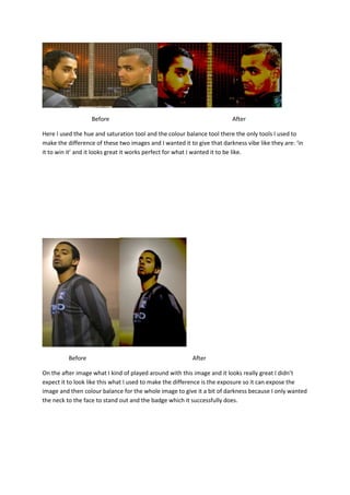
Before After
On the after image what I kind of played around with this image and it looks really great I didn’t
expect it to look like this what I used to make the difference is the exposure so it can expose the
image and then colour balance for the whole image to give it a bit of darkness because I only wanted
the neck to the face to stand out and the badge which it successfully does.
2. Before After
When I edited this image it was easy because I knew what I wanted to do with this one. What I did
with this image is added exposure to the full picture then I added colour burn to change the skin
colour and it then turned out to look like this which I am very happy about because it has that
perfect look for a content page on a sports magazine and that’s what I wanted it to be, the way the
light is shining on the side of his face it looks professional
Before After
His is my favourite image and it is my chosen one for my magazine cover the reason why I chose it to
be because it looks great and professional and I love it what I did was is add exposure on the full
picture and then blurred motion the background which made it look how it is and it’s perfect.
3. Before After
For this image what I did was basically the same thing I added exposure but I didn’t add as much and
I used a lot of the blur motion to make it like this and it looks decent.
Before After
On this image you can tell I didn’t do as much because by looking at it there is hardly a difference all
I did is add exposure and darken the shadows of the two football players that’s all I felt that I did not
need to do as much because the picture looks fantastic the way it is and I did not want to ruing it.
4. Before After
Here you can tell there is a big difference by looking at the skin colour and the foreground of the
football pitch I added colour to the skin by using the colour balance to make it yellow and added
colour balance to the ground and triggered it on green to make it look like different and it stands out
well.
Before After
You can easily tell there is a difference by looking at these two images I only did two things on this
picture to make that difference the first thing Idid is cropped the image so you wont be able to see
my shadow the second thing is that I blurred the background so the footballer can stand out and I
like how it turned out.