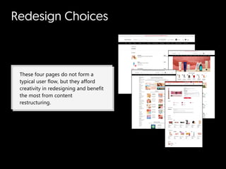
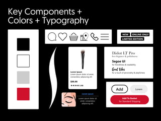
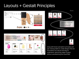
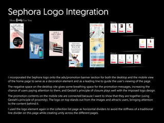
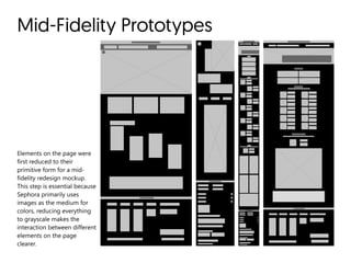
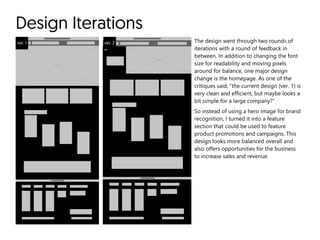
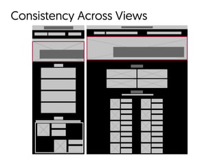
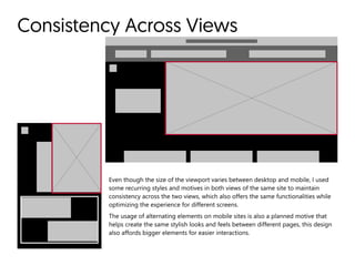
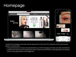
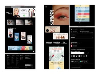
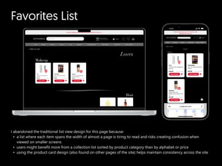
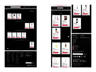
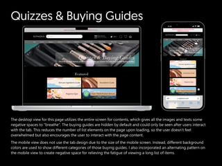
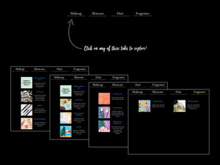
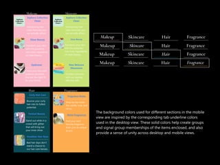
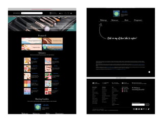
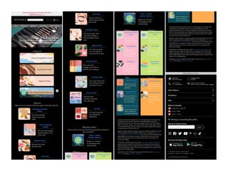
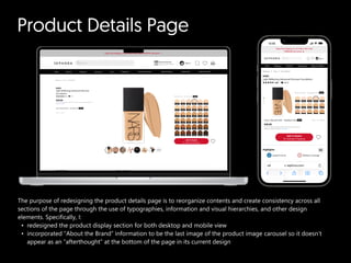
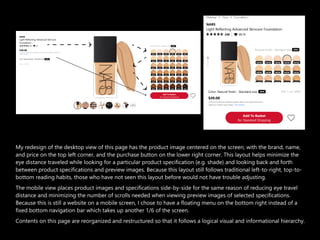
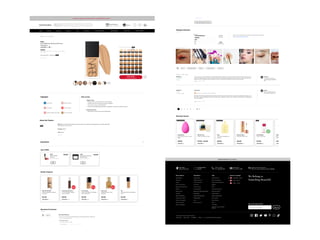
SlideShare a Scribd company logo
SEPHORA

a redesign case study
How to turn Sephora’s website
a shopping rather
than a shopping ?
experience
task
Mood Board +

Design Strategy
#FFFFFF
#000000
Sephora
“to champion all
beauty fearlessly”
Bold, edg
Fashionabl
Minimalistic & monochromatic
backgroun
Playful & vibrant foreground
Redesign Choices
These four pages do not form a
typical user flow, but they afford
creativity in redesigning and benefit
the most from content
restructuring.
Key Components +

Colors + Typography
Lorem Ipsum
Lorem ipsum dolor sit amet,
consectetur adipiscing elit
$99.99
240
NEW
LIMITED EDITION
ONLINE ONLY
Lorem ipsum
Lorem ipsum dolor sit
amet, consectetur
adipiscing elit.
for a touch of personality & playfulness
Good Vibes
Didot LT Pro

for elegance & polishness
Segoe UI  

for friendliness & readability
Add To Basket

for Standard Shipping
Add Lorem
Layouts + Gestalt Principles
Using well-known perception principles and
user viewing habits to create designs that are
minimalistic but natural and easy to
understand, optimizing usage of space
without overwhelming the visual field.
application of the principle of
continuity on carousels
application of principle
of proximity to show
group membership
Sephora Logo Integration
I incorporated the Sephora logo onto the ads/promotion banner section for both the desktop and the mobile view
of the home page to serve as a decoration element and as a leading line to guide the user’s viewing of the page.

The negative space on the desktop site gives some breathing space for the promotion messages, increasing the
chance of users paying attention to them, and Gestalt’s principle of closure plays well with the imposed logo design.

The promotion contents on the mobile site are connected because I want to show that they are together (using
Gestalt’s principle of proximity). The logo on top stands out from the images and attracts users, bringing attention
to the content behind it.

I used the logo element again in the collection list page as horizontal dividers to avoid the stiffness of a traditional
line divider on this page while creating unity across the different pages.
Mid-Fidelity Prototypes
Elements on the page were
first reduced to their
primitive form for a mid-
fidelity redesign mockup.
This step is essential because
Sephora primarily uses
images as the medium for
colors, reducing everything
to grayscale makes the
interaction between different
elements on the page
clearer.
Design Iterations
ver. 1 ver. 2 The design went through two rounds of
iterations with a round of feedback in
between. In addition to changing the font
size for readability and moving pixels
around for balance, one major design
change is the homepage. As one of the
critiques said, “the current design (ver. 1) is
very clean and efficient, but maybe looks a
bit simple for a large company?”

So instead of using a hero image for brand
recognition, I turned it into a feature
section that could be used to feature
product promotions and campaigns. This
design looks more balanced overall and
also offers opportunities for the business
to increase sales and revenue.
Consistency Across Views
Even though the size of the viewport varies between desktop and mobile, I used
some recurring styles and motives in both views of the same site to maintain
consistency across the two views, which also offers the same functionalities while
optimizing the experience for different screens.  

The usage of alternating elements on mobile sites is also a planned motive that
helps create the same stylish looks and feels between different pages, this design
also affords bigger elements for easier interactions.
Homepage
I wanted the homepage to be clean and chic because this is the user’s first impression of the brand and the
website. To achieve that,
removed all product carousels, they diluted the focus of the homepage and made users feel overwhelme
created visual hierarchy and reorganized all other contents and promotions using typography and leading
lines to encourage attention and engagement
Favorites List
I abandoned the traditional list view design for this page because
a list where each item spans the width of almost a page is tiring to read and risks creating confusion when
viewed on smaller screen
users might benefit more from a collection list sorted by product category than by alphabet or price
using the product card design (also found on other pages of the site) helps maintain consistency across the site
Quizzes & Buying Guides
The desktop view for this page utilizes the entire screen for contents, which gives all the images and texts some
negative spaces to “breathe”. The buying guides are hidden by default and could only be seen after users interact
with the tab. This reduces the number of list elements on the page upon loading, so the user doesn’t feel
overwhelmed but also encourages the user to interact with the page content.

The mobile view does not use the tab design due to the size of the mobile screen. Instead, different background
colors are used to show different categories of those buying guides. I also incorporated an alternating pattern on
the mobile view to create negative space for relieving the fatigue of viewing a long list of items.
The background colors used for different sections in the mobile
view are inspired by the corresponding tab underline colors
used in the desktop view. These solid colors help create groups
and signal group memberships of the items enclosed, and also
provide a sense of unity across desktop and mobile views.
Product Details Page
The purpose of redesigning the product details page is to reorganize contents and create consistency across all
sections of the page through the use of typographies, information and visual hierarchies, and other design
elements. Specifically, I
redesigned the product display section for both desktop and mobile vie
incorporated “About the Brand” information to be the last image of the product image carousel so it doesn’t
appear as an “afterthought” at the bottom of the page in its current design
My redesign of the desktop view of this page has the product image centered on the screen, with the brand, name,
and price on the top left corner, and the purchase button on the lower right corner. This layout helps minimize the
eye distance traveled while looking for a particular product specification (e.g. shade) and looking back and forth
between product specifications and preview images. Because this layout still follows traditional left-to-right, top-to-
bottom reading habits, those who have not seen this layout before would not have trouble adjusting.  

The mobile view places product images and specifications side-by-side for the same reason of reducing eye travel
distance and minimizing the number of scrolls needed when viewing preview images of selected specifications.
Because this is still a website on a mobile screen, I chose to have a floating menu on the bottom right instead of a
fixed bottom navigation bar which takes up another 1/6 of the screen.

Contents on this page are reorganized and restructured so that it follows a logical visual and informational hierarchy.
Sephora redesign case study.pdf

More Related Content

What's hot

How Sephora Compares: A Digital Audit
How Sephora Compares: A Digital AuditHow Sephora Compares: A Digital Audit
How Sephora Compares: A Digital Audit
Charlotte Wilson
 
Sephora adv 420 powerpoint
Sephora adv 420 powerpointSephora adv 420 powerpoint
Sephora adv 420 powerpoint
lizeomalley
 
Social Media Strategy For 2023.pdf
Social Media Strategy For 2023.pdfSocial Media Strategy For 2023.pdf
Social Media Strategy For 2023.pdf
Amit Singh
 
Sephora - Digital Marketing Audit
Sephora - Digital Marketing AuditSephora - Digital Marketing Audit
Sephora - Digital Marketing Audit
Oleksandr Martyniuk
 
Sephora
SephoraSephora
Sephora
Saloni Thapa
 
IKEA Social Media Campaign
IKEA Social Media CampaignIKEA Social Media Campaign
IKEA Social Media Campaign
alliexrachel
 
Shiseido Brand Audit
Shiseido Brand AuditShiseido Brand Audit
Shiseido Brand Audit
Sara Chen
 
Sephora case study
Sephora case studySephora case study
Sephora case study
Sasikumar Sivaraj
 
Sephora Success Case Study
Sephora Success Case StudySephora Success Case Study
Sephora Success Case Study
Sneha Iyer
 
Social Media - l'oreal (bpi trinidad)
Social Media - l'oreal (bpi trinidad)Social Media - l'oreal (bpi trinidad)
Social Media - l'oreal (bpi trinidad)
Stacy-Ann Duhaney
 
Digital Marketing Strategy for a Cosmetic Brand - Love Beauty and Planet (A U...
Digital Marketing Strategy for a Cosmetic Brand - Love Beauty and Planet (A U...Digital Marketing Strategy for a Cosmetic Brand - Love Beauty and Planet (A U...
Digital Marketing Strategy for a Cosmetic Brand - Love Beauty and Planet (A U...
Abhishek Sinha
 
Sephora: A Brand Case Study
Sephora: A Brand Case StudySephora: A Brand Case Study
Sephora: A Brand Case Study
Nikki Kerber
 
Sephora Digital Strategy
Sephora Digital StrategySephora Digital Strategy
Sephora Digital Strategy
AmandaGentil2
 
Sephora
SephoraSephora
Brand Management-Nike
Brand Management-NikeBrand Management-Nike
Brand Management-Nike
Cletus Monteiro
 
Social Media Best Practices For Luxury Brands
Social Media Best Practices For Luxury BrandsSocial Media Best Practices For Luxury Brands
Social Media Best Practices For Luxury Brands
BLACKSTONE DIGITAL AGENCY
 
Victoria's Secret Design Cornerstones & Brand Study
Victoria's Secret Design Cornerstones & Brand StudyVictoria's Secret Design Cornerstones & Brand Study
Victoria's Secret Design Cornerstones & Brand Study
taralv
 
Trends + Trendsetters: The Best in Beauty Content Marketing
Trends + Trendsetters: The Best in Beauty Content Marketing Trends + Trendsetters: The Best in Beauty Content Marketing
Trends + Trendsetters: The Best in Beauty Content Marketing
NewsCred
 
BRAND AUDIT
BRAND AUDITBRAND AUDIT
BRAND AUDIT
shrenikjain40
 
digital marketing of coca cola adidas and american tourister
digital marketing of coca cola adidas and american touristerdigital marketing of coca cola adidas and american tourister
digital marketing of coca cola adidas and american tourister
Student
 

What's hot (20)

How Sephora Compares: A Digital Audit
How Sephora Compares: A Digital AuditHow Sephora Compares: A Digital Audit
How Sephora Compares: A Digital Audit
 
Sephora adv 420 powerpoint
Sephora adv 420 powerpointSephora adv 420 powerpoint
Sephora adv 420 powerpoint
 
Social Media Strategy For 2023.pdf
Social Media Strategy For 2023.pdfSocial Media Strategy For 2023.pdf
Social Media Strategy For 2023.pdf
 
Sephora - Digital Marketing Audit
Sephora - Digital Marketing AuditSephora - Digital Marketing Audit
Sephora - Digital Marketing Audit
 
Sephora
SephoraSephora
Sephora
 
IKEA Social Media Campaign
IKEA Social Media CampaignIKEA Social Media Campaign
IKEA Social Media Campaign
 
Shiseido Brand Audit
Shiseido Brand AuditShiseido Brand Audit
Shiseido Brand Audit
 
Sephora case study
Sephora case studySephora case study
Sephora case study
 
Sephora Success Case Study
Sephora Success Case StudySephora Success Case Study
Sephora Success Case Study
 
Social Media - l'oreal (bpi trinidad)
Social Media - l'oreal (bpi trinidad)Social Media - l'oreal (bpi trinidad)
Social Media - l'oreal (bpi trinidad)
 
Digital Marketing Strategy for a Cosmetic Brand - Love Beauty and Planet (A U...
Digital Marketing Strategy for a Cosmetic Brand - Love Beauty and Planet (A U...Digital Marketing Strategy for a Cosmetic Brand - Love Beauty and Planet (A U...
Digital Marketing Strategy for a Cosmetic Brand - Love Beauty and Planet (A U...
 
Sephora: A Brand Case Study
Sephora: A Brand Case StudySephora: A Brand Case Study
Sephora: A Brand Case Study
 
Sephora Digital Strategy
Sephora Digital StrategySephora Digital Strategy
Sephora Digital Strategy
 
Sephora
SephoraSephora
Sephora
 
Brand Management-Nike
Brand Management-NikeBrand Management-Nike
Brand Management-Nike
 
Social Media Best Practices For Luxury Brands
Social Media Best Practices For Luxury BrandsSocial Media Best Practices For Luxury Brands
Social Media Best Practices For Luxury Brands
 
Victoria's Secret Design Cornerstones & Brand Study
Victoria's Secret Design Cornerstones & Brand StudyVictoria's Secret Design Cornerstones & Brand Study
Victoria's Secret Design Cornerstones & Brand Study
 
Trends + Trendsetters: The Best in Beauty Content Marketing
Trends + Trendsetters: The Best in Beauty Content Marketing Trends + Trendsetters: The Best in Beauty Content Marketing
Trends + Trendsetters: The Best in Beauty Content Marketing
 
BRAND AUDIT
BRAND AUDITBRAND AUDIT
BRAND AUDIT
 
digital marketing of coca cola adidas and american tourister
digital marketing of coca cola adidas and american touristerdigital marketing of coca cola adidas and american tourister
digital marketing of coca cola adidas and american tourister
 

Similar to Sephora redesign case study.pdf

Evaluation
EvaluationEvaluation
Evaluation
Josh Brownsword
 
Website conventions
Website conventionsWebsite conventions
Website conventions
oliviadoug
 
Atlogys Tech Talk - Web 2.0 Design Guidelines
Atlogys Tech Talk - Web 2.0 Design GuidelinesAtlogys Tech Talk - Web 2.0 Design Guidelines
Atlogys Tech Talk - Web 2.0 Design Guidelines
Atlogys Technical Consulting
 
Design and User Interface
Design and User InterfaceDesign and User Interface
Design and User Interface
Beth Case
 
Website critique
Website critiqueWebsite critique
Website critique
AzmiSuhaimi
 
2D Web Designs
2D Web Designs2D Web Designs
2D Web Designs
Nusrat Khanom
 
Davidson_Alison_IS30050_IA_Report
Davidson_Alison_IS30050_IA_ReportDavidson_Alison_IS30050_IA_Report
Davidson_Alison_IS30050_IA_Report
Alison Davidson
 
DJNF 2015 Mobile Presentation
DJNF 2015 Mobile PresentationDJNF 2015 Mobile Presentation
DJNF 2015 Mobile Presentation
Kara Williams Glenn
 
Crayola preso
Crayola presoCrayola preso
Crayola preso
jeremypapke
 
Magento responsive theme
Magento responsive themeMagento responsive theme
Magento responsive theme
EmilyPhan21291
 
Empowerment Technology - Basic Web Design Principles and Elements
Empowerment Technology - Basic Web Design Principles and ElementsEmpowerment Technology - Basic Web Design Principles and Elements
Empowerment Technology - Basic Web Design Principles and Elements
Lany Lyn Magdaraog
 
Shopfine - Responsive Multipurpose VirtueMart Template
Shopfine - Responsive Multipurpose VirtueMart TemplateShopfine - Responsive Multipurpose VirtueMart Template
Shopfine - Responsive Multipurpose VirtueMart Template
EmilyPhan21291
 
Generic conventions of a website
Generic conventions of a websiteGeneric conventions of a website
Generic conventions of a website
LaurenHolyoak1
 
A Forecast of 2016 Web Design Trends
A Forecast of 2016 Web Design TrendsA Forecast of 2016 Web Design Trends
A Forecast of 2016 Web Design Trends
webdesigntrends
 
Business website analysis
Business website analysisBusiness website analysis
Business website analysis
Lewis Appleton
 
Mobile UI / UX Trends
Mobile UI / UX TrendsMobile UI / UX Trends
Mobile UI / UX Trends
Evgeny Tsarkov
 
Website Design Case Study: Pilla Sport
Website Design Case Study: Pilla SportWebsite Design Case Study: Pilla Sport
Website Design Case Study: Pilla Sport
JCI Marketing
 
Website Design Part 1
Website Design Part 1Website Design Part 1
Website Design Part 1
Eric Legg
 
Website Design2
Website Design2Website Design2
Website Design2
Eric Legg
 
Basic design
Basic designBasic design

Similar to Sephora redesign case study.pdf (20)

Evaluation
EvaluationEvaluation
Evaluation
 
Website conventions
Website conventionsWebsite conventions
Website conventions
 
Atlogys Tech Talk - Web 2.0 Design Guidelines
Atlogys Tech Talk - Web 2.0 Design GuidelinesAtlogys Tech Talk - Web 2.0 Design Guidelines
Atlogys Tech Talk - Web 2.0 Design Guidelines
 
Design and User Interface
Design and User InterfaceDesign and User Interface
Design and User Interface
 
Website critique
Website critiqueWebsite critique
Website critique
 
2D Web Designs
2D Web Designs2D Web Designs
2D Web Designs
 
Davidson_Alison_IS30050_IA_Report
Davidson_Alison_IS30050_IA_ReportDavidson_Alison_IS30050_IA_Report
Davidson_Alison_IS30050_IA_Report
 
DJNF 2015 Mobile Presentation
DJNF 2015 Mobile PresentationDJNF 2015 Mobile Presentation
DJNF 2015 Mobile Presentation
 
Crayola preso
Crayola presoCrayola preso
Crayola preso
 
Magento responsive theme
Magento responsive themeMagento responsive theme
Magento responsive theme
 
Empowerment Technology - Basic Web Design Principles and Elements
Empowerment Technology - Basic Web Design Principles and ElementsEmpowerment Technology - Basic Web Design Principles and Elements
Empowerment Technology - Basic Web Design Principles and Elements
 
Shopfine - Responsive Multipurpose VirtueMart Template
Shopfine - Responsive Multipurpose VirtueMart TemplateShopfine - Responsive Multipurpose VirtueMart Template
Shopfine - Responsive Multipurpose VirtueMart Template
 
Generic conventions of a website
Generic conventions of a websiteGeneric conventions of a website
Generic conventions of a website
 
A Forecast of 2016 Web Design Trends
A Forecast of 2016 Web Design TrendsA Forecast of 2016 Web Design Trends
A Forecast of 2016 Web Design Trends
 
Business website analysis
Business website analysisBusiness website analysis
Business website analysis
 
Mobile UI / UX Trends
Mobile UI / UX TrendsMobile UI / UX Trends
Mobile UI / UX Trends
 
Website Design Case Study: Pilla Sport
Website Design Case Study: Pilla SportWebsite Design Case Study: Pilla Sport
Website Design Case Study: Pilla Sport
 
Website Design Part 1
Website Design Part 1Website Design Part 1
Website Design Part 1
 
Website Design2
Website Design2Website Design2
Website Design2
 
Basic design
Basic designBasic design
Basic design
 

Recently uploaded

一比一原版亚利桑那大学毕业证(UA毕业证书)如何办理
一比一原版亚利桑那大学毕业证(UA毕业证书)如何办理一比一原版亚利桑那大学毕业证(UA毕业证书)如何办理
一比一原版亚利桑那大学毕业证(UA毕业证书)如何办理
21uul8se
 
Heuristics Evaluation - How to Guide.pdf
Heuristics Evaluation - How to Guide.pdfHeuristics Evaluation - How to Guide.pdf
Heuristics Evaluation - How to Guide.pdf
Jaime Brown
 
一比一原版(UWE毕业证书)西英格兰大学毕业证如何办理
一比一原版(UWE毕业证书)西英格兰大学毕业证如何办理一比一原版(UWE毕业证书)西英格兰大学毕业证如何办理
一比一原版(UWE毕业证书)西英格兰大学毕业证如何办理
etls06p8
 
一比一原版(Coventry毕业证)英国考文垂大学毕业证如何办理
一比一原版(Coventry毕业证)英国考文垂大学毕业证如何办理一比一原版(Coventry毕业证)英国考文垂大学毕业证如何办理
一比一原版(Coventry毕业证)英国考文垂大学毕业证如何办理
tobbk6s8
 
一比一原版(UoN毕业证书)纽卡斯尔大学毕业证如何办理
一比一原版(UoN毕业证书)纽卡斯尔大学毕业证如何办理一比一原版(UoN毕业证书)纽卡斯尔大学毕业证如何办理
一比一原版(UoN毕业证书)纽卡斯尔大学毕业证如何办理
f22b6g9c
 
一比一原版美国旧金山大学毕业证(USF学位证)如何办理
一比一原版美国旧金山大学毕业证(USF学位证)如何办理一比一原版美国旧金山大学毕业证(USF学位证)如何办理
一比一原版美国旧金山大学毕业证(USF学位证)如何办理
xnhwr8v
 
一比一原版(Hull毕业证)英国哈珀亚当斯大学毕业证如何办理
一比一原版(Hull毕业证)英国哈珀亚当斯大学毕业证如何办理一比一原版(Hull毕业证)英国哈珀亚当斯大学毕业证如何办理
一比一原版(Hull毕业证)英国哈珀亚当斯大学毕业证如何办理
aonx8o5f
 
International Upcycling Research Network advisory board meeting 4
International Upcycling Research Network advisory board meeting 4International Upcycling Research Network advisory board meeting 4
International Upcycling Research Network advisory board meeting 4
Kyungeun Sung
 
一比一原版(LSE毕业证书)伦敦政治经济学院毕业证如何办理
一比一原版(LSE毕业证书)伦敦政治经济学院毕业证如何办理一比一原版(LSE毕业证书)伦敦政治经济学院毕业证如何办理
一比一原版(LSE毕业证书)伦敦政治经济学院毕业证如何办理
340qn0m1
 
UXpert_Report (UALR Mapping Renewal 2022).pdf
UXpert_Report (UALR Mapping Renewal 2022).pdfUXpert_Report (UALR Mapping Renewal 2022).pdf
UXpert_Report (UALR Mapping Renewal 2022).pdf
anthonylin333
 
Practical eLearning Makeovers for Everyone
Practical eLearning Makeovers for EveryonePractical eLearning Makeovers for Everyone
Practical eLearning Makeovers for Everyone
Bianca Woods
 
一比一原版(UC毕业证书)堪培拉大学毕业证如何办理
一比一原版(UC毕业证书)堪培拉大学毕业证如何办理一比一原版(UC毕业证书)堪培拉大学毕业证如何办理
一比一原版(UC毕业证书)堪培拉大学毕业证如何办理
wkip62b
 
一比一原版澳洲科廷科技大学毕业证(Curtin毕业证)如何办理
一比一原版澳洲科廷科技大学毕业证(Curtin毕业证)如何办理一比一原版澳洲科廷科技大学毕业证(Curtin毕业证)如何办理
一比一原版澳洲科廷科技大学毕业证(Curtin毕业证)如何办理
bz42w9z0
 
一比一原版马里兰大学毕业证(UMD毕业证书)如何办理
一比一原版马里兰大学毕业证(UMD毕业证书)如何办理一比一原版马里兰大学毕业证(UMD毕业证书)如何办理
一比一原版马里兰大学毕业证(UMD毕业证书)如何办理
9lq7ultg
 
一比一原版(UW毕业证书)华盛顿大学毕业证如何办理
一比一原版(UW毕业证书)华盛顿大学毕业证如何办理一比一原版(UW毕业证书)华盛顿大学毕业证如何办理
一比一原版(UW毕业证书)华盛顿大学毕业证如何办理
i990go7o
 
NHL Stenden University of Applied Sciences Diploma Degree Transcript
NHL Stenden University of Applied Sciences Diploma Degree TranscriptNHL Stenden University of Applied Sciences Diploma Degree Transcript
NHL Stenden University of Applied Sciences Diploma Degree Transcript
lhtvqoag
 
一比一原版(OU毕业证)美国俄克拉荷马大学毕业证如何办理
一比一原版(OU毕业证)美国俄克拉荷马大学毕业证如何办理一比一原版(OU毕业证)美国俄克拉荷马大学毕业证如何办理
一比一原版(OU毕业证)美国俄克拉荷马大学毕业证如何办理
67n7f53
 
一比一原版(USQ毕业证书)南昆士兰大学毕业证如何办理
一比一原版(USQ毕业证书)南昆士兰大学毕业证如何办理一比一原版(USQ毕业证书)南昆士兰大学毕业证如何办理
一比一原版(USQ毕业证书)南昆士兰大学毕业证如何办理
p74xokfq
 
一比一原版(Rice毕业证)美国莱斯大学毕业证如何办理
一比一原版(Rice毕业证)美国莱斯大学毕业证如何办理一比一原版(Rice毕业证)美国莱斯大学毕业证如何办理
一比一原版(Rice毕业证)美国莱斯大学毕业证如何办理
oabn3692
 
一比一原版(NU毕业证书)诺森比亚大学毕业证如何办理
一比一原版(NU毕业证书)诺森比亚大学毕业证如何办理一比一原版(NU毕业证书)诺森比亚大学毕业证如何办理
一比一原版(NU毕业证书)诺森比亚大学毕业证如何办理
21uul8se
 

Recently uploaded (20)

一比一原版亚利桑那大学毕业证(UA毕业证书)如何办理
一比一原版亚利桑那大学毕业证(UA毕业证书)如何办理一比一原版亚利桑那大学毕业证(UA毕业证书)如何办理
一比一原版亚利桑那大学毕业证(UA毕业证书)如何办理
 
Heuristics Evaluation - How to Guide.pdf
Heuristics Evaluation - How to Guide.pdfHeuristics Evaluation - How to Guide.pdf
Heuristics Evaluation - How to Guide.pdf
 
一比一原版(UWE毕业证书)西英格兰大学毕业证如何办理
一比一原版(UWE毕业证书)西英格兰大学毕业证如何办理一比一原版(UWE毕业证书)西英格兰大学毕业证如何办理
一比一原版(UWE毕业证书)西英格兰大学毕业证如何办理
 
一比一原版(Coventry毕业证)英国考文垂大学毕业证如何办理
一比一原版(Coventry毕业证)英国考文垂大学毕业证如何办理一比一原版(Coventry毕业证)英国考文垂大学毕业证如何办理
一比一原版(Coventry毕业证)英国考文垂大学毕业证如何办理
 
一比一原版(UoN毕业证书)纽卡斯尔大学毕业证如何办理
一比一原版(UoN毕业证书)纽卡斯尔大学毕业证如何办理一比一原版(UoN毕业证书)纽卡斯尔大学毕业证如何办理
一比一原版(UoN毕业证书)纽卡斯尔大学毕业证如何办理
 
一比一原版美国旧金山大学毕业证(USF学位证)如何办理
一比一原版美国旧金山大学毕业证(USF学位证)如何办理一比一原版美国旧金山大学毕业证(USF学位证)如何办理
一比一原版美国旧金山大学毕业证(USF学位证)如何办理
 
一比一原版(Hull毕业证)英国哈珀亚当斯大学毕业证如何办理
一比一原版(Hull毕业证)英国哈珀亚当斯大学毕业证如何办理一比一原版(Hull毕业证)英国哈珀亚当斯大学毕业证如何办理
一比一原版(Hull毕业证)英国哈珀亚当斯大学毕业证如何办理
 
International Upcycling Research Network advisory board meeting 4
International Upcycling Research Network advisory board meeting 4International Upcycling Research Network advisory board meeting 4
International Upcycling Research Network advisory board meeting 4
 
一比一原版(LSE毕业证书)伦敦政治经济学院毕业证如何办理
一比一原版(LSE毕业证书)伦敦政治经济学院毕业证如何办理一比一原版(LSE毕业证书)伦敦政治经济学院毕业证如何办理
一比一原版(LSE毕业证书)伦敦政治经济学院毕业证如何办理
 
UXpert_Report (UALR Mapping Renewal 2022).pdf
UXpert_Report (UALR Mapping Renewal 2022).pdfUXpert_Report (UALR Mapping Renewal 2022).pdf
UXpert_Report (UALR Mapping Renewal 2022).pdf
 
Practical eLearning Makeovers for Everyone
Practical eLearning Makeovers for EveryonePractical eLearning Makeovers for Everyone
Practical eLearning Makeovers for Everyone
 
一比一原版(UC毕业证书)堪培拉大学毕业证如何办理
一比一原版(UC毕业证书)堪培拉大学毕业证如何办理一比一原版(UC毕业证书)堪培拉大学毕业证如何办理
一比一原版(UC毕业证书)堪培拉大学毕业证如何办理
 
一比一原版澳洲科廷科技大学毕业证(Curtin毕业证)如何办理
一比一原版澳洲科廷科技大学毕业证(Curtin毕业证)如何办理一比一原版澳洲科廷科技大学毕业证(Curtin毕业证)如何办理
一比一原版澳洲科廷科技大学毕业证(Curtin毕业证)如何办理
 
一比一原版马里兰大学毕业证(UMD毕业证书)如何办理
一比一原版马里兰大学毕业证(UMD毕业证书)如何办理一比一原版马里兰大学毕业证(UMD毕业证书)如何办理
一比一原版马里兰大学毕业证(UMD毕业证书)如何办理
 
一比一原版(UW毕业证书)华盛顿大学毕业证如何办理
一比一原版(UW毕业证书)华盛顿大学毕业证如何办理一比一原版(UW毕业证书)华盛顿大学毕业证如何办理
一比一原版(UW毕业证书)华盛顿大学毕业证如何办理
 
NHL Stenden University of Applied Sciences Diploma Degree Transcript
NHL Stenden University of Applied Sciences Diploma Degree TranscriptNHL Stenden University of Applied Sciences Diploma Degree Transcript
NHL Stenden University of Applied Sciences Diploma Degree Transcript
 
一比一原版(OU毕业证)美国俄克拉荷马大学毕业证如何办理
一比一原版(OU毕业证)美国俄克拉荷马大学毕业证如何办理一比一原版(OU毕业证)美国俄克拉荷马大学毕业证如何办理
一比一原版(OU毕业证)美国俄克拉荷马大学毕业证如何办理
 
一比一原版(USQ毕业证书)南昆士兰大学毕业证如何办理
一比一原版(USQ毕业证书)南昆士兰大学毕业证如何办理一比一原版(USQ毕业证书)南昆士兰大学毕业证如何办理
一比一原版(USQ毕业证书)南昆士兰大学毕业证如何办理
 
一比一原版(Rice毕业证)美国莱斯大学毕业证如何办理
一比一原版(Rice毕业证)美国莱斯大学毕业证如何办理一比一原版(Rice毕业证)美国莱斯大学毕业证如何办理
一比一原版(Rice毕业证)美国莱斯大学毕业证如何办理
 
一比一原版(NU毕业证书)诺森比亚大学毕业证如何办理
一比一原版(NU毕业证书)诺森比亚大学毕业证如何办理一比一原版(NU毕业证书)诺森比亚大学毕业证如何办理
一比一原版(NU毕业证书)诺森比亚大学毕业证如何办理
 

Sephora redesign case study.pdf

  • 2. How to turn Sephora’s website a shopping rather than a shopping ? experience task
  • 3. Mood Board + Design Strategy #FFFFFF #000000 Sephora “to champion all beauty fearlessly” Bold, edg Fashionabl Minimalistic & monochromatic backgroun Playful & vibrant foreground
  • 4. Redesign Choices These four pages do not form a typical user flow, but they afford creativity in redesigning and benefit the most from content restructuring.
  • 5. Key Components + Colors + Typography Lorem Ipsum Lorem ipsum dolor sit amet, consectetur adipiscing elit $99.99 240 NEW LIMITED EDITION ONLINE ONLY Lorem ipsum Lorem ipsum dolor sit amet, consectetur adipiscing elit. for a touch of personality & playfulness Good Vibes Didot LT Pro for elegance & polishness Segoe UI for friendliness & readability Add To Basket for Standard Shipping Add Lorem
  • 6. Layouts + Gestalt Principles Using well-known perception principles and user viewing habits to create designs that are minimalistic but natural and easy to understand, optimizing usage of space without overwhelming the visual field. application of the principle of continuity on carousels application of principle of proximity to show group membership
  • 7. Sephora Logo Integration I incorporated the Sephora logo onto the ads/promotion banner section for both the desktop and the mobile view of the home page to serve as a decoration element and as a leading line to guide the user’s viewing of the page. The negative space on the desktop site gives some breathing space for the promotion messages, increasing the chance of users paying attention to them, and Gestalt’s principle of closure plays well with the imposed logo design. The promotion contents on the mobile site are connected because I want to show that they are together (using Gestalt’s principle of proximity). The logo on top stands out from the images and attracts users, bringing attention to the content behind it. I used the logo element again in the collection list page as horizontal dividers to avoid the stiffness of a traditional line divider on this page while creating unity across the different pages.
  • 8. Mid-Fidelity Prototypes Elements on the page were first reduced to their primitive form for a mid- fidelity redesign mockup. This step is essential because Sephora primarily uses images as the medium for colors, reducing everything to grayscale makes the interaction between different elements on the page clearer.
  • 9. Design Iterations ver. 1 ver. 2 The design went through two rounds of iterations with a round of feedback in between. In addition to changing the font size for readability and moving pixels around for balance, one major design change is the homepage. As one of the critiques said, “the current design (ver. 1) is very clean and efficient, but maybe looks a bit simple for a large company?” So instead of using a hero image for brand recognition, I turned it into a feature section that could be used to feature product promotions and campaigns. This design looks more balanced overall and also offers opportunities for the business to increase sales and revenue.
  • 11. Consistency Across Views Even though the size of the viewport varies between desktop and mobile, I used some recurring styles and motives in both views of the same site to maintain consistency across the two views, which also offers the same functionalities while optimizing the experience for different screens. The usage of alternating elements on mobile sites is also a planned motive that helps create the same stylish looks and feels between different pages, this design also affords bigger elements for easier interactions.
  • 12. Homepage I wanted the homepage to be clean and chic because this is the user’s first impression of the brand and the website. To achieve that, removed all product carousels, they diluted the focus of the homepage and made users feel overwhelme created visual hierarchy and reorganized all other contents and promotions using typography and leading lines to encourage attention and engagement
  • 13.
  • 14. Favorites List I abandoned the traditional list view design for this page because a list where each item spans the width of almost a page is tiring to read and risks creating confusion when viewed on smaller screen users might benefit more from a collection list sorted by product category than by alphabet or price using the product card design (also found on other pages of the site) helps maintain consistency across the site
  • 15.
  • 16. Quizzes & Buying Guides The desktop view for this page utilizes the entire screen for contents, which gives all the images and texts some negative spaces to “breathe”. The buying guides are hidden by default and could only be seen after users interact with the tab. This reduces the number of list elements on the page upon loading, so the user doesn’t feel overwhelmed but also encourages the user to interact with the page content. The mobile view does not use the tab design due to the size of the mobile screen. Instead, different background colors are used to show different categories of those buying guides. I also incorporated an alternating pattern on the mobile view to create negative space for relieving the fatigue of viewing a long list of items.
  • 17.
  • 18. The background colors used for different sections in the mobile view are inspired by the corresponding tab underline colors used in the desktop view. These solid colors help create groups and signal group memberships of the items enclosed, and also provide a sense of unity across desktop and mobile views.
  • 19.
  • 20.
  • 21. Product Details Page The purpose of redesigning the product details page is to reorganize contents and create consistency across all sections of the page through the use of typographies, information and visual hierarchies, and other design elements. Specifically, I redesigned the product display section for both desktop and mobile vie incorporated “About the Brand” information to be the last image of the product image carousel so it doesn’t appear as an “afterthought” at the bottom of the page in its current design
  • 22. My redesign of the desktop view of this page has the product image centered on the screen, with the brand, name, and price on the top left corner, and the purchase button on the lower right corner. This layout helps minimize the eye distance traveled while looking for a particular product specification (e.g. shade) and looking back and forth between product specifications and preview images. Because this layout still follows traditional left-to-right, top-to- bottom reading habits, those who have not seen this layout before would not have trouble adjusting. The mobile view places product images and specifications side-by-side for the same reason of reducing eye travel distance and minimizing the number of scrolls needed when viewing preview images of selected specifications. Because this is still a website on a mobile screen, I chose to have a floating menu on the bottom right instead of a fixed bottom navigation bar which takes up another 1/6 of the screen. Contents on this page are reorganized and restructured so that it follows a logical visual and informational hierarchy.