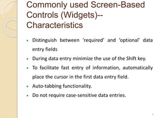
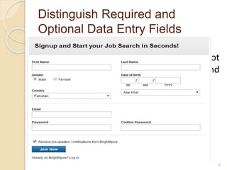
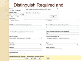
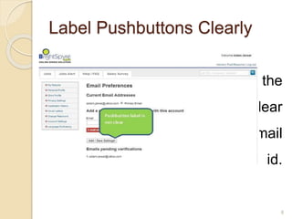
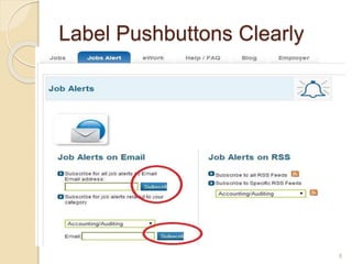
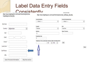
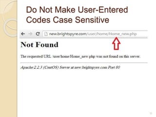
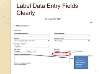
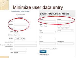
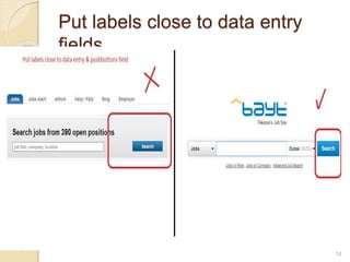
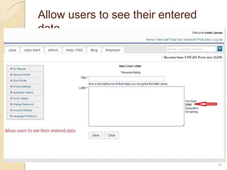
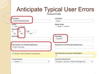
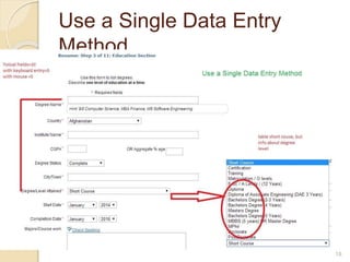
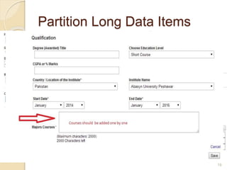
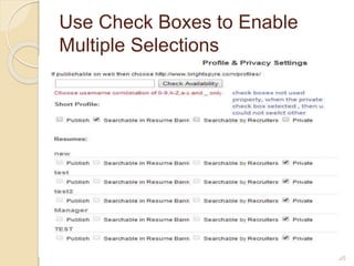
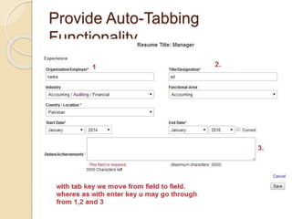
Screen Based Controls
Presenter: Muhammad Aslam Jarwar & Shahid
Janjua
Commonly used Screen-Based
Controls (Widgets)
 Pushbuttons
 Radio buttons
 Check boxes
 Drop down lists
 Data entry fields –Text boxes
2
Commonly used Screen-Based
Controls (Widgets)--
Characteristics
 Pushbuttons look like pushbuttons and that they are clearly
labeled.
 Check boxes should be used to make binary choices, e.g.,
’yes’ or ’no.’
 To minimize the amount of information entered by users.
 Each entry field should be clearly and consistently labeled.
 Place label close to the entry fields.
3
Commonly used Screen-Based
Controls (Widgets)--
Characteristics
 Distinguish between ‘required’ and ‘optional’ data
entry fields
 During data entry minimize the use of the Shift key.
 To facilitate fast entry of information, automatically
place the cursor in the first data entry field.
 Auto-tabbing functionality.
 Do not require case-sensitive data entries.
4
Introduction to Brightspyre
 BrightSpyre is a job portal .
 BrightSpyre was successfully launched on
August 2002 in Pakistan.
 BrightSpyre is Pakistan’s fastest growing
online recruitment solution with a striking
figure of 4 Million hits per month and a
resume bank of 200,000+ from all over
Pakistan and abroad.
5
Distinguish Required and
Optional Data Entry Fields
 At the sign up page, the form does not
distinguish between Required and
optional fields. BrightSpyre sign up
6
Distinguish Required and
Optional Data Entry Fields
 The Personal Profile page shows that
phone number field is not necessary, but
when we try to save the form without
phone number, it displayed warning. Phone
Number Warrning
7
Label Pushbuttons Clearly
 At the account setting page the
push button label is not clear
either it is saving existing email
setting or adding new email id.
Pushbuttons
8
Label Pushbuttons Clearly
 spelling mistake in subscribe push
buttons
9
Label Data Entry Fields
Consistently
 Ensure that data entry labels are worded
consistently.
 same data item is given the same label if
it appears on different pages.
 Inconsistent label phone & Address on
different pages.
10
Do Not Make User-Entered
Codes Case Sensitive
 when we visit home page with Capital
‘H’ in URL bar , then the system did
not find the home page.
11
Label Data Entry Fields
Clearly
 Display an associated label for each
data entry field to help users
understand what entries are desired.
 Employ descriptive labels that clearly,
concisely, and unambiguously define
the required entry.
12
Minimize user data entry
 Do not require users to enter the same
information more than once.
 When we fill form at sign up page we
enter First name, last name and other
info. The form at creating resume asks
for filling the same info again.
13
Put labels close to data entry
fields
 Ensure that labels are close enough to
their associated data entry fields so
that users will recognize the label as
describing the data entry field.
14
Allow users to see their entered
data
 Create data entry fields that are large
enough to show all of the entered data
without scrolling.
 Users should be able to see their
entire entry at one time.
15
Use Radio Buttons for Mutually
Exclusive Selections
 Radio buttons should be used when there is a
need to select from among mutually exclusive
items.
 Radio buttons elicit reliably better performance
than drop-down lists.
 One study reported that for making mutually
exclusive selections, radio buttons elicit reliably
better performance than drop-down lists.
16
Anticipate Typical User Errors
 Use the computer to detect errors made by users.
 Anticipate possible user errors, and when possible, allocate
responsibility to the computer to identify these mistakes and
suggest corrections.
 For example, if a date is entered as ’February 31,’ the
computer should generate an error message asking for a
revised entry.
17
Use a Single Data Entry
Method
 Design data entry transactions so that users can
stay with one entry method as long as possible.
 Do not have users shift back and forth between
data entry methods. Requiring users to make
numerous shifts from keyboard to mouse to
keyboard can substantially slow their entry speed
18
Partition Long Data Items
 Partition long data items into shorter sections for
both data entry and data display.
 Partitioning long data items can aid users in
detecting entry errors, and can reduce erroneous
entries.
 For example, it is easier to enter and verify a
thirteen digit CNIC number when entered as
three groups, XXXXX-XXXXXXX-X.
19
Use Check Boxes to Enable
Multiple Selections
 Use a check box control to allow users
to select one or more items from a list
of possible choices.
 Each check box should be able to be
selected independently of all other
check boxes.
20
Do Not Limit Viewable List Box Options
21
 When using open lists, show as many
options as possible.
 Scrolling to find an item in a list box
can take extra time .
Display Default Values
 Display default values whenever a likely default choice
can be defined.
 The initial or default item could be the most frequently
selected item or the last item selected by that user.
 Default values can be used to speed data entry.
22
Place Cursor in First Data Entry
Field
 Place (automatically) a blinking cursor at the
beginning of the first data entry field when a data
entry form is displayed on a page.
 Users should not be required to move the mouse
pointer to the first data entry field and click on the
mouse button to activate the field.
23
Use Open Lists to Select One from
Many
 the more items users can see in a list
(without scrolling), the faster their responses
will be, and the fewer omission errors they
will make.
 users should be able to see all available
items without scrolling.
 Try to use open list, instead of drop down list,
because drop down lists require extra click to
open.
24
Provide Auto-Tabbing
Functionality
 Provide auto-tabbing functionality for frequent
users with advanced Web interaction skills.
 Auto-tabbing can significantly reduce data
entry times for frequent users by not requiring
them to manually tab from field to field.
25
26

Screen based controls

  • 1.
    Screen Based Controls Presenter:Muhammad Aslam Jarwar & Shahid Janjua
  • 2.
    Commonly used Screen-Based Controls(Widgets)  Pushbuttons  Radio buttons  Check boxes  Drop down lists  Data entry fields –Text boxes 2
  • 3.
    Commonly used Screen-Based Controls(Widgets)-- Characteristics  Pushbuttons look like pushbuttons and that they are clearly labeled.  Check boxes should be used to make binary choices, e.g., ’yes’ or ’no.’  To minimize the amount of information entered by users.  Each entry field should be clearly and consistently labeled.  Place label close to the entry fields. 3
  • 4.
    Commonly used Screen-Based Controls(Widgets)-- Characteristics  Distinguish between ‘required’ and ‘optional’ data entry fields  During data entry minimize the use of the Shift key.  To facilitate fast entry of information, automatically place the cursor in the first data entry field.  Auto-tabbing functionality.  Do not require case-sensitive data entries. 4
  • 5.
    Introduction to Brightspyre BrightSpyre is a job portal .  BrightSpyre was successfully launched on August 2002 in Pakistan.  BrightSpyre is Pakistan’s fastest growing online recruitment solution with a striking figure of 4 Million hits per month and a resume bank of 200,000+ from all over Pakistan and abroad. 5
  • 6.
    Distinguish Required and OptionalData Entry Fields  At the sign up page, the form does not distinguish between Required and optional fields. BrightSpyre sign up 6
  • 7.
    Distinguish Required and OptionalData Entry Fields  The Personal Profile page shows that phone number field is not necessary, but when we try to save the form without phone number, it displayed warning. Phone Number Warrning 7
  • 8.
    Label Pushbuttons Clearly At the account setting page the push button label is not clear either it is saving existing email setting or adding new email id. Pushbuttons 8
  • 9.
    Label Pushbuttons Clearly spelling mistake in subscribe push buttons 9
  • 10.
    Label Data EntryFields Consistently  Ensure that data entry labels are worded consistently.  same data item is given the same label if it appears on different pages.  Inconsistent label phone & Address on different pages. 10
  • 11.
    Do Not MakeUser-Entered Codes Case Sensitive  when we visit home page with Capital ‘H’ in URL bar , then the system did not find the home page. 11
  • 12.
    Label Data EntryFields Clearly  Display an associated label for each data entry field to help users understand what entries are desired.  Employ descriptive labels that clearly, concisely, and unambiguously define the required entry. 12
  • 13.
    Minimize user dataentry  Do not require users to enter the same information more than once.  When we fill form at sign up page we enter First name, last name and other info. The form at creating resume asks for filling the same info again. 13
  • 14.
    Put labels closeto data entry fields  Ensure that labels are close enough to their associated data entry fields so that users will recognize the label as describing the data entry field. 14
  • 15.
    Allow users tosee their entered data  Create data entry fields that are large enough to show all of the entered data without scrolling.  Users should be able to see their entire entry at one time. 15
  • 16.
    Use Radio Buttonsfor Mutually Exclusive Selections  Radio buttons should be used when there is a need to select from among mutually exclusive items.  Radio buttons elicit reliably better performance than drop-down lists.  One study reported that for making mutually exclusive selections, radio buttons elicit reliably better performance than drop-down lists. 16
  • 17.
    Anticipate Typical UserErrors  Use the computer to detect errors made by users.  Anticipate possible user errors, and when possible, allocate responsibility to the computer to identify these mistakes and suggest corrections.  For example, if a date is entered as ’February 31,’ the computer should generate an error message asking for a revised entry. 17
  • 18.
    Use a SingleData Entry Method  Design data entry transactions so that users can stay with one entry method as long as possible.  Do not have users shift back and forth between data entry methods. Requiring users to make numerous shifts from keyboard to mouse to keyboard can substantially slow their entry speed 18
  • 19.
    Partition Long DataItems  Partition long data items into shorter sections for both data entry and data display.  Partitioning long data items can aid users in detecting entry errors, and can reduce erroneous entries.  For example, it is easier to enter and verify a thirteen digit CNIC number when entered as three groups, XXXXX-XXXXXXX-X. 19
  • 20.
    Use Check Boxesto Enable Multiple Selections  Use a check box control to allow users to select one or more items from a list of possible choices.  Each check box should be able to be selected independently of all other check boxes. 20
  • 21.
    Do Not LimitViewable List Box Options 21  When using open lists, show as many options as possible.  Scrolling to find an item in a list box can take extra time .
  • 22.
    Display Default Values Display default values whenever a likely default choice can be defined.  The initial or default item could be the most frequently selected item or the last item selected by that user.  Default values can be used to speed data entry. 22
  • 23.
    Place Cursor inFirst Data Entry Field  Place (automatically) a blinking cursor at the beginning of the first data entry field when a data entry form is displayed on a page.  Users should not be required to move the mouse pointer to the first data entry field and click on the mouse button to activate the field. 23
  • 24.
    Use Open Liststo Select One from Many  the more items users can see in a list (without scrolling), the faster their responses will be, and the fewer omission errors they will make.  users should be able to see all available items without scrolling.  Try to use open list, instead of drop down list, because drop down lists require extra click to open. 24
  • 25.
    Provide Auto-Tabbing Functionality  Provideauto-tabbing functionality for frequent users with advanced Web interaction skills.  Auto-tabbing can significantly reduce data entry times for frequent users by not requiring them to manually tab from field to field. 25
  • 26.