Download to read offline
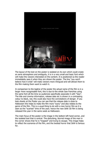


The poster uses isolated text in a small font to intrigue viewers and draw them in. It positions the text so it is immediately visible. The line "you won't believe how it ends" further intrigues viewers and makes them want to watch the film. The title uses a recognizable large font associated with the Saw franchise. Release date information is in a contrasting red color that conveys danger. The date is close to Halloween, relating it to the scary time of year and horror genre. The main focus is a blurred, trapped image in the corner reflecting the film's twisted scenarios and Saw's fame for horror.


