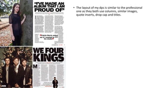
Rough Cut Comparison
• The text ratio is similar
• The sell line content is similar.
• Font choice is similar on some of the sell lines but
quite different on the masthead and main sell line.
• The colour use is similar.
• Photo composition is quite similar but the space
above head is different, the lighting, location and
angle are similar but the pose is different.
• The theme throughout all 4 pages of the magazine is
similar but could be improved.
• There is more dead space on my front cover.
• Better graphic design is used on the professional
magazine.
• I think my front cover shows that it was inspired by
this NME cover.
• Layout is similar however the content ratio is much
higher on the professional magazine.
• My font choice is similar to NME’s, however theirs's is
bolder. The font variation is similar.
• The colour use is similar
• The photography is different by using a different
location, lighting and angle.
• I have more dead space on my contents page than
NME.
• My contents has copied quite a lot of this page.
• The layout of my dps is similar to the professional
one as they both use columns, similar images,
quote inserts, drop cap and titles.

Rough cut comparison

  • 1.
  • 2.
    • The textratio is similar • The sell line content is similar. • Font choice is similar on some of the sell lines but quite different on the masthead and main sell line. • The colour use is similar. • Photo composition is quite similar but the space above head is different, the lighting, location and angle are similar but the pose is different. • The theme throughout all 4 pages of the magazine is similar but could be improved. • There is more dead space on my front cover. • Better graphic design is used on the professional magazine. • I think my front cover shows that it was inspired by this NME cover.
  • 3.
    • Layout issimilar however the content ratio is much higher on the professional magazine. • My font choice is similar to NME’s, however theirs's is bolder. The font variation is similar. • The colour use is similar • The photography is different by using a different location, lighting and angle. • I have more dead space on my contents page than NME. • My contents has copied quite a lot of this page.
  • 4.
    • The layoutof my dps is similar to the professional one as they both use columns, similar images, quote inserts, drop cap and titles.