This presentation is to show all of our
inspirational adverts and double page spread for
draft 5, and how we got into our final draft.
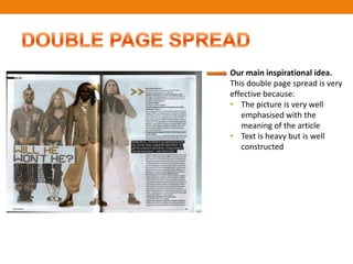
Our main inspirational idea.
This double page spread is very
effective because:
• The picture is very well
   emphasised with the
   meaning of the article
• Text is heavy but is well
   constructed
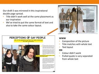
Our draft 5 was mirrored in this inspirational
double page spread.
• Title didn’t work well at the same placement as
  our inspiration
• We’ve tried to put the same format of text and
  also to take the same colour layout.


                                                    WWW
                                                    • Composition of the picture
                                                    • Title matches with whole text
                                                    • Text layout
                                                    EBI
                                                    • Colour didn’t work
                                                    • Pulled quote is very separated
                                                       from whole text
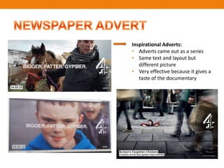
Inspirational Adverts:
• Adverts came out as a series
• Same text and layout but
   different picture
• Very effective because it gives a
   taste of the documentary
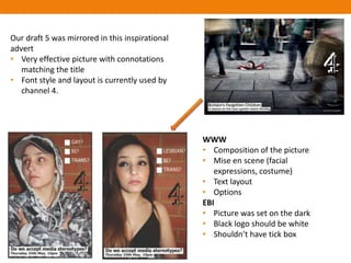
Our draft 5 was mirrored in this inspirational
advert
• Very effective picture with connotations
   matching the title
• Font style and layout is currently used by
   channel 4.


                                                 WWW
                                                 • Composition of the picture
                                                 • Mise en scene (facial
                                                    expressions, costume)
                                                 • Text layout
                                                 • Options
                                                 EBI
                                                 • Picture was set on the dark
                                                 • Black logo should be white
                                                 • Shouldn’t have tick box

Ancillaries draft 5

  • 1.
    This presentation isto show all of our inspirational adverts and double page spread for draft 5, and how we got into our final draft.
  • 2.
    Our main inspirationalidea. This double page spread is very effective because: • The picture is very well emphasised with the meaning of the article • Text is heavy but is well constructed
  • 3.
    Our draft 5was mirrored in this inspirational double page spread. • Title didn’t work well at the same placement as our inspiration • We’ve tried to put the same format of text and also to take the same colour layout. WWW • Composition of the picture • Title matches with whole text • Text layout EBI • Colour didn’t work • Pulled quote is very separated from whole text
  • 4.
    Inspirational Adverts: • Advertscame out as a series • Same text and layout but different picture • Very effective because it gives a taste of the documentary
  • 5.
    Our draft 5was mirrored in this inspirational advert • Very effective picture with connotations matching the title • Font style and layout is currently used by channel 4. WWW • Composition of the picture • Mise en scene (facial expressions, costume) • Text layout • Options EBI • Picture was set on the dark • Black logo should be white • Shouldn’t have tick box