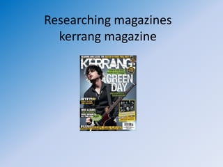
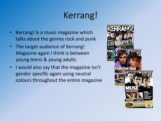
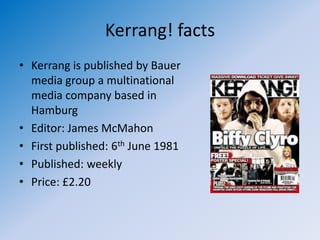
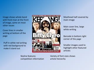
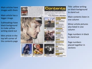
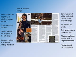
Researching magazines
  kerrang magazine
Kerrang!
• Kerrang! Is a music magazine which
  talks about the genres rock and punk
• The target audience of Kerrang!
  Magazine again I think is between
  young teens & young adults
• I would also say that the magazine isn't
  gender specific again using neutral
  colours throughout the entire magazine
Kerrang! facts
• Kerrang is published by Bauer
  media group a multinational
  media company based in
  Hamburg
• Editor: James McMahon
• First published: 6th June 1981
• Published: weekly
• Price: £2.20
Image shows whole band                                    Masthead half covered by
with front man at the front                               main image
of image, same on most
other issues                                              Main cover line, large
Cover lines in smaller                                    white writing
writing at bottom of the
page                                                      Barcode in bottom right
                                                          corner of the page
Puff in white red writing
with red background to                                    Smaller images used to
make it stand out                                         highlight other featured
                                                          articles

                  Skyline features          Variety of font sizes shows
                  competition information   article hierarchy
Main articles have    Title: yellow writing
images with them      on black background
                      to stand out
Main article has a
                      Main contents listen in
bigger image
                      one column
Subheadings have
                      Minor article pictures
black background
                      also listed in one
to make yellow
                      column
writing stand out
                      Page numbers in black
Mini article in the
                      to stand out
top left corner of
the contents page     Page numbers
                      placed together in
                      sections
Puffs in black ad
                     orange
Pull quote at the                        Continuation of
beginning of                             white and black
article, overlaps                        colours from
picture                                  contents page

Text is written in                       No title for the
columns                                  article
                                         Text wraps around
Photos take up
                                         black text box
the majority of
the left page                            All paragraphs are
                                         started with a
Black text colour                        large drop capital
to make the
writing stand out                        Text wrapped
                                         around photos
Influence on my magazine
• I like the way the page numbers are arranged
  into categories
• I also like the way the pictures fit into columns
  aswell
• Will use a larger image to denote most
  important article on contents page

Researching magazines 2nd mag

  • 1.
    Researching magazines kerrang magazine
  • 2.
    Kerrang! • Kerrang! Isa music magazine which talks about the genres rock and punk • The target audience of Kerrang! Magazine again I think is between young teens & young adults • I would also say that the magazine isn't gender specific again using neutral colours throughout the entire magazine
  • 3.
    Kerrang! facts • Kerrangis published by Bauer media group a multinational media company based in Hamburg • Editor: James McMahon • First published: 6th June 1981 • Published: weekly • Price: £2.20
  • 4.
    Image shows wholeband Masthead half covered by with front man at the front main image of image, same on most other issues Main cover line, large Cover lines in smaller white writing writing at bottom of the page Barcode in bottom right corner of the page Puff in white red writing with red background to Smaller images used to make it stand out highlight other featured articles Skyline features Variety of font sizes shows competition information article hierarchy
  • 5.
    Main articles have Title: yellow writing images with them on black background to stand out Main article has a Main contents listen in bigger image one column Subheadings have Minor article pictures black background also listed in one to make yellow column writing stand out Page numbers in black Mini article in the to stand out top left corner of the contents page Page numbers placed together in sections
  • 6.
    Puffs in blackad orange Pull quote at the Continuation of beginning of white and black article, overlaps colours from picture contents page Text is written in No title for the columns article Text wraps around Photos take up black text box the majority of the left page All paragraphs are started with a Black text colour large drop capital to make the writing stand out Text wrapped around photos
  • 7.
    Influence on mymagazine • I like the way the page numbers are arranged into categories • I also like the way the pictures fit into columns aswell • Will use a larger image to denote most important article on contents page