ROUGH COPY FEEDBACK
Overview
Our teaser gained very
positive reviews and many of
the points raised were similar
so we were able to pinpoint
what was wrong, the worst
comment we got was how
stereotypical the plot seemed.
Positives
Many positives about our trailer were:
•The pace – It was very quick and wanted the
audience to find out more
•Gave an potential plot line without giving it
all away
•Camera work was professional and
interesting, many shots were different and
didn‟t seem repetitive
•The graphics were very professional and
contained relevant information.
Negatives
Some negatives about our trailer were:
•The plot line seemed very cliché and
stereotypical
•Camera work was shaky (although intended)
•The title is spelt wrong (deliberate mistake)
•The title seems more appropriate for a
drama/romantic
•Too quick, couldn't see what was happening
•White boxes around graphics
Conclusion
Despite some criticism of the camera work being
shaky, we have decided to keep it shaky to give a
sense of realism (I took inspiration from Gary Ross
(The Hunger Games), as it made you feel like you
were in the movie)
Also we do understand and agree with the fact the plot
is VERY stereotypical but from a teaser trailer there is
only so much you can reveal, and the plot does have
some interesting twists and turns that set it apart from
other Horror Films
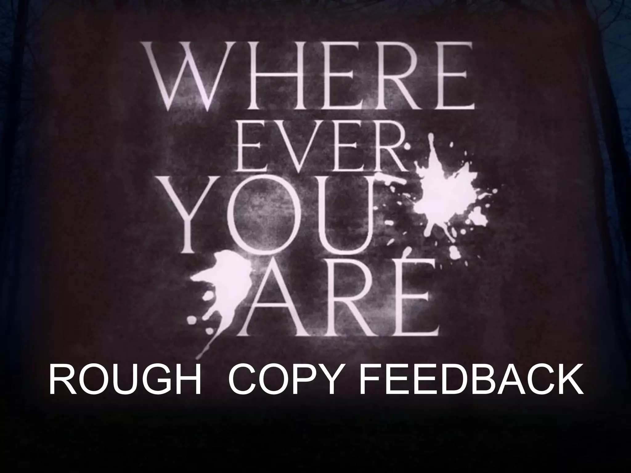
Concerning the title, we chose to misspell the word
„Wherever‟ to Where Ever due to aesthetic reasons as
we believe the logo looks better as four words
Conclusion
Also with regards to the name „Where Ever You Are‟
we chose this name to connect it to the game of hide
and seek which is a big narrative theme. We did battle
with names such as „Hide and Seek‟ and „Come Out,
Come out‟ but we thought the idea of the killer saying
“where ever you are” seemed more intimidating
because he is determined to find you!
We did remove the white boxes around the graphics,
by cropping the images it was due to the size of the
image not being the same as the video player.
Overall, i think we have responded to some of the
criticism but have also stuck with our guns and
proceeded with some of the criticisms.

Rough Copy Feedback

  • 1.
  • 2.
    Overview Our teaser gainedvery positive reviews and many of the points raised were similar so we were able to pinpoint what was wrong, the worst comment we got was how stereotypical the plot seemed.
  • 3.
    Positives Many positives aboutour trailer were: •The pace – It was very quick and wanted the audience to find out more •Gave an potential plot line without giving it all away •Camera work was professional and interesting, many shots were different and didn‟t seem repetitive •The graphics were very professional and contained relevant information.
  • 4.
    Negatives Some negatives aboutour trailer were: •The plot line seemed very cliché and stereotypical •Camera work was shaky (although intended) •The title is spelt wrong (deliberate mistake) •The title seems more appropriate for a drama/romantic •Too quick, couldn't see what was happening •White boxes around graphics
  • 5.
    Conclusion Despite some criticismof the camera work being shaky, we have decided to keep it shaky to give a sense of realism (I took inspiration from Gary Ross (The Hunger Games), as it made you feel like you were in the movie) Also we do understand and agree with the fact the plot is VERY stereotypical but from a teaser trailer there is only so much you can reveal, and the plot does have some interesting twists and turns that set it apart from other Horror Films Concerning the title, we chose to misspell the word „Wherever‟ to Where Ever due to aesthetic reasons as we believe the logo looks better as four words
  • 6.
    Conclusion Also with regardsto the name „Where Ever You Are‟ we chose this name to connect it to the game of hide and seek which is a big narrative theme. We did battle with names such as „Hide and Seek‟ and „Come Out, Come out‟ but we thought the idea of the killer saying “where ever you are” seemed more intimidating because he is determined to find you! We did remove the white boxes around the graphics, by cropping the images it was due to the size of the image not being the same as the video player. Overall, i think we have responded to some of the criticism but have also stuck with our guns and proceeded with some of the criticisms.