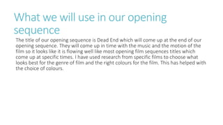
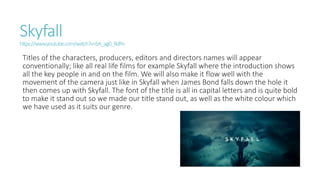
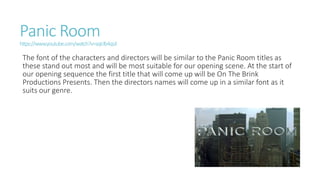
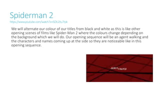
Titles Research
By Joe Turner
What we will use in our opening
sequence
The title of our opening sequence is Dead End which will come up at the end of our
opening sequence. They will come up in time with the music and the motion of the
film so it looks like it is flowing well like most opening film sequences titles which
come up at specific times. I have used research from specific films to choose what
looks best for the genre of film and the right colours for the film. This has helped with
the choice of colours.
Skyfall
https://www.youtube.com/watch?v=bA_ag0_BdPo
Titles of the characters, producers, editors and directors names will appear
conventionally; like all real life films for example Skyfall where the introduction shows
all the key people in and on the film. We will also make it flow well with the
movement of the camera just like in Skyfall when James Bond falls down the hole it
then comes up with Skyfall. The font of the title is all in capital letters and is quite bold
to make it stand out so we made our title stand out, as well as the white colour which
we have used as it suits our genre.
Panic Room
https://www.youtube.com/watch?v=sqIclb4qsJI
The font of the characters and directors will be similar to the Panic Room titles as
these stand out most and will be most suitable for our opening scene. At the start of
our opening sequence the first title that will come up will be On The Brink
Productions Presents. Then the directors names will come up in a similar font as it
suits our genre.
Spiderman 2
https://www.youtube.com/watch?v=iSDU2tu7rpk
We will alternate our colour of our titles from black and white as this is like other
opening scenes of films like Spider-Man 2 where the colours change depending on
the background which we will do. Our opening sequence will be an agent walking and
the characters and names coming up at the side so they are noticeable like in this
opening sequence.

Titles research

  • 1.
  • 2.
    What we willuse in our opening sequence The title of our opening sequence is Dead End which will come up at the end of our opening sequence. They will come up in time with the music and the motion of the film so it looks like it is flowing well like most opening film sequences titles which come up at specific times. I have used research from specific films to choose what looks best for the genre of film and the right colours for the film. This has helped with the choice of colours.
  • 3.
    Skyfall https://www.youtube.com/watch?v=bA_ag0_BdPo Titles of thecharacters, producers, editors and directors names will appear conventionally; like all real life films for example Skyfall where the introduction shows all the key people in and on the film. We will also make it flow well with the movement of the camera just like in Skyfall when James Bond falls down the hole it then comes up with Skyfall. The font of the title is all in capital letters and is quite bold to make it stand out so we made our title stand out, as well as the white colour which we have used as it suits our genre.
  • 4.
    Panic Room https://www.youtube.com/watch?v=sqIclb4qsJI The fontof the characters and directors will be similar to the Panic Room titles as these stand out most and will be most suitable for our opening scene. At the start of our opening sequence the first title that will come up will be On The Brink Productions Presents. Then the directors names will come up in a similar font as it suits our genre.
  • 5.
    Spiderman 2 https://www.youtube.com/watch?v=iSDU2tu7rpk We willalternate our colour of our titles from black and white as this is like other opening scenes of films like Spider-Man 2 where the colours change depending on the background which we will do. Our opening sequence will be an agent walking and the characters and names coming up at the side so they are noticeable like in this opening sequence.