
Recommended
Recommended
More Related Content
What's hot
What's hot (20)
Viewers also liked
Viewers also liked (15)
Similar to RWD Essential Aspects & Benefits
Similar to RWD Essential Aspects & Benefits (20)
Recently uploaded
Recently uploaded (20)
RWD Essential Aspects & Benefits
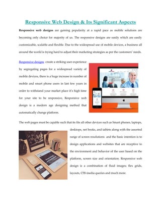
- 1. Responsive Web Design & Its Significant Aspects Responsive web designs are gaining popularity at a rapid pace as mobile solutions are becoming only choice for majority of us. The responsive designs are easily which are easily customizable, scalable and flexible. Due to the widespread use of mobile devices, a business all around the world is trying hard to adjust their marketing strategies as per the customers’ needs. Responsive designs create a striking user experience by segregating pages for a widespread variety of mobile devices, there is a huge increase in number of mobile and smart phone users in last few years in order to withstand your market place it’s high time for your site to be responsive, Responsive web design is a modern age designing method that automatically change platform. The web pages must be capable such that its fits all other devices such as Smart phones, laptops, desktops, net books, and tablets along with the assorted range of screen resolutions and the basic intention is to design applications and websites that are receptive to the environment and behavior of the user based on the platform, screen size and orientation. Responsive web design is a combination of fluid images; flex grids, layouts, CSS media queries and much more.
- 2. • It has Flexible Layout arrangement. • Adjusts screen resolution according to device shape, size and resolution and this is the behavior of Responsive Web Design. • Derive Complex Images That Can Slide. • Reveals portion of an image and hides it too. SEO is one of the major reasons for responsive web design, for any website links are at most important that helps visitors to get into a right page of the website. Websites using responsive web design save your money and time, with responsive web design, your website has to be designed only once, saving your investment in terms of time as well as money, if separate websites are designed for different devices it creates unwanted load on the server and brings down the speed of your website. Responsive Web Design Are Based On The Following Strategies: Adaptive Web Design: This Web design progressively enhances your web site, it also involves range of strategies which can be combined with responsive web design, it can achieved through varied execution tactics including server side user agent detection, or client side responsive web design.
- 3. CSS Framework: Cascading style sheets are pre-prepared software frameworks that makes your web designing work much easier, these framework mostly consist of a grid with more features and additional JavaScript based functions, but are mostly design oriented and unobtrusive. Progressive enhancement: It is a web design strategy that enhances that emphasizes accessibility, semantic HTML markup, and external style sheet and scripting technologies, it allows everyone to access the basic content and functionality of a web page with more advanced browser software or greater bandwidth. Tableless web design: This web design uses HTML tables for page layout control purposes, to arrange elements and text on a web page it uses cascading style sheet. At BlazeDream we design Responsive Websites, responsive web design is not only about adjustable screen resolutions and automatically resizable images, but rather about a whole new way of thinking about design. For more information’s contact: http://blazedream.com/