Downloaded 24 times


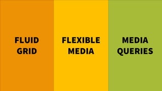

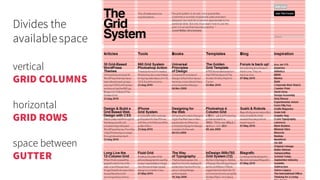
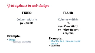

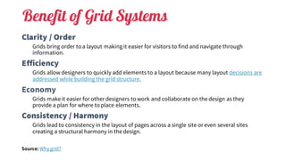


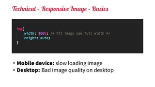


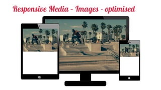
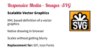
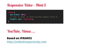
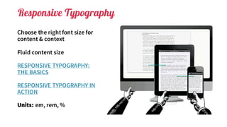
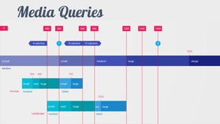
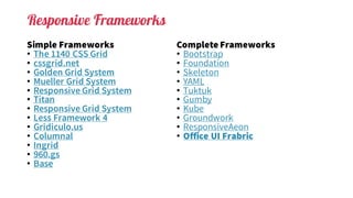

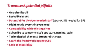
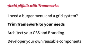

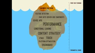

This document discusses responsive web design. It begins by stating that responsive design is about content and context, not devices. It then covers fluid grids and flexible layouts using media queries. Grid systems help bring order and structure to layouts. Images, videos, typography and other elements need flexible solutions to respond to different screen sizes. Frameworks provide tools for responsive design but have some potential pitfalls, so tailoring them to specific needs is important.