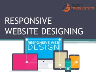
Responsive website designing
•Download as PPTX, PDF•
0 likes•19 views

Responsive Web design is the approach that suggests that design and development should respond to the user’s behaviour and environment based on screen size, platform and orientation.

Recommended
Recommended
More Related Content
What's hot
Similar to Responsive website designing
Similar to Responsive website designing (20)
Recently uploaded
Recently uploaded (20)
Responsive website designing
- 2. What is Responsive Web design? • Responsive Web design is the approach that suggests that design and development should respond to the user’s behaviour and environment based on screen size, platform and orientation.
- 3. What Does Responsive Web Design Look Like? • The purpose of responsive design is to have one site, but with different elements that respond differently when viewed on devices of different sizes.
- 4. • Let’s take a traditional “fixed” website. When viewed on a desktop computer, for instance, the website might show three columns. But when you view that same layout on a smaller tablet, it might force you to scroll horizontally, something users don’t like. Or elements might be hidden from view or look distorted. The impact is also complicated by the fact that many tablets can be viewed either in portrait orientation, or turned sideways for landscape view.
- 5. How Does Responsive Web Design Work? • Responsive sites use fluid grids. All page elements are sized by proportion, rather than pixels. So if you have three columns, you wouldn’t say exactly how wide each should be, but rather how wide they should be in relation to the other columns. Column 1 should take up half the page, column 2 should take up 30%, and column 3 should take up 20%, for instance.
- 6. Reach us at: •OGEN INFOSYSTEM PVT. LTD. Address: 59, First Floor, Rama Road Industrial Area, Near Kirti Nagar Metro Station, Delhi, 110015, India Call us at: 965-493-9970 Whatsapp us at: 965-493-9970 www.ogeninfo.com