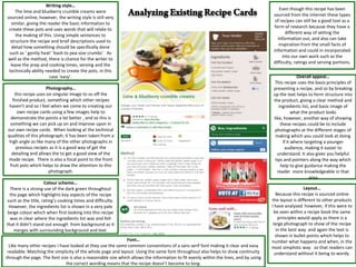
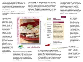
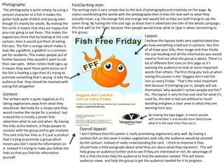
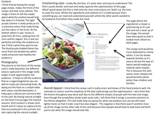
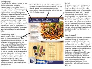
This document provides an analysis of the design elements used across multiple recipe cards.
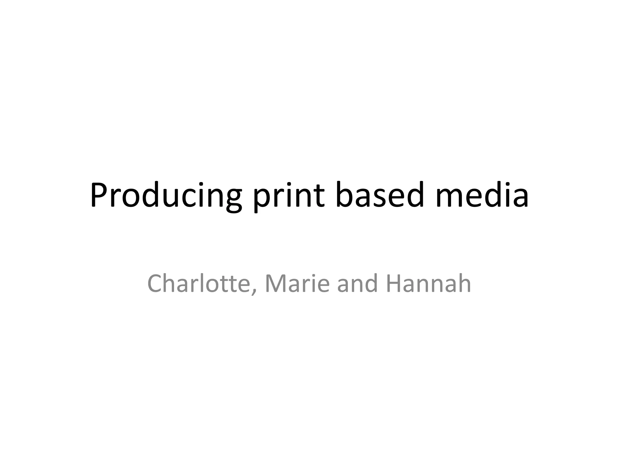
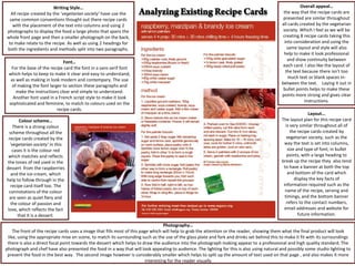
1) Common conventions are used across the cards, including placing text in columns, using photographs of the food, and consistent layouts and color schemes.
2) Photos are typically high quality and help showcase the food. Fonts are easy to read while additional design elements like patterns add visual interest.
3) Color schemes often reflect the foods featured or seasonal influences. Layouts clearly separate ingredients from instructions for easy reading. Additional details help with appeal and usability.
The document analyzes various aspects of NME magazine, including its cover featuring Dizzee Rascal, contents page, and a double page article spread. Key points include:
1) The cover uses design elements like typography, imagery and color scheme to portray Dizzee Rascal as an urban artist and promote a sense of new music.
2) The contents page lists articles in a clear layout and uses red and black colors consistently with the magazine's style.
3) The double page spread continues using a photo of Dizzee Rascal and design principles like column layout and captions to tell the story of the artist.
This document provides a summary of a music magazine contents page layout:
The contents page uses a unique three-part title and creative visuals to draw in readers in a modern and distinctive way. Band names and page numbers are listed clearly in red and black for easy navigation. Bold subheadings and featured articles are highlighted in white and red to stand out from photos and guide the eye. The overall design aims to present the magazine as professional, well-organized, and structured while blending sections together smoothly for a modern look.
This recipe card provides instructions for making a festive filo pillow in a clean, easy to follow format. The front features an image of the finished product and the company logo. On the back, the ingredients and instructions are laid out in columns alongside a smaller reference image. Key details are highlighted in gold and purple fonts, continuing the festive color scheme while the main text remains simple black. The overall layout and design makes the recipe visually appealing and accessible.
The masthead is placed at the top left to easily identify the magazine. Colors like red are used to draw attention to important elements. The main image is of a well-known artist to attract readers interested in that artist. Additional images and stories would further engage readers by informing them of related content.
The document provides an analysis of the front covers and double page spreads of three dance music magazines: DJ Mag, Mixmag, and Knowledge Magazine. It examines the design elements, color schemes, photography styles, and writing approaches used and how they appeal to different target audiences. For DJ Mag and Mixmag, the covers use bright, energetic colors and casual photography and writing to attract a younger audience. Knowledge Magazine features a more serious black and white aesthetic and minimal text, aiming to appeal to an older, more technically-minded readership.
The document analyzes and compares the contents pages of two music magazines - Kerrang! and Q Magazine. Both magazines use their mastheads, continuous color schemes, and teasers to attract readers. However, Kerrang!'s contents page has a more cluttered layout while Q's is neatly structured. Kerrang! also uses a informal sans serif font compared to Q's more formal serif font. The main images on both pages reflect the magazines' genres by featuring popular bands, though Kerrang!'s image has a punk/rock style and Q's portrays its more sophisticated audience.
Evaluation of music magazine courseworkChristmasJ1
The document evaluates a music magazine product. It summarizes how the magazine challenges conventions of real music magazines in its layout, design choices, and content. This includes placing the contents list on the left page rather than right, including coverlines and straplines for each content item, and using one large featured image rather than multiple small ones. It also discusses representing a younger, more rebellious rock genre audience and choosing a publisher like Anthem Press that focuses on the music industry.
I developed ideas from similar music magazines like Kerrang and Q magazine but also challenged conventions by changing fonts, colors, and photographic styles. Key developments included using a guitar string graphic for the masthead, changing the interview tone from formal to informal, and incorporating "Polaroid" style photos of musicians in casual clothing to appeal to a younger indie audience. Reviews of new albums were also included to engage readers and advertise for the bands. Overall, the goal was to create a magazine that represented the wild genre but with a more stylish, youthful design.
The contents page uses visual elements like bold text, column structure, and prominent placement of information to clearly convey what is included in the magazine issue. Key elements stand out through the use of large black text and centering. Less important information is placed in discrete sections to avoid clutter. Photographs and graphics help emphasize the magazine's focus on music and celebrity.
The document summarizes the layout and design elements of a magazine article about the artist Lady Gaga. It analyzes where images and text are placed based on optical areas, use of symmetry and balance in design, and adherence to rules of thirds for the main image. Key points analyzed include bold masthead design fitting Gaga's unusual personality, black and white color scheme making the magazine look professional, and large centered image drawing reader attention.
The document analyzes the front cover design of music magazines like NME. It notes several effective design elements that help establish brand identity and attract buyers. These include:
1) Placing the magazine masthead in a fixed, top-left corner location so it is easily visible from the magazine stand.
2) Using consistent color and font for the logo to reinforce brand recognition across issues.
3) Employing bold, bright colors like red to make the logo and headlines stand out.
4) Positioning the main headline on the left side to capture attention from the magazine stand.
5) Including previews of featured bands to attract potential buyers interested in those artists.
This document provides an overview of page patterns, which are predefined layout templates that enable designers to quickly and consistently generate deliverables. Page patterns include common sections like metadata, strategy, research, and more. They allow generating content faster while maintaining a consistent structure. Designers can also share page patterns and get input from clients before starting a project to set expectations. Automating deliverables through scripting page patterns is also discussed.
The document summarizes the design elements of a magazine page layout. Key details include the use of bold colors like red and orange to draw attention to important titles and sections. Font size and color are also used consistently to indicate relative importance. Images of artists are featured prominently in a black and white style consistent with the magazine's rock music genre. Together these visual design choices help engage the target audience and guide their eyes to the most significant information.
The double page spread features two images of the artist being discussed. The main image shows the artist looking happy and engaged in his work, while not making eye contact with the audience. This could intrigue readers to learn more about what is distracting him. The text provides an in-depth article about the artist in paragraph form. Visual and written elements maintain consistency with the magazine's style to reinforce its brand identity.
The magazine cover uses a simple yet professional design that appeals to its target audience of young adults. High key lighting is used on the main image to make the artist easily recognizable. The bold masthead stretches across the top to clearly display the magazine name. Cover lines down the left side briefly summarize additional articles to entice readers. The overall house style with plain colors and formal typefaces creates a serious yet appealing tone.
This document discusses the forms and conventions used in real published magazines and how those can be applied to a student media magazine. Some conventions discussed include using consistent fonts, colors and layouts across issues to create branding; including eye-catching cover images and headlines; and organizing interior pages with columns, subtitles and credits to break up text. Applying similar techniques like bold titles and images, columnar text and credits can help give a student magazine a polished, professional look and feel.
The document provides details about the design process for a fanzine article focused on hippie fashion. It discusses exploring different layouts, typography, and image styles. Examples included a minimalist design using white space and simplistic black and white photos versus a more graphic urban style. Images would reflect hippie symbols and neon colors. Text would use decorative vintage fonts in a variety of sizes and placements. The designer experimented with manipulating photos in Photoshop and combining images and text in creative overlapping columns and rotations across the page. The goal was to create an unconventional, scrapbook-like design that captures the hippie lifestyle.
Marie, Hannah and Charlotte are conducting audience research. There are different types of vegetarians such as semi-vegetarians, pescatarians, lacto-ovo vegetarians, and vegans. People become vegetarian for reasons like animal welfare, health benefits, religion, and environmental sustainability. A typical vegan meal may include foods like tofu, rice, lentils, chickpeas, and oat milk. The number of vegetarians in the UK and USA is growing, influenced by factors such as education and awareness campaigns.
This document provides a self-evaluation of the student's process and final products for a graphic design project. The student produced three final products within the deadline: a fanzine, broadsheet, and tabloid. Time management was key to completing the projects on time. The student gained new skills using InDesign and experimenting with layouts. Feedback noted strengths like bold headlines that catch attention. Areas for improvement included refining mastheads. Overall, the student felt their technical skills with programs like InDesign and Photoshop improved over the course as their style developed.
The document discusses design conventions for tabloid newspaper front pages. It notes that tabloids prioritize images over text, use candid celebrity photos, and employ colors like red prominently. Common layouts include overlapping text and images, headlines and mastheads of equal size, and multiple stories presented on the front page. Successful designs grab attention with eye-catching headlines and balance the ratio of text to large, engaging photographs that illustrate the stories.
This document provides information about the Purdue Chinese Students and Scholars Association (PUCSSA) for the 2009-2010 year. It lists the advisor, president, president's assistant, and vice presidents over different areas. It provides contact information for these roles and notes upcoming volunteer opportunities and events being organized by PUCSSA, including details about locations, dates, and how to get involved. The document aims to inform Chinese students and scholars at Purdue about PUCSSA's leadership and activities.
El informe resume la situación económica de Barcelona después de la recesión y destaca los esfuerzos para promover la recuperación a través de proyectos como el distrito 22@ y mejorar la conectividad. Aunque la recuperación ha comenzado, el crecimiento sigue siendo modesto. El documento enfatiza la necesidad de desarrollar nuevos sectores estratégicos para generar empleo de calidad y avanzar hacia un modelo económico más competitivo.
La comunicación apoyada en tecnologías. El fenomeno de la comunicacióngigivudg
Este documento define la comunicación como el intercambio de información entre un emisor y receptor a través de un medio o canal. Explica que los elementos clave de la comunicación son la fuente del mensaje, el emisor, el medio por el que se transmite el mensaje, y el receptor. También señala que hoy en día existen infinitas maneras para que las personas se comuniquen debido a la variedad de mensajes y estilos comunicativos posibles.
El documento habla sobre la importancia de la innovación en las empresas y el procesamiento de datos e información. Los estudiantes deben hacer un resumen del documento y un ensayo explicando la importancia de los procesos innovadores, el procesamiento de datos e información, y las transacciones de información. El resumen y ensayo se entregan al profesor Jhon Henao al final de la clase.
Redes Culturales En Las Sociedades Hibridasguest18a42e
El terreno cultural es un eficaz reflejo de la densa realidad y las políticas culturales basadas en la participación y la interacción deberán tener en cuenta que la globalización ensalza la destradicionalización y el desarraigo como medidas de dominio
The document discusses different types of briefs that can be used for projects, including contractual, formal, informal, negotiated, commissioned, tender, competition, and co-operative briefs. It provides definitions and discusses the advantages and disadvantages of each type of brief. The key information is that different brief structures suit different needs, and it's important to thoroughly read the brief and discuss it with the client to fully understand what is being asked for before beginning production.
The front of the recipe card features a colorful image of cheese pasta to grab children's attention. While simple, the back could be improved with pictures showing the cooking process. Key information is presented in an easy to understand format split into stages to guide children and adults through making the recipe.
This recipe card uses a combination of serif and sans serif fonts to create a formal, stylish atmosphere fitting for a Christmas recipe. The main image shows the finished pie staged with side dishes to depict a festive meal. Colours like gold and purple represent Christmas, while white and light grey create a snowy background. Decorative elements like baubles and swirls add flair in a way that breaks from the typical geometric style of other cards, conveying the seasonal theme through a stylized layout and formal design.
This recipe card uses a sans serif font throughout that makes the instructions simple and clean. The title is larger to draw attention, with headings in the same color but smaller text. The color scheme is simple, using shades of red and white, which relates to the recipe ingredients of beetroot and rhubarb. A large, in-focus photo takes up most of the front, using shallow depth of field to draw attention to the food and entice viewers. The writing is formal with full sentences and accessible language to make instructions easy to understand.
This recipe card shows how to make Tangy Leek and Ginger Soup. The color scheme matches the colors in the food. The front features a high-quality image of the soup to showcase its texture. Contact details are included on the back for those interested in other recipes.
This second card shows how to make Carrot and Cashew Fan. The color scheme matches the dish and the front features a perfect-looking meal. The company logo promotes other recipes. Ingredients and methods are clearly laid out in an easy-to-read font.
This third card shows how to make Fudge Brownies. The pink and white color scheme seems aimed at young girls. Simple images and a handwritten-
This recipe card uses a sans serif font throughout that is simple and clean, making the instructions easy to understand. A large title font draws the reader's eye. The colour scheme is simple, using only shades of red and white, which relates back to the recipe ingredients of beetroot and rhubarb. A wide-aperture photo takes up most of the front, focusing attention on the food and enticing the reader. The writing style is formal but avoids long words to ensure accessibility. The two-column, two-row layout separates ingredients from instructions neatly.
The document analyzes the layout, design elements, and stylistic choices used in a rock music magazine. It discusses how the banner, titles, images, colors, fonts, and other components are designed to attract attention and convey the magazine's focus on rock music. Specific techniques like a close-up image of a guitarist, broken text fonts, and high-contrast colors are described as visually representing the style of rock music for readers.
The document provides feedback on different ideas for recipe card designs. Key points from the feedback include:
1) Idea 4, which features a potato stamp and purple ink, is praised for its eye-catching design that sticks to the recipe theme. Breaking up the text and using graphics helps make the card easy to read.
2) Photographs and logos need to be added to meet the client brief. Developing a theme, like summer recipes, could make the cards more cohesive.
3) The feedback agrees clear layouts and minimal text make the cards appealing. Dividing content into boxes helps readability. Stamping designs could be used to make the final cards more interesting.
The layout, typography, use of images and color in the sample music magazine are conventional for the genre. The headline is prominently displayed in a large sans-serif font above the article. The image is placed on one side of the spread with the text on the other. The colors used match the magazine's house style. This layout and design elements are similar to other existing music magazines and help make the content appealing to the target audience.
This recipe card uses a simple and clean layout with minimal colors. The photography focuses on clearly presenting the food. A consistent font is used throughout, with one change to draw attention. The writing style is formal and instructive. Overall, the card prioritizes clear organization and presentation over eye-catching design.
This magazine product uses conventions of real magazines such as:
- A masthead at the top of the front cover and contents page
- Placement of the barcode, date, price and cover lines on the front cover
- Consistent color scheme and fonts throughout
- Inclusion of promotional offers, clothing vouchers, and album information
- Double page spreads with large images and article layouts using interviews
The magazine uses various techniques to appeal to its target audience of 16-25 year olds. These include using eye-catching images of celebrities like Lilly Allen on the cover and inside pages. The layout allows the images to dominate the pages and draw readers in. Bold text is used for headlines and section names to guide readers through the content. The magazine also uses the language and style of interviews to appeal to fans of artists like Lilly Allen.
The document provides feedback on recipe cards designed for a student audience. The feedback addresses aspects like the use of color, fonts, images, layout, and how well the cards appeal to students. Overall, the reviewer feels the cards could be improved by using bolder fonts and images more relevant to students to better match the intended audience.
The document discusses the design of flat newspaper plans and layouts. It examines existing newspaper designs like The Times and The Guardian as inspiration. Key elements of newspaper design identified include the masthead at the top, the main story and headline in a large font, and additional featured stories. The main text is usually set in columns, which can be 4-5 columns. Images are also common and help break up the text. Captions accompany images and additional smaller images can be used within the text. Advertisements are also typically placed to attract readers.
The document discusses various typographic design experiments using techniques like duplicating, overlapping, and warping text in different orientations and combinations of fonts to create effects like reflections, distortions, and the illusion of falling letters. A range of fonts including serif, sans serif, and display styles are used along with techniques like drop shadows, strokes, and transparency to enhance the designs for different purposes and audiences. The designs are intended to be simplistic yet effective using layers, rotations, sizing, and placement of text elements.
This document summarizes the design process and decisions for a concert poster. Key elements included incorporating consistent principles while varying rotation, orientation and sizing to see which worked best. A red and black color scheme was used to attract attention while conveying warning. The header was made bolder to stand out. After experimenting, the designer preferred the header on the right for clarity. Artist names were in unique, modern fonts to appeal to younger audiences. Ticket prices were emphasized in a large red font. The layout was refined by fading text banners and using a shadow effect with red text. Social media links were made smaller. Mixing uppercase and lowercase for the date and time added visual interest while maintaining readability.
This document discusses experiments with layout and design for a fashion magazine article. It begins by using a pink and pastel color scheme with cropped face images to suggest femininity. The article is laid out in three columns. Subsequent experiments include a simplistic 5x3 grid with clean lines, wrapping text around a model silhouette, and warping overlapping text and images in multiple layers for a more abstract style appealing to younger audiences. The final design emphasizes layering cut photographs underneath text in columns of varying sizes to maintain an abstract style.
This document analyzes the layout and design of a double page magazine spread featuring an interview with Emma Watson. Key elements discussed include:
- The use of two columns of text split into paragraphs to keep the audience engaged
- A pull quote taken from the interview in the center to highlight part of the content
- Images and text blended together seamlessly through positioning and negative space
- Traditional magazine styles like serif fonts, line spacing and margins incorporated into the minimalist design.
This document summarizes three examples of factual writing:
1. A step-by-step guide for making a friendship bracelet found in a craft book or girl's magazine. It uses diagrams and minimal text with bold numbering to clearly explain the process.
2. A flyer for a museum party that informs people of dates, times, prices, and music lineup. It uses a stylized digital image and lists information in varying font sizes and a bullet point format for clarity.
3. A passage from a history textbook about Alexander the Great, using images and captions to supplement in-depth textual analysis formatted into paragraphs with bolded keywords. It aims to provide reliable information through multiple sources.
The document describes the process of creating experimental portrait photographs using mixed media techniques. To create the first image, the photographer added a black and white filter to the original photograph to make facial features stand out more. Contrast and curves were also added. Newspaper print with words related to unhappiness were layered over the top portion of the face. The eyebrows, eyes, and lips were created using a collage of cut up fashion magazine pieces. For the second image, the photographer created a collage of texts related to depression, then layered newspaper print and scanography images over the original photograph. Mixed media techniques including ripped magazine strips were used to comment on breaking through stereotypes and the idea of self discovery.
This proposal discusses creating a set of 3 photographs exploring the theme of self-discovery. The photos will use scanography to portray what lies beneath people's appearances and the fronts they put up. A model will be scanned with a focus on their face and hands to represent feeling trapped. Mixed media techniques like overlaying textures will also be used to pull out facial features as part of the image's front. The photos aim to show there is more to people than meets the eye and not to judge by appearances.
Ronny Engelmann is a 24-year-old German student and photo artist whose experimental photography work has gained recognition since 2012. He does not specialize in any specific genre and uses techniques like Photoshop compositing to create surreal black-and-white and sepia images.
Bela Borsodi is an Austrian-born still life photographer based in New York known for his mixed media works featuring household objects arranged to look like separate photos combined into one image. His surreal style reflects on fashion and has been featured in magazines and commercial campaigns.
John Stezaker is a British conceptual artist who pioneered a cut-and-paste technique in the 1970s using existing images from books and
I will conduct a scanography experiment on Tuesday, February 4th at 4:30pm using a scanner, black and white prints, cling film, and quotes written on paper. The experiment will involve taking close-up portrait shots of faces with different expressions and poses to select the best three images. These selected images will have color and text quotes added using additional layers of scanned cling film and paper. The goal is to experiment with different effects and layers to produce three final scanography images.
The document outlines a photography experiment to be conducted on February 3rd at 4:30pm using a camera. The experiment aims to create an image similar to a previous scanography but using a different technique. Close-up, eye-level shots will be used to show emotion in the eyes and draw the reader's attention. While the scanography will have closed eyes, the photography will show open eyes to reveal emotion through the eyes in a transparent layer over the scanography. Both black and white and colored images will be taken of posed and laughing subjects and then further developed in Photoshop using filters and photomontage techniques.
The document outlines planning details for a mixed media experiment taking place over two days at York College. Materials including felt tip pens, cellophane, acrylic paints, and textured paper will be used. The first experiment will involve using cellophane as a transparent layer and adding colored pen outlines to contrast emotions in scanned images. A second experiment will explore framing techniques and layering colored papers to create a collage-like effect.
This document discusses ideas for experimental photography projects related to self-discovery. It presents four ideas: 1) Using abandoned buildings to represent memories and history, applying filters and mixed media. 2) Combining scanography and mixed media to create portraits with hidden meanings. 3) Using light writing, reflection, and out-of-focus techniques to capture changes to city locations over time. 4) Creating a still life of sentimental travel objects, scanned with photomontage to represent rediscovery. Each idea discusses techniques like filters, textures, and overlays to convey themes of discovery, identity, and memory.
This proposal discusses creating a set of 3 photographs exploring the theme of self-discovery. The photos will use scanography to portray what lies beneath people's appearances and the fronts they put up. A model will be scanned with a focus on their face and hands to represent feeling trapped. Mixed media techniques like overlaying textures will also be used to pull out facial features as part of the image's front. The photos aim to show there is more to people than meets the eye and not to judge by appearances.
The document describes several experiments in experimental photography conducted by Charlotte Shaw. Shaw explored out-of-focus photography, capturing movement with long shutter speeds, capturing reflections, creating photomontages, light writing, using the Harris shutter app, and scanography. For each technique, Shaw explains the process, shares examples, and discusses ways the experiments could be further developed.
Ronny Engelmann is a 24-year-old German student and photo artist whose experimental photography work using techniques like Photoshop has gained recognition since 2012. His work has no single genre as he quotes "There are too many things in this world." The examples provided show overlays, composites, and manipulations that give his work a contemporary style within experimental photography.
Bela Borsodi is an Austrian-born still life photographer based in New York known for his surreal mixed-media works combining aspects of fine art, graphic design, and psychology. His colorful photographic compositions incorporating household objects have appeared in magazines and advertisements since the 1990s.
John Stezaker is a British conceptual artist recognized
I will conduct a scanography experiment on Tuesday, February 4th at 4:30pm using a scanner, black and white prints, cling film, and quotes written on paper. The experiment will involve taking close-up portrait shots of faces with different expressions and poses to select the best three images. These selected images will have color and text quotes added using additional layers of scanned cling film and paper. The goal is to experiment with different effects and layers to produce three final scanography images.
The document outlines a photography experiment to be conducted on February 3rd at 4:30pm using a camera. The experiment aims to create an image similar to a previous scanography but using a different technique. Close-up, eye-level shots will be used to show emotion in the eyes and draw the reader's attention. While the scanography will have closed eyes, the photography will show open eyes to reveal emotion through the eyes in a transparent layer over the scanography. Both black and white and colored images will be taken of posed and laughing subjects and then further developed in Photoshop using filters and photomontage techniques.
The document outlines planning details for a mixed media experiment taking place over two days at York College. Materials including felt tip pens, cellophane, acrylic paints, and textured paper will be used. The first experiment will involve using cellophane as a transparent layer and adding colored pen outlines to contrast emotions in scanned images. A second experiment will explore framing techniques and layering colored papers to create a collage-like effect.
2. Writing Style… Overall appeal…
All recipe created by the ‘vegetarian society’ have use the the way that the recipe cards are
same common conventions thought out there recipe cards presented are similar throughout
with the placement of the text into columns and using 2 all cards created by the vegetarian
photographs to display the food a large photo that spans the society. Which I feel as we will be
whole front page and then a smaller photograph on the back, creating 8 recipe cards taking this
to make relate to the recipe. As well as using 2 headings for into consideration and using the
both the ingredients and methods split into two paragraphs. same layout and style will also
help to make it look professional
and show continuity between
Font…
each card. I also like the layout of
For the base of the recipe card the font in a sans serif font
the text because there isn't too
which helps to keep to make it clear and easy to understand,
much text or blank spaces in-
as well as making in look modern and contempary. The use
between the text. Laying it out in
of making the font larger to section these paragraphs and
bullet points helps to make these
make the instructions clear and simple to understand.
points more strong and gives clear
Another font used in a French script style to make it look
instructions.
sophisticated and feminine, to match to colours used on the
recipe cards.
Layout…
Colour scheme… The layout plan for this recipe card
There is a strong colour is very similar throughout all of
scheme throughout all the the recipe cards created by
recipe cards created by the vegetarian society, such as the
‘vegetarian society’ in this way the text is set into columns,
cases it is the colour red size and type of font; in bullet
which matches and reflects points, with a large heading to
the tones of red used in the break up the recipe they also tend
dessert from the raspberries to have a banner at both the top
and the ice-cream, which and bottom of the card which
help to follow through in the display the key facts of
recipe card itself too. The information required such as the
connotations of the colour name of the recipe, serving and
are seen as quiet fiery and timings, and the bottom banner
the colour of passion and refers to the contact numbers,
love, which reflects the fact email addresses and website for
that it is a dessert. future information.
Photography…
The front of the recipe cards uses a image that fills most of this page which will help to grab the attention or the reader, showing them what the final product will look
like, using the appropriate mise en scene, to match its surrounding such as the use of the glass plate and fork and drinks set behind this to make it fit with its surroundings
there is also a direct focal point towards the dessert which helps to draw the audience into the photograph making appear to a professional and high quality standard. The
photograph and chef have also presented the food in a way that will look appealing to audience. The lighting for this is also using natural and possibly some studio lighting to
present the food in the best way. The second image however is considerably smaller which helps to split up the amount of text used on that page , and also makes it more
interesting for the reader visually
3. Writing Style… Layout...
The text used for the recipe cards is in first person describing This recipe card spans over 3 pages and each page having a clear purpose; the front page uses a large
the stages that the sandwich is made, using specific words photograph to display the what the recipe looks like and then page 2 is filled with the ingredients
appropriate for cooking industry. Compared to other recipe needed to create the recipe, formatted into bullet points , the fact there is a lot of preparations and
cards I have studied this is more likely to be a recipe book, ingredients needed they have headed there's bullet point to into the different fillings which is also
which explains the reason for it spanning across 3 pages. With listed in order of what, when and how much is required. Which is something we could think about
this being such a big recipe there is a page set aside for the including if there is a lot of ingredients required for a recipe. And so the 3 pages takes a similar format
ingredients and another for the method, which some may into chunks of text for each step/element. They have also included unlike some of the other recipe
argue is a waste of space as in some areas they is a lot of blank cards I have looked at they have added a graphic pattern behind the text which fits in well with the
space. The writer has also included different pull out quotes to colour scheme and makes it more visually appealing without it been to over the top making the text
add interest and description behind the recipe. hard to see.
Colour scheme…
the use of the Overall
orange, red and appeal… i feel
green work well that this recipe
together to create cards uses
a strong colour interesting and
scheme different ways
throughout which to make it more
suggests and appealing to the
follows the audience, as I
spring/summer like the colour
time of year that scheme which
these recipe cards works really
might be found in well with the
or appropriate for. season and
These colours are when this food
used in both the would be most
photographs in the appropriate to
colours of the food eat, the way hat
and also used they have
around the colours presented this
of the text, which Photography… Font… recipe card is
is something found Like other recipe cards the photography is very simplistic with the ratio being the font for this recipe card is set in also appealing
common in recipe more text to images. Using one large image covering the whole page, which a sans serif font making it clear and and made
cards using the presents the food in an attractive and way that captures the ingredients and easy to understand, by emphasising interesting by
colours from the the work gone into the making and processing of the food. There always also some of the wording in bold helps to its use of edgy
food and tends to include utensils for eating within the image to make it more relatable highlight the key elements especially colour, photogr
incorporating this to the topic linking in with its mise-en-scene. the lighting for this is most likely when there is a lot of text on the aph and some
there colour to be high key to brighten up the photographs, making it look summery and page. This photograph is presented of the graphic
scheme for the give it that professional quality. The depth of field for this image is also heavily to be like a polaroid picture which used on and
rest of the recipe focused on the food itself. There is also a smaller version of this image used on helps to give it a scrapbook effect around the
card. the recipe its self , making it easily for the customer to see and understand and make it look more casual images.
helps to break the amount of text up on the page. appropriate for lunches.
4. Writing style…
Even though this recipe has been
The lime and blueberry crumble creams were
sourced from the internet these types
sourced online, however, the writing style is still very
of recipes can still be a good tool as a
similar, giving the reader the basic information to
form of research because they have a
create these pots and uses words that will relate to
different way of setting the
the making of this. Using simple sentences to
information out, and also can take
structure the recipe and brief descriptions used to
inspiration from the small facts of
detail how something should be specifically done
information and could in incorporated
such as ‘ gently heat’ ‘bash to pea-size crumbs’. As
into our own work such as the
well as the method, there is chance for the writer to
difficulty, ratings and serving portions.
leave the prep and cooking times, serving and the
technically ability needed to create the pots, in this
case ‘easy’. Overall appeal…
This recipe uses the basis principles of
Photography… presenting a recipe, and so by breaking
this recipe uses on singular image to so off the up the text helps to form structure into
finished product, something which other recipes the product, giving a clear method and
haven't and so I feel when we come to creating our ingredients list, and basic image of
own recipe cards using a few images help to what the product looks
demonstrate the points a lot better , and so this is like, however, another way of showing
something we can pick up on and improve upon in these recipes could be to include
our own recipe cards. When looking at the technical photographs at the different stages of
qualities of this photograph; it has been taken from a making which you could look at doing
high angle as like many of the other photographs in if it where targeting a younger
previous recipes as it is a good way of get the audience, making it easier to
detailing and allows the to get a good view of the understand. It also gives you helpful
made recipe. There is also a focal point to the front tips and pointers along the way which
fruit pots which helps to draw the attention to this help to give guidance making the
photograph. reader more knowledgeable in that
area
Colour scheme…
There is a strong use of the dark green throughout Layout…
the page which highlights key aspects of the recipe Because this recipe is sourced online
such as the title, rating’s cooking times and difficulty. the layout is different to other products
However, the ingredients list is shown in a very pale I have analysed however, if this were to
beige colour which when first looking into this recipe be seen within a recipe book the same
was in clear where the ingredients list was and felt principles would apply as there is a
that it didn’t stand out enough from background as it large photograph to show of the recipe
merges with surrounding background and text. in the best way and again the text is
shown in bullet points which helps to
Font… number what happens and when, in the
Like many other recipes I have looked at they use the same common conventions of a sans serif font making it clear and easy most simplistic way so that readers can
readable. Matching the simplicity of the whole page and layout. Using the same font throughout also helps to show continuity understand without it being to wordy.
through the page. The font size is also a reasonable size which allows the information to fit evenly within the lines, and by using
the correct wording means that the recipe doesn’t become to long.
5. The font that has been used is simple. This is so Overall review: The card is very simple which can reflect The meal information like time it takes the
the method and ingredients are easy to read and the simplicity of the recipe. The layout is easy to follow and cook and the amount it serves are stated at
understand. If its hard to read then someone understand. Additional alternatives for the recipe are stated the top. This is so it is the first thing the
might get the timings wrong and end up burning later on for different versions on the meal to spice up the audience reads. It lets them now if the
the food or recreating the recipe wrong and it recipe. This is a good feature if someone likes the recipe and recipe is right for them at that time and
won’t taste right. makes it a lot, after a while they would get tired of the same whether or not they will need to change
taste so having additional ingredient ideas can change up the amount of ingredients. The timing icons
The text isn’t aimed at the reader, they only use the taste now and then. are in green which makes them stand out
the word ‘you’ once well describing what items yet fit in with the vegetarian theme.
you need.
The method box is
The purple colour set in a different
scheme is to match colour to help it
the colour of the red stand out. It is the
kidney beans that are most important part
the main ingredient of about the card and
the dish. This ties the needs to be easy to
card together nicely, spot and understand.
letting the theme run The colour chosen is
through the card a block colour so the
allows it to link writing is still clear to
together and seem read. It is a much
more professional. lighter colour than
the text so the words
They have used a red are still readable. The
plate to contrast the colour can be
colour of the associated with the
guacamole. Also these tortilla wraps used in
types of plates are the recipe.
associated with the
Mexican culture. The
lime on the side of the This allows the
plate also links in with audience to know that
the Mexican theme as the card is apart of a
it is a highly used The pictures on the card show the finished series. If they know it is
flavour in Mexican The logo allows people to know that it is product. This allows the public to see the product apart of a series and
cuisine. suitable for their vegetarian diet. The before trying to make it to see if it looks they like the recipe then
logo also makes it look more official and appealing or not. Whether it looks like something they are likely to check
more trustworthy. The logo is in green they would enjoy. The picture takes in most of out the other cards that
because it is a colour highly associated the front of the card to catch the attention of the are part of the set.
with vegetarians because vegetables are public. The chilli fits in with the Mexican food as
also called “greens”. Mexican food is usually spicy.
6. The font contrasts nicely with the curly patterns Contact information and personal details have been This card uses italics for a little side note.
scattered around the card. It is again easy to read and left on the card so you can contact the company with Its saying what kind of pan you’ll need as it
understand. The colour of the font fits in with the opinions or your own recipes. Their website is also on important because of the size of the pie. It is
patterns and decoration on the card. the card, advertising more recipes. also in a purple, which is one of the darker
colours on the card, making it stand out. Making
This card has the it stand out must mean it is important.
picture on the back
and the front so no The colours used
matter which side on this card are
you’re looking at you very festive. They
still can see how the can be associated
meal looks. with Christmas,
mostly the gold.
The pie is set on a The swirls and
table that is dressed patterns on the
for Christmas dinner. card are very
It is the only part of Christmassy with
the image that is in the holly and bells.
focus which could The use of baubles
suggest it is the main as the background
dish. This implies that for little bits of
the pie a great text are very
alternative for the effective and tie
traditional Turkey. This into the theme
means that even non nicely.
vegetarians can try the
recipe and have it
available on the dinner The method has
table as an option. baubles as the
background of the
The pie had been cut numbers. This links
out to show the public the method with the
what is inside the pie theme of the card.
with out them having The important parts
to turn the card over of the method is in a
and read the darker colour so it is
ingredients. Again the logo is easier to read.
Overall: the theme is spread through the card very well. Making sure all the different parts of
placed in the bottom the card are apart of the theme help bring it together. If one part of the card wasn’t in the right
corner to ensure colour or had the right font then it would stand out and look odd. Having a good theme and
people that the food is sticking to it helps the product look more professional.
vegetarian friendly.
7. The reds used in this card symbolises the autumn colours. The
theme of the set of cards this one belongs too is seasonal The list of ingredients and the method are both very simple. The
title and headings are in colour, again a red one to fit in with the The font is
vegetables. The month for this recipe is October which is an
seasons theme. This makes them stand out and lets you know simple like its
autumn month.
that they are the start of what you should be reading. layout. Being
Different shades of red have been used since the colours of the
able to read the
leaves in autumn have many different shades.
text is very
important and
The use of red an average font
follows into the will make it
photography of the extremely
finished product. readable.
The chilli sauce is
two tonal due to The language
the seeds and used is informal
flakes. The colour of and undirected.
the food itself is a It doesn’t use
crispy golden colour the word “you”
which also fits the so it is very
autumn colour impersonal to
range. The use of the reader.
chopsticks makes
and bamboo
placemat has given The layout is
the product an very simple
Asian feel. This which
makes the food compliments
seem more the simplicity of
interesting and the recipe
different to have. nicely. There is
only 4 steps to
Also the Asian feel making this
works with the red which seems
theme as people very quick and
often think of the easy.
colour red when
they think of Asia.
Overall: Looking at this card you won’t know it was part of a set. No extra information has been left on the
card to suggest going to a website or looking at other recipes. The reason for this card is purely for the recipe.
Non of the attention is taken away by additional information that doesn’t have to be known in order to make
the dish.
8. Photography: Font/writing style:
The photography is quite simply, by using a The writing style is very simple due to the lack of photography and creativity on the page. By
cartoon character of a fish it makes the colour coordinating the words with the photography then it links the text well to what they
poster look quite childish and young even actually mean, e.g. the orange fish and orange text would link as they are both trying to say the
though it’s mainly for adults. By making the same thing. By having the title and sign as black then it advertises the title of the whole campaign,
fish smile it means that they are happy that this link well to the ‘links’ because then people would know what to type in when connecting to
your not going to eat them. This makes the this group.
vegetarians think that by looking at the cute Layout:
cartoon, then it would put them of eating I believe the layouts looks very sophisticated due
fish also. The fish is orange which makes it to how everything is laid out in sections. You first
look like a goldfish, a goldfish is a common of all have your title, then image and then finally
pet for residents. This makes people put of the sub-heading and all the information you would
further because they wouldn’t want to eat need to find out what the group is about. There's a
their own pets. When rioters hold signs up lot of different font sizes on this page as it’s
it means they want there point across so if wanting the audience to look at more important
the fish is holding a sign then it’s trying to words than others. The first thing you look at when
promote something that’s wrong. It tells the seeing this poster is the ‘Veggies don’t eat fish.
audience that they should be involved with Join us every Friday. ’ That’s the most important
eating fish altogether. text because it’s bringing you in, people will ask
themselves ‘why wouldn’t certain people eat fish?’
Content: Etc. The layout is very formal and neat for what it’s
The written work is quite negative as it’s used for, the text is laid out without to much
taking vegetarians away from what they wording and gives a clear view to what they are
should eat. Normally for a recipe card they wanting from you.
would involve the recipe for a product but
By making the logo bigger, it means people
instead this is mostly a poster that
will remember it and would more likely know
advertises what to eat and when. By having what it is the next time they see it.
the links at the bottom, it helps people to
connect with the group and to get involved. Overall Appeal:
This card only has links as it’s just a product I don’t believe that this poster is really promoting vegetarians very well. By having a
that’s trying to promote a group which cartoon fish on the cover it makes vegetarians look silly, the audience would be amused
means you don’t need the information on by the cartoon instead of really understanding the card. I think to improve it they
it. Instead it’s trying to make you follow the should have a little paragraph about what they are about what they represent. This will
links so that you find the information help grasp an audience further and to see if they are interested or not. An advantage of
yourself. this is that the links help the audience to find the websites needed. This will boost
audience views and help the group to get the audience needed for it to progress.
9. Content:
I think that by having the recipe
Font/writing style: I really like the font, it’s quite clear and easy to understand. The
page simple, makes the front of the font is quite slender and neat and really captures the sophistication of the page.
What’s good about the font is that only the main instructions are ‘bold’ e.g. the time
recipe card look more vibrant. The
to cook the meal. Whilst the ingredients and method isn’t in bold because that’s
image is there to tell the reader
something you can read and understand yourself, whilst the other words needed to
about what the product would look
be looked at first before they made the meal.
like when it’s finished. The light The page where the
purple scheme is really pretty as it’s ingredients is shown is
a summery colour that really brings quite boring as it’s just
out the colour in the fruits. At the text and not a close up of
bottom where it says ‘serves 4, the image, this would
prep time 20 mins, cooking time 10 have been good so that it
mins and for vegans’ this is laid out looked more vibrant to
perfectly and helps the audience to both pages.
see if that’s what they want to eat.
The blue/purple shaded theme has This recipe card would be
come from the blueberries which more dedicated to mainly
really enhances how healthy the adults, it can be shown
product is. towards families as it’s
Photography: easy to do but the way it’s
The picture on the front of the recipe layout would maybe go
card is really beautiful, the different towards adult couples.
colours captured in this image really This is because this dish
makes it look appetising for the seems more relaxed and
audience. It helps to tell the audience would benefits adults
that as a vegan/vegetarian you are better than children and
able to really eat interesting foods. By families.
laying out the food on a simple table Overall Appeal: I think that this recipe card is really smart and shows of the food products well, the
with colour coordinated plates, it contrasts in colours and the simplicity of the text really brings out the sophistication. I also think that
helps give a vibrant yet summery feel the theme throughout was done well due to the different shades of purple with the text and image.
to the card. By having natural sunlight Even though the purple/blue shade looks quite cold, I still think that it brings a summery element to
on the food it encourages the tropical the theme altogether. This will really help our group for when we produce ours are we will need
seasons. Each product is shown each lighter tones so that it looks smart but also elegant. The negative is that there wasn’t another close
month and it’s clever to capture fruits up of the image on the other side of the card because then people would have to look back and forth
that are produced in the summer but just to see what the image should look like.
also capturing the natural sunlight.
10. Photography:
The photography is really captured on this Layout:
recipe card because of how the I think that this will go well with what our group is By using the wood as the background for
ingredients are presented but also the doing because the layout looks very British. The use both the ingredients and the picture, it
main dish itself. The different colours that of blues, whites and browns really do link with really helps to give a homely feel to the
are portrayed in the image are really British culture, the different shades help to fit in well card. I believe this would be dedicated to
captured and it looks appetising which with the food products. families because of the way it’s set out.
would make the audience more interested This meal looks very creative, this is a
in the product. By having the picture benefit because then you can make it for
enlarged then it gives more detail which a whole family instead of just one person.
means when someone is making it then By picturing all the ingredients next to
they’ll know what it will look like properly. the list, it can help people visually to find
The way the food is presented and also the out what ingredients they would need. By
whole theme, really go together because having the two section, it helps to spread
the bright colours of the food also go well the page out so that it’s all organised and
with the wood layout but also the dark sensible instead of everything being on
titles. one page.
Font/Writing style: Overall Appeal:
What’s good about this recipe card is that I think this recipe card is very vibrant and
there isn’t to much writing, the text is creative which can be suitable for any
simple and is organised perfectly. This is a ages but mostly for families. I love the
advantage because then you can add range of colours on the page because you
more things to it like the logo, links, more want to look at one area of the page but
photography images. The font is quite then your eyes get drawn to another. The
quirky and has a serif font look to it, this only thing that I would improve would be
makes it more understanding for people how there is dark wood in the
to read. By having a paragraph about what background but also light wood. It might
the meal is about and how healthy it is have looked neater if they were both
then people will want to read about it to similar toning backgrounds. This would
see if it’s something they would be help merge them together a bit so that it
interested in. Then by putting the looks similar. I do agree with the
ingredients in a list then it really helps backgrounds too because it creates
people to figure out the recipe 1 by 1 so sections but I believe there is to much
it’s easier to do. going on.
11. Overview;
• Additional information hints and tips on how to spice up the taste of the dish.
• Red white and blue colour scheme throughout to reflect our theme of a British afternoon
tea.
• Making sure that the text will be bullet pointed out into key steps so that its easier to
follow and understand.
• Using a sans serif font to make it clear and easy to read, as well as using a serif font for the
title to make it look traditional and in keeping with our theme.
• Making sure that we are including a photograph on both the front and back so the reader
doesn’t have to constantly turn over the page to view the photograph, and helps to make
it look more visually appealing and splits up the amount of text on the page.
• The background of the images will help portray the theme of the cards but to insure full
focus is on the food, and the background will be blurred.