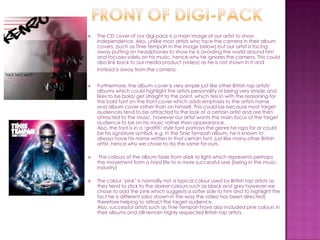
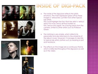
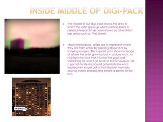
The document summarizes how the ancillary texts for a British rap album, including the album cover, magazine advertisement, and music video, were designed to effectively link together through consistent themes, colors, and stylistic elements. Specific design choices were made to appeal to target audiences while also differentiating the artist, such as using simpler designs, facing the artist away from the camera, and including pink tones alongside typical darker colors. The ancillary texts were meant to portray the artist's personality of focusing on his music above all else.