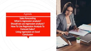
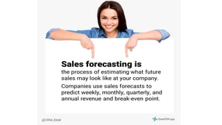
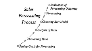
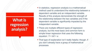
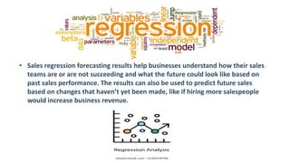
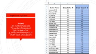
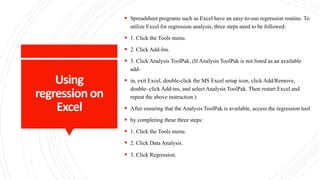
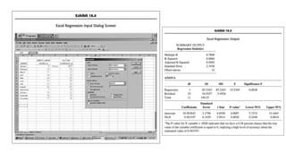
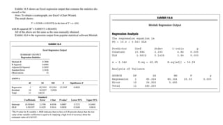
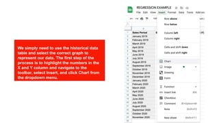
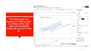
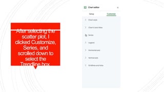
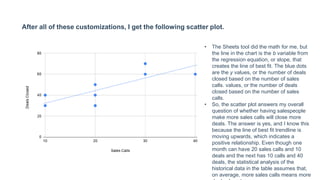
Chapter 16: Regression analysis:
popular sales forecast system
Team 7: Mukhusinova Parvina
Mirkhakimova Madinabonu
Abdusaidova Makhliyo
Salesforecasting
Whatisregressionanalysis?
Shouldweuseregressionanalysis?
HowToUseRegressionAnalysisTo
ForecastSales?
UsingregressiononExcel
Conclusion
Agenda
 In statistics, regression analysis is a mathematical
method used to understand the relationship between a
dependent variable and an independent variable.
Results of this analysis demonstrate the strength of
the relationship between the two variables and if the
dependent variable is significantly impacted by the
independent variable.
 There are multiple different types of regression
analysis, but the most basic and common form is
simple linear regression that uses the following
equation: Y = bX + a
 That type of explanation isn’t really helpful, though, if
you don’t already have a grasp of mathematical
processes
What is
regression
analysis?
• Sales regression forecasting results help businesses understand how their sales
teams are or are not succeeding and what the future could look like based on
past sales performance. The results can also be used to predict future sales
based on changes that haven’t yet been made, like if hiring more salespeople
would increase business revenue.
Howtousea
regressionanalysis
toforecastsales?
Leastsquares
method
 Y=bX+a
X is number of sales calls
Y is number of deals closed
b is the slope of line
a is the point of interception, or what Y equals when
X is zero
Example
exercise
Y=bX+a
X isnumberofsalescalls
Y isnumberofdealsclosed
b istheslopeofline
a isthepointofinterception,or
whatYequals whenXiszero
Regression equation:
Using
regressionon
Excel
 Spreadsheet programs such as Excel have an easy-to-use regression routine. To
utilize Excel for regression analysis, three steps need to be followed:
 1. Click the Tools menu.
 2. Click Add-Ins.
 3. Click Analysis ToolPak. (If Analysis ToolPak is not listed as an available
add-
 in, exit Excel, double-click the MS Excel setup icon, click Add/Remove,
double- click Add-ins, and select Analysis ToolPak. Then restart Excel and
repeat the above instruction.)
 After ensuring that the Analysis ToolPak is available, access the regression tool
 by completing these three steps:
 1. Click the Tools menu.
 2. Click Data Analysis.
 3. Click Regression.g regression on Excel
Using regression on Excel Using regression on Excel
We simply need to use the historical data
table and select the correct graph to
represent our data. The first step of the
process is to highlight the numbers in the
X and Y column and navigate to the
toolbar, select Insert, and click Chart from
the dropdown menu.
The default graph that
appears isn’t what we need,
so I clicked on the Chart
editor tool and selected
Scatter plot, as shown in the
gif .
After selecting the
scatter plot, I
clicked Customize,
Series, and
scrolled down to
select the
Trendline box
After all of these customizations, I get the following scatter plot.
• The Sheets tool did the math for me, but
the line in the chart is the b variable from
the regression equation, or slope, that
creates the line of best fit. The blue dots
are the y values, or the number of deals
closed based on the number of sales
calls. values, or the number of deals
closed based on the number of sales
calls.
• So, the scatter plot answers my overall
question of whether having salespeople
make more sales calls will close more
deals. The answer is yes, and I know this
because the line of best fit trendline is
moving upwards, which indicates a
positive relationship. Even though one
month can have 20 sales calls and 10
deals and the next has 10 calls and 40
deals, the statistical analysis of the
historical data in the table assumes that,
on average, more sales calls means more
CONCLUSIO
N
Regression analysis: popular sales forecast system .pptx

Regression analysis: popular sales forecast system .pptx

  • 1.
    Chapter 16: Regressionanalysis: popular sales forecast system Team 7: Mukhusinova Parvina Mirkhakimova Madinabonu Abdusaidova Makhliyo
  • 2.
  • 7.
     In statistics,regression analysis is a mathematical method used to understand the relationship between a dependent variable and an independent variable. Results of this analysis demonstrate the strength of the relationship between the two variables and if the dependent variable is significantly impacted by the independent variable.  There are multiple different types of regression analysis, but the most basic and common form is simple linear regression that uses the following equation: Y = bX + a  That type of explanation isn’t really helpful, though, if you don’t already have a grasp of mathematical processes What is regression analysis?
  • 8.
    • Sales regressionforecasting results help businesses understand how their sales teams are or are not succeeding and what the future could look like based on past sales performance. The results can also be used to predict future sales based on changes that haven’t yet been made, like if hiring more salespeople would increase business revenue.
  • 9.
    Howtousea regressionanalysis toforecastsales? Leastsquares method  Y=bX+a X isnumber of sales calls Y is number of deals closed b is the slope of line a is the point of interception, or what Y equals when X is zero
  • 10.
  • 11.
    Y=bX+a X isnumberofsalescalls Y isnumberofdealsclosed bistheslopeofline a isthepointofinterception,or whatYequals whenXiszero Regression equation:
  • 12.
    Using regressionon Excel  Spreadsheet programssuch as Excel have an easy-to-use regression routine. To utilize Excel for regression analysis, three steps need to be followed:  1. Click the Tools menu.  2. Click Add-Ins.  3. Click Analysis ToolPak. (If Analysis ToolPak is not listed as an available add-  in, exit Excel, double-click the MS Excel setup icon, click Add/Remove, double- click Add-ins, and select Analysis ToolPak. Then restart Excel and repeat the above instruction.)  After ensuring that the Analysis ToolPak is available, access the regression tool  by completing these three steps:  1. Click the Tools menu.  2. Click Data Analysis.  3. Click Regression.g regression on Excel
  • 15.
    Using regression onExcel Using regression on Excel We simply need to use the historical data table and select the correct graph to represent our data. The first step of the process is to highlight the numbers in the X and Y column and navigate to the toolbar, select Insert, and click Chart from the dropdown menu.
  • 16.
    The default graphthat appears isn’t what we need, so I clicked on the Chart editor tool and selected Scatter plot, as shown in the gif .
  • 17.
    After selecting the scatterplot, I clicked Customize, Series, and scrolled down to select the Trendline box
  • 18.
    After all ofthese customizations, I get the following scatter plot. • The Sheets tool did the math for me, but the line in the chart is the b variable from the regression equation, or slope, that creates the line of best fit. The blue dots are the y values, or the number of deals closed based on the number of sales calls. values, or the number of deals closed based on the number of sales calls. • So, the scatter plot answers my overall question of whether having salespeople make more sales calls will close more deals. The answer is yes, and I know this because the line of best fit trendline is moving upwards, which indicates a positive relationship. Even though one month can have 20 sales calls and 10 deals and the next has 10 calls and 40 deals, the statistical analysis of the historical data in the table assumes that, on average, more sales calls means more
  • 19.