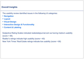
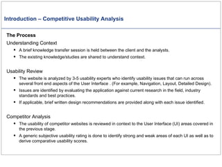
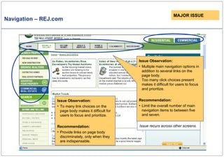
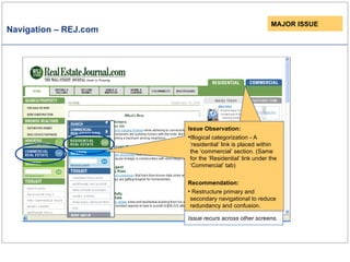
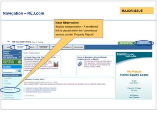
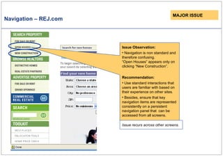
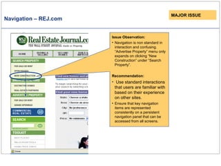
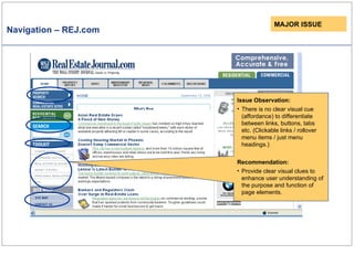
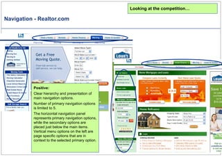
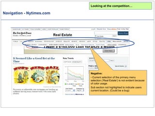
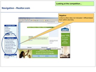
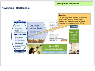
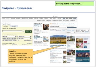
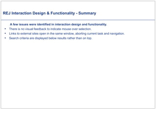
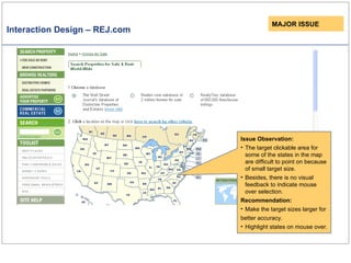
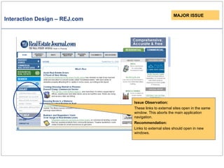
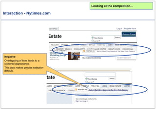
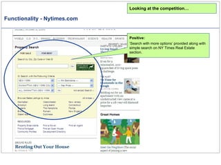
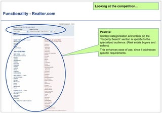
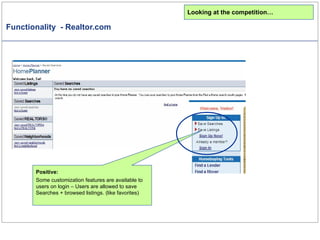
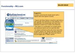
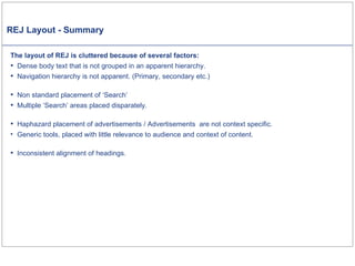
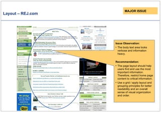
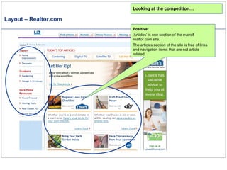
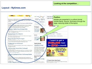
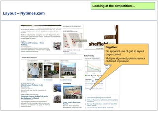
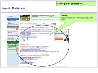
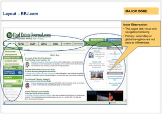
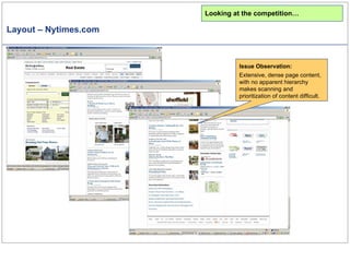
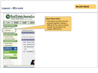
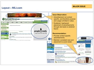
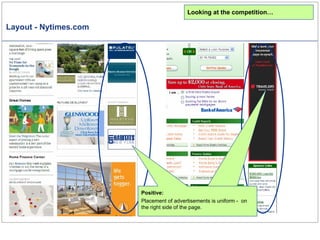
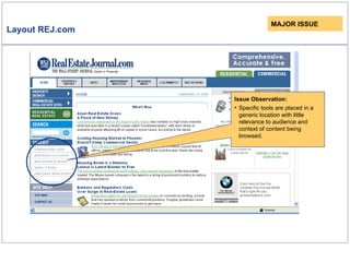
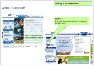
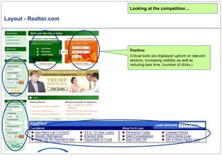
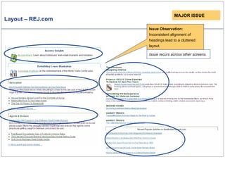
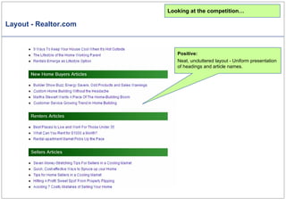
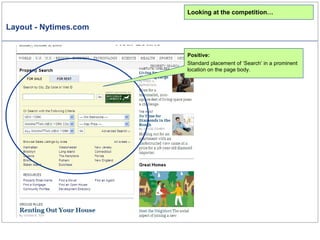
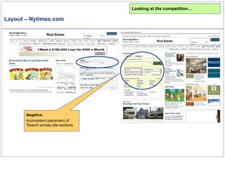
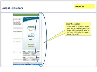
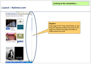
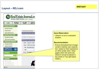
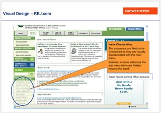
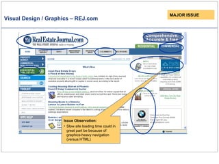
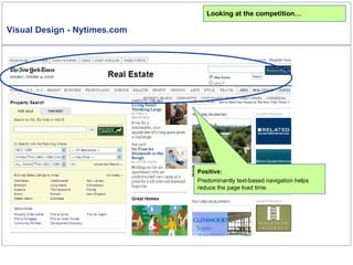
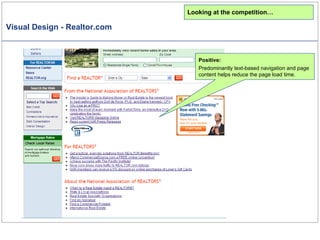
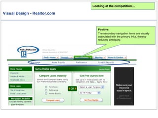
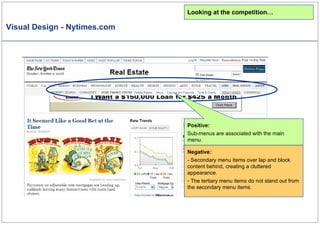
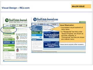
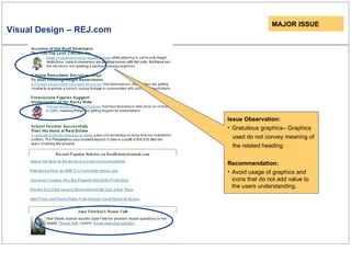
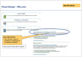
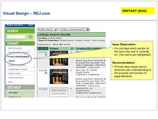
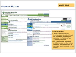
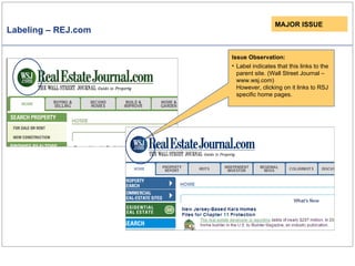
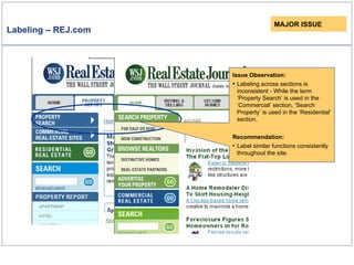
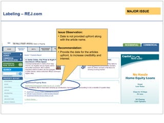
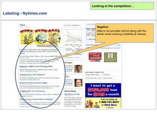
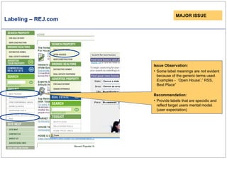
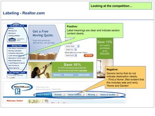
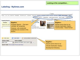
Project Name: Competitive Usability Analysis - Realestate Journal Reviewers:   Satyajit Das, Siddharth Gupta.  (Sep-Oct / 2006)
Introduction – Competitive Usability Analysis The Process Understanding Context A brief knowledge transfer session is held between the client and the analysts. The existing knowledge/studies are shared to understand context. Usability Review The website is analyzed by 3-5 usability experts who identify usability issues that can run across several front end aspects of the User Interface . (For example, Navigation, Layout, Detailed Design). Issues are identified by evaluating the application against current research in the field, industry standards and best practices. If applicable, brief written design recommendations are provided along with each issue identified. Competitor Analysis The usability of competitor websites is reviewed in context to the User Interface (UI) areas covered in the previous stage. A generic subjective usability rating is done to identify strong and weak areas of each UI as well as to derive comparative usability scores.
Overall Insights The usability review identified issues in the following UI categories: Navigation Layout Visual Design Interaction Design & Functionality 	 Content & Labeling Subjective Rating Scales indicated realestatejournal.com as having medium usability  (score = 59). Realtor’s ratings indicate high usability (score = 40)  New York Times’ Real Estate ratings indicate low usability (score = 68)
Subjective Usability Analysis- REJ.com Strengths :  Visibility Help and Documentation Weakness:  Efficiency Consistency & Standards Real world conventions Simplicity Sequencing Supportive Automation Memory Load
Subjective Usability Analysis- Realtor.com Strengths :  Relevance Consistency & Standards Simplicity Visibility Structure Sequencing Error Prevention  Undo & Redo Efficiency User Control Supportive Automation Memory Load Free Cognitive Resources Weakness:  Real world conventions Self Evidency
Subjective Usability Analysis- NYTimes.com Strengths :  Consistency & Standards Feedback Error Prevention & Recovery Weakness:  Relevance Efficiency Simplicity Visibility Structure Sequencing Undo & Redo Efficiency User Control Supportive Automation Memory Load Free Cognitive Resources
REJ Navigation - Summary Review indicates some issues in the Navigation of Real Estate Journal: There are too many click choices on the page making it difficult for the user to focus/prioritize tasks. Illogical categorization of sections. Examples: Presence of “Commercial..” link within the ‘Residential’ tab ‘Discussion’ is a global link, it is placed on the section specific navigation panels. Unclear visual cues (affordance) to differentiate links, buttons, tabs etc. Page headings and breadcrumbs are not visually differentiated.  Navigation in some instances is non standard and therefore confusing.
Navigation – REJ.com Issue Observation: Multiple main navigation options in addition to several links on the page body. Too many click choices present makes it difficult for users to focus and prioritize. Recommendation: Limit the overall number of main navigation items to between five and seven. MAJOR ISSUE Issue recurs across other screens. Issue Observation: To many link choices on the page body makes it difficult for users to focus and prioritize. Recommendation: Provide links on page body discriminately, only when they are indispensable.
Navigation – REJ.com Issue Observation: Illogical categorization - A ‘residential’ link is placed within the ‘commercial’ section.   (Same for the ‘Residential’ link under the ‘Commercial’ tab) Recommendation: Restructure primary and secondary navigational to reduce redundancy and confusion. MAJOR ISSUE Issue recurs across other screens.
Navigation – REJ.com MAJOR ISSUE Issue Observation: Illogical categorization - A residential link is placed within the ‘commercial’ section. (under ‘Property Report’)
Navigation – REJ.com Issue Observation: Navigation is non standard and therefore confusing. “Open Houses” appears only on clicking “New Construction”. Recommendation: Use standard interactions that users are familiar with based on their experience on other sites. Besides, ensure that key navigation items are represented consistently on a persistent navigation panel that  can be accessed from all screens. MAJOR ISSUE Issue recurs across other screens.
Navigation – REJ.com Issue Observation: Navigation is non standard in interaction and confusing. “Advertise Property” menu only expands on clicking “New Construction” under “Search Property”.  Recommendation: Use standard interactions that users are familiar with based on their experience on other sites. Ensure that key navigation items are represented consistently on a persistent navigation panel that can be accessed from all screens. MAJOR ISSUE
Navigation – REJ.com Issue Observation: There is no clear visual cue (affordance) to differentiate between links, buttons, tabs etc. (Clickable links / rollover menu items / just menu headings.) Recommendation: Provide clear visual clues to enhance user understanding of the purpose and function of page elements.  MAJOR ISSUE
Navigation - Realtor.com Looking at the competition… Positive: Clear hierarchy and presentation of main navigation options. Number of primary navigation options is limited to 5.  The horizontal navigation panel represents primary navigation options, while the secondary options are placed just below the main items. Vertical menu options on the left are page specific options that are in context to the selected primary option.
Navigation - Nytimes.com Looking at the competition… Negative: Current selection of the primary menu selection (‘Real Estate’) is not evident because of color usage. Sub section not highlighted to indicate users current location. (Could be a bug)
Navigation - Realtor.com Looking at the competition… Negative: Links to other sites not indicated / differentiated from within site links.
Navigation - Realtor.com Looking at the competition… Negative: The grouping of the items is inconsistent.  ‘Real Estate News’ & ‘Local School Reports’ are links to articles. However, these are grouped along with ‘Tools’.
Navigation – Nytimes.com Negative: Clicking on ‘Great Homes’ launches a section with navigation + look and feel that is inconsistent to other site sections. Looking at the competition…
Navigation – REJ.com IRRIRANT Issue Observation: Although ‘Discussion’ is a global link, it is placed on the section specific navigation panel. (Under ‘Residential’ and ‘Commercial’) Recommendation: Provide ‘Discussion’ as a global link.
Navigation – REJ.com Issue Observation: Style of page headings and breadcrumbs is inconsistent throughout the site.  This makes it difficult to differentiate between breadcrumbs and page headings.  IRRITANT Issue recurs across other screens.
Navigation – Nytimes.com Negative: Although these are key topics, they are not part of main (persistent) navigation menu. They are only provided as content on the page body. Looking at the competition…
REJ Interaction Design & Functionality - Summary   A few issues were identified in interaction design and functionality. There is no visual feedback to indicate mouse over selection. Links to external sites open in the same window, aborting current task and navigation. Search criteria are displayed below results rather than on top.
Interaction Design – REJ.com Issue Observation: The target clickable area for some of the states in the map are difficult to point on because of small target size. Besides, there is no visual feedback to indicate mouse over selection.  Recommendation: Make the target sizes larger for better accuracy.   Highlight states on mouse over. MAJOR ISSUE
Interaction Design – REJ.com MAJOR ISSUE Issue Observation: These links to external sites open in the same window. This aborts the main application navigation.  Recommendation: Links to external sites should open in new windows.
Interaction - Nytimes.com Looking at the competition… Negative: Overlapping of links leads to a cluttered appearance.  This also makes precise selection difficult.
Functionality - Nytimes.com Looking at the competition… Positive: ‘ Search with more options’ provided along with simple search on NY Times Real Estate section.
Functionality - Realtor.com Looking at the competition… Positive: Content categorization and criteria on the ‘Property Search’ section is specific to the specialized audience. (Real estate buyers and sellers). This enhances ease of use, since it addresses specific requirements.
Functionality  - Realtor.com Positive: Some customization features are available to users on login – Users are allowed to save Searches + browsed listings. (like favorites) Looking at the competition…
Functionality – REJ.com MAJOR ISSUE Suggestion: Consider enhancing the simple search with a ‘Search with more options’ function. ‘ Search with More Options’ should be used when a user typically only searches on a key attribute, or a few attributes, but occasionally may need more attributes to search by in certain circumstances. This option is a combination of a simple search and advanced search and not used that often . To reduce confusion to the user of too many tiers of search options, the "Search with More Options" section should not toggle with Advanced Search, but just toggle with a "Views" section.
REJ Layout - Summary The layout of REJ is cluttered because of several factors: Dense body text that is not grouped in an apparent hierarchy. Navigation hierarchy is not apparent. (Primary, secondary etc.) Non standard placement of ‘Search’ Multiple ‘Search’ areas placed disparately.  Haphazard placement of advertisements / Advertisements  are not context specific. Generic tools, placed with little relevance to audience and context of content.  Inconsistent alignment of headings.
Layout – REJ.com MAJOR ISSUE Issue Observation: The body text area looks verbose and information heavy.  Recommendation: The page layout should help users find and use the most important information. Therefore, restrict home page content to critical information.  Use a grid / apply layout and grouping principles for better readability and an overall sense of visual organization and order.
Layout – Realtor.com Looking at the competition… Positive: ‘ Articles’ is one section of the overall realtor.com site. The articles section of the site is free of links and navigation items that are not article related.
Layout - Nytimes.com Looking at the competition… Positive: Articles are presented in a uniform format (Article Name, Source, Summary) through the page, reducing clutter of the layout.
Layout – Nytimes.com Looking at the competition… Negative: No apparent use of grid to layout page content. Multiple alignment points create a cluttered impression.
Layout - Realtor.com Looking at the competition… Positive: Consistent alignment of headings reduce the clutter.
Layout – REJ.com Issue Observation: The pages lack visual and navigation hierarchy.  Primary, secondary or global navigation are not easy to differentiate. MAJOR ISSUE
Layout – Nytimes.com Issue Observation: Extensive, dense page content, with no apparent hierarchy makes scanning and prioritization of content difficult. Looking at the competition…
Layout – REJ.com MAJOR ISSUE Issue Observation: The search functions are not grouped together making it difficult for the users to locate quickly and recognize the usages /differences.
Layout – REJ.com Issue Observation: Advertisement sizes and placeholders are not consistent leading to disorientation of the layout and reduced predictability of what the user can expect. Issue Observation: Advertisement not context specific, and therefore purpose and usage is limited in value. Scattered, haphazard placement of advertisements  through site leads to cluttered layout. Recommendation: Provide context specific advertisements. Maintain consistent size and placement to avoid clutter. MAJOR ISSUE
Layout - Nytimes.com Looking at the competition… Advertisements are limited to extreme right side of the page layout reducing clutter. Positive: Placement of advertisements is uniform -  on the right side of the page.
Layout REJ.com Issue Observation: Specific tools are placed in a generic location with little relevance to audience and context of content being browsed. MAJOR ISSUE
Layout - Realtor.com Looking at the competition… Positive: The ‘Tools’ sections are specific to the section being browsed.
Layout - Realtor.com Looking at the competition… Positive: Critical tools are displayed upfront on relevent sectons, increasing visibility as well as reducing task time. (number of clicks.)
Layout – REJ.com Issue Observation: Inconsistent alignment of headings lead to a cluttered layout. Issue recurs across other screens. MAJOR ISSUE
Layout - Realtor.com Looking at the competition… Positive: Neat, uncluttered layout - Uniform presentation of headings and article names.
Layout - Nytimes.com Looking at the competition… Positive: Standard placement of ‘Search’ in a prominent location on the page body.
Layout – Nytimes.com Negative: Inconsistent placement of ‘Search across site sections. Looking at the competition…
Layout – REJ.com Issue Observation: ‘ Index page of REJ.com is very long and required scrolling a lot to get to the page end. Most of the page information is hidden below the scroll. IRRITANT
Layout – Nytimes.com Looking at the competition… Negative: Index page of NY Times ‘Real Estate’ is very long and required scrolling a lot to get to the page end. Most of the page information is hidden below the scroll.
Layout – REJ.com Issue Observation: ‘ Search’ is not in a standard location. Recommendation: Ensure that placement of page content matches user expecta-tion, based on their experience on other similar sites / other pages within the same site  (Search should be placed in top center or Top right place holder.) IRRITANT
Layout – REJ.com Issue Observation: ‘ Site Map’ , ‘About Us’ & ‘Contact Us’ do not logically fall under the ‘site help’ category. Recommendation: ‘ Sitemap’ should be moved to the footer menu. ‘ About’ & ‘Contact’ should be moved up to the top right, as global links. IRRITANT
REJ Visual Design - Summary There are a few Visual Design issues on the REJ site:-  Sub-menus are visually disassociated with the main menu and are likely to be overlooked. Ambiguous visual cues make it difficult to decipher current menu selection . Gratuitous graphics – Graphics used do not convey meaning of the related heading. The “tab look” used on headings is misleading to the user as it indicates click ability. Slow site loading time greatly because of heavy graphics-based navigation (versus HTML).
Visual Design – REJ.com SHOWSTOPPER Issue Observation: The submenus are likely to be overlooked as they are visually disassociated with the main menu. Besides, in some instances the sub menu items are hidden beyond the scroll.  Issue recurs across other screens.
Visual Design / Graphics – REJ.com Issue Observation: Slow site loading time could in great part be because of graphics-heavy navigation (versus HTML)  MAJOR ISSUE
Visual Design - Nytimes.com Looking at the competition… Positive: Predominantly text-based navigation helps reduce the page load time.
Visual Design - Realtor.com Looking at the competition… Positive: Predominantly text-based navigation and page content helps reduce the page load time.
Visual Design - Realtor.com Looking at the competition… Positive: The secondary navigation items are visually associated with the primary links, thereby reducing ambiguity.
Visual Design - Nytimes.com Looking at the competition… Negative: - Secondary menu items over lap and block content behind, creating a cluttered appearance. The tertiary menu items do not stand out from the secondary menu items.  Positive: Sub-menus are associated with the main menu.
Visual Design – REJ.com MAJOR ISSUE Issue recurs across other screens. Issue Observation: Inconsistent visual treatment of menu items.  In “Residential” the links under “Search Property” are shown as sub links; whereas, in “Commercial” the links are shown as a rollover menu.
Visual Design – REJ.com MAJOR ISSUE Issue Observation: Gratuitous graphics– Graphics used do not convey meaning of the related heading.  Recommendation: Avoid usage of graphics and icons that do not add value to the users understanding.
Visual Design – REJ.com MAJOR ISSUE Issue Observation: The “tab look” used on headings is misleading as it indicates clickability. Issue recurs across other screens.
Visual Design – REJ.com Issue Observation: It is not clear which section of the menu the user is currently on. (Two items are highlighted) Recommendation: Provide clear visual cues to enhance user understanding of the purpose and function of page elements.  IRRITANT (BUG)
Visual Design - Realtor.com Looking at the competition… Positive: Different sections on realtor.com are visually differentiated through use of color.  Besides, selected buttons / tabs are clearly differentiated from unselected buttons.
Visual Design - Realtor.com Looking at the competition… Positive: The site is rich in dynamic visual content – This helps capture and maintain user interest. Negative: However, this leads to high site load time.
Visual Design - Nytimes.com Looking at the competition… Positive: The site is rich in dynamic content which captures and maintain user interest. Negative: However, this leads to high site load time.
Visual Design - Nytimes.com Looking at the competition… Negative: Placement and visual representation makes some sections of the page appear to be related (part of) to the navigation menu and leads to visual clutter.
REJ Content and Labeling - Summary Issues in labeling and content include: Labeling across sections is inconsistent - While the term ‘Property Search’ is used in the ‘Commercial’ section, ‘Search Property’ is used in the ‘Residential’ section. Dates are not provided upfront along with the article names.  Some label meanings are not evident because of the generic terms used. Examples -  ‘Open House’,” RSS, Best Place”. Target audience types and importance are not evident through the content and presentation of content on the ‘Residential’ and ‘Commercial’ sections.
Content – REJ.com MAJOR ISSUE Issue Observation: Target audience types and importance are not evident through the content and presentation of content on the ‘Residential’ and ‘Commercial’ sections. For Example, while ‘Residential’ and ‘Commercial’ are clear cut user categories, sub categorization of user types (brokers, buyers) are not evident.
Labeling – REJ.com MAJOR ISSUE Issue Observation: Label indicates that this links to the parent site. (Wall Street Journal – www.wsj.com) However, clicking on it links to RSJ specific home pages.
Labeling – REJ.com MAJOR ISSUE Issue Observation: Labeling across sections is inconsistent - While the term ‘Property Search’ is used in the ‘Commercial’ section, ‘Search Property’ is used in the ‘Residential’ section. Recommendation: Label similar functions consistently throughout the site.
Labeling – REJ.com MAJOR ISSUE Issue Observation: Date is not provided upfront along with the article name.  Recommendation: Provide the date for the articles upfront, to increase credibility and interest.
Labeling - Nytimes.com Looking at the competition… Negative: Date is not provided upfront along with the article name reducing credibility & interest.
Labeling – REJ.com MAJOR ISSUE Issue Observation: Some label meanings are not evident because of the generic terms used. Examples -  ‘Open House’,” RSS, Best Place”  Recommendation: Provide labels that are specidic and reflect target users mental model. (user expectation)
Labeling - Realtor.com Looking at the competition… Positive: Label meanings are clear and indicate section content clearly. Negative: Generic terms that do not indicate destination clearly. - ‘Find a Home’ (Not evident that this includes sale and rent), ‘Home and Garden’
Labeling - Nytimes.com Negative   : Generic terms that do not indicate destination clearly – ‘Communities’, ‘Great Homes’ Negative: ‘ Property Search’ – This term indicates ‘all’ properties.  However, only residential properties are covered in this section. Negative   : Generic terms that do not indicate destination clearly -  Development Directory. Looking at the competition…
Thank You!
Appendix – Issue Categorization Issues are categorized by UI aspect. (Similar issues are grouped together in the report)  UI aspects include - Branding, Site Strategy, Navigation, Layout, Wording, Graphics, Animation, Color, Fonts, Control Elements, Web Standards, Error Handling etc. Issues are also categorized by severity.  Severity types include: Showstoppers – Catastrophic issues that prevent people from accomplishing their goals. Major Issues – Issues that cause waste of time, increased learning and error rates Irritants – Minor cosmetic or consistency issues that slow users down slightly / are a minimal violation of usability guidelines

Realestate Journal Analysis Upload

  • 1.
    Project Name: CompetitiveUsability Analysis - Realestate Journal Reviewers: Satyajit Das, Siddharth Gupta. (Sep-Oct / 2006)
  • 2.
    Introduction – CompetitiveUsability Analysis The Process Understanding Context A brief knowledge transfer session is held between the client and the analysts. The existing knowledge/studies are shared to understand context. Usability Review The website is analyzed by 3-5 usability experts who identify usability issues that can run across several front end aspects of the User Interface . (For example, Navigation, Layout, Detailed Design). Issues are identified by evaluating the application against current research in the field, industry standards and best practices. If applicable, brief written design recommendations are provided along with each issue identified. Competitor Analysis The usability of competitor websites is reviewed in context to the User Interface (UI) areas covered in the previous stage. A generic subjective usability rating is done to identify strong and weak areas of each UI as well as to derive comparative usability scores.
  • 3.
    Overall Insights Theusability review identified issues in the following UI categories: Navigation Layout Visual Design Interaction Design & Functionality Content & Labeling Subjective Rating Scales indicated realestatejournal.com as having medium usability (score = 59). Realtor’s ratings indicate high usability (score = 40) New York Times’ Real Estate ratings indicate low usability (score = 68)
  • 4.
    Subjective Usability Analysis-REJ.com Strengths : Visibility Help and Documentation Weakness: Efficiency Consistency & Standards Real world conventions Simplicity Sequencing Supportive Automation Memory Load
  • 5.
    Subjective Usability Analysis-Realtor.com Strengths : Relevance Consistency & Standards Simplicity Visibility Structure Sequencing Error Prevention Undo & Redo Efficiency User Control Supportive Automation Memory Load Free Cognitive Resources Weakness: Real world conventions Self Evidency
  • 6.
    Subjective Usability Analysis-NYTimes.com Strengths : Consistency & Standards Feedback Error Prevention & Recovery Weakness: Relevance Efficiency Simplicity Visibility Structure Sequencing Undo & Redo Efficiency User Control Supportive Automation Memory Load Free Cognitive Resources
  • 7.
    REJ Navigation -Summary Review indicates some issues in the Navigation of Real Estate Journal: There are too many click choices on the page making it difficult for the user to focus/prioritize tasks. Illogical categorization of sections. Examples: Presence of “Commercial..” link within the ‘Residential’ tab ‘Discussion’ is a global link, it is placed on the section specific navigation panels. Unclear visual cues (affordance) to differentiate links, buttons, tabs etc. Page headings and breadcrumbs are not visually differentiated. Navigation in some instances is non standard and therefore confusing.
  • 8.
    Navigation – REJ.comIssue Observation: Multiple main navigation options in addition to several links on the page body. Too many click choices present makes it difficult for users to focus and prioritize. Recommendation: Limit the overall number of main navigation items to between five and seven. MAJOR ISSUE Issue recurs across other screens. Issue Observation: To many link choices on the page body makes it difficult for users to focus and prioritize. Recommendation: Provide links on page body discriminately, only when they are indispensable.
  • 9.
    Navigation – REJ.comIssue Observation: Illogical categorization - A ‘residential’ link is placed within the ‘commercial’ section. (Same for the ‘Residential’ link under the ‘Commercial’ tab) Recommendation: Restructure primary and secondary navigational to reduce redundancy and confusion. MAJOR ISSUE Issue recurs across other screens.
  • 10.
    Navigation – REJ.comMAJOR ISSUE Issue Observation: Illogical categorization - A residential link is placed within the ‘commercial’ section. (under ‘Property Report’)
  • 11.
    Navigation – REJ.comIssue Observation: Navigation is non standard and therefore confusing. “Open Houses” appears only on clicking “New Construction”. Recommendation: Use standard interactions that users are familiar with based on their experience on other sites. Besides, ensure that key navigation items are represented consistently on a persistent navigation panel that can be accessed from all screens. MAJOR ISSUE Issue recurs across other screens.
  • 12.
    Navigation – REJ.comIssue Observation: Navigation is non standard in interaction and confusing. “Advertise Property” menu only expands on clicking “New Construction” under “Search Property”. Recommendation: Use standard interactions that users are familiar with based on their experience on other sites. Ensure that key navigation items are represented consistently on a persistent navigation panel that can be accessed from all screens. MAJOR ISSUE
  • 13.
    Navigation – REJ.comIssue Observation: There is no clear visual cue (affordance) to differentiate between links, buttons, tabs etc. (Clickable links / rollover menu items / just menu headings.) Recommendation: Provide clear visual clues to enhance user understanding of the purpose and function of page elements. MAJOR ISSUE
  • 14.
    Navigation - Realtor.comLooking at the competition… Positive: Clear hierarchy and presentation of main navigation options. Number of primary navigation options is limited to 5. The horizontal navigation panel represents primary navigation options, while the secondary options are placed just below the main items. Vertical menu options on the left are page specific options that are in context to the selected primary option.
  • 15.
    Navigation - Nytimes.comLooking at the competition… Negative: Current selection of the primary menu selection (‘Real Estate’) is not evident because of color usage. Sub section not highlighted to indicate users current location. (Could be a bug)
  • 16.
    Navigation - Realtor.comLooking at the competition… Negative: Links to other sites not indicated / differentiated from within site links.
  • 17.
    Navigation - Realtor.comLooking at the competition… Negative: The grouping of the items is inconsistent. ‘Real Estate News’ & ‘Local School Reports’ are links to articles. However, these are grouped along with ‘Tools’.
  • 18.
    Navigation – Nytimes.comNegative: Clicking on ‘Great Homes’ launches a section with navigation + look and feel that is inconsistent to other site sections. Looking at the competition…
  • 19.
    Navigation – REJ.comIRRIRANT Issue Observation: Although ‘Discussion’ is a global link, it is placed on the section specific navigation panel. (Under ‘Residential’ and ‘Commercial’) Recommendation: Provide ‘Discussion’ as a global link.
  • 20.
    Navigation – REJ.comIssue Observation: Style of page headings and breadcrumbs is inconsistent throughout the site. This makes it difficult to differentiate between breadcrumbs and page headings. IRRITANT Issue recurs across other screens.
  • 21.
    Navigation – Nytimes.comNegative: Although these are key topics, they are not part of main (persistent) navigation menu. They are only provided as content on the page body. Looking at the competition…
  • 22.
    REJ Interaction Design& Functionality - Summary A few issues were identified in interaction design and functionality. There is no visual feedback to indicate mouse over selection. Links to external sites open in the same window, aborting current task and navigation. Search criteria are displayed below results rather than on top.
  • 23.
    Interaction Design –REJ.com Issue Observation: The target clickable area for some of the states in the map are difficult to point on because of small target size. Besides, there is no visual feedback to indicate mouse over selection. Recommendation: Make the target sizes larger for better accuracy. Highlight states on mouse over. MAJOR ISSUE
  • 24.
    Interaction Design –REJ.com MAJOR ISSUE Issue Observation: These links to external sites open in the same window. This aborts the main application navigation. Recommendation: Links to external sites should open in new windows.
  • 25.
    Interaction - Nytimes.comLooking at the competition… Negative: Overlapping of links leads to a cluttered appearance. This also makes precise selection difficult.
  • 26.
    Functionality - Nytimes.comLooking at the competition… Positive: ‘ Search with more options’ provided along with simple search on NY Times Real Estate section.
  • 27.
    Functionality - Realtor.comLooking at the competition… Positive: Content categorization and criteria on the ‘Property Search’ section is specific to the specialized audience. (Real estate buyers and sellers). This enhances ease of use, since it addresses specific requirements.
  • 28.
    Functionality -Realtor.com Positive: Some customization features are available to users on login – Users are allowed to save Searches + browsed listings. (like favorites) Looking at the competition…
  • 29.
    Functionality – REJ.comMAJOR ISSUE Suggestion: Consider enhancing the simple search with a ‘Search with more options’ function. ‘ Search with More Options’ should be used when a user typically only searches on a key attribute, or a few attributes, but occasionally may need more attributes to search by in certain circumstances. This option is a combination of a simple search and advanced search and not used that often . To reduce confusion to the user of too many tiers of search options, the "Search with More Options" section should not toggle with Advanced Search, but just toggle with a "Views" section.
  • 30.
    REJ Layout -Summary The layout of REJ is cluttered because of several factors: Dense body text that is not grouped in an apparent hierarchy. Navigation hierarchy is not apparent. (Primary, secondary etc.) Non standard placement of ‘Search’ Multiple ‘Search’ areas placed disparately. Haphazard placement of advertisements / Advertisements are not context specific. Generic tools, placed with little relevance to audience and context of content. Inconsistent alignment of headings.
  • 31.
    Layout – REJ.comMAJOR ISSUE Issue Observation: The body text area looks verbose and information heavy. Recommendation: The page layout should help users find and use the most important information. Therefore, restrict home page content to critical information. Use a grid / apply layout and grouping principles for better readability and an overall sense of visual organization and order.
  • 32.
    Layout – Realtor.comLooking at the competition… Positive: ‘ Articles’ is one section of the overall realtor.com site. The articles section of the site is free of links and navigation items that are not article related.
  • 33.
    Layout - Nytimes.comLooking at the competition… Positive: Articles are presented in a uniform format (Article Name, Source, Summary) through the page, reducing clutter of the layout.
  • 34.
    Layout – Nytimes.comLooking at the competition… Negative: No apparent use of grid to layout page content. Multiple alignment points create a cluttered impression.
  • 35.
    Layout - Realtor.comLooking at the competition… Positive: Consistent alignment of headings reduce the clutter.
  • 36.
    Layout – REJ.comIssue Observation: The pages lack visual and navigation hierarchy. Primary, secondary or global navigation are not easy to differentiate. MAJOR ISSUE
  • 37.
    Layout – Nytimes.comIssue Observation: Extensive, dense page content, with no apparent hierarchy makes scanning and prioritization of content difficult. Looking at the competition…
  • 38.
    Layout – REJ.comMAJOR ISSUE Issue Observation: The search functions are not grouped together making it difficult for the users to locate quickly and recognize the usages /differences.
  • 39.
    Layout – REJ.comIssue Observation: Advertisement sizes and placeholders are not consistent leading to disorientation of the layout and reduced predictability of what the user can expect. Issue Observation: Advertisement not context specific, and therefore purpose and usage is limited in value. Scattered, haphazard placement of advertisements through site leads to cluttered layout. Recommendation: Provide context specific advertisements. Maintain consistent size and placement to avoid clutter. MAJOR ISSUE
  • 40.
    Layout - Nytimes.comLooking at the competition… Advertisements are limited to extreme right side of the page layout reducing clutter. Positive: Placement of advertisements is uniform - on the right side of the page.
  • 41.
    Layout REJ.com IssueObservation: Specific tools are placed in a generic location with little relevance to audience and context of content being browsed. MAJOR ISSUE
  • 42.
    Layout - Realtor.comLooking at the competition… Positive: The ‘Tools’ sections are specific to the section being browsed.
  • 43.
    Layout - Realtor.comLooking at the competition… Positive: Critical tools are displayed upfront on relevent sectons, increasing visibility as well as reducing task time. (number of clicks.)
  • 44.
    Layout – REJ.comIssue Observation: Inconsistent alignment of headings lead to a cluttered layout. Issue recurs across other screens. MAJOR ISSUE
  • 45.
    Layout - Realtor.comLooking at the competition… Positive: Neat, uncluttered layout - Uniform presentation of headings and article names.
  • 46.
    Layout - Nytimes.comLooking at the competition… Positive: Standard placement of ‘Search’ in a prominent location on the page body.
  • 47.
    Layout – Nytimes.comNegative: Inconsistent placement of ‘Search across site sections. Looking at the competition…
  • 48.
    Layout – REJ.comIssue Observation: ‘ Index page of REJ.com is very long and required scrolling a lot to get to the page end. Most of the page information is hidden below the scroll. IRRITANT
  • 49.
    Layout – Nytimes.comLooking at the competition… Negative: Index page of NY Times ‘Real Estate’ is very long and required scrolling a lot to get to the page end. Most of the page information is hidden below the scroll.
  • 50.
    Layout – REJ.comIssue Observation: ‘ Search’ is not in a standard location. Recommendation: Ensure that placement of page content matches user expecta-tion, based on their experience on other similar sites / other pages within the same site (Search should be placed in top center or Top right place holder.) IRRITANT
  • 51.
    Layout – REJ.comIssue Observation: ‘ Site Map’ , ‘About Us’ & ‘Contact Us’ do not logically fall under the ‘site help’ category. Recommendation: ‘ Sitemap’ should be moved to the footer menu. ‘ About’ & ‘Contact’ should be moved up to the top right, as global links. IRRITANT
  • 52.
    REJ Visual Design- Summary There are a few Visual Design issues on the REJ site:- Sub-menus are visually disassociated with the main menu and are likely to be overlooked. Ambiguous visual cues make it difficult to decipher current menu selection . Gratuitous graphics – Graphics used do not convey meaning of the related heading. The “tab look” used on headings is misleading to the user as it indicates click ability. Slow site loading time greatly because of heavy graphics-based navigation (versus HTML).
  • 53.
    Visual Design –REJ.com SHOWSTOPPER Issue Observation: The submenus are likely to be overlooked as they are visually disassociated with the main menu. Besides, in some instances the sub menu items are hidden beyond the scroll. Issue recurs across other screens.
  • 54.
    Visual Design /Graphics – REJ.com Issue Observation: Slow site loading time could in great part be because of graphics-heavy navigation (versus HTML) MAJOR ISSUE
  • 55.
    Visual Design -Nytimes.com Looking at the competition… Positive: Predominantly text-based navigation helps reduce the page load time.
  • 56.
    Visual Design -Realtor.com Looking at the competition… Positive: Predominantly text-based navigation and page content helps reduce the page load time.
  • 57.
    Visual Design -Realtor.com Looking at the competition… Positive: The secondary navigation items are visually associated with the primary links, thereby reducing ambiguity.
  • 58.
    Visual Design -Nytimes.com Looking at the competition… Negative: - Secondary menu items over lap and block content behind, creating a cluttered appearance. The tertiary menu items do not stand out from the secondary menu items. Positive: Sub-menus are associated with the main menu.
  • 59.
    Visual Design –REJ.com MAJOR ISSUE Issue recurs across other screens. Issue Observation: Inconsistent visual treatment of menu items. In “Residential” the links under “Search Property” are shown as sub links; whereas, in “Commercial” the links are shown as a rollover menu.
  • 60.
    Visual Design –REJ.com MAJOR ISSUE Issue Observation: Gratuitous graphics– Graphics used do not convey meaning of the related heading. Recommendation: Avoid usage of graphics and icons that do not add value to the users understanding.
  • 61.
    Visual Design –REJ.com MAJOR ISSUE Issue Observation: The “tab look” used on headings is misleading as it indicates clickability. Issue recurs across other screens.
  • 62.
    Visual Design –REJ.com Issue Observation: It is not clear which section of the menu the user is currently on. (Two items are highlighted) Recommendation: Provide clear visual cues to enhance user understanding of the purpose and function of page elements. IRRITANT (BUG)
  • 63.
    Visual Design -Realtor.com Looking at the competition… Positive: Different sections on realtor.com are visually differentiated through use of color. Besides, selected buttons / tabs are clearly differentiated from unselected buttons.
  • 64.
    Visual Design -Realtor.com Looking at the competition… Positive: The site is rich in dynamic visual content – This helps capture and maintain user interest. Negative: However, this leads to high site load time.
  • 65.
    Visual Design -Nytimes.com Looking at the competition… Positive: The site is rich in dynamic content which captures and maintain user interest. Negative: However, this leads to high site load time.
  • 66.
    Visual Design -Nytimes.com Looking at the competition… Negative: Placement and visual representation makes some sections of the page appear to be related (part of) to the navigation menu and leads to visual clutter.
  • 67.
    REJ Content andLabeling - Summary Issues in labeling and content include: Labeling across sections is inconsistent - While the term ‘Property Search’ is used in the ‘Commercial’ section, ‘Search Property’ is used in the ‘Residential’ section. Dates are not provided upfront along with the article names. Some label meanings are not evident because of the generic terms used. Examples - ‘Open House’,” RSS, Best Place”. Target audience types and importance are not evident through the content and presentation of content on the ‘Residential’ and ‘Commercial’ sections.
  • 68.
    Content – REJ.comMAJOR ISSUE Issue Observation: Target audience types and importance are not evident through the content and presentation of content on the ‘Residential’ and ‘Commercial’ sections. For Example, while ‘Residential’ and ‘Commercial’ are clear cut user categories, sub categorization of user types (brokers, buyers) are not evident.
  • 69.
    Labeling – REJ.comMAJOR ISSUE Issue Observation: Label indicates that this links to the parent site. (Wall Street Journal – www.wsj.com) However, clicking on it links to RSJ specific home pages.
  • 70.
    Labeling – REJ.comMAJOR ISSUE Issue Observation: Labeling across sections is inconsistent - While the term ‘Property Search’ is used in the ‘Commercial’ section, ‘Search Property’ is used in the ‘Residential’ section. Recommendation: Label similar functions consistently throughout the site.
  • 71.
    Labeling – REJ.comMAJOR ISSUE Issue Observation: Date is not provided upfront along with the article name. Recommendation: Provide the date for the articles upfront, to increase credibility and interest.
  • 72.
    Labeling - Nytimes.comLooking at the competition… Negative: Date is not provided upfront along with the article name reducing credibility & interest.
  • 73.
    Labeling – REJ.comMAJOR ISSUE Issue Observation: Some label meanings are not evident because of the generic terms used. Examples - ‘Open House’,” RSS, Best Place” Recommendation: Provide labels that are specidic and reflect target users mental model. (user expectation)
  • 74.
    Labeling - Realtor.comLooking at the competition… Positive: Label meanings are clear and indicate section content clearly. Negative: Generic terms that do not indicate destination clearly. - ‘Find a Home’ (Not evident that this includes sale and rent), ‘Home and Garden’
  • 75.
    Labeling - Nytimes.comNegative : Generic terms that do not indicate destination clearly – ‘Communities’, ‘Great Homes’ Negative: ‘ Property Search’ – This term indicates ‘all’ properties. However, only residential properties are covered in this section. Negative : Generic terms that do not indicate destination clearly - Development Directory. Looking at the competition…
  • 76.
  • 77.
    Appendix – IssueCategorization Issues are categorized by UI aspect. (Similar issues are grouped together in the report) UI aspects include - Branding, Site Strategy, Navigation, Layout, Wording, Graphics, Animation, Color, Fonts, Control Elements, Web Standards, Error Handling etc. Issues are also categorized by severity. Severity types include: Showstoppers – Catastrophic issues that prevent people from accomplishing their goals. Major Issues – Issues that cause waste of time, increased learning and error rates Irritants – Minor cosmetic or consistency issues that slow users down slightly / are a minimal violation of usability guidelines