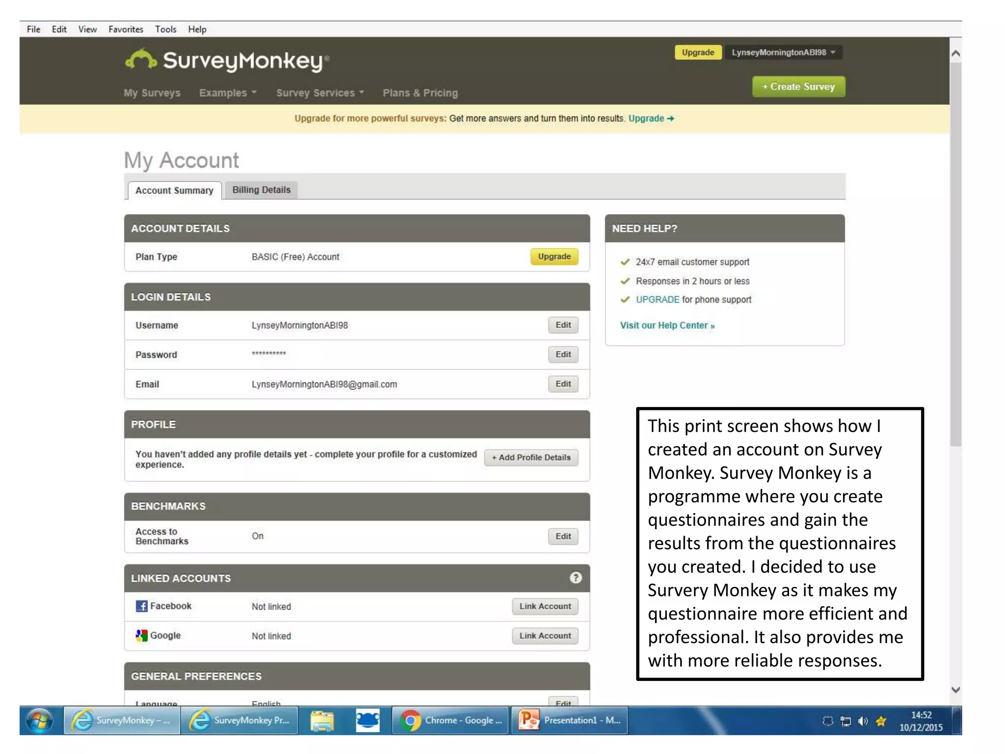
This print screen shows how I
created an account on Survey
Monkey. Survey Monkey is a
programme where you create
questionnaires and gain the
results from the questionnaires
you created. I decided to use
Survery Monkey as it makes my
questionnaire more efficient and
professional. It also provides me
with more reliable responses.
These are the
questions I will use to
question my target
audience about their
preferences regarding
T.V news.
As you can see, I have
made my questions very
relevant to my topic
regarding T.V News.
I have ten questions
which will be
distributed to 16
people from the ages
of 11- 39+
Results
As you can see in the chart. I have had equal
responses from male and female. This means that
out of 16 questionnaires 8 males have answered
my questionnaire and 8 females have answered
my questionnaire. This has worked out perfectly
as I can show that my questionnaire has been
distributed equally between males and females
so that I can get more reliable responses.
From the chart you can analyse that the majority of the people
who answered my questionnaire was 39+ and the lowest amount
of people who answered my questionnaire was 11-17 years old.
This reinforces the idea that more of the older generation took
the time to answer my questionnaire then the younger
generation. This is reinforced throughout my table as the amount
of responses from each age category increases as the age does.
This identifies the fact that half the people that
answered my questionnaire watch Television so
that they can receive News updates, five of the
people who answered my questionnaire watch
Television for entertainment whereas the other
three people watch Television for music
programmes. No one uses Television for any
other reason. As a result, this chart shows that
the most popular genre on Television is News.
This shows that more then 80% of the people who answered my questionnaire watch Local T.V News. This means that mostly everyone will watch
my News Programme.
This chart shows that the
majority of the people who
answered my questionnaire
watch ITV News. Finishing
just below that would be BBC
News. Three of the people
who answered my
questionnaire clicked the
other option. As you can see
from the chart the responses
I got to the other category
was none. This will mean that
they don’t watch TV News at
all. Through this chart I can
identify that ITV is hugely
popular therefore it is
important for me to research
the codes and conventions
they use to make their News
programme so successful.
This identifies that the majority of the people who
answered my questionnaire watch the News on a
weekly basis. This will mean that they are interested
in the news and will want to receive the most recent
updates via a local News programme.
This chart shows that more then half of the people
who answered my questionnaire watch the whole
broadcast. The next highest category which my target
audience watch will be only the football element part
of the News programme whereas only just over 15%
wait to specifically watch the weather element. I
never got responses from three people as they must
not watch any element of the News.
This chart shows that the majority of the people
who answered my questionnaire would access
local updates via Television. This means that if
my News programme is successful then most of
my target audience will be able to access
beneficial information through my News
programme Via the Television.
This chart reinforces the idea that more then
50% of the people who answered my
questionnaire believe that problems in the
local area should be the information which is
delivered on a News programme. This
identified to me what Information I need to
include in my News programme.
This chart shows that more then
60% of the people who answered
my questionnaire believe that live
streaming is beneficial to a News
programme. This allowed me to
recognize what I need to include so
that I create an efficient and
successful News programme.

Questonaire

  • 1.
    This print screenshows how I created an account on Survey Monkey. Survey Monkey is a programme where you create questionnaires and gain the results from the questionnaires you created. I decided to use Survery Monkey as it makes my questionnaire more efficient and professional. It also provides me with more reliable responses.
  • 2.
    These are the questionsI will use to question my target audience about their preferences regarding T.V news.
  • 3.
    As you cansee, I have made my questions very relevant to my topic regarding T.V News.
  • 4.
    I have tenquestions which will be distributed to 16 people from the ages of 11- 39+
  • 5.
    Results As you cansee in the chart. I have had equal responses from male and female. This means that out of 16 questionnaires 8 males have answered my questionnaire and 8 females have answered my questionnaire. This has worked out perfectly as I can show that my questionnaire has been distributed equally between males and females so that I can get more reliable responses.
  • 6.
    From the chartyou can analyse that the majority of the people who answered my questionnaire was 39+ and the lowest amount of people who answered my questionnaire was 11-17 years old. This reinforces the idea that more of the older generation took the time to answer my questionnaire then the younger generation. This is reinforced throughout my table as the amount of responses from each age category increases as the age does.
  • 7.
    This identifies thefact that half the people that answered my questionnaire watch Television so that they can receive News updates, five of the people who answered my questionnaire watch Television for entertainment whereas the other three people watch Television for music programmes. No one uses Television for any other reason. As a result, this chart shows that the most popular genre on Television is News.
  • 8.
    This shows thatmore then 80% of the people who answered my questionnaire watch Local T.V News. This means that mostly everyone will watch my News Programme.
  • 9.
    This chart showsthat the majority of the people who answered my questionnaire watch ITV News. Finishing just below that would be BBC News. Three of the people who answered my questionnaire clicked the other option. As you can see from the chart the responses I got to the other category was none. This will mean that they don’t watch TV News at all. Through this chart I can identify that ITV is hugely popular therefore it is important for me to research the codes and conventions they use to make their News programme so successful.
  • 10.
    This identifies thatthe majority of the people who answered my questionnaire watch the News on a weekly basis. This will mean that they are interested in the news and will want to receive the most recent updates via a local News programme.
  • 11.
    This chart showsthat more then half of the people who answered my questionnaire watch the whole broadcast. The next highest category which my target audience watch will be only the football element part of the News programme whereas only just over 15% wait to specifically watch the weather element. I never got responses from three people as they must not watch any element of the News.
  • 12.
    This chart showsthat the majority of the people who answered my questionnaire would access local updates via Television. This means that if my News programme is successful then most of my target audience will be able to access beneficial information through my News programme Via the Television.
  • 13.
    This chart reinforcesthe idea that more then 50% of the people who answered my questionnaire believe that problems in the local area should be the information which is delivered on a News programme. This identified to me what Information I need to include in my News programme.
  • 14.
    This chart showsthat more then 60% of the people who answered my questionnaire believe that live streaming is beneficial to a News programme. This allowed me to recognize what I need to include so that I create an efficient and successful News programme.