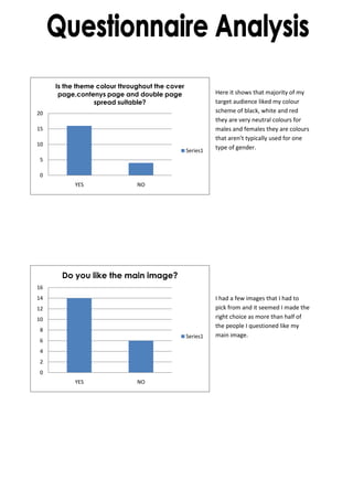
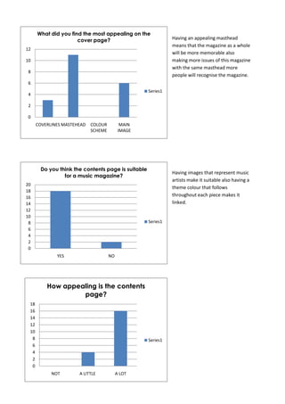
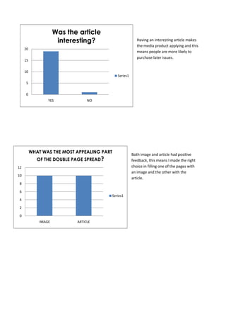
The document contains survey results from a target audience about a music magazine prototype. The majority liked the black, white and red color scheme. Over half liked the main image on the cover. Having an appealing masthead makes the magazine more memorable. Images representing music artists and a theme color throughout make the contents page suitable. Both the image and article on the double page spread were appealing parts, showing the right design choices were made.