Report
Share
Recommended
Mushroom key pakwan A Lecture By Mr Allah Dad Khan Former DG Agriculture Exte...
Mushroom key pakwan A Lecture By Mr Allah Dad Khan Former DG Agriculture Extension Khyber Pakhtun Khwa Province & Visiting Professor Agriculture University Peshawar Pakistan
History of poppy A Presentation By Mr Allah Dad khan Former Director General ...
History of poppy A Presentation By Mr Allah Dad khan Former Director General Agriculture Extension KPK Province and Visiting Professor the University of Agriculture Peshawar Pakistan
Autowisher
Autowisher is a tool that allows companies to automatically send birthday wishes to customers. It collects customers' birthdates from CRM systems or manually entered data. Messages can be created for emails and SMS with images, video, or text. Autowisher then automates the process of sending reminder messages to reps 3 days before a customer's birthday and sending the actual wishes to the customer on their birthday. This helps reps remember customers and build better relationships through personalized automated messages.
Pautas de producción de texto
Este documento proporciona pautas para la producción y corrección de textos. Incluye recomendaciones sobre el uso de tildes, mayúsculas, minúsculas, signos de puntuación como interrogación y exclamación, y comillas y rayas de diálogo. También brinda ejemplos para ilustrar conceptos como la tercera persona gramatical, preguntas directas e indirectas, y enumeraciones con dos puntos. Finalmente, extrae la información de la Real Academia Española.
Luis cancino bioanálisis
Este documento incluye dos tablas. La primera tabla muestra los materiales y equipos necesarios para un laboratorio, así como el método de pago para cada elemento. La mayoría de los elementos se pagaron en efectivo, mientras que algunos se pagaron con tarjeta. La segunda tabla es un inventario que incluye los materiales y equipos necesarios, el costo de cada elemento, la cantidad requerida y el método de pago. El inventario muestra que la mayoría de los elementos se compraron en efectivo o con tarjeta de crédito.
Question6
The document discusses technologies learned while constructing a media product. The author learned how to use Blogger to organize work, picked up Photoshop skills like editing contents, used Slideshare to upload PowerPoints, and researched fonts online. Overall, the technologies like Blogger, Photoshop, Slideshare, and font websites made the media product easier to create and exposed the author to new digital skills for constructing media.
Question5
The document discusses how the author addressed their target audience of 12-17 year old girls in their pop culture magazine. They used feminine imagery on the cover featuring a young female idol. The contents page included features on fashion and dating tips about popular artists. Images throughout were of pretty, confident female pop stars to attract readers. Bold formatting and simple language made the articles engaging for teenage girls.
Question4
The target audience for this media product would be lower class females aged 12-17 who enjoy pop music and gossip about pop stars. They would be interested in buying the £1.99 magazine using their pocket money. The magazine is aimed at this younger female demographic as research found they were most interested in pop music. The font, language, and soft colors used in the design are meant to appeal to this age range.
Question3
IPC media would be a good publisher to distribute the media product because they distribute popular music magazines like NME and there is a gap in their market for a pop magazine, which the media product is. IPC media would fill that gap and reach the intended audience for a pop magazine.
Question2 d
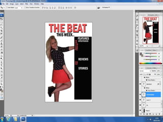
The media product represents young females aged 12-17. Features like bold, simple colors and focus on gossip appeal to teenage girls. The soft colors and girly artist portrayal also relate to the target audience. Clothing and poses aim to show the artist as important, sexy, and a style icon. Language uses words like "princess" and "topless" that would interest teenage girls. The formal language and Franklin Gothic font keep the style bold, simple, and girly to engage readers.
Question6
I have learned several new technologies through constructing this media product. I learned how to use Blogger for the first time and found it helpful for organizing my work. I also gained experience using Photoshop, though I did not study media at GCSE. Photoshop became easier to use as I progressed, and I learned new skills. Additionally, Slideshare was very useful for uploading PowerPoint presentations to Blogger. The internet provided a valuable research resource, including a website that assisted with selecting fonts.
Question5
The author attracts their teenage girl audience through the use of feminine imagery and language on the front cover. A photo of a young female pop star idols draws in readers to learn more about their favorite artists. Inside, article headlines about fashion and dating tips interest readers. Throughout the magazine, simple but bold designs, prominent female images, and language familiar to teenagers keeps the intended audience engaged.
Question4
The target audience for this media product is lower class females aged 12-17 who enjoy pop music and gossip about pop stars. This age group has disposable income from allowances to regularly purchase magazines. Research showed the target demographic, especially females, were interested in pop music. The magazine is priced at £1.99, which is affordable for its young readers. The content and design aim to attract this audience with articles about fashion, quizzes matching readers to pop stars, and coverage of artists who serve as role models.
Question2 d
My media product represents teenage girls aged 12-17. The front cover uses bold, simple, and colorful design that appeals to teens who want gossip. Soft colors feel "girly" and relate to the target audience. The featured artist is presented in a mid-shot pose with her hand on her hip, showing her importance and sex appeal in a way that icons in pop magazines. Words like "princess," "new look," and "topless" in bold catch the eyes of the target readers. The soft colors and consistent color scheme across pages create a "girly" feel that interests the readers.
Question3
IPC Media would be a good publisher to distribute the media product because they distribute popular music magazines like NME and there is a gap in their market for a pop magazine, which the media product is. IPC Media publishes magazines in various genres and locations, so they were researched as a potential publisher.
Question2
My media product represents teenage girls aged 12-17. The bold and colorful front cover, use of "girly" colors, and fashion-focused feature story aim to appeal to this target audience. Photos showing the artist as important and sexy match the interests of teenage girls. Clothing, language using words like "princess" and "topless," and a formal tone also relate to this social group. The simple bold font and consistent color scheme create a "girly feel" intended to attract young female readers.
Question1
My media product uses and develops conventions from real magazines. I was inspired by the magazine "Blender" which I found to have an effective yet simple style. I took some of Blender's conventions like having a solo artist image dominate the cover page and using a limited color palette. However, my cover image is positioned to the side rather than the center. I developed my own conventions too, like making the text on my contents page larger to suit my younger target audience. Overall, I was able to produce professional-looking pages like my favorite article page while putting my own spin on conventions from real magazines.
Photoshoot
This document compares a color photo to the same photo edited into black and white. The original photo was the author's favorite from a recent shoot. They decided to convert it to black and white by editing the image. The before and after photos are shown side by side for comparison.
Photoshoot
The photographer took photos of a model, Jodie Uscroft, in a school dance studio with lighting and a whiteboard background to achieve a sexy yet sophisticated look for teenagers to look up to. The photographer used Blender magazine for inspiration and took shots looking up at the model smiling to seem fun like Katy Perry, as well as photos where she looks sophisticated from further away or with shadows.
More Related Content
More from laceyuscroft
Question6
The document discusses technologies learned while constructing a media product. The author learned how to use Blogger to organize work, picked up Photoshop skills like editing contents, used Slideshare to upload PowerPoints, and researched fonts online. Overall, the technologies like Blogger, Photoshop, Slideshare, and font websites made the media product easier to create and exposed the author to new digital skills for constructing media.
Question5
The document discusses how the author addressed their target audience of 12-17 year old girls in their pop culture magazine. They used feminine imagery on the cover featuring a young female idol. The contents page included features on fashion and dating tips about popular artists. Images throughout were of pretty, confident female pop stars to attract readers. Bold formatting and simple language made the articles engaging for teenage girls.
Question4
The target audience for this media product would be lower class females aged 12-17 who enjoy pop music and gossip about pop stars. They would be interested in buying the £1.99 magazine using their pocket money. The magazine is aimed at this younger female demographic as research found they were most interested in pop music. The font, language, and soft colors used in the design are meant to appeal to this age range.
Question3
IPC media would be a good publisher to distribute the media product because they distribute popular music magazines like NME and there is a gap in their market for a pop magazine, which the media product is. IPC media would fill that gap and reach the intended audience for a pop magazine.
Question2 d
The media product represents young females aged 12-17. Features like bold, simple colors and focus on gossip appeal to teenage girls. The soft colors and girly artist portrayal also relate to the target audience. Clothing and poses aim to show the artist as important, sexy, and a style icon. Language uses words like "princess" and "topless" that would interest teenage girls. The formal language and Franklin Gothic font keep the style bold, simple, and girly to engage readers.
Question6
I have learned several new technologies through constructing this media product. I learned how to use Blogger for the first time and found it helpful for organizing my work. I also gained experience using Photoshop, though I did not study media at GCSE. Photoshop became easier to use as I progressed, and I learned new skills. Additionally, Slideshare was very useful for uploading PowerPoint presentations to Blogger. The internet provided a valuable research resource, including a website that assisted with selecting fonts.
Question5
The author attracts their teenage girl audience through the use of feminine imagery and language on the front cover. A photo of a young female pop star idols draws in readers to learn more about their favorite artists. Inside, article headlines about fashion and dating tips interest readers. Throughout the magazine, simple but bold designs, prominent female images, and language familiar to teenagers keeps the intended audience engaged.
Question4
The target audience for this media product is lower class females aged 12-17 who enjoy pop music and gossip about pop stars. This age group has disposable income from allowances to regularly purchase magazines. Research showed the target demographic, especially females, were interested in pop music. The magazine is priced at £1.99, which is affordable for its young readers. The content and design aim to attract this audience with articles about fashion, quizzes matching readers to pop stars, and coverage of artists who serve as role models.
Question2 d
My media product represents teenage girls aged 12-17. The front cover uses bold, simple, and colorful design that appeals to teens who want gossip. Soft colors feel "girly" and relate to the target audience. The featured artist is presented in a mid-shot pose with her hand on her hip, showing her importance and sex appeal in a way that icons in pop magazines. Words like "princess," "new look," and "topless" in bold catch the eyes of the target readers. The soft colors and consistent color scheme across pages create a "girly" feel that interests the readers.
Question3
IPC Media would be a good publisher to distribute the media product because they distribute popular music magazines like NME and there is a gap in their market for a pop magazine, which the media product is. IPC Media publishes magazines in various genres and locations, so they were researched as a potential publisher.
Question2
My media product represents teenage girls aged 12-17. The bold and colorful front cover, use of "girly" colors, and fashion-focused feature story aim to appeal to this target audience. Photos showing the artist as important and sexy match the interests of teenage girls. Clothing, language using words like "princess" and "topless," and a formal tone also relate to this social group. The simple bold font and consistent color scheme create a "girly feel" intended to attract young female readers.
Question1
My media product uses and develops conventions from real magazines. I was inspired by the magazine "Blender" which I found to have an effective yet simple style. I took some of Blender's conventions like having a solo artist image dominate the cover page and using a limited color palette. However, my cover image is positioned to the side rather than the center. I developed my own conventions too, like making the text on my contents page larger to suit my younger target audience. Overall, I was able to produce professional-looking pages like my favorite article page while putting my own spin on conventions from real magazines.
Photoshoot
This document compares a color photo to the same photo edited into black and white. The original photo was the author's favorite from a recent shoot. They decided to convert it to black and white by editing the image. The before and after photos are shown side by side for comparison.
Photoshoot
The photographer took photos of a model, Jodie Uscroft, in a school dance studio with lighting and a whiteboard background to achieve a sexy yet sophisticated look for teenagers to look up to. The photographer used Blender magazine for inspiration and took shots looking up at the model smiling to seem fun like Katy Perry, as well as photos where she looks sophisticated from further away or with shadows.