The document summarizes how the author attracted their intended audience for an indie music magazine. Some key techniques included:
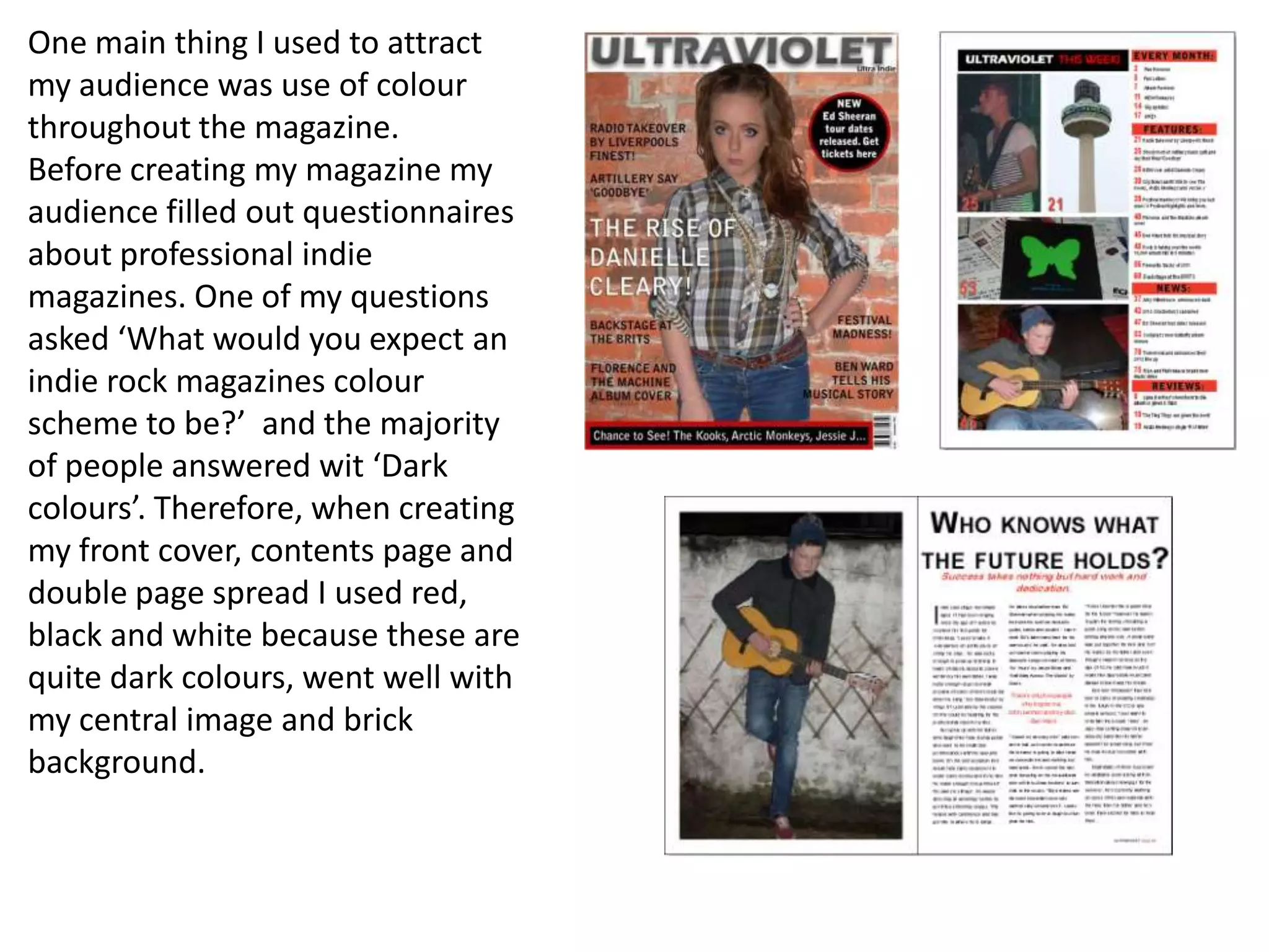
1) Using dark colors like red, black, and white throughout the magazine based on audience feedback that this matched their expectations for an indie magazine's color scheme.
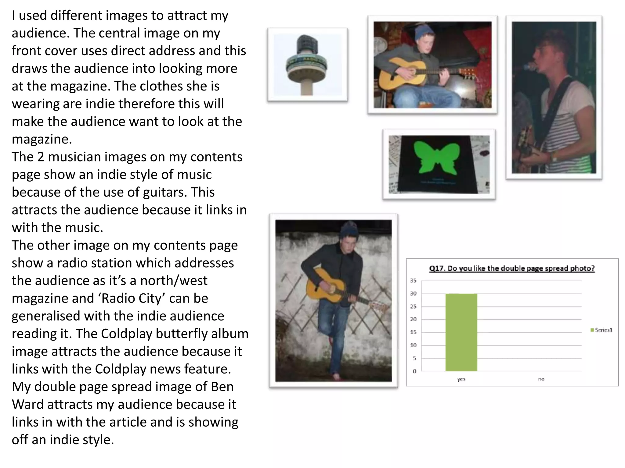
2) Choosing images that depicted indie music styles and bands to match the audience's interests.
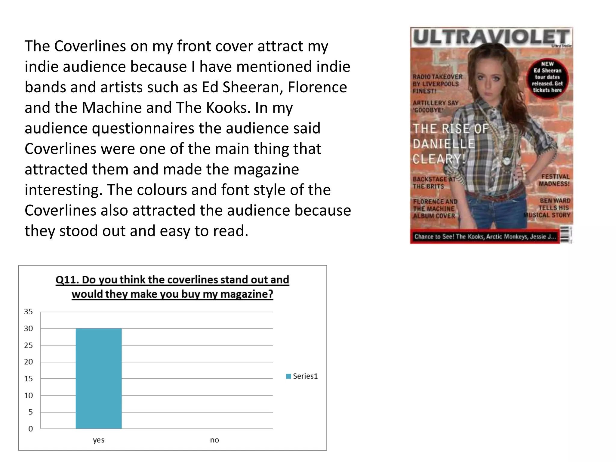
3) Including coverlines mentioning popular indie artists to draw attention and match what audiences said interested them most.
4) Following standard codes and conventions of magazine design, such as column rules and distinctive mastheads, to make the magazine look professional and like a real music publication.