A2 Question 3 Mblrecords
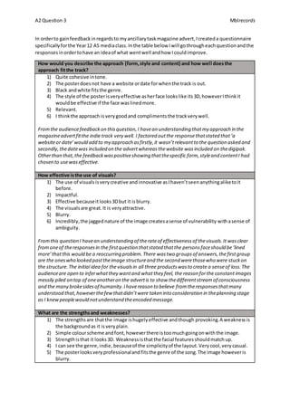
In orderto gainfeedbackinregardsto myancillarytaskmagazine advert,Icreateda questionnaire
specificallyforthe Year12 AS mediaclass.Inthe table below Iwill gothrougheachquestionandthe
responsesinordertohave an ideaof what wentwell andhow Icouldimprove.
How would you describe the approach (form,style and content) and how well doesthe
approach fitthe track?
1) Quite cohesive intone.
2) The posterdoesnot have a website ordate forwhenthe track is out.
3) Black andwhite fitsthe genre.
4) The style of the posterisveryeffective asherface lookslike its3D,howeverIthinkit
wouldbe effective if the face waslinedmore.
5) Relevant.
6) I thinkthe approach isverygoodand complimentsthe trackverywell.
Fromthe audiencefeedbackon thisquestion,I havean understanding thatmy approach in the
magazineadvertfitthe indie track very well. I factored outthe responsethatstated that‘a
websiteor date’would add to my approach asfirstly,it wasn’trelevantto the question asked and
secondly,thedatewas included on the advertwhereasthewebsite wasincluded on thedigipak.
Otherthan that,the feedbackwaspositiveshowing thatthespecific form,styleand contentI had
chosen to usewaseffective.
How effective isthe use of visuals?
1) The use of visualsisverycreative andinnovative asIhaven’tseenanythingaliketoit
before.
2) Impactful.
3) Effective becauseitlooks3Dbut it isblurry.
4) The visualsare great.It is veryattractive.
5) Blurry.
6) Incredibly,the jaggednature of the image createsasense of vulnerability withasense of
ambiguity.
Fromthis question I havean understanding of therateof effectivenessof thevisuals.It wasclear
fromoneof theresponsesin the firstquestion thatstated thatthe personsfaceshould be‘lined
more’thatthis would be a reoccurring problem.There wastwo groupsof answers,thefirstgroup
are the oneswho looked pasttheimage structureand the second werethosewho were stuckon
the structure.The initial idea for thevisualsin all three productswasto create a senseof loss.The
audienceare open to inferwhatthey wantand whatthey feel, the reason forthe constantimages
messily piled on top of oneanotheron the advertis to show thedifferentstreamof consciousness
and the many brokesidesof humanity.Ihavereason to believe fromtheresponsesthatmany
understood that,howeverthefewthatdidn’twere taken into consideration in theplanning stage
as I knewpeoplewould notunderstand theencoded message.
What are the strengthsand weaknesses?
1) The strengthsare thatthe image ishugelyeffective andthough provoking.A weaknessis
the backgroundas it isveryplain.
2) Simple colourscheme andfont,howeverthere istoomuchgoingonwiththe image.
3) Strengthisthat it looks3D. Weaknessisthatthe facial featuresshouldmatchup.
4) I can see the genre,indie, becauseof the simplicityof the layout.Verycool,verycasual.
5) The posterlooksveryprofessionalandfitsthe genre of the song.The image howeveris
blurry.
A2 Question 3 Mblrecords
6) The way the image situatesrealityforambiguityisastrength.A weaknessisthe colour
clash.
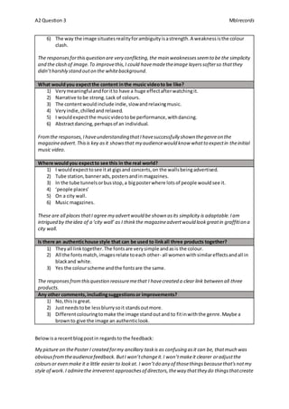
The responsesforthisquestion are very conflicting,the main weaknessesseemto be the simplicity
and the clash of image.To improvethis,I could havemadetheimage layerssofterso thatthey
didn’tharshly stand outon the whitebackground.
What wouldyou expectthe content inthe music videoto be like?
1) Verymeaningfulandforitto have a huge effectafterwatchingit.
2) Narrative tobe strong.Lack of colours.
3) The contentwouldinclude indie,slowandrelaxingmusic.
4) Veryindie,chilledand relaxed.
5) I wouldexpectthe musicvideotobe performance,withdancing.
6) Abstractdancing,perhapsof an individual.
Fromthe responses,IhaveunderstandingthatIhavesuccessfully shown thegenreon the
magazineadvert.Thisis key asit showsthat my audiencewould know whatto expectin theinitial
music video.
Where wouldyou expectto see this in the real world?
1) I wouldexpecttosee itat gigsand concerts,on the wallsbeingadvertised.
2) Tube station,bannerads,postersandin magazines.
3) In the tube tunnelsorbusstop,a bigposterwhere lotsof people wouldsee it.
4) ‘people places’
5) On a city wall.
6) Music magazines.
These are all places thatI agree my advertwould be shown asits simplicity is adaptable.Iam
intrigued by theidea of a ‘city wall’ as I thinkthe magazineadvertwould lookgreatin graffition a
city wall.
Is there an authentichouse style that can be used to linkall three products together?
1) Theyall linktogether.The fontsare verysimple andasis the colour.
2) All the fontsmatch,imagesrelate toeach other- all womenwithsimilareffectsandall in
blackand white.
3) Yes the colourscheme andthe fontsare the same.
The responsesfromthisquestion reassuremethat I havecreated a clear link between all three
products.
Any other comments,includingsuggestionsor improvements?
1) No,thisis great.
2) Justneedstobe lessblurrysoit standsoutmore.
3) Differentcolouringtomake the image standoutand to fitinwiththe genre.Maybe a
brownto give the image an authenticlook.
Belowisa recentblogpostin regardsto the feedback:
My picture on thePoster I created formy ancillary taskis as confusing asit can be, thatmuch was
obviousfromtheaudiencefeedback. ButI won’tchangeit.I won’tmakeit clearer oradjustthe
coloursor even make it a little easier to lookat. I won’tdo any of thosethingsbecausethat'snotmy
style of work.I admirethe irreverent approachesof directors,theway thatthey do thingsthatcreate
A2 Question 3 Mblrecords
an intense realism whilststaying true to their imagination.Iwantto do that.I wantto capturethe
fearand complexities of human natureon camera,defining my workto be real and original.The
picture I created on theposter is supposed to show thedifferentelementsto humanity,to show that
there is more than oneside to them. It’ssupposed to beharsh to theeye, ugly to see butalso
captivating enough to lookat.You are supposed to see whatyou wantto see, notwhatyou thinkyou
should see.It's a mind game,individualto each and every oneof you.

Question 3

  • 1.
    A2 Question 3Mblrecords In orderto gainfeedbackinregardsto myancillarytaskmagazine advert,Icreateda questionnaire specificallyforthe Year12 AS mediaclass.Inthe table below Iwill gothrougheachquestionandthe responsesinordertohave an ideaof what wentwell andhow Icouldimprove. How would you describe the approach (form,style and content) and how well doesthe approach fitthe track? 1) Quite cohesive intone. 2) The posterdoesnot have a website ordate forwhenthe track is out. 3) Black andwhite fitsthe genre. 4) The style of the posterisveryeffective asherface lookslike its3D,howeverIthinkit wouldbe effective if the face waslinedmore. 5) Relevant. 6) I thinkthe approach isverygoodand complimentsthe trackverywell. Fromthe audiencefeedbackon thisquestion,I havean understanding thatmy approach in the magazineadvertfitthe indie track very well. I factored outthe responsethatstated that‘a websiteor date’would add to my approach asfirstly,it wasn’trelevantto the question asked and secondly,thedatewas included on the advertwhereasthewebsite wasincluded on thedigipak. Otherthan that,the feedbackwaspositiveshowing thatthespecific form,styleand contentI had chosen to usewaseffective. How effective isthe use of visuals? 1) The use of visualsisverycreative andinnovative asIhaven’tseenanythingaliketoit before. 2) Impactful. 3) Effective becauseitlooks3Dbut it isblurry. 4) The visualsare great.It is veryattractive. 5) Blurry. 6) Incredibly,the jaggednature of the image createsasense of vulnerability withasense of ambiguity. Fromthis question I havean understanding of therateof effectivenessof thevisuals.It wasclear fromoneof theresponsesin the firstquestion thatstated thatthe personsfaceshould be‘lined more’thatthis would be a reoccurring problem.There wastwo groupsof answers,thefirstgroup are the oneswho looked pasttheimage structureand the second werethosewho were stuckon the structure.The initial idea for thevisualsin all three productswasto create a senseof loss.The audienceare open to inferwhatthey wantand whatthey feel, the reason forthe constantimages messily piled on top of oneanotheron the advertis to show thedifferentstreamof consciousness and the many brokesidesof humanity.Ihavereason to believe fromtheresponsesthatmany understood that,howeverthefewthatdidn’twere taken into consideration in theplanning stage as I knewpeoplewould notunderstand theencoded message. What are the strengthsand weaknesses? 1) The strengthsare thatthe image ishugelyeffective andthough provoking.A weaknessis the backgroundas it isveryplain. 2) Simple colourscheme andfont,howeverthere istoomuchgoingonwiththe image. 3) Strengthisthat it looks3D. Weaknessisthatthe facial featuresshouldmatchup. 4) I can see the genre,indie, becauseof the simplicityof the layout.Verycool,verycasual. 5) The posterlooksveryprofessionalandfitsthe genre of the song.The image howeveris blurry.
  • 2.
    A2 Question 3Mblrecords 6) The way the image situatesrealityforambiguityisastrength.A weaknessisthe colour clash. The responsesforthisquestion are very conflicting,the main weaknessesseemto be the simplicity and the clash of image.To improvethis,I could havemadetheimage layerssofterso thatthey didn’tharshly stand outon the whitebackground. What wouldyou expectthe content inthe music videoto be like? 1) Verymeaningfulandforitto have a huge effectafterwatchingit. 2) Narrative tobe strong.Lack of colours. 3) The contentwouldinclude indie,slowandrelaxingmusic. 4) Veryindie,chilledand relaxed. 5) I wouldexpectthe musicvideotobe performance,withdancing. 6) Abstractdancing,perhapsof an individual. Fromthe responses,IhaveunderstandingthatIhavesuccessfully shown thegenreon the magazineadvert.Thisis key asit showsthat my audiencewould know whatto expectin theinitial music video. Where wouldyou expectto see this in the real world? 1) I wouldexpecttosee itat gigsand concerts,on the wallsbeingadvertised. 2) Tube station,bannerads,postersandin magazines. 3) In the tube tunnelsorbusstop,a bigposterwhere lotsof people wouldsee it. 4) ‘people places’ 5) On a city wall. 6) Music magazines. These are all places thatI agree my advertwould be shown asits simplicity is adaptable.Iam intrigued by theidea of a ‘city wall’ as I thinkthe magazineadvertwould lookgreatin graffition a city wall. Is there an authentichouse style that can be used to linkall three products together? 1) Theyall linktogether.The fontsare verysimple andasis the colour. 2) All the fontsmatch,imagesrelate toeach other- all womenwithsimilareffectsandall in blackand white. 3) Yes the colourscheme andthe fontsare the same. The responsesfromthisquestion reassuremethat I havecreated a clear link between all three products. Any other comments,includingsuggestionsor improvements? 1) No,thisis great. 2) Justneedstobe lessblurrysoit standsoutmore. 3) Differentcolouringtomake the image standoutand to fitinwiththe genre.Maybe a brownto give the image an authenticlook. Belowisa recentblogpostin regardsto the feedback: My picture on thePoster I created formy ancillary taskis as confusing asit can be, thatmuch was obviousfromtheaudiencefeedback. ButI won’tchangeit.I won’tmakeit clearer oradjustthe coloursor even make it a little easier to lookat. I won’tdo any of thosethingsbecausethat'snotmy style of work.I admirethe irreverent approachesof directors,theway thatthey do thingsthatcreate
  • 3.
    A2 Question 3Mblrecords an intense realism whilststaying true to their imagination.Iwantto do that.I wantto capturethe fearand complexities of human natureon camera,defining my workto be real and original.The picture I created on theposter is supposed to show thedifferentelementsto humanity,to show that there is more than oneside to them. It’ssupposed to beharsh to theeye, ugly to see butalso captivating enough to lookat.You are supposed to see whatyou wantto see, notwhatyou thinkyou should see.It's a mind game,individualto each and every oneof you.