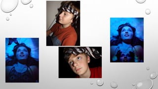
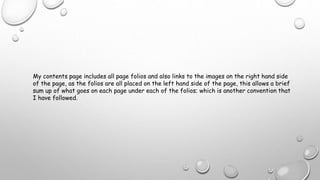
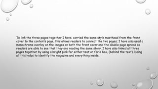
The document discusses the design choices made for a music magazine. Some of the key conventions followed include placing cover lines on the left side of the page so magazines can stack, putting the masthead at the top of the page, and including a drop capital at the start of articles. The designer placed the text and masthead on the left page of a double-page spread so the story flows together. A monochrome overlay was used on cover and double-page images to link the pages visually. The contents page lists page numbers and brief summaries, continuing design conventions for consistency across issues.