Download to read offline
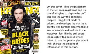
This document provides feedback on a magazine cover design, praising the placement of the sell lines, masthead, and use of a skyline image. It also compliments the dominant image addressing the viewer directly and overlapping the masthead slightly. While the placement of the barcode is felt to be sensible, the pull quote is considered too busy, so the information within it will be reduced.


