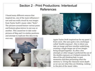
This document summarizes the ways in which the author's music video and print productions for the song "Gather & Run" use, develop, and challenge conventions of real media products.
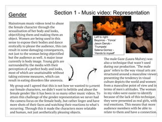
For the music video, the author conforms to conventions such as length of the song, promotional focus on the artist, and relationship between lyrics and visuals. However, it also challenges conventions through its representation of females, youth, sexuality, and use of color/black and white.
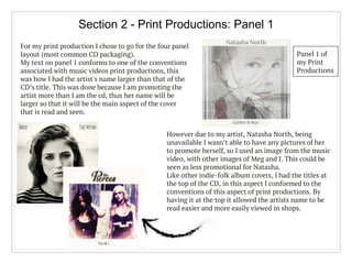
For the print productions, the author conforms to conventions like four panel layout and placement of text/images. But it also challenges conventions through inconsistent color schemes, lack of additional information, and placement of track listing.
The magazine advertisement con