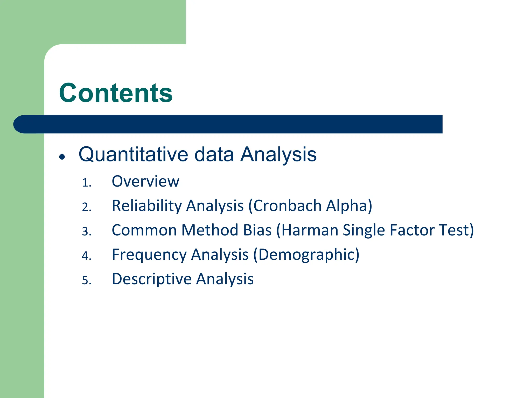
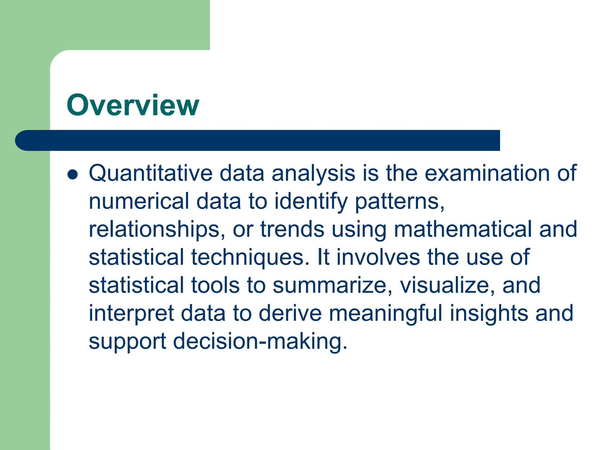
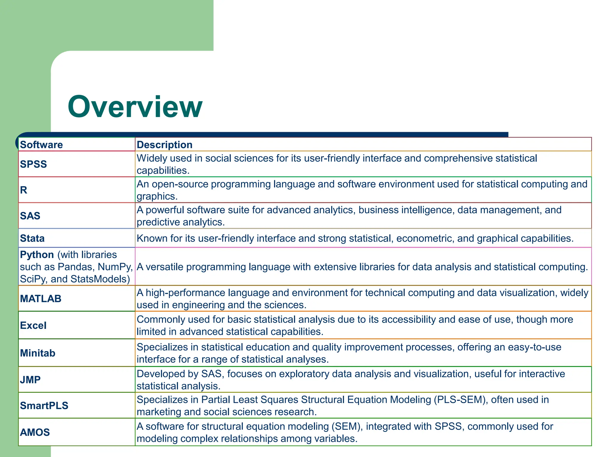
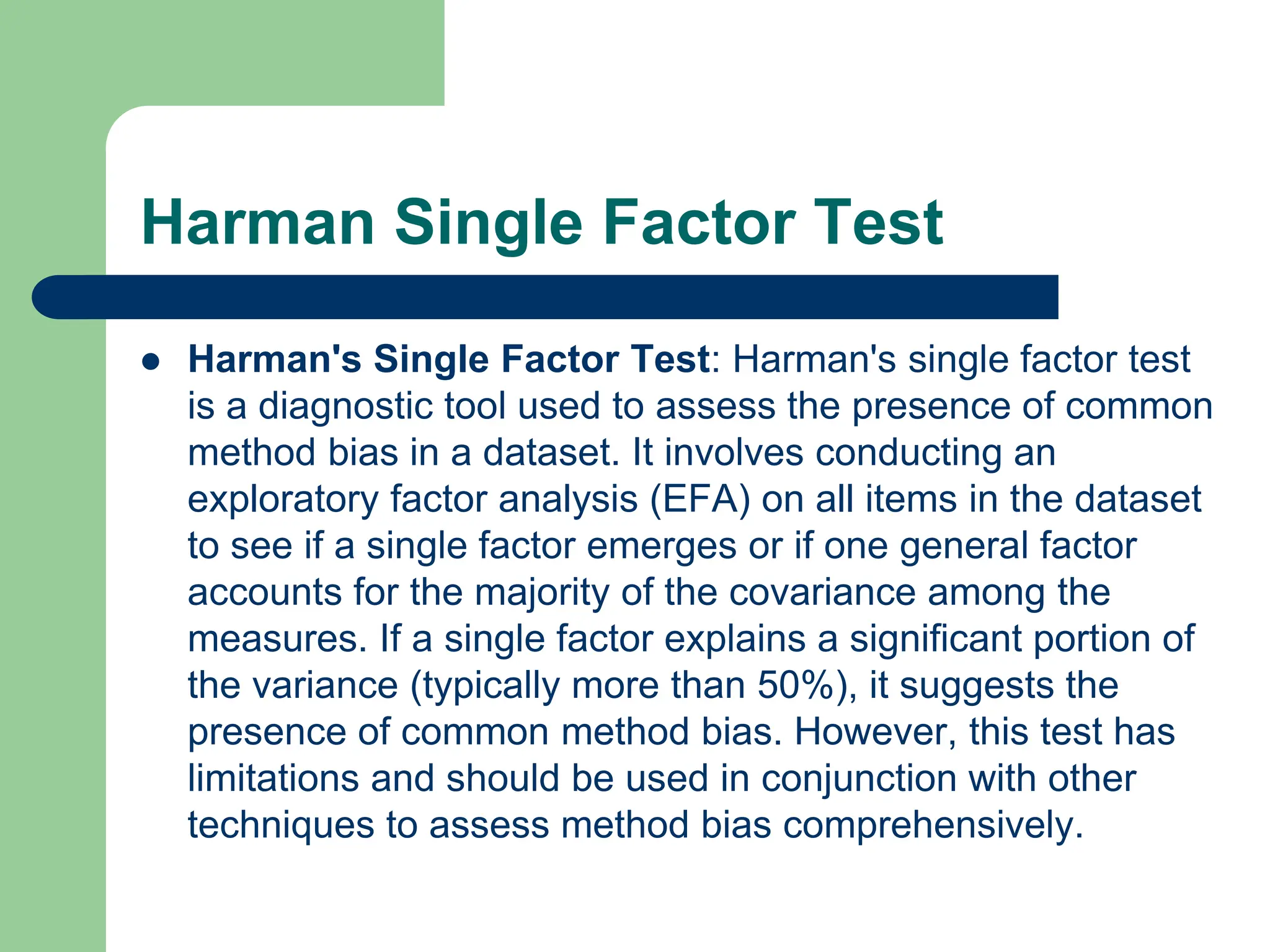
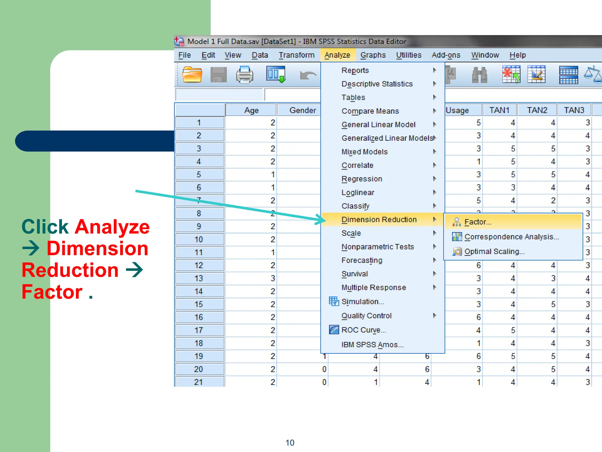
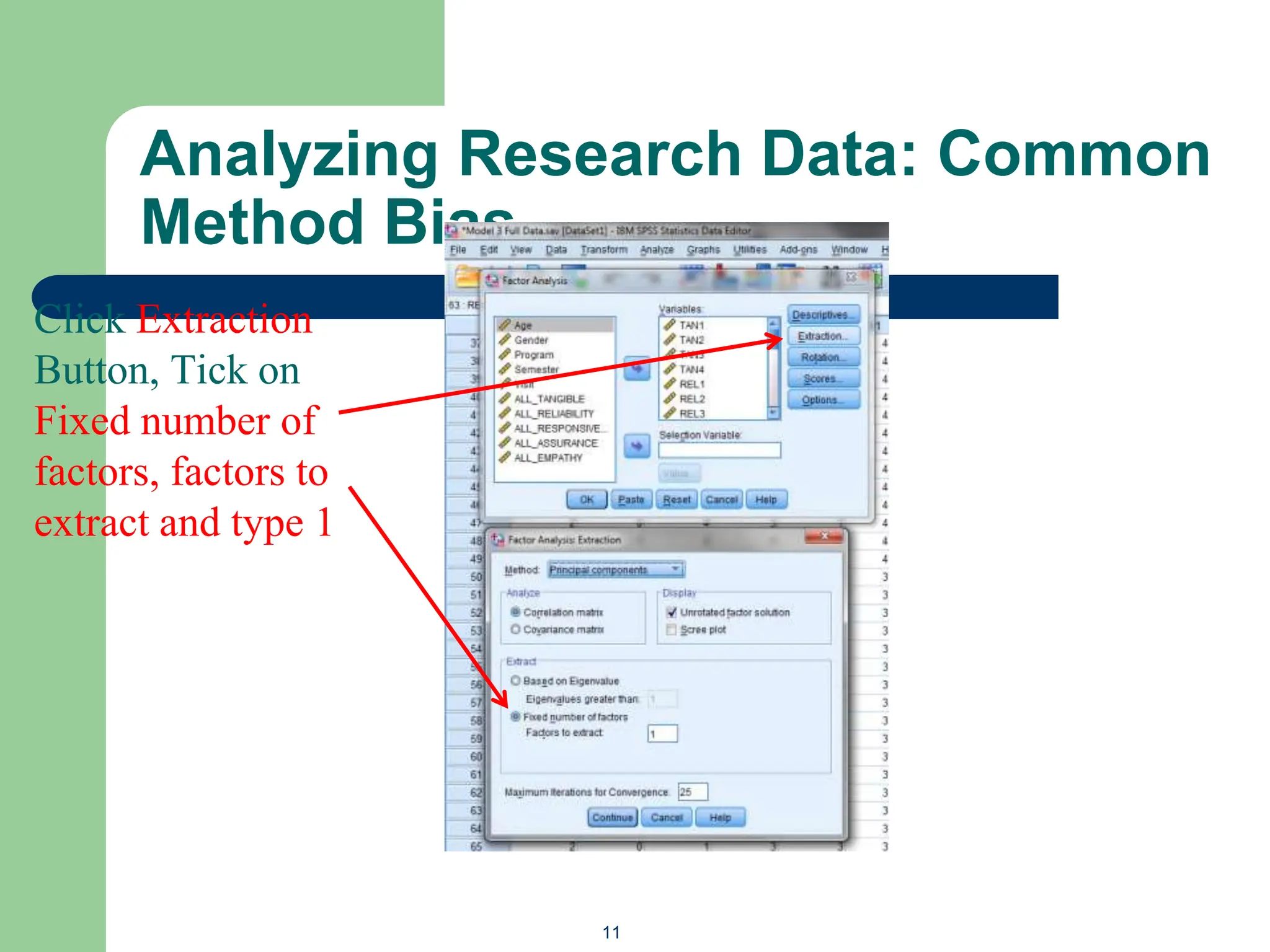
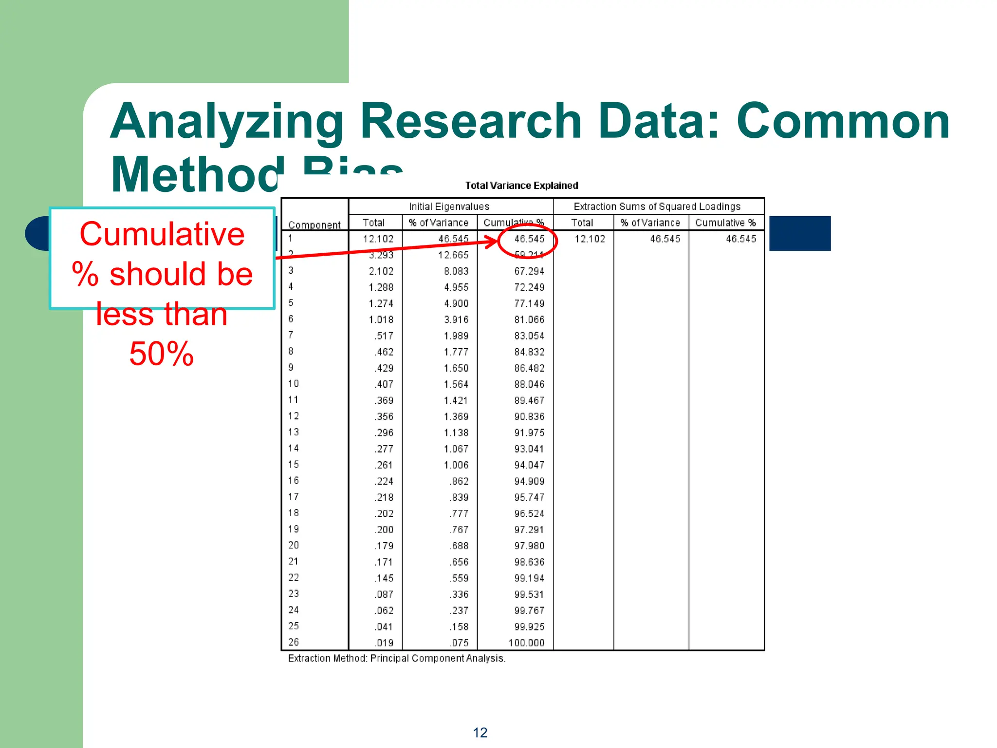
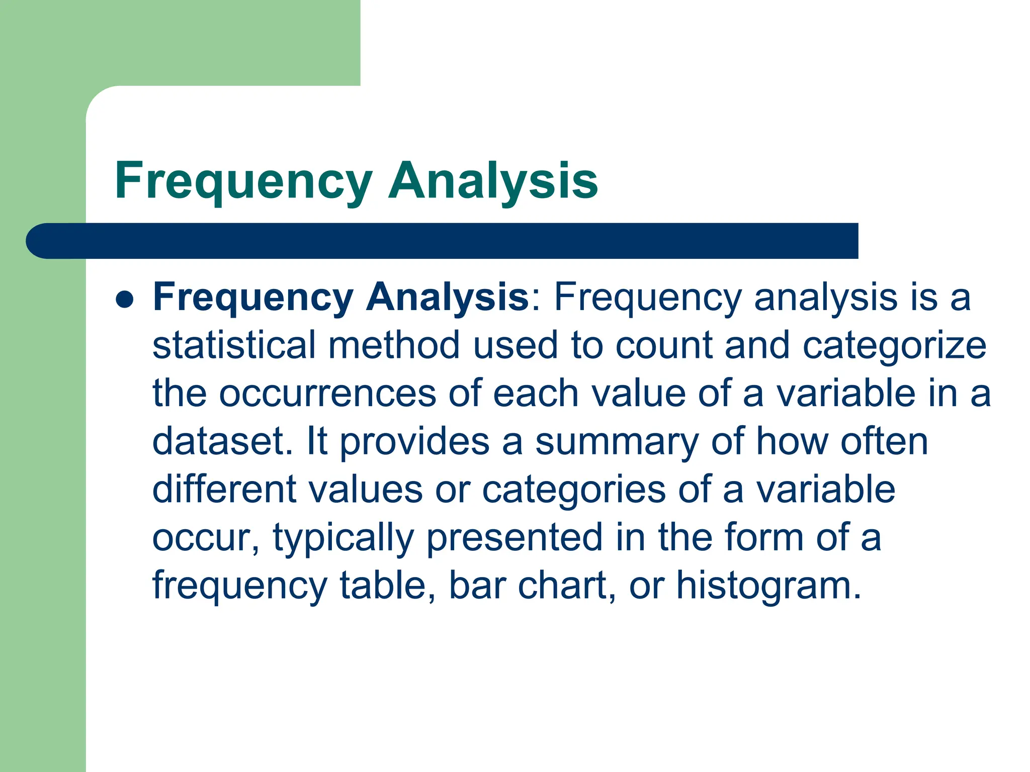
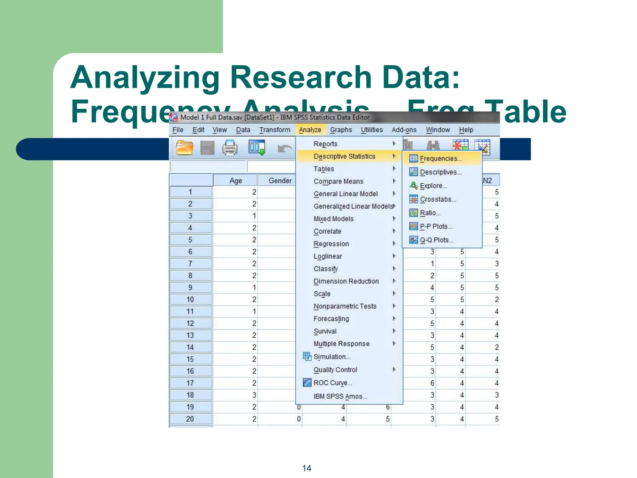
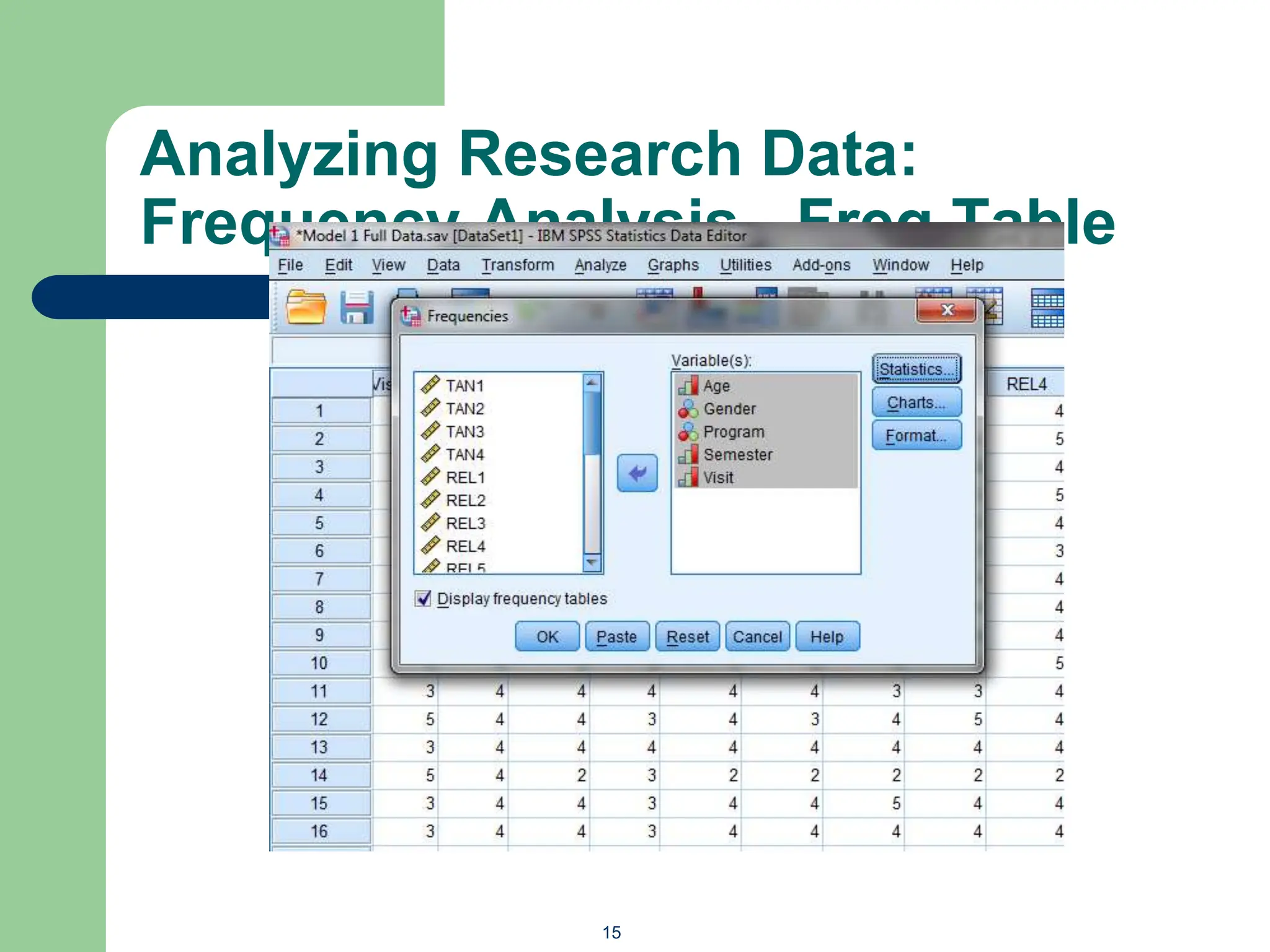
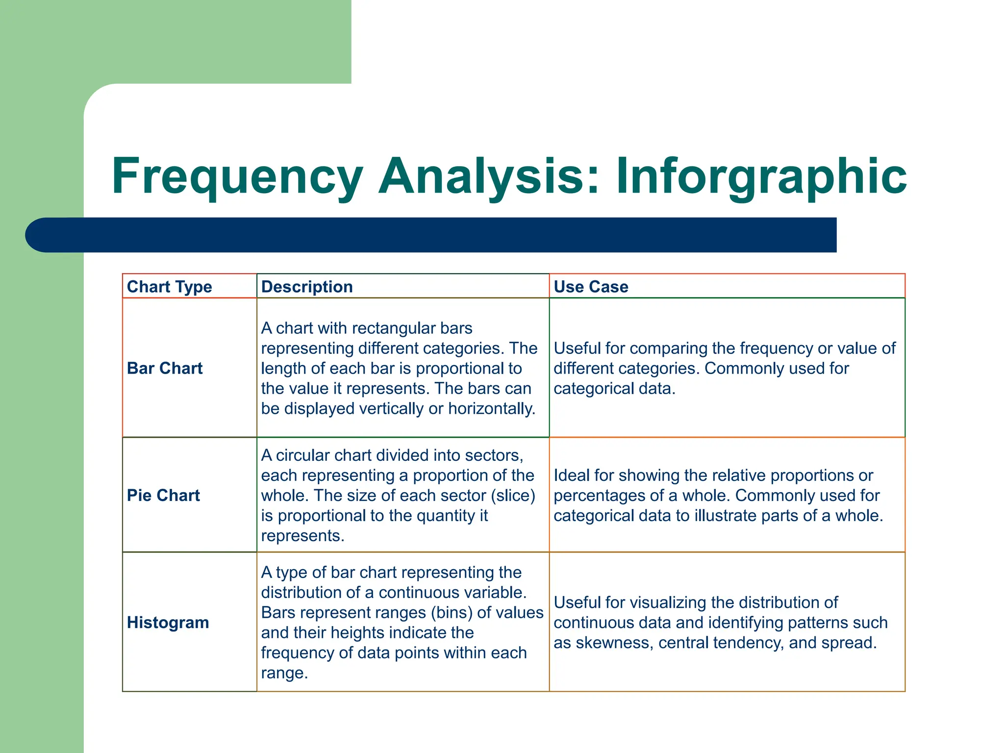
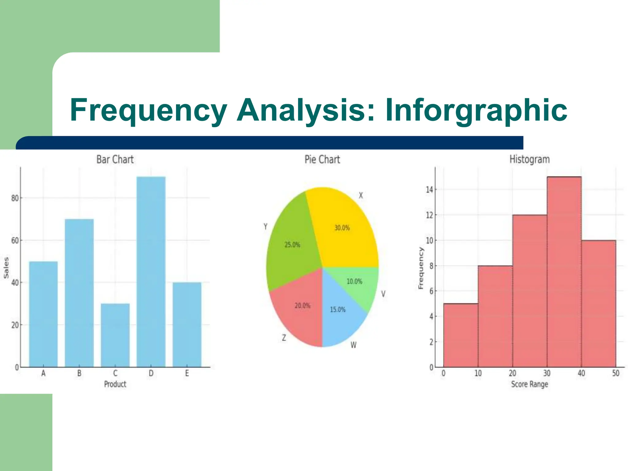
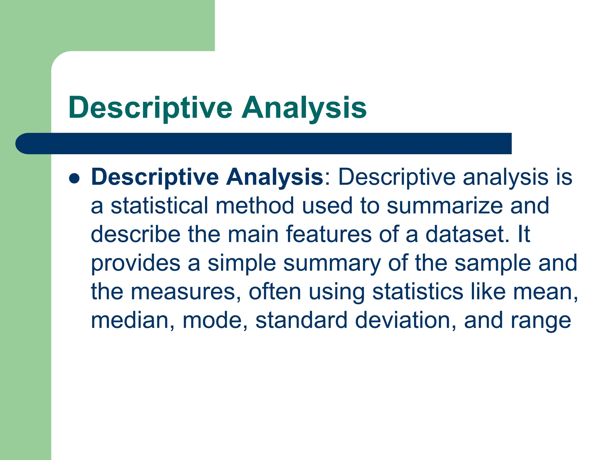
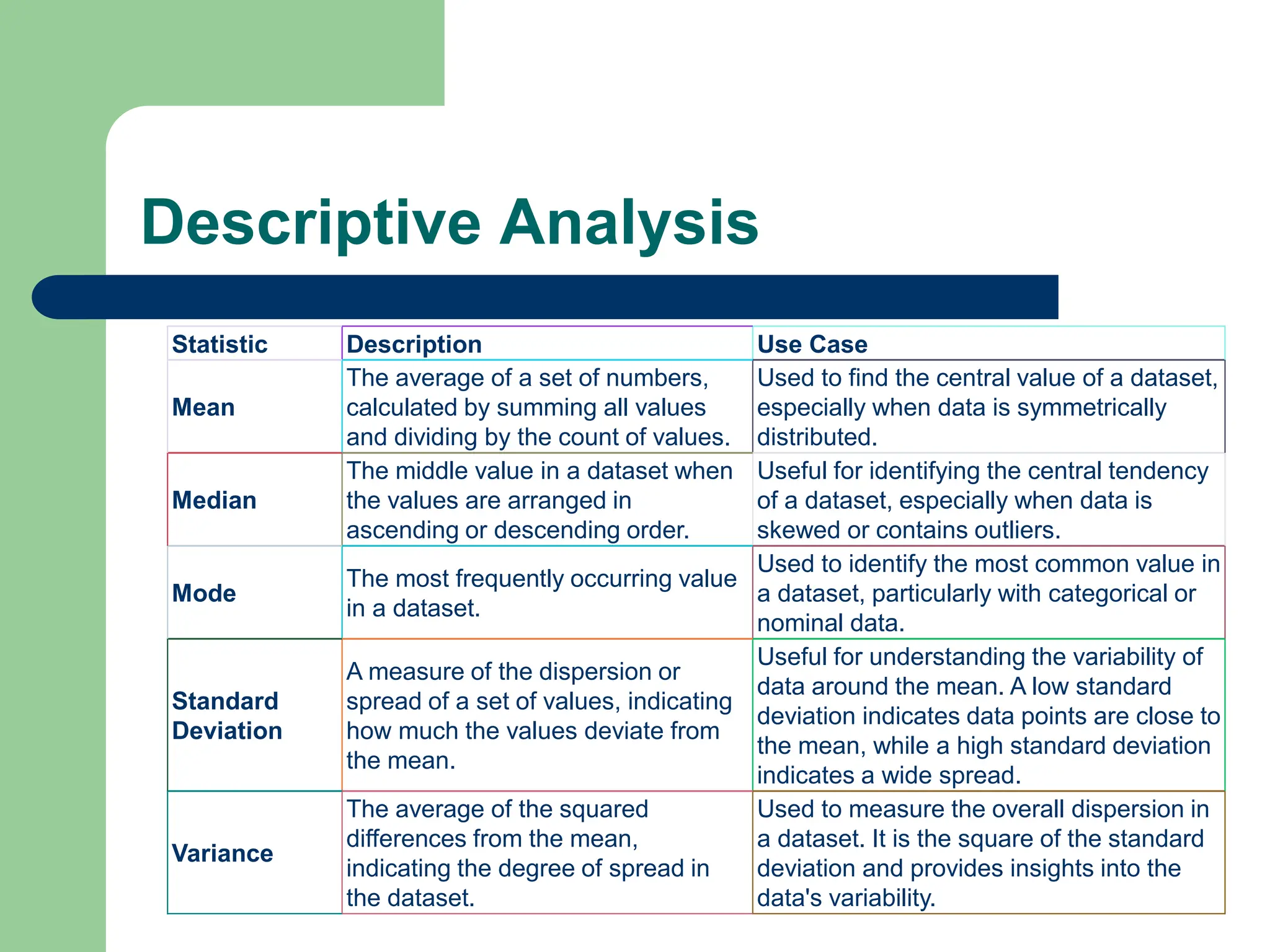
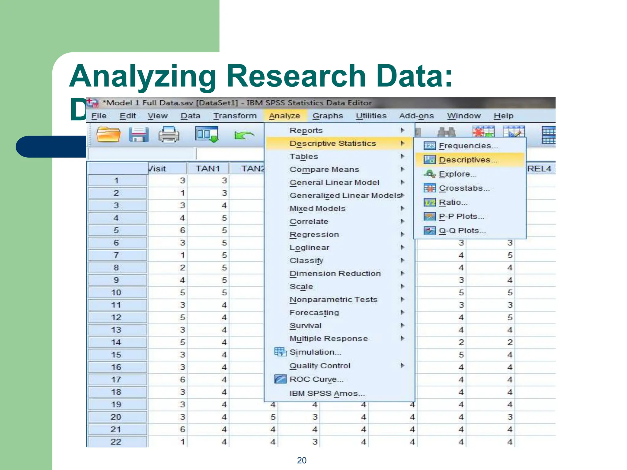
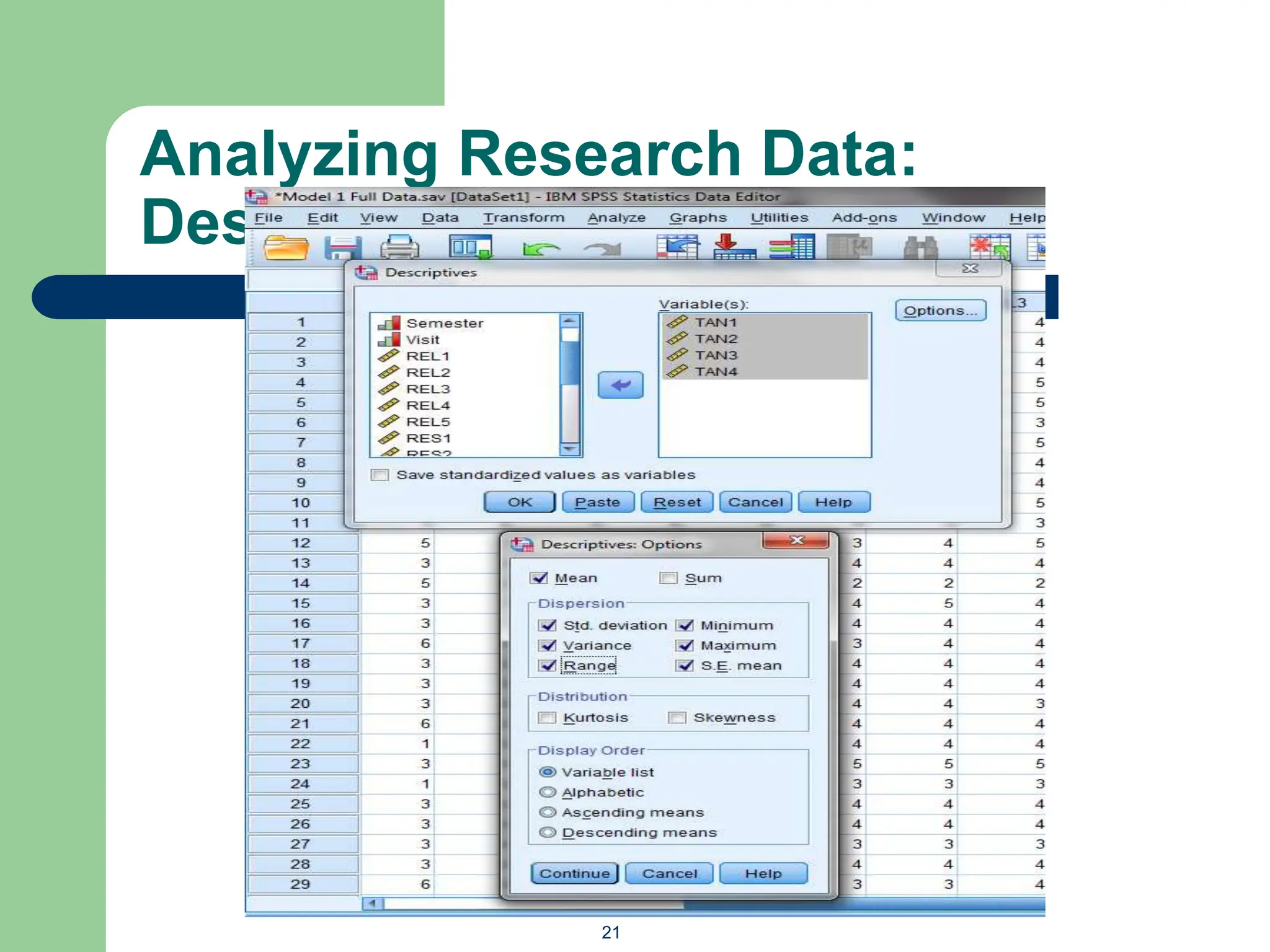
RESEARCH METHODS FOR
INFORMATION SCIENCE (IMC732)
Topic 9:
Quantitative Data Analysis (Part 1)
Contents
 Quantitative data Analysis
1. Overview
2. Reliability Analysis (Cronbach Alpha)
3. Common Method Bias (Harman Single Factor Test)
4. Frequency Analysis (Demographic)
5. Descriptive Analysis
Overview
 Quantitative data analysis is the examination of
numerical data to identify patterns,
relationships, or trends using mathematical and
statistical techniques. It involves the use of
statistical tools to summarize, visualize, and
interpret data to derive meaningful insights and
support decision-making.
Overview
Software Description
SPSS
Widely used in social sciences for its user-friendly interface and comprehensive statistical
capabilities.
R
An open-source programming language and software environment used for statistical computing and
graphics.
SAS
A powerful software suite for advanced analytics, business intelligence, data management, and
predictive analytics.
Stata Known for its user-friendly interface and strong statistical, econometric, and graphical capabilities.
Python (with libraries
such as Pandas, NumPy,
SciPy, and StatsModels)
A versatile programming language with extensive libraries for data analysis and statistical computing.
MATLAB
A high-performance language and environment for technical computing and data visualization, widely
used in engineering and the sciences.
Excel
Commonly used for basic statistical analysis due to its accessibility and ease of use, though more
limited in advanced statistical capabilities.
Minitab
Specializes in statistical education and quality improvement processes, offering an easy-to-use
interface for a range of statistical analyses.
JMP
Developed by SAS, focuses on exploratory data analysis and visualization, useful for interactive
statistical analysis.
SmartPLS
Specializes in Partial Least Squares Structural Equation Modeling (PLS-SEM), often used in
marketing and social sciences research.
AMOS
A software for structural equation modeling (SEM), integrated with SPSS, commonly used for
modeling complex relationships among variables.
Reliability Analysis
 Reliability Analysis: Reliability analysis is a method used
to assess the consistency and stability of a measurement
instrument or test. It evaluates whether the instrument
consistently measures what it is intended to measure across
different occasions, items, or raters. Reliable instruments
yield similar results under consistent conditions.
 Cronbach's Alpha: Cronbach's alpha is a statistic used to
measure the internal consistency or reliability of a set of
scale or test items. It ranges from 0 to 1, with higher values
indicating greater reliability. An alpha value above 0.7 is
generally considered acceptable, indicating that the items in
the scale are measuring the same underlying construct
consistently.
Assessing Reliability (Cronbach
Alpha): Pilot Test
6
Click
Analyze 
Reliability
Analysis.
Under
Descriptives
For, tick
Item, Scale
and Scale if
Item
Deleted
7
Cronbach Alpha
for tangible
dimension =
0.624 (above the
required value of
0.6)
Common Method Bias
 Common Method Bias (Variance): Common method bias
(CMB) refers to the variance that is attributable to the
measurement method rather than to the constructs the
measures represent. This bias can occur when data is
collected from the same source using the same method,
potentially inflating or deflating the relationships between
variables. CMB can compromise the validity of the findings,
making it difficult to determine if the relationships observed
are due to the constructs being studied or the method of
data collection.
Harman Single Factor Test
 Harman's Single Factor Test: Harman's single factor test
is a diagnostic tool used to assess the presence of common
method bias in a dataset. It involves conducting an
exploratory factor analysis (EFA) on all items in the dataset
to see if a single factor emerges or if one general factor
accounts for the majority of the covariance among the
measures. If a single factor explains a significant portion of
the variance (typically more than 50%), it suggests the
presence of common method bias. However, this test has
limitations and should be used in conjunction with other
techniques to assess method bias comprehensively.
Click Analyze
 Dimension
Reduction 
Factor .
10
Analyzing Research Data: Common
Method Bias
11
Click Extraction
Button, Tick on
Fixed number of
factors, factors to
extract and type 1
Analyzing Research Data: Common
Method Bias
12
Cumulative
% should be
less than
50%
Frequency Analysis
 Frequency Analysis: Frequency analysis is a
statistical method used to count and categorize
the occurrences of each value of a variable in a
dataset. It provides a summary of how often
different values or categories of a variable
occur, typically presented in the form of a
frequency table, bar chart, or histogram.
Analyzing Research Data:
Frequency Analysis – Freq Table
14
Analyzing Research Data:
Frequency Analysis - Freq Table
15
Frequency Analysis: Inforgraphic
Chart Type Description Use Case
Bar Chart
A chart with rectangular bars
representing different categories. The
length of each bar is proportional to
the value it represents. The bars can
be displayed vertically or horizontally.
Useful for comparing the frequency or value of
different categories. Commonly used for
categorical data.
Pie Chart
A circular chart divided into sectors,
each representing a proportion of the
whole. The size of each sector (slice)
is proportional to the quantity it
represents.
Ideal for showing the relative proportions or
percentages of a whole. Commonly used for
categorical data to illustrate parts of a whole.
Histogram
A type of bar chart representing the
distribution of a continuous variable.
Bars represent ranges (bins) of values
and their heights indicate the
frequency of data points within each
range.
Useful for visualizing the distribution of
continuous data and identifying patterns such
as skewness, central tendency, and spread.
Frequency Analysis: Inforgraphic
Descriptive Analysis
 Descriptive Analysis: Descriptive analysis is
a statistical method used to summarize and
describe the main features of a dataset. It
provides a simple summary of the sample and
the measures, often using statistics like mean,
median, mode, standard deviation, and range
Descriptive Analysis
Statistic Description Use Case
Mean
The average of a set of numbers,
calculated by summing all values
and dividing by the count of values.
Used to find the central value of a dataset,
especially when data is symmetrically
distributed.
Median
The middle value in a dataset when
the values are arranged in
ascending or descending order.
Useful for identifying the central tendency
of a dataset, especially when data is
skewed or contains outliers.
Mode
The most frequently occurring value
in a dataset.
Used to identify the most common value in
a dataset, particularly with categorical or
nominal data.
Standard
Deviation
A measure of the dispersion or
spread of a set of values, indicating
how much the values deviate from
the mean.
Useful for understanding the variability of
data around the mean. A low standard
deviation indicates data points are close to
the mean, while a high standard deviation
indicates a wide spread.
Variance
The average of the squared
differences from the mean,
indicating the degree of spread in
the dataset.
Used to measure the overall dispersion in
a dataset. It is the square of the standard
deviation and provides insights into the
data's variability.
Analyzing Research Data:
Descriptive Analysis
20
Analyzing Research Data:
Descriptive Analysis
21
Descriptive Analysis: Box Plot
 Box Plot: A box plot, also known as a whisker plot, is a graphical representation of
the distribution of a dataset. It displays the dataset's minimum, first quartile (Q1),
median (Q2), third quartile (Q3), and maximum. Box plots are useful for identifying
outliers and understanding the spread and skewness of the data.
– Components of a Box Plot:
– Minimum: The smallest data point excluding outliers.
– First Quartile (Q1): The 25th percentile of the data.
– Median (Q2): The middle value of the data (50th percentile).
– Third Quartile (Q3): The 75th percentile of the data.
– Maximum: The largest data point excluding outliers.
– Interquartile Range (IQR): The range between Q1 and Q3 (Q3 - Q1).
– Whiskers: Lines extending from the box to the minimum and maximum values
within 1.5 * IQR from Q1 and Q3, respectively.
– Outliers: Data points outside the whiskers, often plotted as individual dots.
Descriptive Analysis: Box Plot
Interpretation:
•Box: The blue box represents the
interquartile range (IQR), containing the
middle 50% of the data.
•Whiskers: The lines extending from the box
show the range of the data within 1.5 * IQR
from the first and third quartiles.
•Median: The red line inside the box
represents the median (Q2) of the data.
•Outliers: Any data points outside the
whiskers are considered outliers and are often
plotted as individual dots.
THE END

Quantitative Data AnalysisReliability Analysis (Cronbach Alpha) Common Method Bias (Harman Single Factor Test).ppt

  • 1.
    RESEARCH METHODS FOR INFORMATIONSCIENCE (IMC732) Topic 9: Quantitative Data Analysis (Part 1)
  • 2.
    Contents  Quantitative dataAnalysis 1. Overview 2. Reliability Analysis (Cronbach Alpha) 3. Common Method Bias (Harman Single Factor Test) 4. Frequency Analysis (Demographic) 5. Descriptive Analysis
  • 3.
    Overview  Quantitative dataanalysis is the examination of numerical data to identify patterns, relationships, or trends using mathematical and statistical techniques. It involves the use of statistical tools to summarize, visualize, and interpret data to derive meaningful insights and support decision-making.
  • 4.
    Overview Software Description SPSS Widely usedin social sciences for its user-friendly interface and comprehensive statistical capabilities. R An open-source programming language and software environment used for statistical computing and graphics. SAS A powerful software suite for advanced analytics, business intelligence, data management, and predictive analytics. Stata Known for its user-friendly interface and strong statistical, econometric, and graphical capabilities. Python (with libraries such as Pandas, NumPy, SciPy, and StatsModels) A versatile programming language with extensive libraries for data analysis and statistical computing. MATLAB A high-performance language and environment for technical computing and data visualization, widely used in engineering and the sciences. Excel Commonly used for basic statistical analysis due to its accessibility and ease of use, though more limited in advanced statistical capabilities. Minitab Specializes in statistical education and quality improvement processes, offering an easy-to-use interface for a range of statistical analyses. JMP Developed by SAS, focuses on exploratory data analysis and visualization, useful for interactive statistical analysis. SmartPLS Specializes in Partial Least Squares Structural Equation Modeling (PLS-SEM), often used in marketing and social sciences research. AMOS A software for structural equation modeling (SEM), integrated with SPSS, commonly used for modeling complex relationships among variables.
  • 5.
    Reliability Analysis  ReliabilityAnalysis: Reliability analysis is a method used to assess the consistency and stability of a measurement instrument or test. It evaluates whether the instrument consistently measures what it is intended to measure across different occasions, items, or raters. Reliable instruments yield similar results under consistent conditions.  Cronbach's Alpha: Cronbach's alpha is a statistic used to measure the internal consistency or reliability of a set of scale or test items. It ranges from 0 to 1, with higher values indicating greater reliability. An alpha value above 0.7 is generally considered acceptable, indicating that the items in the scale are measuring the same underlying construct consistently.
  • 6.
    Assessing Reliability (Cronbach Alpha):Pilot Test 6 Click Analyze  Reliability Analysis. Under Descriptives For, tick Item, Scale and Scale if Item Deleted
  • 7.
    7 Cronbach Alpha for tangible dimension= 0.624 (above the required value of 0.6)
  • 8.
    Common Method Bias Common Method Bias (Variance): Common method bias (CMB) refers to the variance that is attributable to the measurement method rather than to the constructs the measures represent. This bias can occur when data is collected from the same source using the same method, potentially inflating or deflating the relationships between variables. CMB can compromise the validity of the findings, making it difficult to determine if the relationships observed are due to the constructs being studied or the method of data collection.
  • 9.
    Harman Single FactorTest  Harman's Single Factor Test: Harman's single factor test is a diagnostic tool used to assess the presence of common method bias in a dataset. It involves conducting an exploratory factor analysis (EFA) on all items in the dataset to see if a single factor emerges or if one general factor accounts for the majority of the covariance among the measures. If a single factor explains a significant portion of the variance (typically more than 50%), it suggests the presence of common method bias. However, this test has limitations and should be used in conjunction with other techniques to assess method bias comprehensively.
  • 10.
  • 11.
    Analyzing Research Data:Common Method Bias 11 Click Extraction Button, Tick on Fixed number of factors, factors to extract and type 1
  • 12.
    Analyzing Research Data:Common Method Bias 12 Cumulative % should be less than 50%
  • 13.
    Frequency Analysis  FrequencyAnalysis: Frequency analysis is a statistical method used to count and categorize the occurrences of each value of a variable in a dataset. It provides a summary of how often different values or categories of a variable occur, typically presented in the form of a frequency table, bar chart, or histogram.
  • 14.
    Analyzing Research Data: FrequencyAnalysis – Freq Table 14
  • 15.
    Analyzing Research Data: FrequencyAnalysis - Freq Table 15
  • 16.
    Frequency Analysis: Inforgraphic ChartType Description Use Case Bar Chart A chart with rectangular bars representing different categories. The length of each bar is proportional to the value it represents. The bars can be displayed vertically or horizontally. Useful for comparing the frequency or value of different categories. Commonly used for categorical data. Pie Chart A circular chart divided into sectors, each representing a proportion of the whole. The size of each sector (slice) is proportional to the quantity it represents. Ideal for showing the relative proportions or percentages of a whole. Commonly used for categorical data to illustrate parts of a whole. Histogram A type of bar chart representing the distribution of a continuous variable. Bars represent ranges (bins) of values and their heights indicate the frequency of data points within each range. Useful for visualizing the distribution of continuous data and identifying patterns such as skewness, central tendency, and spread.
  • 17.
  • 18.
    Descriptive Analysis  DescriptiveAnalysis: Descriptive analysis is a statistical method used to summarize and describe the main features of a dataset. It provides a simple summary of the sample and the measures, often using statistics like mean, median, mode, standard deviation, and range
  • 19.
    Descriptive Analysis Statistic DescriptionUse Case Mean The average of a set of numbers, calculated by summing all values and dividing by the count of values. Used to find the central value of a dataset, especially when data is symmetrically distributed. Median The middle value in a dataset when the values are arranged in ascending or descending order. Useful for identifying the central tendency of a dataset, especially when data is skewed or contains outliers. Mode The most frequently occurring value in a dataset. Used to identify the most common value in a dataset, particularly with categorical or nominal data. Standard Deviation A measure of the dispersion or spread of a set of values, indicating how much the values deviate from the mean. Useful for understanding the variability of data around the mean. A low standard deviation indicates data points are close to the mean, while a high standard deviation indicates a wide spread. Variance The average of the squared differences from the mean, indicating the degree of spread in the dataset. Used to measure the overall dispersion in a dataset. It is the square of the standard deviation and provides insights into the data's variability.
  • 20.
  • 21.
  • 22.
    Descriptive Analysis: BoxPlot  Box Plot: A box plot, also known as a whisker plot, is a graphical representation of the distribution of a dataset. It displays the dataset's minimum, first quartile (Q1), median (Q2), third quartile (Q3), and maximum. Box plots are useful for identifying outliers and understanding the spread and skewness of the data. – Components of a Box Plot: – Minimum: The smallest data point excluding outliers. – First Quartile (Q1): The 25th percentile of the data. – Median (Q2): The middle value of the data (50th percentile). – Third Quartile (Q3): The 75th percentile of the data. – Maximum: The largest data point excluding outliers. – Interquartile Range (IQR): The range between Q1 and Q3 (Q3 - Q1). – Whiskers: Lines extending from the box to the minimum and maximum values within 1.5 * IQR from Q1 and Q3, respectively. – Outliers: Data points outside the whiskers, often plotted as individual dots.
  • 23.
    Descriptive Analysis: BoxPlot Interpretation: •Box: The blue box represents the interquartile range (IQR), containing the middle 50% of the data. •Whiskers: The lines extending from the box show the range of the data within 1.5 * IQR from the first and third quartiles. •Median: The red line inside the box represents the median (Q2) of the data. •Outliers: Any data points outside the whiskers are considered outliers and are often plotted as individual dots.
  • 24.