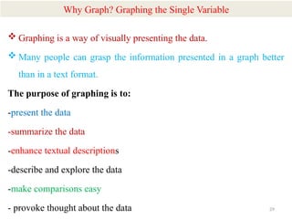
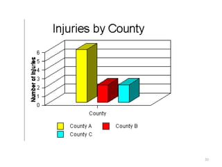
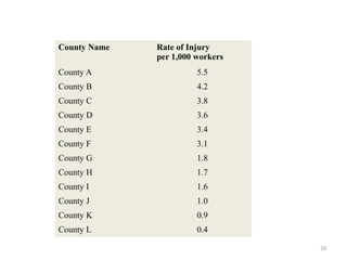
1
Chapter Three
APPLICATION TO UNIVARITE
ANALYSIS
2
 In statistics, there are three kinds of techniques that are used in
the data analysis.
 These are univariate analysis, bivariate analysis, and
multivariate analysis.
 How the data analysis technique is selected is based on the
variable number and the data type.
 The statistical inquiry focus is also something to be consider.
This part explains the details of the univariate analysis.
3
 Univariate analysis is a basic kind of analysis technique for
statistical data.
 Here the data contains just one variable and does not have to deal
with the relationship of a cause and effect.
 Like for example consider a survey of a classroom. The analysts
would want to count the number of boys and girls in the room.
What is Univariate Analysis?
4
 The major reason for univariate analysis is to describe and
summarize a single variable's characteristics within a dataset.
 This type of analysis helps in understanding the distribution,
central tendency (such as mean, median, mode), variability
(such as range, variance, standard deviation), and other
relevant aspects of the data.
 Univariate analysis can provide insights into patterns, trends,
and potential outliers related to that particular variable, which
is crucial for forming hypotheses and guiding further analysis.
5
 A variable is simply a condition or subset of your data in univariate
analysis.
 It can be thought of as a “category.” For example, the analysis could
look at a variable such as “age,” or it can look at “height,” or “weight.”
 However, it does not examine more than one variable at a time, nor
would it look at their relationship.
 The analysis of two variables and their relationship is termed
bivariate analysis.
 If three or more variables are considered simultaneously, it is
multivariate analysis.
6
 Univariate analysis is conducted in many ways and most of these
ways are of a descriptive nature. These are;
 the Frequency Distribution
 Tables
 Frequency Polygons
 Histograms
 Bar Charts and
 Pie Charts
How do you conduct Univariate Analysis?
7
 Let us get into details here of the kind of analysis that is done to
analyze univariate data.
Summary Statistics
 The most common method for performing univariate analysis is
summary statistics.
 The appropriate statistics are determined by the level of
measurement or the nature of the information contained within the
variables.
 The following are the two most common types of summary
statistics:
Types of Univariate Analysis
8
 These numbers describe how evenly distributed the values
are in a dataset.
 The range, standard deviation, interquartile range, and
variance are some examples.
• Range -the difference between the max value and min value in a
dataset
• Standard Deviation- an average measure of the spread
• Interquartile Range- the spread of the middle 50% of values.
Large value, central portion of data spread out further.
a. Measures of Dispersion
9
 These numbers describe the location of a dataset’s center or the
middle value of the data set.
 The mean and median are two examples.
•Frequency distribution table
 Frequency means how often something takes place.
 The observation frequency tells the number of times for the
occurrence of an event.
 The frequency distribution table may show categorical or
qualitative and numeric or quantitative variables.
 The distribution gives a snapshot of the data and lets you find out
the patterns.
b. Measures of central tendency
10
 The bar chart is represented in the form of rectangular bars. The
graph will compare various categories.
 The graph could be plotted vertically or these could be plotted
horizontally.
 In maximum cases, the bar will be plotted vertically.
 The horizontal or the x-axis will represent the category and the
vertical y-axis represents the category’s value.
 The bar graph looks at the data set and makes comparisons.
 Like for example, it may be used to see what part is taking the
maximum budget?
Bar chart
11
 The histogram is the same as a bar chart which analysis the data
counts.
 The bar graph will count against categories and the histogram
displays the categories into bins.
 The bin is capable of showing the number of data positions, the
range, or the interval.
Histogram
12
13
 The frequency polygon is pretty similar to the histogram.
 However, these can be used to compare the data sets or in order to
display the cumulative frequency distribution.
 The frequency polygon will be represented as a line graph.
Frequency Polygon
14
 The pie chart displays the data in a circular format.
 The graph is divided into pieces where each piece is proportional to
the fraction of the complete category.
 So each slice of the pie in the pie chart is relative to categories size.
 The entire pie is 100 percent and when you add up each of the pie
slices then it should also add up to 100.
 Pie charts are used to understand how a group is broken down into
small pieces.
Pie Chart
15
 The univariate data is the one that consists of just one variable.
 The analysis of univariate data is the simplest since the information
has to deal with a single quantity only and the changes in it.
 It doesn’t have to study the relationship and cause and the analysis
is used to describe the data and to find out the pattern that exists in
it.
 Like for example, the height of ten students in a class can be
recorded and this is univariate data.
 There is only one variable which is the height and thus it does not
have any relationship and cause attached to it.
Examples of univariate analysis
16
 The description of the pattern that is found in this type of data is
made by drawing out conclusions based on dispersion, central
measures of tendency, spread, or data, and this is done through the
histograms, frequency distribution table, bar charts, etc.
 Univariate analysis works by examining its effect on a single
variable on a given data set.
 Like for example, the frequency distribution table is a kind of
univariate analysis.
17
 Here only one variable is involved in the data analysis. There could
however be many alternate variables too like height, age, and
weight.
 Univariate is a common term that you use in statistics to describe a
type of data that contains only one attribute or characteristic.
18
 The salaries of people in the industry could be a univariate analysis
example.
 The univariate data could also be used to calculate the mean age of
the population in a village.
19
More example on univarite
1) Raw Data
 Obtain a printout of the raw data for all the variables.
 Raw data resembles a matrix, with the variable names heading the
columns, and the information for each case or record displayed
across the rows.
 Example: Raw data for a study of injuries among county workers
(first 10 cases)
20
Injury Report
No.
County Name Cause of
Injury
Severity of
Injury
1 County A Fall 3
2 County B Auto 4
3 County C Fall 6
4 County C Fall 4
5 County B Fall 5
6 County A Violence 9
7 County A Auto 3
8 County A Violence 2
9 County A Violence 9
10 County B Auto 3
21
 It is difficult to tell what is going on with each variable in this data
set.
 Raw data is difficult to grasp, especially with large number of cases
or records.
 Univariate descriptive statistics can summarize large quantities of
numerical data and reveal patterns in the raw data.
 In order to present the information in a more organized format, start
with univariate descriptive statistics for each variable.
22
For example, the variable Severity of Injury:
Severity of Injury
3
4
6
4
5
9
3
2
9
23
2) Frequency Distribution
 Obtain a frequency distribution of the data for the variable.
 This is done by identifying the lowest and highest values of the
variable, and then putting all the values of the variable in order
from lowest to highest.
 Next, count the number of appearance of each value of the variable.
This is a count of the frequency with which each value occurs in
the data set.
 For example, for the variable "Severity of Injury," the values range
from 2 to 9.
Severity of Injury
Number of Injuries with this
Severity
2 1
3 3
4 2
5 1
6 1
9 2
Total 10
24
25
3) Grouped Data
 Decide on whether the data should be grouped into classes.
 The severity of injury ratings can be collapsed into just a few categories
or groups.
 Grouped data usually has from 3 to 7 groups.
 There should be no groups with a frequency of zero (for example, there
are no injuries with a severity rating of 7 or 8).
• One way to construct groups is to have equal class intervals (e.g., 1-3,
4-6, 7-9).
• Remember that class intervals must be both mutually exclusive and
exhaustive.
26
Severity of Injury Number of Injuries with this Severity
Mild (1-3) 4
Moderate (4-6) 4
Severe (7-9) 2
Total 10
27
4) Cumulative Distributions
 Cumulative frequency distributions include a third column in the
table (this can be done with either simple frequency distributions or
with grouped data):
 A cumulative frequency distribution can answer questions such as,
how many of the injuries were at level 5 or lower? Answer=7
Severity of Injury Number of Injuries Cumulative frequency
2 1 1
3 3 4
4 2 6
5 1 7
6 1 8
9 2 10
28
5) Percentage Distributions
 Frequencies can also be presented in the form of percentage
distributions and cumulative percentages.
Severity of Injury Percent of Injuries Cumulative percentages
2 10 10
3 30 40
4 20 50
5 10 70
6 10 80
9 20 100
29
Why Graph? Graphing the Single Variable
 Graphing is a way of visually presenting the data.
 Many people can grasp the information presented in a graph better
than in a text format.
The purpose of graphing is to:
-present the data
-summarize the data
-enhance textual descriptions
-describe and explore the data
-make comparisons easy
- provoke thought about the data
30
Bar Graphs
 Bar graphs are used to display the frequency distributions for
variables measured at the nominal and ordinal levels.
 Bar graphs use the same width for all the bars on the graph, and
there is space between the bars.
 Label the parts of the graph, including the title, the left (Y) or
vertical axis, the right (X) or horizontal axis, and the bar labels.
31
32
HISTOGRAM
 A histogram is a chart that is similar to a bar chart, but it is used for
interval and ratio level variables.
 With a histogram, the width of the bar is important, since it is the
total area under the bar that represents the proportion of the
phenomenon accounted for by each category.
 The bars convey the relationship of one group or class of the
variable to the other(s).
 For example, in the case of the countries and employee injuries, we
might have information on the rate of injury according to the
number of workers in each county in State X.
33
County Name Rate of Injury
per 1,000 workers
County A 5.5
County B 4.2
County C 3.8
County D 3.6
County E 3.4
County F 3.1
County G 1.8
County H 1.7
County I 1.6
County J 1.0
County K 0.9
County L 0.4
34
If we group the injury rates into three groups, then a low rate of injury
would be 0.0-1.9 injuries per 1,000 workers; moderate would be 2.0-
3.9; and high would be 4.0 and above (in this case, up to 5.9). This
could be graphed as follows:
35
• The main difference between a bar graph and a histogram lies in the type of
data they represent and how that data is displayed:
1. Data Representation:
1. Bar Graph: Displays categorical data, where each bar represents a category.
The categories are discrete and can be rearranged without affecting the meaning.
2. Histogram: Displays continuous data that is grouped into ranges or intervals.
The bars represent the frequency of data points within each range.
2. Bar Spacing:
1. Bar Graph: There is space between the bars because the categories are distinct.
2. Histogram: The bars are touching each other, as the data represents intervals of
continuous values.
3. X-axis:
1. Bar Graph: The x-axis typically shows categories or groups.
2. Histogram: The x-axis shows numerical intervals or bins representing the range
of continuous data.
4. Purpose:
1. Bar Graph: Used to compare different categories or groups.
2. Histogram: Used to show the distribution of a dataset and visualize the
frequency of data points across a range.
36
For example, the following table shows the average injury rate per 1,000
employes for counties in State X for the years 1980 to 1990.
A cumulative frequency polygon is used to display the cumulative
distribution of values for a variable.
Year 1980 1981 1982 1983 1984 1985 1986 1987 1988 1989 1990
Rate 3.6 4.2 3.4 5.5 3.8 3.1 1.7 1.8 1.0 1.6 0.9
Frequency polygon
37
PIE CHART
 Another way to show the relationships between classes or
categories of a variable is in a pie or circle chart.
 In a pie chart, each "slice" represents the proportion of the total
phenomenon that is due to each of the classes or groups.
38
Rates and Ratios
 Other ways to look at the sub-groups or classes within one variable
is by the relation of each sub-group or class to the whole.
 This can be calculated with a proportion.
 A proportion is obtained by dividing the frequency of observations
counted for one group or class (written as f) by the total number of
observations counted for the variable (written as N).
This can be expressed as f / N
 A percentage is the same as a proportion, multiplied by 100.
This can be expressed as f / N x 100
39
• A rate is the relationship between two different numbers, for
example, the number of injuries among country workers and the
population of the county. This can be calculated as the first number
(N1, or injuries) divided by the second number (N2, or population).
• This can be expressed as N1 / N2
• Many health statistics are expressed as rates, for example, the birth
rate is the number of births per some population, such as number of
births per 1,000 women.
40
THANK
YOU
FOR YOUR
ATTENTION!

Chapter Three Univarite Anaalysis.pptx

  • 1.
  • 2.
    2  In statistics,there are three kinds of techniques that are used in the data analysis.  These are univariate analysis, bivariate analysis, and multivariate analysis.  How the data analysis technique is selected is based on the variable number and the data type.  The statistical inquiry focus is also something to be consider. This part explains the details of the univariate analysis.
  • 3.
    3  Univariate analysisis a basic kind of analysis technique for statistical data.  Here the data contains just one variable and does not have to deal with the relationship of a cause and effect.  Like for example consider a survey of a classroom. The analysts would want to count the number of boys and girls in the room. What is Univariate Analysis?
  • 4.
    4  The majorreason for univariate analysis is to describe and summarize a single variable's characteristics within a dataset.  This type of analysis helps in understanding the distribution, central tendency (such as mean, median, mode), variability (such as range, variance, standard deviation), and other relevant aspects of the data.  Univariate analysis can provide insights into patterns, trends, and potential outliers related to that particular variable, which is crucial for forming hypotheses and guiding further analysis.
  • 5.
    5  A variableis simply a condition or subset of your data in univariate analysis.  It can be thought of as a “category.” For example, the analysis could look at a variable such as “age,” or it can look at “height,” or “weight.”  However, it does not examine more than one variable at a time, nor would it look at their relationship.  The analysis of two variables and their relationship is termed bivariate analysis.  If three or more variables are considered simultaneously, it is multivariate analysis.
  • 6.
    6  Univariate analysisis conducted in many ways and most of these ways are of a descriptive nature. These are;  the Frequency Distribution  Tables  Frequency Polygons  Histograms  Bar Charts and  Pie Charts How do you conduct Univariate Analysis?
  • 7.
    7  Let usget into details here of the kind of analysis that is done to analyze univariate data. Summary Statistics  The most common method for performing univariate analysis is summary statistics.  The appropriate statistics are determined by the level of measurement or the nature of the information contained within the variables.  The following are the two most common types of summary statistics: Types of Univariate Analysis
  • 8.
    8  These numbersdescribe how evenly distributed the values are in a dataset.  The range, standard deviation, interquartile range, and variance are some examples. • Range -the difference between the max value and min value in a dataset • Standard Deviation- an average measure of the spread • Interquartile Range- the spread of the middle 50% of values. Large value, central portion of data spread out further. a. Measures of Dispersion
  • 9.
    9  These numbersdescribe the location of a dataset’s center or the middle value of the data set.  The mean and median are two examples. •Frequency distribution table  Frequency means how often something takes place.  The observation frequency tells the number of times for the occurrence of an event.  The frequency distribution table may show categorical or qualitative and numeric or quantitative variables.  The distribution gives a snapshot of the data and lets you find out the patterns. b. Measures of central tendency
  • 10.
    10  The barchart is represented in the form of rectangular bars. The graph will compare various categories.  The graph could be plotted vertically or these could be plotted horizontally.  In maximum cases, the bar will be plotted vertically.  The horizontal or the x-axis will represent the category and the vertical y-axis represents the category’s value.  The bar graph looks at the data set and makes comparisons.  Like for example, it may be used to see what part is taking the maximum budget? Bar chart
  • 11.
    11  The histogramis the same as a bar chart which analysis the data counts.  The bar graph will count against categories and the histogram displays the categories into bins.  The bin is capable of showing the number of data positions, the range, or the interval. Histogram
  • 12.
  • 13.
    13  The frequencypolygon is pretty similar to the histogram.  However, these can be used to compare the data sets or in order to display the cumulative frequency distribution.  The frequency polygon will be represented as a line graph. Frequency Polygon
  • 14.
    14  The piechart displays the data in a circular format.  The graph is divided into pieces where each piece is proportional to the fraction of the complete category.  So each slice of the pie in the pie chart is relative to categories size.  The entire pie is 100 percent and when you add up each of the pie slices then it should also add up to 100.  Pie charts are used to understand how a group is broken down into small pieces. Pie Chart
  • 15.
    15  The univariatedata is the one that consists of just one variable.  The analysis of univariate data is the simplest since the information has to deal with a single quantity only and the changes in it.  It doesn’t have to study the relationship and cause and the analysis is used to describe the data and to find out the pattern that exists in it.  Like for example, the height of ten students in a class can be recorded and this is univariate data.  There is only one variable which is the height and thus it does not have any relationship and cause attached to it. Examples of univariate analysis
  • 16.
    16  The descriptionof the pattern that is found in this type of data is made by drawing out conclusions based on dispersion, central measures of tendency, spread, or data, and this is done through the histograms, frequency distribution table, bar charts, etc.  Univariate analysis works by examining its effect on a single variable on a given data set.  Like for example, the frequency distribution table is a kind of univariate analysis.
  • 17.
    17  Here onlyone variable is involved in the data analysis. There could however be many alternate variables too like height, age, and weight.  Univariate is a common term that you use in statistics to describe a type of data that contains only one attribute or characteristic.
  • 18.
    18  The salariesof people in the industry could be a univariate analysis example.  The univariate data could also be used to calculate the mean age of the population in a village.
  • 19.
    19 More example onunivarite 1) Raw Data  Obtain a printout of the raw data for all the variables.  Raw data resembles a matrix, with the variable names heading the columns, and the information for each case or record displayed across the rows.  Example: Raw data for a study of injuries among county workers (first 10 cases)
  • 20.
    20 Injury Report No. County NameCause of Injury Severity of Injury 1 County A Fall 3 2 County B Auto 4 3 County C Fall 6 4 County C Fall 4 5 County B Fall 5 6 County A Violence 9 7 County A Auto 3 8 County A Violence 2 9 County A Violence 9 10 County B Auto 3
  • 21.
    21  It isdifficult to tell what is going on with each variable in this data set.  Raw data is difficult to grasp, especially with large number of cases or records.  Univariate descriptive statistics can summarize large quantities of numerical data and reveal patterns in the raw data.  In order to present the information in a more organized format, start with univariate descriptive statistics for each variable.
  • 22.
    22 For example, thevariable Severity of Injury: Severity of Injury 3 4 6 4 5 9 3 2 9
  • 23.
    23 2) Frequency Distribution Obtain a frequency distribution of the data for the variable.  This is done by identifying the lowest and highest values of the variable, and then putting all the values of the variable in order from lowest to highest.  Next, count the number of appearance of each value of the variable. This is a count of the frequency with which each value occurs in the data set.  For example, for the variable "Severity of Injury," the values range from 2 to 9.
  • 24.
    Severity of Injury Numberof Injuries with this Severity 2 1 3 3 4 2 5 1 6 1 9 2 Total 10 24
  • 25.
    25 3) Grouped Data Decide on whether the data should be grouped into classes.  The severity of injury ratings can be collapsed into just a few categories or groups.  Grouped data usually has from 3 to 7 groups.  There should be no groups with a frequency of zero (for example, there are no injuries with a severity rating of 7 or 8). • One way to construct groups is to have equal class intervals (e.g., 1-3, 4-6, 7-9). • Remember that class intervals must be both mutually exclusive and exhaustive.
  • 26.
    26 Severity of InjuryNumber of Injuries with this Severity Mild (1-3) 4 Moderate (4-6) 4 Severe (7-9) 2 Total 10
  • 27.
    27 4) Cumulative Distributions Cumulative frequency distributions include a third column in the table (this can be done with either simple frequency distributions or with grouped data):  A cumulative frequency distribution can answer questions such as, how many of the injuries were at level 5 or lower? Answer=7 Severity of Injury Number of Injuries Cumulative frequency 2 1 1 3 3 4 4 2 6 5 1 7 6 1 8 9 2 10
  • 28.
    28 5) Percentage Distributions Frequencies can also be presented in the form of percentage distributions and cumulative percentages. Severity of Injury Percent of Injuries Cumulative percentages 2 10 10 3 30 40 4 20 50 5 10 70 6 10 80 9 20 100
  • 29.
    29 Why Graph? Graphingthe Single Variable  Graphing is a way of visually presenting the data.  Many people can grasp the information presented in a graph better than in a text format. The purpose of graphing is to: -present the data -summarize the data -enhance textual descriptions -describe and explore the data -make comparisons easy - provoke thought about the data
  • 30.
    30 Bar Graphs  Bargraphs are used to display the frequency distributions for variables measured at the nominal and ordinal levels.  Bar graphs use the same width for all the bars on the graph, and there is space between the bars.  Label the parts of the graph, including the title, the left (Y) or vertical axis, the right (X) or horizontal axis, and the bar labels.
  • 31.
  • 32.
    32 HISTOGRAM  A histogramis a chart that is similar to a bar chart, but it is used for interval and ratio level variables.  With a histogram, the width of the bar is important, since it is the total area under the bar that represents the proportion of the phenomenon accounted for by each category.  The bars convey the relationship of one group or class of the variable to the other(s).  For example, in the case of the countries and employee injuries, we might have information on the rate of injury according to the number of workers in each county in State X.
  • 33.
    33 County Name Rateof Injury per 1,000 workers County A 5.5 County B 4.2 County C 3.8 County D 3.6 County E 3.4 County F 3.1 County G 1.8 County H 1.7 County I 1.6 County J 1.0 County K 0.9 County L 0.4
  • 34.
    34 If we groupthe injury rates into three groups, then a low rate of injury would be 0.0-1.9 injuries per 1,000 workers; moderate would be 2.0- 3.9; and high would be 4.0 and above (in this case, up to 5.9). This could be graphed as follows:
  • 35.
    35 • The maindifference between a bar graph and a histogram lies in the type of data they represent and how that data is displayed: 1. Data Representation: 1. Bar Graph: Displays categorical data, where each bar represents a category. The categories are discrete and can be rearranged without affecting the meaning. 2. Histogram: Displays continuous data that is grouped into ranges or intervals. The bars represent the frequency of data points within each range. 2. Bar Spacing: 1. Bar Graph: There is space between the bars because the categories are distinct. 2. Histogram: The bars are touching each other, as the data represents intervals of continuous values. 3. X-axis: 1. Bar Graph: The x-axis typically shows categories or groups. 2. Histogram: The x-axis shows numerical intervals or bins representing the range of continuous data. 4. Purpose: 1. Bar Graph: Used to compare different categories or groups. 2. Histogram: Used to show the distribution of a dataset and visualize the frequency of data points across a range.
  • 36.
    36 For example, thefollowing table shows the average injury rate per 1,000 employes for counties in State X for the years 1980 to 1990. A cumulative frequency polygon is used to display the cumulative distribution of values for a variable. Year 1980 1981 1982 1983 1984 1985 1986 1987 1988 1989 1990 Rate 3.6 4.2 3.4 5.5 3.8 3.1 1.7 1.8 1.0 1.6 0.9 Frequency polygon
  • 37.
    37 PIE CHART  Anotherway to show the relationships between classes or categories of a variable is in a pie or circle chart.  In a pie chart, each "slice" represents the proportion of the total phenomenon that is due to each of the classes or groups.
  • 38.
    38 Rates and Ratios Other ways to look at the sub-groups or classes within one variable is by the relation of each sub-group or class to the whole.  This can be calculated with a proportion.  A proportion is obtained by dividing the frequency of observations counted for one group or class (written as f) by the total number of observations counted for the variable (written as N). This can be expressed as f / N  A percentage is the same as a proportion, multiplied by 100. This can be expressed as f / N x 100
  • 39.
    39 • A rateis the relationship between two different numbers, for example, the number of injuries among country workers and the population of the county. This can be calculated as the first number (N1, or injuries) divided by the second number (N2, or population). • This can be expressed as N1 / N2 • Many health statistics are expressed as rates, for example, the birth rate is the number of births per some population, such as number of births per 1,000 women.
  • 40.