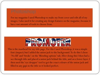
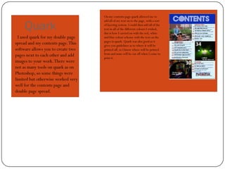
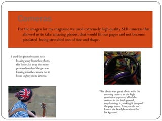
What have you learnt about the
technologies from the process of
constructing your media product?
Digital technologies I have used
 Photoshop
 Quark
 Cameras
 Blogger
 Prezi
 The internet
Photoshop
   For my magazine I used Photoshop to make my front cover and edit all of my
   images. I also used it for creating any design features on the magazine, because it
   has a vast amount of tools to choose from.


This is the masthead for my title page. For this I used Photoshop, it was a simple
  font (impact) but I added the union jack to the background. To do this I chose
  ‘No fill’ and ‘Stroke’ on the ‘Blending options’ tab. After doing this I then had a
  see through title and placed a union jack behind the title, and on a lower layer. I
  then used the ‘eye dropper’ tool to get the exact colours of the union jack and
  filled in any gaps in the title so it looked perfect.
On my contents page quark allowed me to


     Quark
                                    add all of my text on to the page, with a sort
                                    of layering system. I could then add all of the
                                    text in all of the different colours I wished,
                                    this is how I carried on with the red, white
  I used quark for my double page   and blue colour scheme with the text on the
                                    pages in quark. Quark was also good as it
spread and my contents page. This   gives you guidelines as to where it will be
software allows you to create two   printed off, so I know where will be printed
pages next to each other and add    from and none will be cut off when I come to
                                    print it.
images to your work. There were
not as many tools on quark as on
Photoshop, so some things were
limited but otherwise worked very
well for the contents page and
double page spread.
Cameras
     For the images for my magazine we used extremely high quality SLR cameras that
        allowed us to take amazing photos, that would fit our pages and not become
        pixelated being stretched out of size and shape.


I used this photo because he is
     looking away from this photo,
     this does take away the more
     personal touch of the person
     looking into the camera but it
     looks slightly more artistic.


                                                     This photo was great photo with the
                                                         amazing camera as the high
                                                         resolution captured all of the
                                                         colours in the background,
                                                         emphasising it, making it jump off
                                                         the page more. Also you do not
                                                         loosed the headphones into the
                                                         background.
Blogger.com
To Present all of our work for marking we used a blog, which we could
   continuously add work too and edit it if we needed to. We could also add
   different blogs in at different times to make sure that the work actually fit into
   when it should have. This was also a good tool as we could use it as a checklist
   for the work we had and hadn't done yet

Q6 what have you learned

  • 1.
    What have youlearnt about the technologies from the process of constructing your media product?
  • 2.
    Digital technologies Ihave used  Photoshop  Quark  Cameras  Blogger  Prezi  The internet
  • 3.
    Photoshop For my magazine I used Photoshop to make my front cover and edit all of my images. I also used it for creating any design features on the magazine, because it has a vast amount of tools to choose from. This is the masthead for my title page. For this I used Photoshop, it was a simple font (impact) but I added the union jack to the background. To do this I chose ‘No fill’ and ‘Stroke’ on the ‘Blending options’ tab. After doing this I then had a see through title and placed a union jack behind the title, and on a lower layer. I then used the ‘eye dropper’ tool to get the exact colours of the union jack and filled in any gaps in the title so it looked perfect.
  • 4.
    On my contentspage quark allowed me to Quark add all of my text on to the page, with a sort of layering system. I could then add all of the text in all of the different colours I wished, this is how I carried on with the red, white I used quark for my double page and blue colour scheme with the text on the pages in quark. Quark was also good as it spread and my contents page. This gives you guidelines as to where it will be software allows you to create two printed off, so I know where will be printed pages next to each other and add from and none will be cut off when I come to print it. images to your work. There were not as many tools on quark as on Photoshop, so some things were limited but otherwise worked very well for the contents page and double page spread.
  • 5.
    Cameras For the images for my magazine we used extremely high quality SLR cameras that allowed us to take amazing photos, that would fit our pages and not become pixelated being stretched out of size and shape. I used this photo because he is looking away from this photo, this does take away the more personal touch of the person looking into the camera but it looks slightly more artistic. This photo was great photo with the amazing camera as the high resolution captured all of the colours in the background, emphasising it, making it jump off the page more. Also you do not loosed the headphones into the background.
  • 6.
    Blogger.com To Present allof our work for marking we used a blog, which we could continuously add work too and edit it if we needed to. We could also add different blogs in at different times to make sure that the work actually fit into when it should have. This was also a good tool as we could use it as a checklist for the work we had and hadn't done yet