Downloaded 39 times

The document provides an overview of procurement KPIs and total spend analysis through various charts and graphs that are linked to Excel, allowing for automatic updates based on data changes. It includes instructions for editing these graphs and customizing colors in PowerPoint presentations. Additionally, it features information on accessing a wide range of editable icons for presentations.
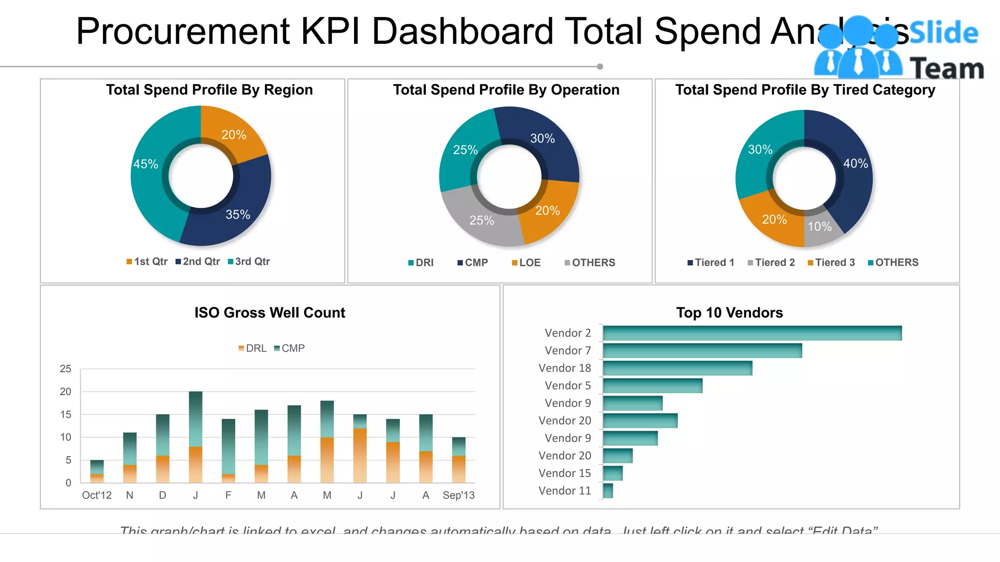
The slide presents a detailed procurement KPI dashboard, showing total spend profile by region, operation, and tiered categories, along with vendor performance.
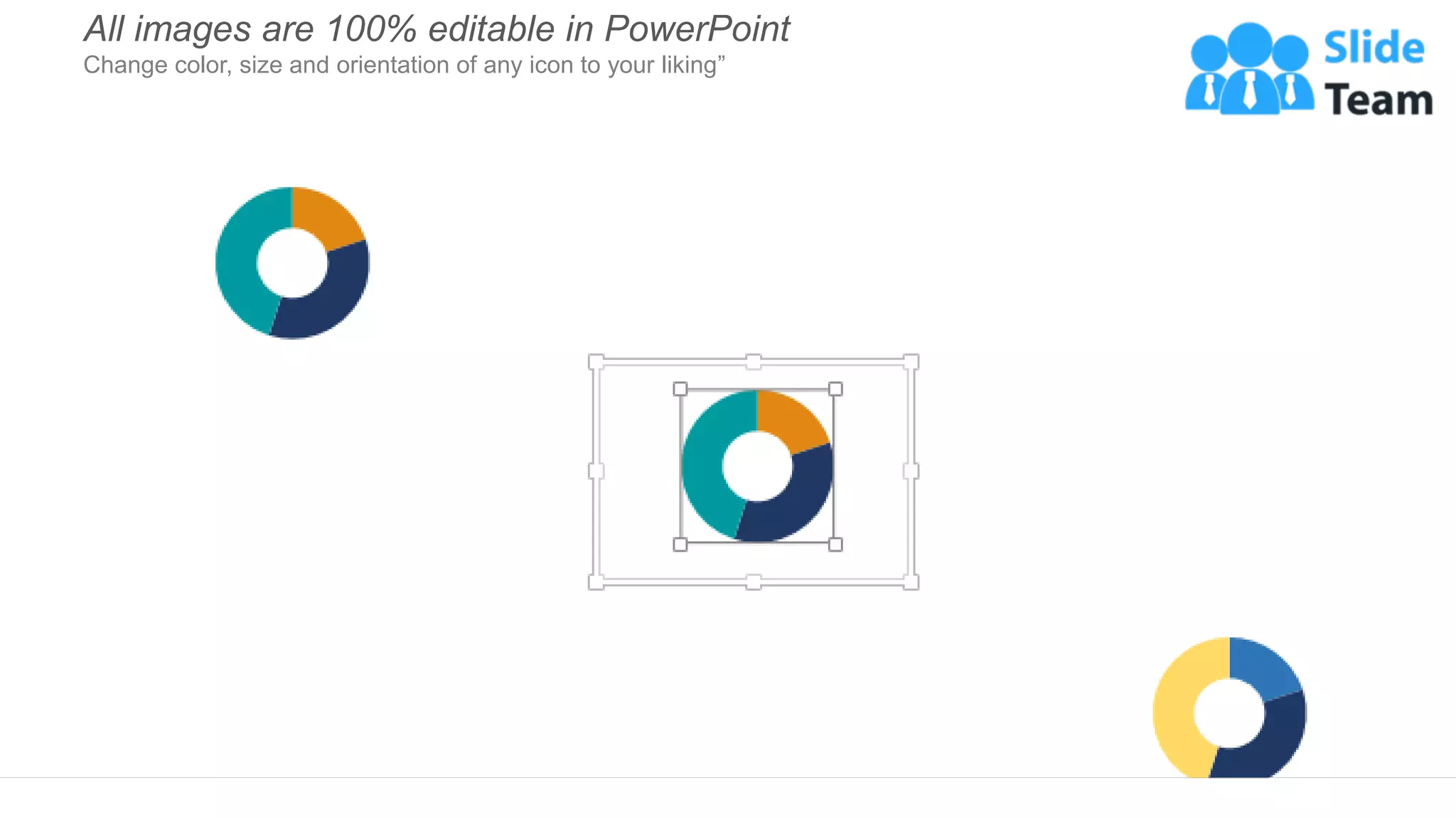
Highlights that all images in the presentation are 100% editable, allowing customization in color, size, and orientation.
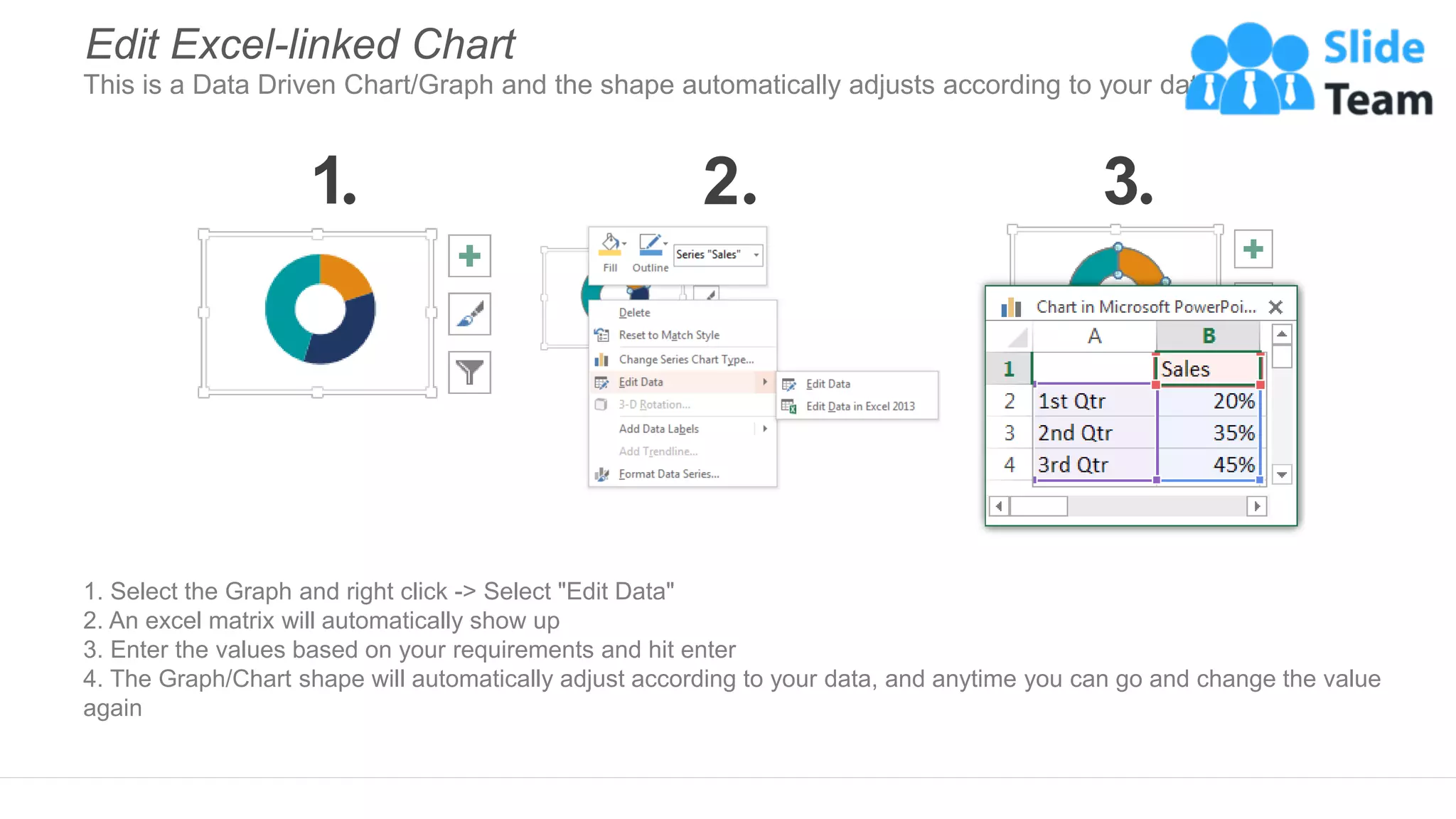
Provides a step-by-step guide on how to edit Excel-linked charts within PowerPoint, ensuring dynamic data representation.
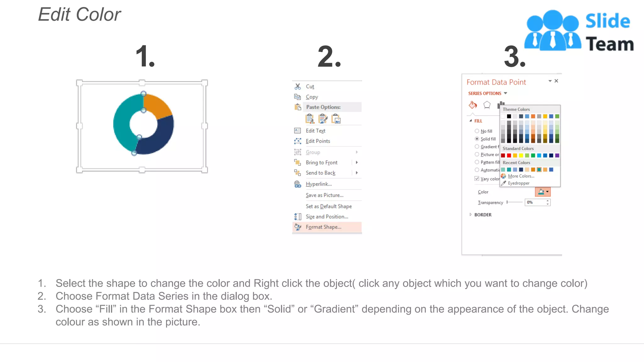
Explains how to change colors of chart elements in PowerPoint, emphasizing the selection and formatting process.
Introduces a resource for selecting editable icons across various topics available on a dedicated website.


![CleanMyMac X v5.2.8 Crack for MacOS Full Version [Latest] pptx](https://cdn.slidesharecdn.com/ss_thumbnails/softwareoverview-251207194121-a81f0142-thumbnail.jpg?width=640&height=640&fit=bounds)
![iStat Menus 7.20 Crack for MacOS 2026 Full Version [Latest] pptx](https://cdn.slidesharecdn.com/ss_thumbnails/softwareoverview-251207191544-22b737dc-thumbnail.jpg?width=640&height=640&fit=bounds)
![Moho Pro 14.4 Crack for MacOS Works Until 2050 [Latest] pptx](https://cdn.slidesharecdn.com/ss_thumbnails/softwareoverview-251207192639-797289c4-thumbnail.jpg?width=640&height=640&fit=bounds)


