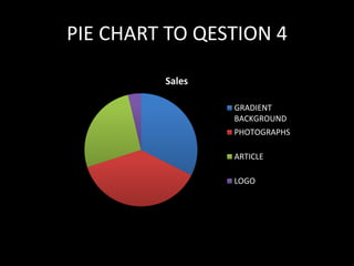
AUDIENCE FEEDBACK
Q1. How is your overall reaction when
you saw the magazine?
• ‘’Overall I think that the magazine looks great, especially the images of the artists and I
also like the font that has ben used. The color scheme and the gradient backgrounds is
another aspect that I found very striking about this magazine. I would totally buy it.’’
• ‘’ I think that the overall appearance of the magazine is great.’’
• ‘’Overall the magazine looks amazing. I especially love the logo.’’
• ‘’Overall it looks great and the www.xposed.com website I would defiantly visit if it was
a media product.’’
• ‘’I love how the model is dressed in smart clothing it changes the perspective of the
overall magazine appearance and how the R&B genre may be portrayed.’’
• ‘’I love it when I first saw the magazine I thought it was a real, professional one. I was
little surprised that I did’t know about it but even more surprised when they told me it
a part of someone coursework. It looks really good.’’
• ‘’I feel that the model on the cover is so provoking to the female audience targeted.’’
• ‘’ All of the pages fit together very well and the free posters are just a bonus of it all.’’
• ‘’I would totally read the magazine if it was a real media product. I would urchse it
without any doubt.’’
Q2. Do you feel any interest in the
article and the Upcoming artists
Young-Z? If so why?
• I think that, yes, the article is very interesting due to the content. I also like
the font. It makes it very easy to read it. ‘’
• ‘’Yeah, I am very interested in the article. I love how the quote is written in
the color red. My attention goes there automatically. ‘’
• ‘’The double page spread is my favorite out of them all due to the gradient
background makes it look so cool therefore I would defiantly be in trigged
to read the article, which I have, and I found it very interesting’’
• ‘’The article makes me want to find out more about the artist’’
• ‘’I love the fact that actual artists like Chris Brown and Tinashe have been
used. It genially makes the article seem so real.’’
• ‘’I like how the article seems to be so personal and open about the artist.
Defiantly very interesting.’’
• ‘’I like how it has some aspects of the artist personal life as well as what he
thinks about becoming an R&B star.’’
Q3. What aspects of the layout
attract you and what do you think
could be improved?
• ‘’Layout look very professional I don’t think anything could be improved’’
• ‘’ It looks great, however I do think maybe the font of the text could have been larger
especially on the double page spread.’’
• ‘’The cover is very crowded and this could be a good as well as a bad thing. Its good
because there is a lot of information included, but its bed because the reader does’t
know of what to look at first. I do still think it looks very good though. ‘’
• ‘’Contents page looks great. The layout of the picture of high contrast goes very well
against the background and the writing.’’
• ‘’I love the ‘’X’’ and the back of the double page and the contents page. It’s very good
and I think it was done so it reminds the reader that it is from the XPOSED magazine,
I'm not sure but I automatically think this.’’
• ‘’I think it can be improved by using provocative women artist on the cover or
something to target male audiences although I like how the poster inside is of a female.
It’s like a surprise for those who by the magazine. I also find the female artist on the
poster very pretty and the layout of it look great, simple yet a good appearance. The
model used is very beautiful and elegant.’’
•
Q4. What do you think was the most
striking element of my magazine?
• ‘’The color scheme for me was the most striking’’
• ‘’The pictures look great and professional’’
• ‘’Loved the article itself as well as the model.’’
• ‘’the front cover looks great. Love the explicit language used.’’
• ‘’The free posters, I love them especially the Troy Morgan one, his eyes look
amazing. He reminds me of Trey Songs somehow. ‘’
• ‘’I like the logo so much. Its so professional.’’
• ‘’I like the organization of the magazine. It is very well managed.’’
• ‘’Models. They look fantastic.’’
• ‘’Gradient background is amazing. I found it very striking.’’
• ‘’the contrast of the photograph on the contents page. I love that type of
photography or whatever you call it. ‘’
PIE CHART TO QESTION 4
Sales
GRADIENT
BACKGROUND
PHOTOGRAPHS
ARTICLE
LOGO
Q5. Looking at my magazine can you tell what
genre is being presented and who the target
audience is?
Pop
R&B
Hip Hop
Rap
Q6. Would you buy my magazine and
if so why?
• ‘’Defiantly. If I saw this magazine in a shop I would certainty pick it up.’’
• ‘’Yes, I love it. I love every aspect of it.’’
• ‘’Personally I don’t really read magazines, I prefer to get my news online
therefore I would not buy the magazine but I would visit its website as I
find the overall appearance great.’’
• ‘’Yeah. I love the artists used.’’
• ‘’Sure. The free posters trigger me the most’’
• ‘’Yes, I would love to, just because I love reading and the magazine looks
really good.’’
Q7. do you think there is anything I
can improve on?
Sales
LAYOUT
FONT
MASHEAD
PROVOCATIVE
FEMALES

Presentation1

  • 1.
  • 2.
    Q1. How isyour overall reaction when you saw the magazine? • ‘’Overall I think that the magazine looks great, especially the images of the artists and I also like the font that has ben used. The color scheme and the gradient backgrounds is another aspect that I found very striking about this magazine. I would totally buy it.’’ • ‘’ I think that the overall appearance of the magazine is great.’’ • ‘’Overall the magazine looks amazing. I especially love the logo.’’ • ‘’Overall it looks great and the www.xposed.com website I would defiantly visit if it was a media product.’’ • ‘’I love how the model is dressed in smart clothing it changes the perspective of the overall magazine appearance and how the R&B genre may be portrayed.’’ • ‘’I love it when I first saw the magazine I thought it was a real, professional one. I was little surprised that I did’t know about it but even more surprised when they told me it a part of someone coursework. It looks really good.’’ • ‘’I feel that the model on the cover is so provoking to the female audience targeted.’’ • ‘’ All of the pages fit together very well and the free posters are just a bonus of it all.’’ • ‘’I would totally read the magazine if it was a real media product. I would urchse it without any doubt.’’
  • 3.
    Q2. Do youfeel any interest in the article and the Upcoming artists Young-Z? If so why? • I think that, yes, the article is very interesting due to the content. I also like the font. It makes it very easy to read it. ‘’ • ‘’Yeah, I am very interested in the article. I love how the quote is written in the color red. My attention goes there automatically. ‘’ • ‘’The double page spread is my favorite out of them all due to the gradient background makes it look so cool therefore I would defiantly be in trigged to read the article, which I have, and I found it very interesting’’ • ‘’The article makes me want to find out more about the artist’’ • ‘’I love the fact that actual artists like Chris Brown and Tinashe have been used. It genially makes the article seem so real.’’ • ‘’I like how the article seems to be so personal and open about the artist. Defiantly very interesting.’’ • ‘’I like how it has some aspects of the artist personal life as well as what he thinks about becoming an R&B star.’’
  • 4.
    Q3. What aspectsof the layout attract you and what do you think could be improved? • ‘’Layout look very professional I don’t think anything could be improved’’ • ‘’ It looks great, however I do think maybe the font of the text could have been larger especially on the double page spread.’’ • ‘’The cover is very crowded and this could be a good as well as a bad thing. Its good because there is a lot of information included, but its bed because the reader does’t know of what to look at first. I do still think it looks very good though. ‘’ • ‘’Contents page looks great. The layout of the picture of high contrast goes very well against the background and the writing.’’ • ‘’I love the ‘’X’’ and the back of the double page and the contents page. It’s very good and I think it was done so it reminds the reader that it is from the XPOSED magazine, I'm not sure but I automatically think this.’’ • ‘’I think it can be improved by using provocative women artist on the cover or something to target male audiences although I like how the poster inside is of a female. It’s like a surprise for those who by the magazine. I also find the female artist on the poster very pretty and the layout of it look great, simple yet a good appearance. The model used is very beautiful and elegant.’’ •
  • 5.
    Q4. What doyou think was the most striking element of my magazine? • ‘’The color scheme for me was the most striking’’ • ‘’The pictures look great and professional’’ • ‘’Loved the article itself as well as the model.’’ • ‘’the front cover looks great. Love the explicit language used.’’ • ‘’The free posters, I love them especially the Troy Morgan one, his eyes look amazing. He reminds me of Trey Songs somehow. ‘’ • ‘’I like the logo so much. Its so professional.’’ • ‘’I like the organization of the magazine. It is very well managed.’’ • ‘’Models. They look fantastic.’’ • ‘’Gradient background is amazing. I found it very striking.’’ • ‘’the contrast of the photograph on the contents page. I love that type of photography or whatever you call it. ‘’
  • 6.
    PIE CHART TOQESTION 4 Sales GRADIENT BACKGROUND PHOTOGRAPHS ARTICLE LOGO
  • 7.
    Q5. Looking atmy magazine can you tell what genre is being presented and who the target audience is? Pop R&B Hip Hop Rap
  • 8.
    Q6. Would youbuy my magazine and if so why? • ‘’Defiantly. If I saw this magazine in a shop I would certainty pick it up.’’ • ‘’Yes, I love it. I love every aspect of it.’’ • ‘’Personally I don’t really read magazines, I prefer to get my news online therefore I would not buy the magazine but I would visit its website as I find the overall appearance great.’’ • ‘’Yeah. I love the artists used.’’ • ‘’Sure. The free posters trigger me the most’’ • ‘’Yes, I would love to, just because I love reading and the magazine looks really good.’’
  • 9.
    Q7. do youthink there is anything I can improve on? Sales LAYOUT FONT MASHEAD PROVOCATIVE FEMALES