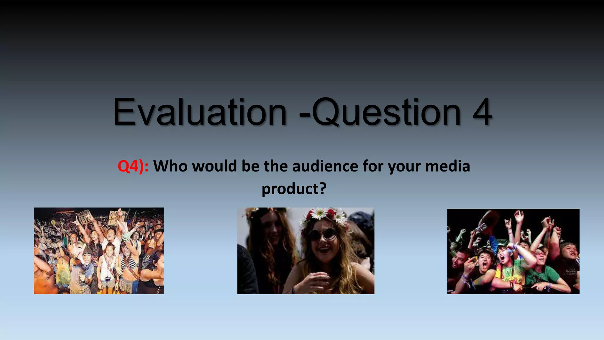
The document describes research conducted to identify the target audience for a magazine called Velvet.
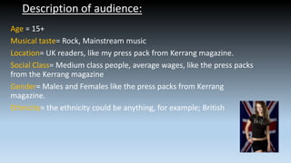
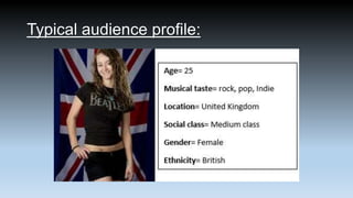
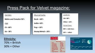
The target audience is described as being 15+ years old, with musical tastes in rock and mainstream music. They are located primarily in the UK and are readers of Kerrang magazine. The audience is of mixed gender and ethnicity but mostly middle-class.
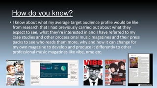
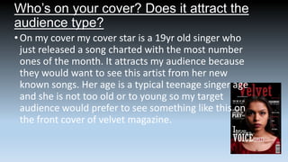
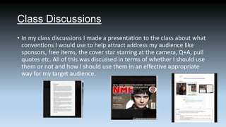
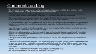
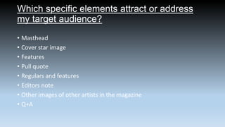
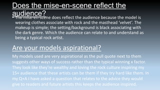
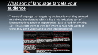
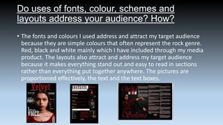
Various methods were used to attract and address this audience, including cover stars that would appeal to teenagers, language at a mid-lexis level, fonts and colors associated with rock music, and aspirational models and stories in the magazine. Feedback from focus groups, surveys, blog comments and peer evaluations helped refine the magazine's design and content.


![In What Ways Does Your Music Magazine Use(1)[1]](https://cdn.slidesharecdn.com/ss_thumbnails/inwhatwaysdoesyourmusicmagazineuse11-100405090752-phpapp02-thumbnail.jpg?width=640&height=640&fit=bounds)


