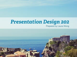
PowerPoint Design 202 (intermediate level), a workshop I presented in January 2014. Useful for business, consulting, sales, marketing, and case competition presentations.
How to Create a Professional Slideshare for Absolute BeginnersSarah Burke
It's hard to get going with Slideshares. Particularly, if you're an absolute beginner. We've shared some tips on how to start off creating Slideshares in Powerpoint that are simple, consistent and yet still professional. Enjoy!
I am currently working at AGT Graphics as their senior Graphics Designer. My job responsibilities include designing different graphics for AGT's clients and helping them with day to day tasks. I have worked with clients all over the world including North America, Dubai, Australia.
Beyond Bullets: Creating Presentations That EngageCMHSL
Are you guilty of using the same slide deck, year after year for your teaching? Have you sat through presentations that are not only ugly, but confusing? Poorly designed slides can affect your audience’s attention as well as their ability to learn. Join Andrea Horne Denton (Head of Research and Data Services) and Kimberley R. Barker (Librarian for Digital Life)- both of UVA's Claude Moore Health Sciences Library- as they outline the basics of learner-centered design, share examples of well-designed presentations, and introduce you to tools and resources which will make creating beautiful, well-organized PowerPoint presentations as easy as clicking your mouse.
You may also hear a recording of the class that was taught on June 21, 2016 at https://vimeo.com/171769495
This was a activity for one of my modules and my re-purposing of the dos and dont's of presentations made me understand how to design my presentations in the future. Hope this will help someone out there it definitely helped me and credit was given to all the sources I borrowed the material from.
Art of Creating Digital Slides for a Presentation - ROJosonReynaldo Joson
In practically all presentations nowadays, presenters use
digital slides as visual aids. There is an art in creating digital slides for presentation so that audience
will appreciate and will not criticize! This set of slides contains tips on the do's and don'ts of creating digital slides. The target audience consists of medical students and hospital staff, both medical and non-medical.
Microsoft PowerPoint is a powerful slide show presentation program. It is a standard component of the company's Microsoft Office suite software, and is bundled together with Word, Excel, and other office productivity tools. The program uses slides to convey information rich in multimedia
This presentation, created by Syed Faiz ul Hassan, explores the profound influence of media on public perception and behavior. It delves into the evolution of media from oral traditions to modern digital and social media platforms. Key topics include the role of media in information propagation, socialization, crisis awareness, globalization, and education. The presentation also examines media influence through agenda setting, propaganda, and manipulative techniques used by advertisers and marketers. Furthermore, it highlights the impact of surveillance enabled by media technologies on personal behavior and preferences. Through this comprehensive overview, the presentation aims to shed light on how media shapes collective consciousness and public opinion.
Have you ever wondered how search works while visiting an e-commerce site, internal website, or searching through other types of online resources? Look no further than this informative session on the ways that taxonomies help end-users navigate the internet! Hear from taxonomists and other information professionals who have first-hand experience creating and working with taxonomies that aid in navigation, search, and discovery across a range of disciplines.
Acorn Recovery: Restore IT infra within minutesIP ServerOne
Introducing Acorn Recovery as a Service, a simple, fast, and secure managed disaster recovery (DRaaS) by IP ServerOne. A DR solution that helps restore your IT infra within minutes.
0x01 - Newton's Third Law: Static vs. Dynamic AbusersOWASP Beja
f you offer a service on the web, odds are that someone will abuse it. Be it an API, a SaaS, a PaaS, or even a static website, someone somewhere will try to figure out a way to use it to their own needs. In this talk we'll compare measures that are effective against static attackers and how to battle a dynamic attacker who adapts to your counter-measures.
About the Speaker
===============
Diogo Sousa, Engineering Manager @ Canonical
An opinionated individual with an interest in cryptography and its intersection with secure software development.
This presentation by Morris Kleiner (University of Minnesota), was made during the discussion “Competition and Regulation in Professions and Occupations” held at the Working Party No. 2 on Competition and Regulation on 10 June 2024. More papers and presentations on the topic can be found out at oe.cd/crps.
This presentation was uploaded with the author’s consent.
Sharpen existing tools or get a new toolbox? Contemporary cluster initiatives...Orkestra
UIIN Conference, Madrid, 27-29 May 2024
James Wilson, Orkestra and Deusto Business School
Emily Wise, Lund University
Madeline Smith, The Glasgow School of Art
2. Laura Wong
• Self-taught graphic designer
• 1st place in CMABC Case Competition
(2011), 1st place in Manitoba International
Marketing Competition (2013), 3rd place in
Brazil Case Competition (2014)
• TA for COMM 202 and works full time for
the Vancouver Canucks
5. DESIGN PRINCIPLE:
Keep it simple
• Limit fonts and colours
• Say no to gradients, glows, borders
• As few words as possible – every character
must count!
• Use visual representations where possible
• Simplify graphs and data (remove unnecessary
axes, labels, background colours, lines)
6. DESIGN PRINCIPLE:
Keep it simple
Who
should
I
give
my
extra
concert
6cket
to?
Mom
Roommate
Boyfriend
Best
friend
7. DESIGN PRINCIPLE:
Keep it simple
Who
should
I
give
my
extra
concert
6cket
to?
Mom
Roommate
Boyfriend
Best
friend
8. DESIGN PRINCIPLE:
Keep it simple
Who
should
I
give
my
extra
concert
6cket
to?
Mom
Roommate
Boyfriend
Best
friend
9. DESIGN PRINCIPLE:
Keep it simple
Who
should
I
give
my
extra
concert
6cket
to?
Mom
Roommate
Boyfriend
Best
friend
10. DESIGN PRINCIPLE:
Keep it simple
Who
should
I
give
my
extra
concert
6cket
to?
Mom
Roommate
Best
friend
11. A selection of
Design P!inciples
§ Keep it simple
1
§ Limit fonts & colours
2
12. DESIGN PRINCIPLE:
Limit fonts and colours
• Find colours that work well together (use a
colour scheme)
• 2-3 colours; designate 1 for emphasis
• 1, maybe 2 fonts à don’t want to visually
overwhelm viewer or create visual confusion
13. A selection of
Design P!inciples
§ Keep it simple
1
§ Limit fonts & colours
2
§ Consider contrast &
readability
3
14. DESIGN PRINCIPLE:
Contrast & readability
• Clashing colours
– Safe background colours: Black, white, grey
(avoid actual colours)
• Font size: 30pt minimum
• Sans serif vs serif fonts
– Sans serif fonts (Arial, Helvetica) are easier to read
for large chunks of text
– Generally use serif fonts for titles
15. A selection of
Design P!inciples
1 § Keep it simple
§ Use motifs
§ Limit fonts & colours
2
§ Consider contrast &
readability
3
4
16. DESIGN PRINCIPLE:
Motifs
• Motifs = objects/shapes/patterns that form a
theme throughout your presentation
• Can appear in your title slide, in your tracker,
numbering, bullet points, emphasis
• Shapes, colours, symbols, or patterns of
using style/formatting to emphasize text
17. A selection of
Design P!inciples
§ Keep it simple
§ Limit fonts & colours
§ Consider contrast &
readability
§ Use motifs
§ Create emphasis
1
2
3
4
5
18. DESIGN PRINCIPLE:
Emphasis
• Can be done through colour, font size,
bolding, spacing, CAPS
• For graphs/data: highlight key points using
colour
• Don’t overdo it or it will lose its effect!
19. A selection of
Design P!inciples
§ Keep it simple
§ Limit fonts & colours
§ Consider contrast &
readability
§ Use motifs
§ Create emphasis
§ Visuals vs. words
1
2
3
4
5
6
20. DESIGN PRINCIPLE:
Visuals vs. Words
• Use symbols or fonts (such as Wingdings/
Webdings) to visually represent words
• Use simple images (not clipart!) to convey an
idea faster than words can
21. DEMO:
Slide Master
• Learn the keyboard shortcut!
• When you open up the Slide Master, do NOT
edit the top “daddy” slide unless you want
something to show up on EVERY slide
• When creating a tracker, duplicate the slide
multiple times and change the colour of the
tracker on each of the slides
• When you exit the slide master, you can use your
templates by [Home tab > Layout > Title and
Content (or whatever slide you used)]
22. DEMO:
Smart Art
• Use smart art to save time
• Can use it to make a quick tracker
• Not really that “smart”… difficult to format
and rearrange/position to your liking
23. DEMO:
Alignment & distribution
• If you have 3+ shapes and want to space
them evenly, go to [Home tab > Format >
Arrange > Align or Distribute > Distribute
horizontally/vertically]
• Use the same path above to align shapes/
text boxes to the same line
• When moving shapes around, a dotted line
may appear to help you center/align objects
in relation to each other
24. DEMO:
Colour schemes
• Once you have chosen a colour
scheme (see resources), go to
[Themes tab > Theme Options >
Colors > Create Theme Colors]
• To input your colour scheme,
double click on one of the Accent
boxes – you will need the RGB
code of each colour
• Click Apply to All – this colour
scheme will now always be
available when you open
PowerPoint!
25. Laura’s Parting Tips
§ Save as a PDF
§ Use a colour scheme
§ Match the colour scheme to company’s logo/colours
§ Fonts: Helvetica/Arial, Myriad Pro
§ No gratuitous pictures/clipart
§ KEEP IT SIMPLE!
27. Contact Me
Questions about PowerPoint? Design? Marketing?
Email me anytime J
Laura@alumni.ubc.ca!
!
Also, feel free to add me on LinkedIn (just add a note that
you attended the workshop!)
www.linked.com/in/lothwe!